School of Motion is reimagining art school with world-class training that is available on your schedule from anywhere on Earth. They offer a wide variety of courses that can take your creative goals to the next level. Check out their website to see all of their offerings. The below video originally appeared on School of Motion’s YouTube Channel.
Designing characters that are unique and exciting doesn’t have to feel overwhelming. Today we will focus on three simple tips that will make your character design animation ready in no time!
Tip one: Don’t skip all the planning and prep work before you start drawing
Taking time to plan and research your character can make all the difference when it comes to successful character design. Here are three steps to help improve your planning process before you dive into designing your character.
Step one: Get to know your character
If there’s one thing that you need to know about character design, it’s that every choice, line, and color that you pick and make should all be in the service of one thing: story.
Effective character design plays as big a part in the story as good animation. That’s why it’s essential to take the time before you start designing your character to ask questions such as: Where does my character live? What are their personality traits? What are their strengths and weaknesses? How does their arc play out in the story? Knowing how your character will move and act in their world will help you hone in on the correct design for your character.

Step two: Pick a target audience
While designing your character you need to figure out who this character’s audience is going to be. This will have a large effect on what style and detail you put into your character. For example, the character design in kid’s shows will typically be much simpler than a character in a video game meant for older audiences. God of War uses realistic character design perfectly as it grabs the attention of its older target audience.
Step 3: Research and gather reference
Reference is an artist’s best friend. This is especially true when your character is from another culture or time period. Researching those different periods or cultures before you start designing will help you get the right image of who your character should be. It can be helpful to gather images and create an inspiration board on Pinterest so your reference is all in one place.

Tip two: Construct characters using basic shape language
Shape language is the secret language that every human knows. Your brain comes pre-programmed to see certain shapes as dangerous, safe, or stable. Circles typically represent peacefulness, softness, approachableness, or harmlessness. Squares typically tend to be interpreted as sturdy, strong, reliable, solid, or sometimes inflexible. Triangles can be interpreted as sharp, directional, dynamic, dangerous, or unpredictable.
You are not confined to one shape, though; you can use more than one type of shape while designing your character to give them more complex traits.

Let’s take a look at Ralph from Disney’s Wreck-It Ralph. In Ralph’s character design, his appearance perfectly conveys his story at a glance. Despite being the villain in his video game, Ralph needed to appear intimidating and strong while also exhibiting the potential for growth and change.
His design effectively utilizes all three shapes to achieve this balance. The dominant use of squares and rectangles portrays his strength and sturdiness, symbolizing his role as a wrecker. However, there are also rounded elements in his facial features, indicating his softer and more vulnerable side.
Additionally, the spikiness in his hair, and the big triangle on his chest, emphasize his villainous nature. It’s clear that Ralph’s character designer invested significant thought into his story arc and created a three-dimensional character.

Tip three: Use contrast
Contrast is when two or more opposing elements are placed next to each other, while variety is just when a wide variety of elements are present in the design. The human brain loves contrast, and the more contrast in a design, the longer a viewer will look at it.
One of the easiest ways you can add contrast is to use the principle of big, medium, and small. For a basic example, compare these two snowmen. Which one is more visually interesting? The one on the right, because it uses the principle of big, medium, and small to create contrast compared to the one on the left, has no direction.

You can always break up a character into groupings of various sizes. These groupings start at the horizontal lines on your character design, then from their chin, waist, knees, and ending at their feet. It is important to include the principle here to create contrast. Ralph is a great example of using the big, medium, and small principle in vertical groupings.

This principle can also be applied to the smaller and finer details of your character. If you can apply this principle to their clothes or hair or any part of their design, it will add contrast and be more visually interesting to look at. The goal is to not have any groupings on your character that are all the same size and shape.
Want to learn more?
While this was not a complete guide to character design, it will certainly get you started on creating great characters ready for animation.
Interested in learning the entire process to illustrate for animation? School of Motion’s Illustration for Motion course has you covered. For more tips, head to School of Motion’s Youtube Channel, or find complete courses on their website.
If you want your social media posts to stand out, you need to learn how to add animation. In just a few minutes, you can take a so-so picture and transform it into internet gold. We all understand that maintaining a presence on these platforms is critical to building both a business and a brand, but the time commitment can turn many new artists off. We’re here to show you a better way.
Graphic designers are being asked to create more content for social media these days, and you know what’s better than an eye-catching design? An eye-catching design that moves. If you’ve been working in Adobe Photoshop for a while, you’re closer than you think to adding animation. Today, we will fire up After Effects so you can see just how familiar the interface can be. We will take some designs and add some subtle movements in After Effects.
1. Prep your image in Photoshop

We will be working with Photoshop CC 2022 and After Effects CC 2022, for this tutorial, but these techniques should work in other versions as well. We are keeping it very simple for this one. Now you could animate in Photoshop, but that can be quite challenging. Instead, it’s easier to prep your files so they’ll work better in After Effects.
How to pick the right image to animate
To start, you need to pick the right images. Look for something that has good contrast between the foreground and background elements. That will help us cleanly separate the images. And if you’re still having trouble cutting out pictures, we have an entire tutorial showing you all the tips and tricks.

We’ve selected an image of a skateboarder, and we want to animate the background. This is pretty similar to a lot of work you’ll get as a freelance designer and animator. Your client will want some element pulled from the foreground and either placed somewhere new or animated in some way.
So looking at the image above, how should we make them move? Well, we’re going to use an old trick. Instead of the subject moving, the background will cycle from left to right, giving the impression of movement.

You also need to pay attention to the lighting. While a distinct light source looks great for a still image, it is going to appear off when you start moving it against a different background, or one in which the lighting no longer matches. Your viewer might not know exactly what is wrong, but they’ll get distracted from the effect. Like a drunk magician, it really kills the illusion.

Separate your layers (and name them)
As you can see in the video above, we’re using masks (preferably non-destructive) to separate out the subject, the board, the shadow, and the background. This allows us to make subtle fixes if we notice an issue down the road. If we’d just deleted pixels, they’re gone forever (once you’re past CTRL/CMD+Z range).
Make sure to name each layer as you go. Nothing is worse than trying to find that one image in a list of Layer 1 – 100.
The background needs a little polish, as it isn’t quite lined up with our intended perspective.

It’s our intention to loop the background, but you can see the two sides don’t quite match up. Since the left side is more aligned with our guides, let’s copy that side, flip it, and drop it over the right. Once we have it lined up, use CTRL/CMD+E to merge the layers.
Check your image size
Before we bring the image into After Effects, we need to check our image size. After Effects can handle some pretty huge files…but your computer might not be so powerful. There are a number of ways to change your image size, but we’re going to start by changing our canvas. This changes our canvas without messing with any pixels, and then we can resize our images to fit.

We adjusted our canvas (Image > Canvas Size…) to 1920×1080. Now our images were WAY bigger, so we’ll have to adjust them to fit.

There are still some imperfections, but we can fix those in After Effects with a little motion blur. You’ll notice that there are a few pixels hanging outside the edge of the canvas. Sometimes you might want those to stay, but we’re not going to need them in AE. Use the Crop tool (C) to quickly trim your images to fit the canvas. Now it’s time to bring our image into After Effects and start animating.
Importing Photoshop files into After Effects
Check your layer names and then save your work (we recommend adding something like “to_AE” so you can easily find your file. If you need help getting over to After Effects, we’ve got you covered. You can go check out that video, or use this quick method.
How to import a file from Photoshop into After Effects
- Open After Effects
- Go to File > Import > Files
- Select your file
- Click Import
Now check out the comparison between Photoshop and After Effects.

Looks pretty similar? Adobe made an effort to keep things familiar between various software, making it even easier to move between apps in Creative Cloud. You’ll notice our layers down in the timeline, although they look slightly different. This is why naming your layers was such an important step.
With this new composition (comp to us pros) you’ll be able to set your FPS or frames-per-second. In general, animation is done at 24 fps (24 frames equal 1 second of footage), but there may be situations where you need more or less. It all depends on the project and your client’s needs.
Set up your composition
We hope you’ve had your coffee, because we’re about to go fast (the name of the game is an animated social media post in no time at all, right?)
Now, the easiest way to animate this skateboarder is to move the background, right? When we move it out of the way, it almost seems like the skater lunges forward.

All we’ll need to do is duplicate the background, much like they do in cartoons. Grab the layer, then go to Edit > Duplicate (CMD/CTRL + D) and you’ll get a brand new layer. We could theoretically make dozens of copies and animate them flying by, but there’s an easier method: Motion Tile.
Animating in After Effects
Motion Tile
On the right side of your screen, go to Effects and Presets, then search Motion Tile. Drag and drop that onto your layer (be careful not to drop it on the wrong layer, although that can create some cool effects).
On the left you’ll see your effects controls, with two key options: Output Width and Output Height. When we put “200” in Output Width…

Now we have a little bit more of our background on the left and right. We’ve effectively duplicated the image by a small amount. Now if you try to click on the duplicated area, you won’t be able to. Only your original layer can be moved.
Of course, simple duplication or tiling creates small artifacts. If we look at the ground or the background, there are lines that don’t quite look right. And finally, don’t overdo it with the Output number. You’ll crash your computer.
To animate this, let’s first adjust our composition length. Go to Composition > Composition Settings.

We can also change our FPS, as we discussed above. Set this for 5 seconds, and it’s time to animate this image.
Animating With Keyframes
Twirl down on your clean plate layer and you’ll see your Transform options.

Make sure your Playhead is all the way at the beginning of your timeline, then click the Stopwatch next to Position. This marks the x and y axis of your layer at that moment on the timeline. You just created your first Keyframe on the timeline. These are the basic building blocks of animation in After Effects.
Move the Playhead to the end of your timeline and you’ll create another Keyframe. Now go back to Transform and adjust the Position so the background has moved from left to right (or right to left, if you’re aiming to have this Tony Hawk wannabe flipping a gnarly 360 to Boneless).
When you press play, After Effects interpolates how the layer needs to move in order to exist at the first and last keyframes within the allotted time.
GIF
If we want our skateboarder to move faster, we just need to move further down the plate in the allotted time. To move slower, cover less ground. But there is one thing we’re noticing that’s not so thrifty. The seam where our duplicated tile comes together is a little janky. Luckily, we can cover that up with some motion blur.
Add Motion Blur
Motion blur is the streaking or smearing of images caused by an object moving during the exposure of the lens. In video motion blur is usually caused by the lens focusing on one object while out-of-focus items move in the background. In our case, that’s the effect we want to use.

Hit the Motion Blur control (three circles close together). You’ll see boxes appear next to your layers. Only select your clean plate, and watch the motion blur hide the imperfections. Just like that, we have some great animation without breaking a sweat. But we can always touch things up even more.
Adding realistic shadows
You might notice that the shadow under the skateboard still has a line from the original ground.

We’re not trying to make an okay social image. We’re trying to make something that’s worth sharing around. Let’s fix that quickly. Now, we could have simply fixed this in Photoshop before bringing it over, but we forgot (or rather, we skipped that step so we could show you here! See, we knew what we were doing the whole time).
First, create a new layer by going to Layer > New (CMD/CTRL + Y) and select a black fill. This creates a black solid the size of our composition. Using the Pen tool (P), we’re going to draw a simple shape. It doesn’t have to be perfect, just the basic idea of a shadow.

Once we close off the mask we’ll see the created shape over our image. It’s…fine. But we can make it work. Using the points and Bezier Handles, adjust the shape until it fits underneath the skateboard. If you’d made masks in Photoshop, this should feel familiar.
With a little work, we have something that fits underneath the skateboard.

Now toggle off the original shadow layer and rename our new layer Shadow (or Shadow 2, or Darkwing Duck, or whatever works for you). Just like in Photoshop, we have Blending Modes. If you don’t see them, hit F4. Switch your new Shadow to Multiply.
This looks a little harsh, so let’s feather the edges. Twirl open the Mask menu and you’ll see more options.

Adjust the Feathering and voila! When we play back, we now have a slick animated image, and it honestly took us no time at all.
Render in the render queue
Of course, this image isn’t doing anything for you if it sits in After Effects forever. Let’s see if we can fix that.
If you’re unfamiliar with the term, Rendering just tells After Effects (or whichever app you using to build a composition) to bake down all the layers into one movie (mp4, mpeg, Quicktime, etc). Quicktime will work for most of your needs, but we also recommend Apple ProRes 422. In this case, let’s use Animation, which will be an uncompressed, high-resolution file. If you have any Audio, make sure it is turned at the bottom of the window.

Hit Okay, and then you need to select where this file will go. Hit Output To and find your desired location.
Guess what? You just made an animation. You took a picture, cut it into neat layers, animated those layers, and turned that composition into a movie. We’re pretty stoked to know you right now.
Of course, if you want to get really fancy, you should head back up to the video so we can teach you a few more tricks.
Want to learn more?
Check out School of Motion for tons more courses, tips, tricks, and tutorials.
Are you ready to take your animation skills to the next level? Check out Animation Bootcamp, School of Motion’s most popular course, which teaches the principles behind great animation. Or try After Effects Kickstart, which will introduce you to the fundamentals of Adobe After Effects in the easiest and most fun way possible. And there are a bunch more on their courses page!
Because of his popularity, Sam is often asked what tools he uses — from his hardware, like his Wacom Cintiq Pro, to his software — often Adobe Photoshop. But some viewers want more detail: what specific Photoshop brushes does he use? In the video below, he answers the question. The below article is based on this video from his YouTube channel. All ideas are Sam’s, and this video is embedded and summarized with his permission.
This is probably the question I get the most on all of my platforms anytime I put my work out there. This question always comes up, so I’ve had enough. I’m going to tell you guys about my brushes, but you’re going to be very disappointed because there is literally no secret to anything that I do. I really do think when it comes to brushes, less is more. I’m going to show you guys my Adobe Photoshop brushes, but I do have a set for Procreate that is available on my Patreon as well.
The first thing that you’re going to do when you start a painting is to start with a sketch, and there are certain brushes that I like to use for that. I’ve got two line brushes. The one thing that I look for in my line brushes for my sketches is control. How easily am I going to be able to communicate an idea in a clear way without the brush fighting me?

Okay, so there’s no secret to these brushes that I use for sketching, they’re just really small, really thin, they give you a lot of control, and you can say things really clearly with them, that’s it. Then we move on to other brushes like the airbrush and the round brush.
These brushes cover a larger surface. The round brush is actually my primary brush for almost everything that I do, in terms of rendering coloring and all that, because it’s just so simple and it gets the job done. That’s what I like about it. You put down the skin color, you’ve got this nice kind of fade on this brush, and you can also create some really solid hard edges. There are endless possibilities.
I’ve experimented with a whole lot of different brushes throughout my time, practicing my portraits, and honestly, nothing really comes close to the ease of use that I have with a round brush. I just keep coming back to it every single time. I’ve tried different tip shapes, I’ve tried different textures, and nothing really works quite as well as just that simple, clean round brush. It’s amazing, it’s good for everything. Let’s say you want to draw some hair. Look, there’s hair, the round brush, 10 seconds. That’s honestly one of my favorite brushes.

One of the important things to note about the round brush is you want to make sure that you’re using pressure opacity because this allows you to control the brush stroke’s solidity based on how hard you press. The harder you press, the more solid it gets, and the lighter you press, the lighter the brush stroke gets. But if you turn that off, every single line you put down is going to be very solid, so make sure that you have that on, and it’s going to do wonders for you.
For my painting process, the majority of the time is spent on rendering and getting the colors right, and for that entire section, I’m using the round brush. If you look at my process videos on Patreon, you’re going to see that for the majority of the time, I’ve got the round brush selected.
So for those of you guys who are expecting some kind of secret brush, some kind of secret ingredient that allows me to do everything that I do right, and then you come down here … you know, I’ve got some textured brushes, for when I want to get a little bit frisky with my drawings. There are some cool-looking textures in there, but I’ll save that for the end.
There’s also the little half-tone texture that I like to apply to a lot of my drawings. And there’s also the blending brush, which I think is pretty important if you’re trying to render skin. You want a blending brush that is really nice and smooth. If I blend the edge between the hair and the skin, now you’ve got a nice soft, flowy transition, almost like you brush it over with an airbrush.
You can just play around with the settings and tweak it a little bit. I’m using the smudge tool in Photoshop, and you could use the smudge tool in Procreate for this as well. I’ve been using this one since forever, and it works great for skin. It’s just something that I combine with the round brush, which leaves some hard edges.

I’ve also got an eraser tool, so my eraser has a little bit of texture. If you erase back into it, you can see there’s a little bit of a brushed-looking kind of texture on my eraser. I just think that it’s a little bit more interesting than just the flat round eraser. Nothing too special about the eraser; it just takes things off the page.
Here’s the secret when I’m painting. I think there’s an optimal number of six to seven different brushes that I use for the entire painting, not including the smudge tool and the eraser. I like to keep it simple like this because each brush leaves a very distinct mark on that page. So, if you put down 20 different textures on a single area, you’re going to get a very crowded, very cluttered look unless you’re going for something that is completely messy and painterly.
It depends on what you’re looking for, but in my paintings, I value clarity a lot. I value being able to see what the subject is and being able to pick up what they’re doing at first glance. So, I don’t need that many different painterly textures, and that’s the reason why I like to keep my brushes really simple, that’s probably also a big reason why the basic round brush plays such a big part in my workflow.

I think this is a really good tip, especially if you’re a beginner just getting into the flow of digital painting. You want to make sure not to get overwhelmed by your brushes. It’s good for you to try out different brushes, different textures, but you also want to make sure that you’re the one in the driver’s seat, and the brush is not taking over control of what you’re trying to say. Find five or six different brushes that you’re really comfortable with and focus on finding a purpose and a spot for them in each painting that you make.
You can experiment with a different set of brushes for different paintings. If you’re going for something a bit more painterly, obviously you’re going to need brushes that are a little bit more textured, that have a little bit more flare to them. If you’re going for something a little bit clearer, kind of like what I’m doing, obviously you’re going to want brushes that are flatter, brushes that are simple, they’re easy to use and very predictable.
A tip for all you beginners: don’t get overwhelmed by your brushes. Take like four or five, find the ones that really work for you, and there is no secret brush that I use, or any other artist uses that elevates their skill to a new level.
For the majority of my paintings, I would be using the round brush for applying colors and rendering, and using a line brush, something that’s a little bit sharper, for applying some details like the facial features and things like that, just getting the sharp details in there, getting that taper. As I said before, I use about six or seven different brushes for a lot of my paintings. The majority of these brushes I don’t even touch during my painting process. I know a lot of other big artists who have 50, 60 different brushes in their brush sets, and they also do not touch the majority of those brushes in the process of a single painting.
I’ve got all of these different textured brushes, right? And they’re really interesting to play around with. I actually don’t use them for most of my workflows. They’re here mostly because if I happen to be drawing something that would require a specific texture, I will have them on hand, and I wouldn’t have to go online to look for some new brushes or make one up on the spot.

Okay, so before I get carried away with that, another brush that I really like to use in my workflow for things like local colors on the skin is the airbrush. Let’s say I want to apply a blush, just like that, you know, two seconds, and you’ve got a nice soft fade into the colors into the rest of the face. It’s also one of those brushes that you want to make sure you don’t overdo because if you use it too much, your painting is going to start to look out of focus, and things are going to start looking muddy.
The key takeaway, I think, from looking at my brushes and the way that I use them is that sometimes less is more. I really think the round brush is the default brush for so many applications for a good reason. It’s just very effective. It really takes the fluff, you know, and all the different distractions with textures out of the equation. So if you’re a beginner, you can focus solely on the colors that you’re putting down.
To be honest with you guys, for maybe about 70 percent of my painting process, I am using the basic round brush. For the other 30, I’m using, you know, maybe a line brush with a little bit of opacity for some of the sharper details. It’s just incredibly simple. It’s almost disappointing. There’s absolutely nothing to it. There’s nothing special about my brushes. It’s not about the brushes; it’s about the way you use them.
If you want to know my secrets, you want to draw like me, with a basic round brush, and a nice thin line brush, you’re good to go. I hope you are satisfied with getting a look at my different brushes. I know you’re probably disappointed to know that I’m using a basic round brush and that there is no secret formula to anything that I’m doing, but I think that’s part of the beauty of it.
I feel like there should be a little bit more to it, but honestly, this is it. Like this is… it’s painfully simple. But if you guys want an even more detailed 45-minute breakdown of my complete workflow with all my brushes, that is over on my Patreon.
A basic round brush with pressure opacity is king. I don’t know what else to say. But I hope this was helpful for people who have been asking about my brushes, and for people who are curious about my workflow with my brushes.

More from Sam Yang
For more tips and art content check out SamDoesArts on YouTube, purchase some of his more in-depth tutorials on his Gumroad, follow him on Instagram or Twitter, or support him and join his community on Patreon.
Also, check out some of his other posts on this blog — for example, Perspective for Beginners or The Best Way to Practice Drawing.
Want to learn more about Adobe Photoshop Brushes?
Wacom is running a deep dive into all of the ins and outs of Adobe Photoshop brushes. Learn how to use them, the differences between different types, and even how to make your own! Click here for Part One of our four-part Adobe Photoshop brush series.
]]>When I first started drawing digitally on my Wacom Intuos Pro, I couldn’t quite get the strokes like I wanted them and I felt very discouraged. However, after doing some research I realized that I wasn’t alone. Indeed, many artists have struggled with the disconnect of drawing on the surface of your pen tablet while seeing your image on a separate screen.
It is precisely this unnatural sensation that makes you feel like you will never be able to achieve the results that you were used to when using traditional art mediums, but with some practice I can promise you that you will ultimately cultivate the type of hand-eye coordination necessary.
To keep things interesting, I have gathered seven useful exercises that you can use to help you master your first pen tablet.

1. Use it as a mouse
You may be wondering how replacing your mouse with your tablet could improve your digital artwork, but trust me, it will. While it feels strange at first, this simple trick will allow you to better familiarize yourself with your pen tablet and you will quickly sense that you are a lot more comfortable when using it. Make sure that you stay consistent and use it for everything, from opening files to navigating online. Soon enough you will be locking your old mouse up for good!
2. Circle the dots
This is an excellent task to improve your hand-eye coordination when drawing digitally. Practicing a little every day really helped me develop my ability to judge distances on screen, so I can’t recommend it enough. All you need to do is download an image of dot grid paper, or you can make one yourself by simply filling a blank sheet with dots. Then, once you’ve opened the image in your digital painting program, practice circling each dot. You can do this in rows or in any other way you like, but as you progress try to challenge yourself to go faster or increase the number of dots on the page.

3. Cross hatching
A big issue that artists face when starting out in digital art is that they can’t recreate the same types of strokes that they used to on paper. This is understandably frustrating, especially when you take a long time perfecting your style, and it is definitely something that I struggled with in the beginning.
However, just like when I was learning how to properly use a pencil, all it took was a little practice, and I found cross-hatching exercises a very helpful way of doing this. Fill your canvas with all types of hatches and quickly feel a lot more confident with your strokes!

4. Play snake
Most of you will be familiar with the popular video game concept Snake and those of you who are 25 years old and older probably have many memories playing it. While this activity isn’t a game itself, it’s great to improve your accuracy, and the premise of it always reminds me of the hours I spent on my old Nokia mobile phone trying to beat my brother’s high score.
Essentially, you start by drawing a big rectangle in your canvas that acts as a bordered space for you to draw in. Next, you draw a continuous line inside the rectangle and must use it to fill the entire space without running into itself. You can go in whichever direction you like and even change your starting shape. Thankfully, I found this exercise a lot easier than the game!

5. Tutorials for children
Continuing on with themes of childhood nostalgia, I remember using a lot of step by step tutorials on “How to draw a…” when I was younger. Likewise, when learning how to spell I would practice by filling out a good deal of alphabet worksheets, copying letters over and over.
While obviously my goal moved on from achieving the perfect letter b, or learning how to draw a cat, I found that revisiting these kinds of activities really helped me with my hand-eye coordination and general observational skills.

6. Coloring book
This activity is pretty self explanatory, but it works wonders to help you grow your skills in painting with a pen tablet. You could download one of the many coloring sheets that are available online, or even scan in your own black and white design. Once you’ve chosen your image, simply color within the lines and experiment. Not only will this simple exercise improve your confidence when using a drawing tablet, but it is also proven to be a relaxing and meditative activity for your day-to-day.

7. Tracing
Nothing looks as intimidating to an artist as a blank canvas, so perhaps the most effective exercise of them all is to trace over different drawings and images until you truly master your skills. You could choose some images from your favorite artist, or draw over your own after scanning them in.
Personally, it really helped me to draw on paper and trace over my artwork digitally. I did this by reducing the opacity of the original image and then tracing it using another layer. While this may feel like a lot of work at first, it is definitely worth the results.

Conclusion
The hardest thing about using a pen tablet is accepting that it will take a bit of time to get used to. However, like with every new skill, practice makes perfect and soon enough you will be able to draw directly on your drawing tablet without ever glancing at it!
For more useful tips, make sure to check this blog, Wacom’s website, or even the Creativity Camp page for tutorials and creative advice to get started on your digital art journey!
]]>Many beginning artists struggle with perspective, but there’s a pretty simple way to learn it, according to Sam. Here’s his tutorial for how beginners can master 1, 2, and 3-point perspective. The below article is based on this video from his YouTube channel. All ideas are Sam’s.
If you hear the word perspective and don’t know where to begin then you came to the right place. This post is tailored to guide you through the fundamental principles of drawing perspective, with a focus on three distinctive types: 1, 2, and 3-point perspective.
1-point perspective
1-point perspective is the most basic type of perspective. There is one point — the “vanishing point” — that all of the lines will point towards. Let’s start by making a basic square in 1 point perspective.

- Draw a horizon line and put the vanishing point anywhere on the horizon.
- Draw a square somewhere on the paper.
- Connect all of the corners back to the vanishing point.
- Cut out the shape of the cube wanted using the vertical and horizontal edges.
- Trace the cube over and now there is a cube in three-dimensional space.
This same concept can be done anywhere on the page as long as the corners are leading back to the vanishing point. Also, there is no limit to the shapes that can be used; there can be triangles, spheres, pretty much anything.
2-point perspective
2-point perspective is all in the name. Take the same concept from 1-point perspective, but this time there will be two vanishing points on the horizon line.

- Find the midpoint between your two vanishing points.
- Draw the middle edge of the cube there.
- Connect each end of the line to both vanishing points.
- Figure out where the cube will be and draw vertical lines on both sides on the middle edge.
- Connect the top of both lines to the opposite vanishing point.
- Trace the cube out and erase the connecting lines to get a cube in 2 point perspective.
3-point perspective
3 point perspective is more complex, but is not as scary as it sounds. The steps are almost the same as 2-point perspective until the last few steps.

- Find the midpoint between your two vanishing points.
- Draw the middle edge of the cube there.
- Connect each end of the line to both vanishing points.
- Figure out where the cube will be and draw vertical lines on both sides on the middle edge.
- Connect the top of both lines to the opposite vanishing point.
- Add a third vanishing point to the bottom below the middle edge.
- Connect the outer edges of the cube down to the third vanishing point.
- Trace over the outlines of the cube and erase the connecting lines to get a cube in 3 point perspective.
3-point perspective can be a very exaggerated view, but has its place in drawing. An example of where this can be used is if you were drawing a bird’s eye view of multiple tall buildings. 3 point perspective is perfect for this and creates a real sense of three dimensions that otherwise would be missing.

Conclusion
This introduced three basic ways to start drawing perspective. Starting with these principles can help build a strong foundation if perspective is new to you. While there is much more that can be covered, 1, 2, and 3 point perspectives will be a great starting place.
]]>

CG Spectrum is an online animation, visual effects, game design, and 3D visualization school, whose mission is to inspire and prepare industry-ready film, game, and visualization artists. Their online courses are some of the best in the industry for beginners and experienced creatives alike. Check out their website to see all of their offerings.
The below article originally appeared on CG Spectrum’s blog.
Want to get a job in game design? Here are the top 5 tips from industry veteran Simon Warwick, who’s been working in the games industry for more than a decade.

1. Get the latest skills
Learning never stops, and there are always new tools and techniques to pick up. Fast track your way into becoming a valuable employee who is always in demand by staying up to date with game industry news, playing games (woohoo!), taking courses, and growing your skills. Find a game design school where the mentors are active in the industry themselves. That will ensure you’re learning the most up-to-date techniques used by actual studios.
Action Points:
- Follow game industry media and news: Check out Gamasutra.com
- Subscribe to developer newsletters: Sign up for MCV updates
- Play and analyze games from various genres and platform styles: Visit twitch.tv
- Learn new skills from industry professionals: Check out CG Spectrum’s Game Design Course
2. Make things and finish them
There’s nothing holding you back from creating whatever content you want if you’re given enough time. Keep in mind a finished, polished product is considered valuable and rare, so start small and be realistic about the scope of the idea you’re trying to achieve. Use your time wisely by exploring and creating using all the tools available out there.
Action Points:
- Apply for indie projects with royalty payments: Visit Unity’s “Collaboration” forum
- Create your own game design or pitch an idea to friends: Apply for Unreal’s development grants
3. Hunger for personal growth and learning
Get used to always being just outside your comfort zone, where you aren’t quite sure how you’ll be able to accomplish your goal. Practice getting your work critiqued so you can listen and learn from people’s reactions and interpretations. Make an effort to critique other people’s work too, not only will it help them but it also sharpens your skills to identify and describe useful feedback. Also try to keep your ear to the ground for the next new software or industry shifts and don’t be afraid to abandon old ways of thinking.
Action Points:
- Research the latest industry trends: Visit cgchannel.com
- Keep up to date with software forums: Visit Autodesk’s forums

4. Only show your best work
Retiring work from your showreel should be a common practice. It’s better to keep things as concentrated as possible with “wow” factor and let the rest be explained during the interview. Don’t be afraid to add your own personality and interpretation into your showreel. All rules are made to be broken and if there’s something you want to say that’s unique then say it.
Action Points:
- Browse for game design jobs to see what’s in demand: Look for a job at Creativeheads.net
- Apply to game studios that are expanding and hiring
5. Don’t be a jerk
Being able to work well with others is one of the most underrated skills within the games industry yet it takes a lifetime to master. One bad apple in a team can destroy a department’s morale and bring a project to its knees. Take every opportunity you can to meet and greet people at conventions or social situations, even if the conversation goes terribly, it brings perspective, knowledge and experience. Make sure to listen and ask questions when socializing and remember to stay humble and polite. Being the person people enjoy spending time with can get you the recommendation you need without asking for it.
Action Points:
- Attend game development conferences: Plan a trip to the GDC, attend at your local PAX Convention
- Research local social events where developers meet up
Additional Game Development Resources:
]]>School of Motion is reimagining art school with world-class training that is available on your schedule from anywhere on Earth. They offer a wide variety of courses that can take your creative goals to the next level. Check out their website to see all of their offerings.
A version of the below article originally appeared on School of Motion’s blog.
Using squash and stretch
Squash and Stretch is an “easy to learn, hard to master” principle, mostly because it’s very easy to overdo it. Want to show that your object is moving fast? Maybe your animation needs to feel heavy and make an impact. But how?
Squash and Stretch is a super simple animation principle to grasp, but a little trickier to implement. The tools in After Effects are set up very intuitively for it, but there are plenty of ways to work around that and get your animations looking awesome.
Jacob Richardson shows us how effective squash and stretch can be for exaggerating movement and adding a little more life to your animations. Check out this quick tip, and then head over to School of Motion to download the project files if you’d like to follow along.
Squash and stretch After Effects tutorial
What is squash and stretch?
From the 12 principles of animation, Squash and Stretch is an amazing way of separating amateur work from professional work. This may seem like an easy principle to apply, but when you start to dig into it this can be a hard one to master.
How does squash and stretch work and what’s happening? To start off, let’s break down the two different terms.
By manipulating an object’s shape through stretching its height, you can help give your object a sense of speed. Stretching is also a good way of showing strain on an object, and can help show how moldable or “squishy” your objects are.
Why use squash and stretch
We’re trying to tell stories using animation, and in those stories, we are attempting to give an illusion of life. Squashing can really help the viewer understand the up or down impact being dealt on an object. For example, an object hitting the ground or a person’s cheek gathering when being punched. Like stretch, squash can show how moldable or squishy your objects are.
Wine After Coffee showcased this clean animation for Blend a few years ago, and the squash and stretch principle is so well done. Check out the video below, and notice how you can tell the difference between solid objects and their counterparts, providing a truly dynamic experience.
When it comes to giving more detail about your animated subjects, keep in mind how loose or rigid your object is. If you have a bowling ball dropping into your scene, it’s probably not going to change shape very much. But if you have a stress ball being tossed back and forth, then it has the potential to really get bent out of shape!
See if you can spot the subtle squash and stretch details in this adorable animation created by the legendary Jorge R. Canedo E. from Ordinary Folk, below.
These rules can easily be broken if you’re wanting to spice up an animation, or even if you’re looking to show speed using traditional smear frames. Smear frames come from hand-drawn animations, but this isn’t the article for that. Instead, you can read more about them here if you would like. Definitely an eye-opener.
Here’s a really cool onion skin of a bunny hop created by Markus Magnusson as an example:

Ready to learn more about animation?
Are you ready to take your animation skills to the next level? Check out Animation Bootcamp. Animation Bootcamp is School of Motion’s most popular course, and for a good reason. It has helped transform motion design careers across the globe.
Not only will you learn how to master the graph editor, but you’ll also learn the principles of animation alongside hundreds of other students. If you’re ready to dig deep and take on a challenge, head on over to their courses page to find out more!
Sam is often asked how he gained his artistic skill, and of course the answer is: practice! But how? Digital artists might think the answer is to practice digitally, but Sam’s answer is possibly unintuitive. The below article is based on the below video from his YouTube channel. All ideas are Sam’s.
The benefits of practicing by drawing in a sketchbook
In today’s digital age, it can be hard to remember the basic drawing practices with all of the high-tech tools we have at our disposal now. One of the best ways to practice your drawing is to simply go back to the basics and use a sketchbook.
The sketchbook: a low-stakes visual journal
The great thing about a sketchbook is it’s essentially a visual journal. Anything that comes to mind at the moment, anything that you’re interested in at that specific time, you could put down in the sketchbook. It is a great place to practice drawing subjects that you struggle with.
For example, most people struggle with drawing hands, and if you fall into that category as well, a sketchbook is the perfect place to practice those drawings. You can look at images on Pinterest or Google images of hands and do some quick studies of these in your sketchbook.

This practice is very simple, as all you need is your sketchbook, a pencil, and an eraser. It can take a lot of pressure off of you not to worry about how to fill an entire canvas, or apply all of the colors to the drawing.
That is why a sketchbook is great. It is just meant for you to have somewhere to practice drawing that isn’t meant for everyone to see. You don’t need to love everything in your sketchbook — in fact, you can dislike them! It’s just meant to be a place for you to work through the drawing process and give you some good practice.
Limiting options to jumpstart creativity
While digital tablets like Wacom Intuos or Wacom Cintiq have many benefits for artists, sketchbooks also have their own unique advantages. The limited number of edits you can make on a single drawing prevents an endless loop of revisions, enabling you to move forward and learn from each piece.
Sketching on paper helps you absorb information more effectively, as it allows you to analyze, break down, and understand the subject. By focusing on form and shape, without the distractions of color palettes or rendering, you develop a better understanding of what your subject matter actually is.

How to use a sketchbook effectively
Your sketchbook should be made up of a variety of subjects, even if you do not have plans to use them in an actual piece. The process of sketching them will help grow your drawing skills and create a wider variety of subjects and their profiles you know of.
For example, your sketchbook can have drawings of portraits, animals, and cars, which you might not normally use — but understanding the shapes that they are made of and how to draw them will benefit you. Having experience drawing a wide variety of subjects will leave some memories of the process. So, if you ever need to draw something you don’t typically do, it might be in your memory already from your sketchbook.

Using a sketchbook can help you learn from other great artists or even help you get over art block. You can search for drawings or character designs from one of your favorite artists and practice sketching them. This helps you understand the different styles artists have and what style you might have or want to have.
Sketchbooks are a beneficial tool for artists, no matter their skill set. It’s a blank canvas waiting to be filled with your ideas, experiments, and growth as an artist. Especially for beginners, it is an affordable option that will give you tons of practice. Sometimes you need to go back to the basics to practice drawing — just grab a sketchbook!
]]>
School of Motion is reimagining art school with world-class training that is available on your schedule from anywhere on Earth. They offer a wide variety of courses that can take your creative goals to the next level. Check out their website to see all of their offerings. This article, based on the below video by 3D artist Marina Nakagawa, originally appeared on School of Motion’s blog.
Are you looking to design simple 3D characters in Cinema 4D? Having trouble building out your pipeline from creation to finished character? Today, we’re going to focus on creating a stylized character in Cinema 4D, and talking about the tools and techniques you can use to enhance the originality of your character!
Character design might sound intense, but it is a really fun process once you understand the tools you should use. We’ll provide you with an overview of some of our favorite apps, such as Cinema 4D, ZBrush and Substance Painter. We’ll cover not only how to use each application, but also why we use them for different aspects of creating characters.
In this tutorial, you’ll learn:
- How to create a simple base model
- How to add details to your model in ZBrush
- How to texture your character with Substance Painter
How to create a simple model in Cinema 4D
Creating a character should be fun, and you can use this process to establish a rhythm every time you set out to make something new.
Start with an initial sketch

Before we jump into Cinema 4D, always sketch the concept design. It’s way easier to model your character based on a sketch as it informs what you will be required to model…versus jumping into a 3D app not quite knowing what you’re making.
We typically sketch out a character design on a notepad with several variations. Even with all the fancy gizmos and gadgets in our office, few things beat a traditional pencil and paper.

We also usually make a Pinterest board per project to gather inspiration. For this project, we gathered some 2D / 3D illustrations as inspiration for our character’s costume and tools.
Once you finish designing the concept, scan it into your computer (you can even take a picture with your phone if you don’t have a printer/scanner). Import it into Photoshop and then make front and side pose sketches to use as reference when you’re modeling in 3D.
Box modeling vs. sculpting

There are 2 main workflows for modeling characters: Box Modeling and Sculpting.
Box modeling is a more traditional process of modeling. You start with a cube, adding cuts and manipulating polygons, until you draw a character out.
If you have a solid idea of how the character looks on your sketch — and your character is fairly simple — box modeling is an easier and simpler process for you than trying to find your character while modeling.
Sculpting is a newer method, which is using software with dynamic remeshing tools — such as ZBrush or Blender — which sculpts the model like clay. It’s a very fun process, however the model you make with these tools has a very dense mesh and you can’t rig or animate as is — you have to “retopologize” the model, which is basically simplifying your polygons with the right topology flow for rigging.
If you are an artist and you want to be more experimental during the modeling process, or want to build a more complex character, sculpting may suit you.
Modeling a simple 3D character

There are 2 things we caution all artists about during the modeling process.
The first thing is to make a model with the lowest number of polygons possible. This is generally an important rule for modeling any object. If you create a dense model, your project will be heavier and harder to work with due to the slower speeds in your viewport.
The second thing is to create a clean topology. This is also very important if you want to make a character model from as a single object. This is especially important if you are ultimately going to rig the character.
There are tons of great resources on Pinterest if you search topology. Also INTRO TO 3D has a great topology guide on their website.
Now it’s time to get into a detailed area: the face.
Modeling a face in Cinema 4D

Let’s begin modeling the face! First, set your sketch in the viewport. Go to View settings and click the Front View Window to make it active. You’ll see Viewport [Front] on the Attributes and you can load up an image.
Select Back and then you can select the background for your image. We like to adjust the position here and make the transparency about 80%.
Then Click on the Right View window and do the same thing again.

Now let’s call up a cube and make her head. Shrink this cube to about the size you want her head to be, and then add the subdivision surface to make our cube subdivided. Keep the subdivision level 2, then make it editable with the shortcut C. Now we have this rounded cube which is a bit closer to a head shape.
Here we have a polyloop which we want to use for her face. At the moment, this loop is a bit small and out of place, so what we’re gonna do is select this line loop with U+L, right-click and dissolve. Then select the polygons on the front of the face, move them back slightly and enlarge.
Next, we select all the points on the right half of her head and delete them. Then we add a symmetry object. We also add another subdivision object and put this object as the child of the Subdivision Surface—and make this subdivision level to 1, not 2.
Now you can use a sculpt tool or magnet tool to make this shape closer to her head shape.
If the model’s center points move off the axis for some reason, you can select all of the center points by loop selection, then open the coordinate manager, zero out the size of X, and align the position to 0 in the coordinate manager.
Quick tip: If you need any brush to be a smooth brush, hold Shift as you use it.
Let’s make her an eye hole. Add a loop cut with the shortcut key K+L, and another here.

These 4 polygons will be her eyes. So I select these 4 polygons, then inset with the shortcut key I, and smooth them out using a smooth brush. Now we have eyes.
Make another loop for her nose and mouth—we like to make this symmetry object editable with the shortcut C. Inset these polygons with I, and then add 3 more loop cuts in this section and smooth the polygons.
At this point, this model looks like C-3PO, but don’t worry too much. It will be ok. Just take your time. Since this part is more about feel and artistry, we’ll let you work on your own. Check out the video above to see how we finished out our character.
Working with ZBrush and Cinema 4D
So this is the final model. Now we’re going to move into ZBrush and add a bit more polish. C4D is great for modeling, but ZBrush excels at finer details.
Before we go to ZBrush, we have to prepare files to export. The first thing you want to create is the UV maps. You can make a UV map with ZBrush if you want, but we personally prefer doing this with C4D.
Now I go to File, Export, and choose FBX file.
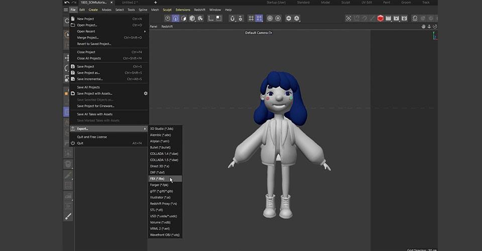
We’re going to barely scratch the surface of ZBrush, as there is a TON to learn. In this tutorial, we’ll show you a few tips and tricks, but you really need to roll up your sleeves and get to work inside the program to really get a handle on everything it has to offer.
I imported the FBX model I just exported. I subdivide all of these objects in ZBrush again. Now this model is ready to add some extra details.
The goal here is to keep the basic shape we created in C4D and add some extra details—such as details on her hair and wrinkles on her clothes. How much detail you add is completely up to you.
ZBrush is perfect for modeling finer details because sculpting can be a more intuitive way to model than box modeling. In ZBrush, you don’t have to worry about polygon flows; you can sculpt just as you would sculpt clay in real life.
It’s important to keep things consistent across your work, meaning if you add a lot of realistic details on your model’s clothes, then you should probably make the character’s face and body more realistic and detailed as well.
The great thing about ZBrush is that you can subdivide the model and add details without making the project heavy. Then you can bake these details as normal maps and displacement maps. This way, you still keep your models low poly in C4D for rigging, but also have some nice details using these maps as texture.
Now that she has some nice details, export the low poly FBX model and subdivided high poly model, as well as normal maps and displacement maps for each object. Now we are ready to go to Substance Painter and make the textures.
Finishing your 3D model with substance painter

Substance painter is a super powerful software for texturing. You’ll find many character artists are using Substance Painter to add detailed textures to their characters, because it allows you to paint directly onto your 3D model in a very intuitive way. If you’re familiar with using Photoshop, you’ll find Painter uses a lot of the same techniques and tools.
With our project set up, we’ll show you how to make her skin texture first.
In the Asset Window, we already have tons of preset materials we can use.
Applying the material is super simple: Just drag the material you want to use onto the model or layer window. Then you can go to the properties window and adjust the details, such as colors or roughness.
Now she looks OK, but we think she would look nicer with a natural blush on her face. So we’ll duplicate our material and this time choose pink, then we add a black mask. This mask works exactly like a Photoshop mask and we can paint some nice details directly onto this 3D model using the brush.
If you wanted to add this level of detail to your texture without using Substance Painter, you would probably need to paint onto the flat UV map using Photoshop. But it’s very tricky to paint by just imagining how your texture would look in 3D without the 3D preview, so this is where Substance Painter is really helpful. It allows you to paint directly on the model so you can create beautiful materials easily.
If you need a specific texture and don’t have one available, go to Adobe Substance Assets page to find an incredible amount of assets—and you can download 30 assets per month for free, so you don’t even need to know how to make these materials from scratch.
From here, keep experimenting with the preset textures, adjusting them, adding layers of paints and textures until you feel happy. Now that her texture is done, let’s go back to C4D and assemble the models and texture, and we will show you how it ended up.

So this is the final work! We added her buddy-cat monster and the magic tablet pen.
Cinema 4D is an incredibly powerful tool for art and design, and you can get by with unwrapped UVs and a bit of imagination. But the power of ZBrush and Substance Painter opens up an amazing workflow. We hope you picked up a few cool tricks, and we can’t wait to see what you’ll create next.
Learn 3D art and design like a pro
Are you interested in learning Cinema 4D, but not sure how to start? We highly recommend taking School of Motion’s Cinema 4D Basecamp course. Learn Cinema 4D, from the ground up, in this intro to Cinema 4D course from Maxon Certified Trainer, EJ Hassenfratz. This course will get you comfortable with the basics of modeling, lighting, animation, and many other important topics for 3D Motion Design. Master basic 3D principles and lay the foundation for more advanced subjects in the future.
About the artist

Marina Nakagawa is a Japanese freelance motion designer and 3D artist based in London. She is a big fan of cute/weird characters and funny animations.
She relies on her Wacom products to make her work: “Honestly I can’t work without Wacom, I literally don’t use a mouse anymore and all I use is my Cintiq. So technically any project on my IG are made using Wacom.”
To learn more about her and her work, check out her website, ArtStation, Instagram, Behance, or Twitter.