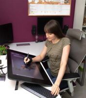
Monika Zagrobelna is a Polish artist with a great passion for creating new things — whether by drawing, digital painting, or photo manipulation. She specializes in creating realistic art, especially of animals, and is a big fan of dragons and feline creatures!
She loves sharing her skills with others, including on her blog and social media accounts. Check her out on X (Twitter), Facebook, LinkedIn, Instagram, or on her website.
In this extremely detailed tutorial, she walks step-by-step through her process for utilizing three-dimensional perspective in her drawings.
If you don’t want your drawings to look flat, you need to use perspective. It’s a scary word for beginners, and for a good reason — it’s often taught as something mathematical, abstract, and hard to apply to the intuitive process of creating art. So in this tutorial I’ll try to explain it to you in a different way — with less theory and more practice. Let’s get started!
How to Draw a Box
This is a flat shape — a rectangle. A rectangle is 2D, which means it has two dimensions: length (L) and height (H).

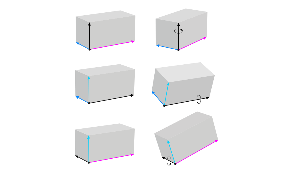
If we want to turn this flat rectangle into a 3D box, we need to add the third dimension: width (W).

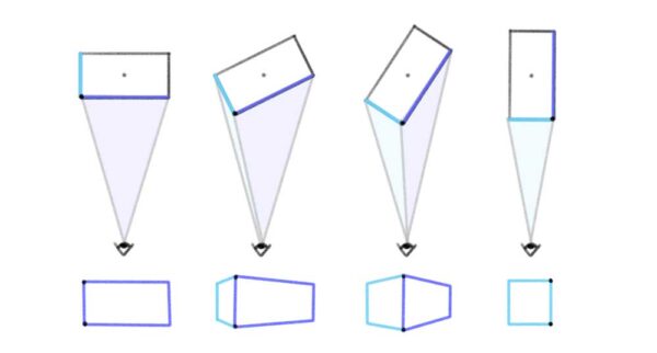
You can control the look of the whole box by manipulating these three lines. First, you can decide whether you want to show the top or the bottom by changing the direction of the width and length:
- Make the width and/or length point up to make the top visible
- Make the width and/or length point down to make the bottom visible
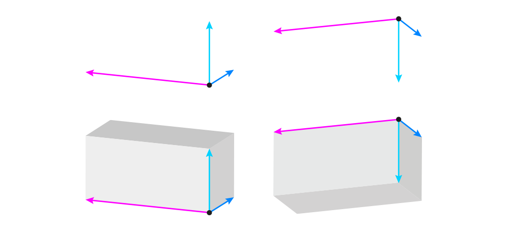
Second, you can control the tilt of the box by changing the direction of the height:
- Make the height vertical to keep the box parallel to the ground
- Make the height not-vertical to tilt the box
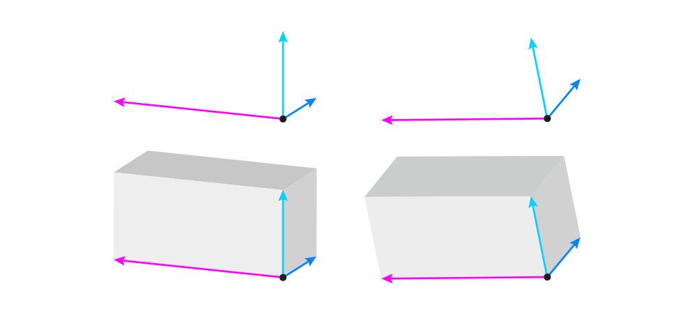
Third, you need to pay attention to the angles between these three lines. The basic rules are pretty simple:
- Both the angle between the width and height, and between the length and height, must be acute — that is, under 90°.
- The sum of the two acute angles can’t be smaller than 90°. The bigger this sum, the closer the box will seem to the eye level of the viewer (making it 180° will place the box directly at eye level).
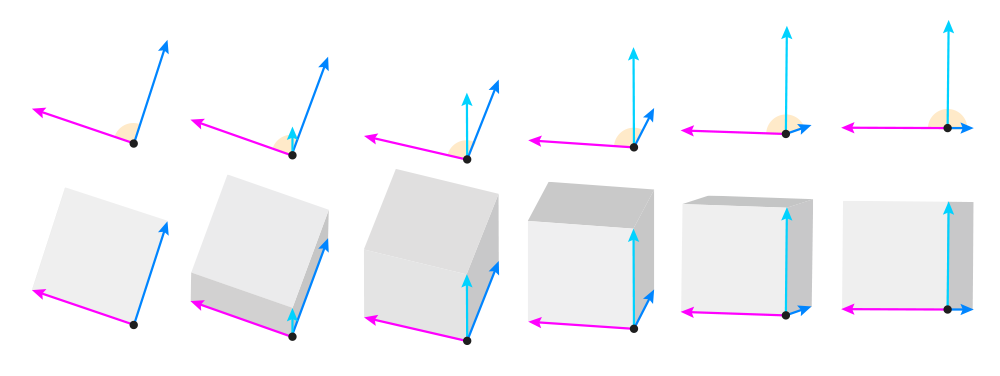
The right angle (90°) is reserved for 2D figures only. In math textbooks, you can sometimes see a cube with 90° angles, but this is an abstract representation of this shape — in reality, a cube will never look like that.

The angles change when the object is rotated, so you can control the view very precisely by adjusting the angles. The general rule is: the bigger one angle, the smaller the other one. 90° is the limit — once you reach it on one angle, the other reaches 0°.
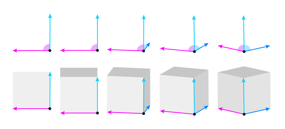
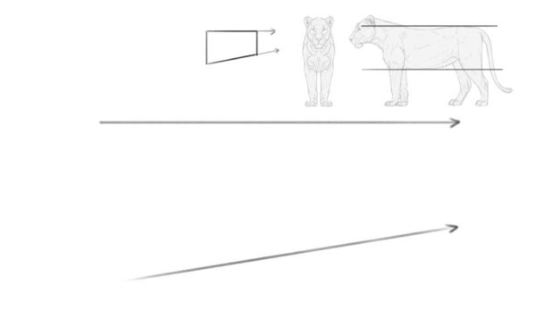
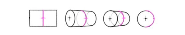
OK, so we’ve got the direction and the angle of these lines. Now we need to establish their length. Each of the lines has its original value that can be seen in full in the 2D view. But once the box is rotated, these values get smaller — we call this foreshortening. Here’s how it works:
- The closer the sum of two angles is to 180°, the closer the height is to its original value. At 90°, the height is diminished to 0.
- For the width/length, the smaller the angle, the more shortened the line. At 90°, the line achieves its full value.
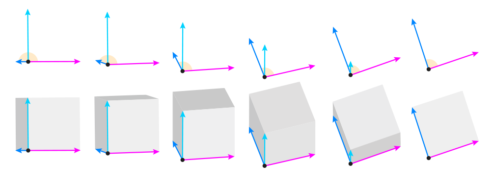
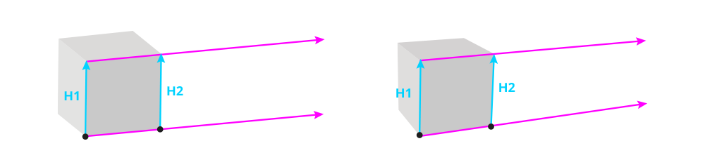
So the three lines are done now, and all we have to do is to draw the other lines. But before we do this, I need to quickly explain this one concept. It’s a well known fact that objects that are farther away appear to be smaller. And this applies to the parts of objects, too. So since in the below image H1 is closer than H2, then H2 must be smaller (shorter). This means that the lower length line and the upper length line are not parallel to each other, but slightly tilted.
The exact degree of this tilt is not important, because in photos it can be exaggerated or decreased just by using a different lens. So you can use any, as long as you keep it consistent across the whole scene.
With that out of the way, let’s continue building our box! First, attach the width and length to the tip of the height. It should be slightly tilted towards the original dimensions (slightly below the parallel position). The smaller the angle, the stronger the tilt.
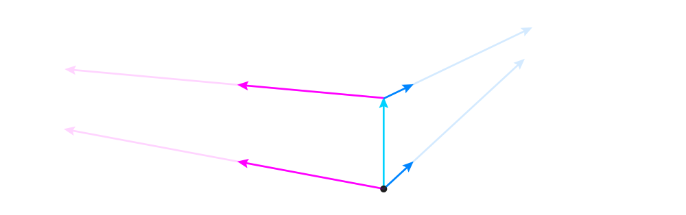
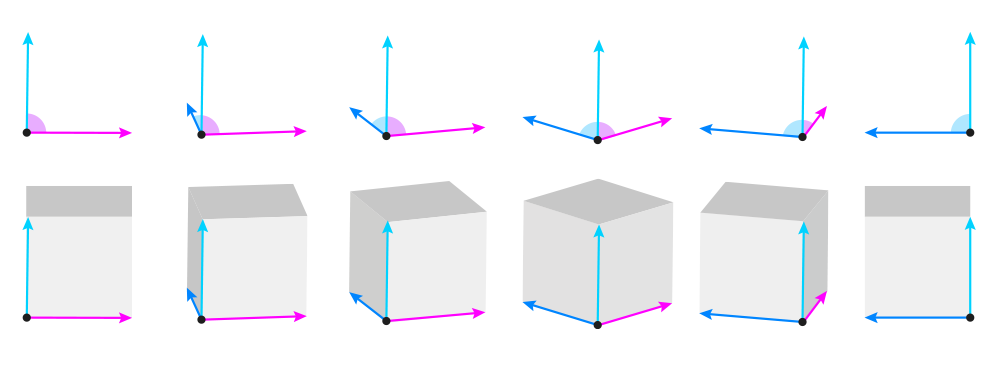
There’s also one more thing you can do at this point. If you don’t want to show the top/bottom, you can make these new lines horizontal, or even pointing towards an imaginary horizontal line crossing the box.
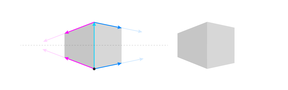
Now you can add the two remaining height lines, properly shortened by the tilt. These lines should usually be parallel to each other, unless your box is supposed to look huge (like a building) — then you can tilt them slightly towards the middle one for a powerful foreshortening effect.

Finally, time to add the remaining width and length lines. Tilt them towards the other ones.
How to Draw an Ellipsoid
A box can be a nice base for many other, more complex forms. Let me show you how to create an ellipsoid this way! An ellipsoid is a 3D version of a 2D ellipse — that is, an oval. It doesn’t have any corners, but it still has all three dimensions — they’re just hidden.
To draw an ellipsoid, first draw a box using the view that you want to use for your ellipsoid.

Then, draw an ellipse inside of it. Its long axis should be parallel to the length of the box, and run right through the middle of the box. This ellipse doesn’t have to fill the box perfectly — just follow its general shape.

Mark the center of the long axis, and draw the three dimensions across it — parallel to the dimensions of the box. The closer the angle to 90°, the closer the lines should be to the outline of the ellipse — but they will only touch it if the angle is 90°.

Now attach two short lines to the tips of the dimension lines — parallel to the lines from the corresponding side of the box. Their length doesn’t matter.

Finally, connect these short lines to each other with partial ellipses wrapped around the whole form. These curves will help you see the volume of the ellipsoid.

How to Draw Multiple Objects In Perspective
Drawing multiple objects together may seem complex, but it’s really not, if only you follow these few rules. First, remember to draw the ground plane before or right after drawing the first object. Then you can place the other objects on this ground plane to keep them on the same level.
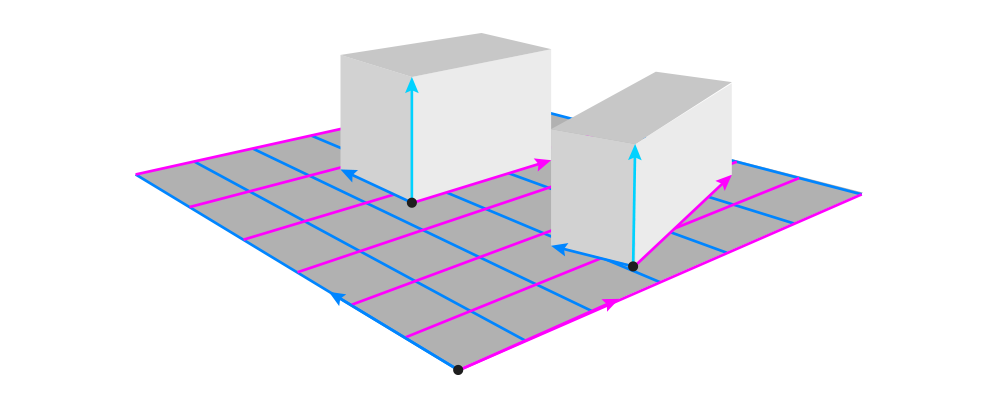
Second, to make the objects appear rotated in relation to each other, all you need to do is to keep one dimension constant. Then it will be recognized as the axis of rotation:
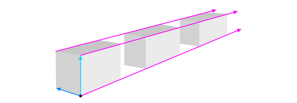
Third, if you draw multiple objects in the same position, for example lying in a row, make sure that their corresponding dimension lines are all tilted towards the same imaginary point. Doing this will also help you adjust the size properly.
And fourth, when drawing combined objects, always draw the middle line across the surface of the objects. These middle lines should be aligned to each other to keep everything symmetrical.

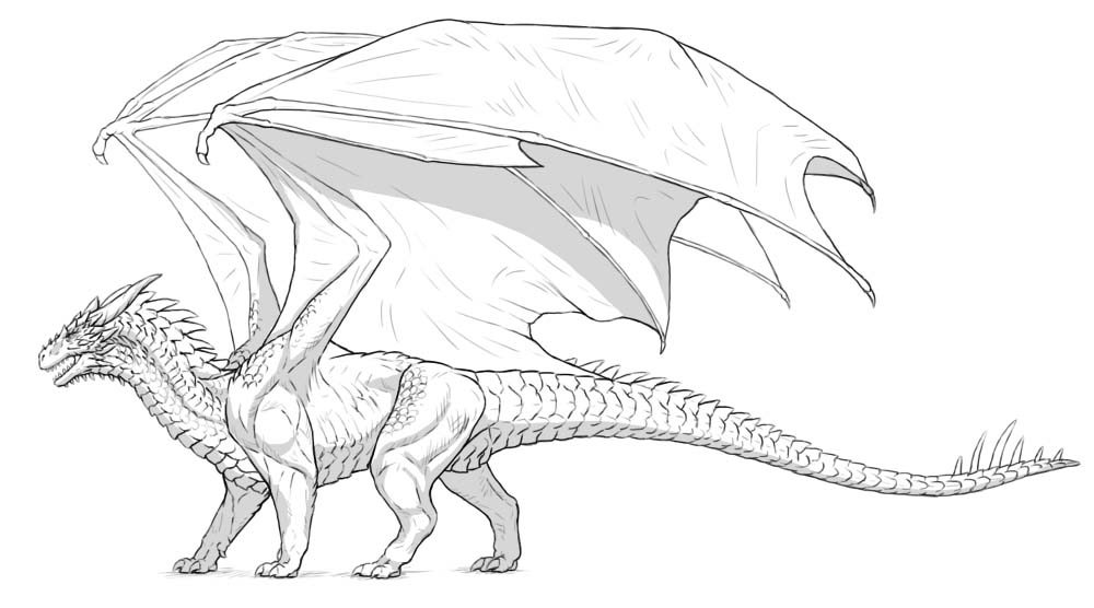
How to Draw in Perspective: a Practical Example
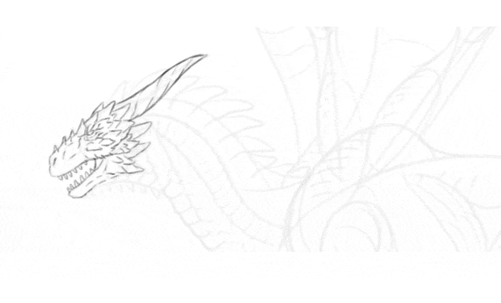
Let me show you how to use all these tricks to create a simple drawing. Let’s say I have this sketch, and I want to make it look 3D:
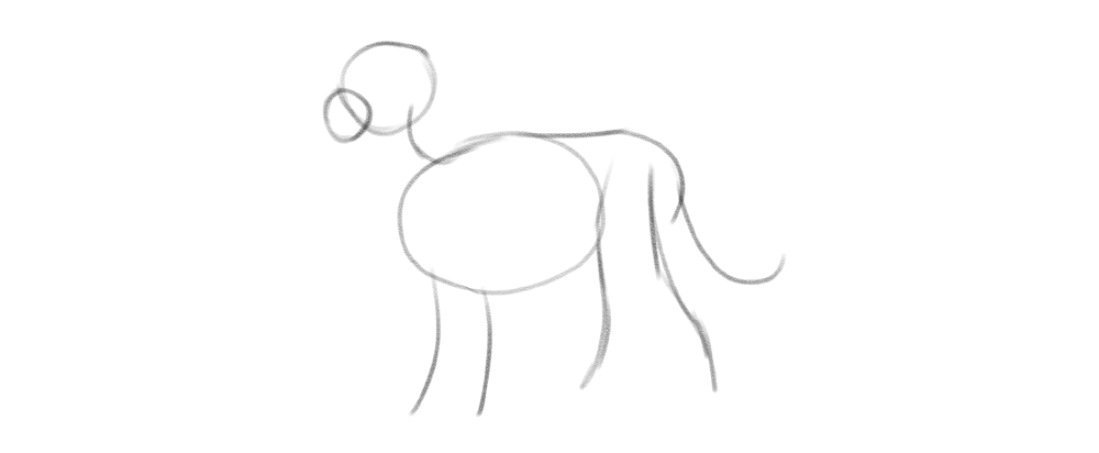
First, it’s good to create the ground plane. To do this, I draw a line from the belly towards the imaginary ground, and place a set of three dimensions here. I use a very wide angle for them — this will create a fairly neutral view.
Once I have these lines, it’s easy to turn them into a plane (or a flat box).
Next, I add the short dimension lines to the sides of the torso’s ellipsoid. I make sure to tilt these lines properly towards the lines on the ground. I add some curves based on these lines, as well as a simple shape for the hips.
Then I align the legs by drawing the dimension lines between them. To make the pose less artificial, I intentionally break this rhythm in the hind legs, drawing one of the legs farther than the symmetry would require.
I can make the pose even more natural by turning the head slightly towards the viewer. To to this, I draw the head in a different view, while keeping the height dimension constant — indicating that this is the axis of rotation.
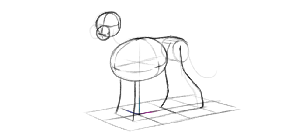
Finally, to keep the tail at a proper distance from the ground, I sketch a few vertical lines under it, making sure all of them touch the ground along its middle line.
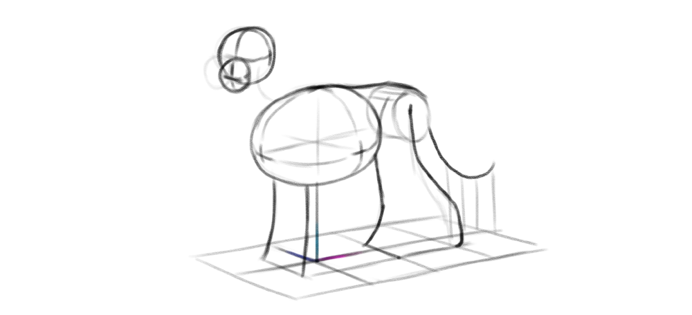
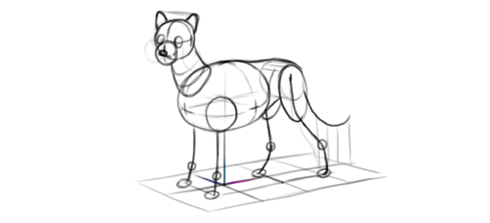
Once you sketch the perspective this way, adding any other elements is easy — all you need to do is to make sure the corresponding dimension lines are properly tilted to each other, and the rotated parts share one axis with the others.
Monika Zagrobelna is a Polish artist with a great passion for creating new things — whether by drawing, digital painting, or photo manipulation. She specializes in creating realistic art, especially of animals, and is a big fan of dragons and feline creatures!
She loves sharing her skills with others, including on her blog and social media accounts. Check her out on X (Twitter), Facebook, LinkedIn, Instagram, or on her website.
In this extremely detailed tutorial, she walks step-by-step through her process for drawing an incredibly cute little bird!
When you think about creating a digital artwork, you may know exactly what the final result is supposed to look like, but not the steps that you need to take to get there. So in this tutorial I’ll show you an example process of creating a digital painting from start to finish! You’ll learn how to draw the sketch, plan the basic colors, add some shading, and render the whole picture — and you can easily modify this process to create your own style.
Setting up your tools
Digital art, as any medium, has its special tools. They differ slightly depending on the program you use, but the basic ones are pretty similar. Here’s a quick overview of the tools I’ll be using in this tutorial, with examples from Sketchbook Pro (light grey) and Photoshop (dark grey).
Image Size
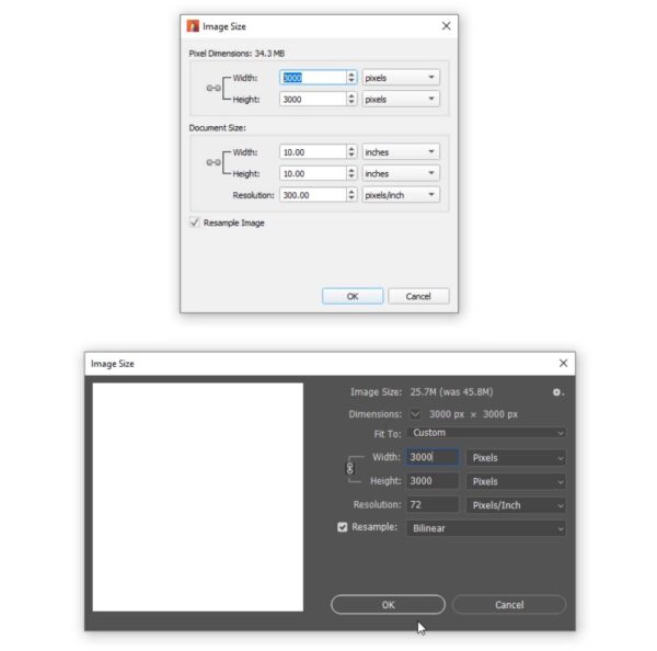
Before you start working on your drawing, you need to make sure the canvas is the right size. If your canvas is too small, the drawing will look blurry; if it’s too big, your brushes may look blurry or too small (and they may lag). 3000 x 3000 px should be enough for most drawings. You can define your canvas dimensions by going to Image > Image size.
Drawing Brush
Every drawing program comes with its default brushes, and in this tutorial you’re going to need only two of them. First, find a brush that tapers at the ends according to the pressure of your pen, and becomes more opaque the stronger you press it. This will be your drawing brush — perfect for sketching and creating the line art! You can resize it using the square bracket keys ([ and ]), but keep it pretty thin.
Painting Brush
Second, find a brush that also changes its opacity in reaction to the pressure, but retains a consistent size all over the length of the stroke. This brush can be used for painting. Change its size manually depending on the need.
Editor’s Note: want to learn more about brush settings in Adobe Photoshop?
Check out our comprehensive Photoshop brush series here.
Color Picker
To change the color, you can use the Color Picker. It may have a form of a square, triangle, or simply a rainbow gradient, with sliders that allow you to precisely change the attributes of color.
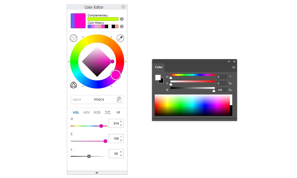
Eyedropper Tool
You can take a sample of any color present in the canvas by holding the Alt key and clicking in the chosen area.

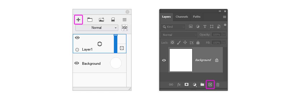
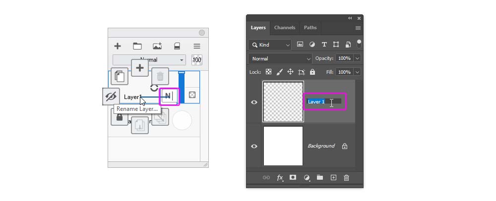
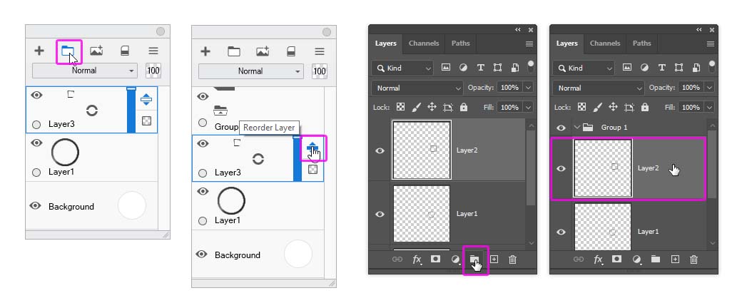
New Layer
Layers allow you to separate parts of the drawing from each other. To create a New Layer, click the plus icon in the Layers panel.
New Layer
Layers allow you to separate parts of the drawing from each other. To create a New Layer, click the plus icon in the Layers panel.
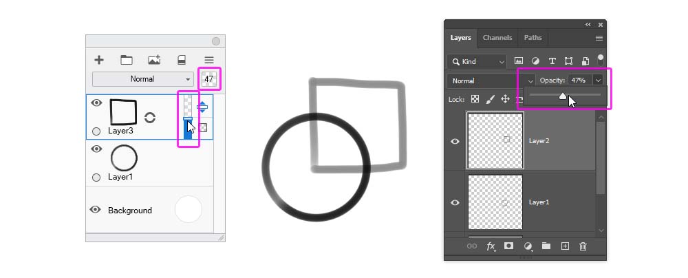
Layer Opacity
At any moment, you can make the content of a layer less visible in a non-destructive way. Look for a 100% number somewhere in the Layers panel — editing this number will allow you to reduce the Opacity of the layer. In Sketchbook Pro, you can also do it directly by moving the vertical slider next to the layer.
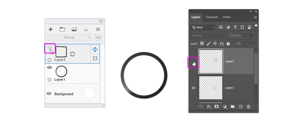
Layer Visibility
You can also make the layer temporarily invisible. To hide a layer, click the eye icon next to it. Click the same place to bring it back.
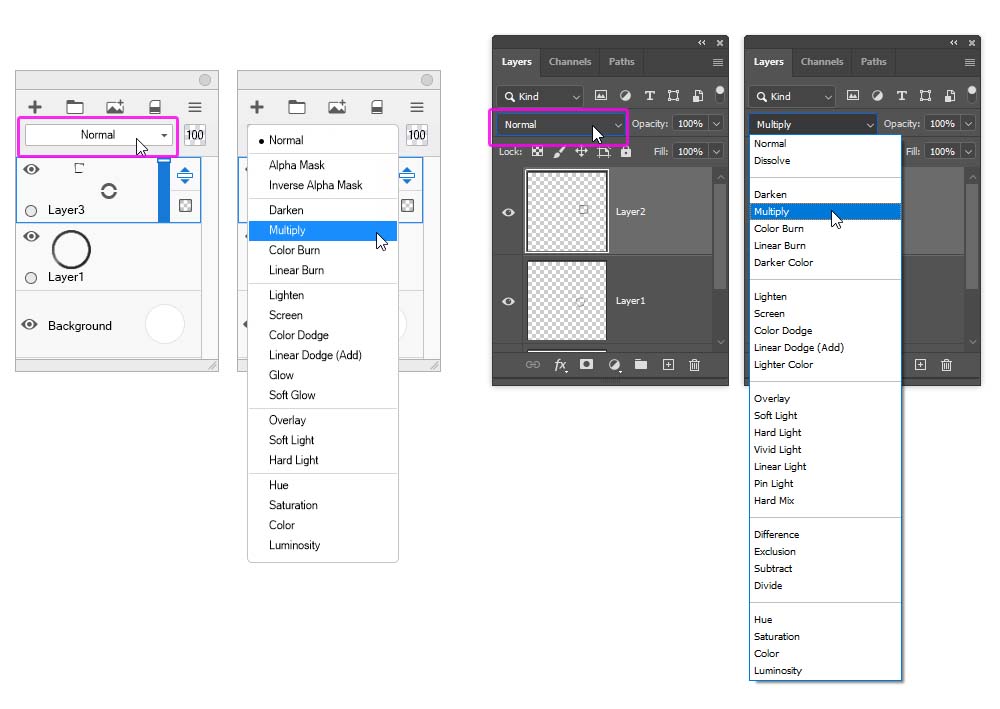
Blend Mode
By default, the upper layer covers the lower layer (unless you change its Opacity), the same it would work if you used oil paint. But covering is just one type of layer mixing — and you can select one of many others in the Blend Mode menu. To open it, click the bar labeled “Normal”.
Layer Group
If you have lots of layers, it’s good to divide them into groups. You can create a New Group by clicking the folder icon, and then drag the selected layers into it.
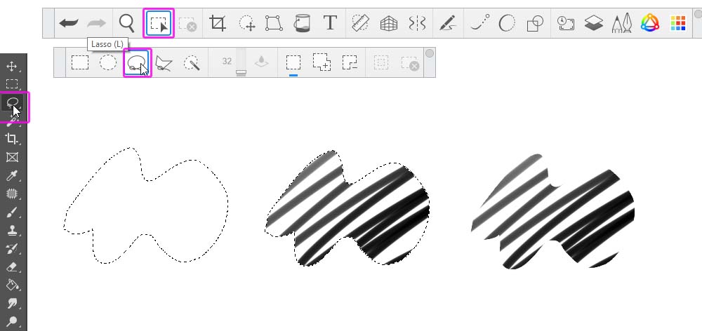
Lasso Tool
The Lasso Tool is a special type of a selecting tool. You can use it to draw the outline of the selection area, which gives you a precise control over its shape. Then, once you have this selection, you can paint inside it, and never cross its borders! You can add to the selection by holding the Shift key, and subtract from it by using the Alt key. Control-D will remove the selection.
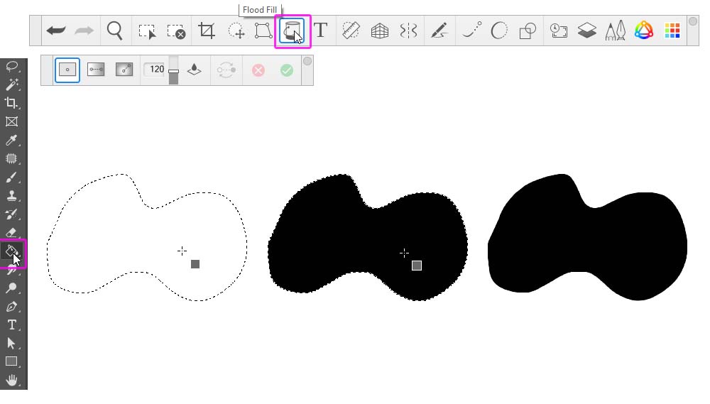
Paint Bucket Tool
Once you have the selection, you can quickly turn it into a full, hard-edged shape by filling it with the Paint Bucket Tool:
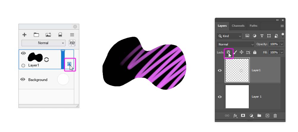
Pixel Transparency Lock/Alpha Lock
If you put a little lock next to your layer, locking its transparent pixels, you’ll be able to draw over the content of the layer and never cross its edges.
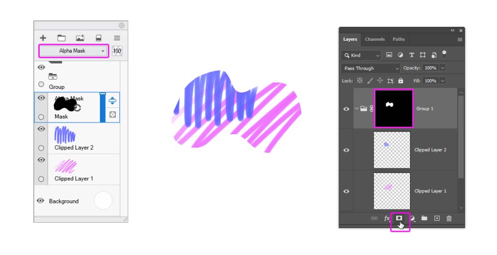
Alpha Mask
If you want to create multiple layers, all within the same borders, you can use an Alpha Mask for this. Put all your layers inside a group, and change its Blend Mode to Normal. Then add a Mask. In Sketchbook Pro, the Mask is simply a layer on top, with its Blend Mode set to Alpha Mask. In Photoshop, you need to add a Layer Mask to the group, and then draw the masking shape on it. After this, anything you add to the group will be automatically clipped to the shape of the Mask.
1. How to Create the Sketch
You can create your own sketch for this tutorial and modify the steps to make them fit your illustration. But if you want, here’s a quick guide for drawing this bird.
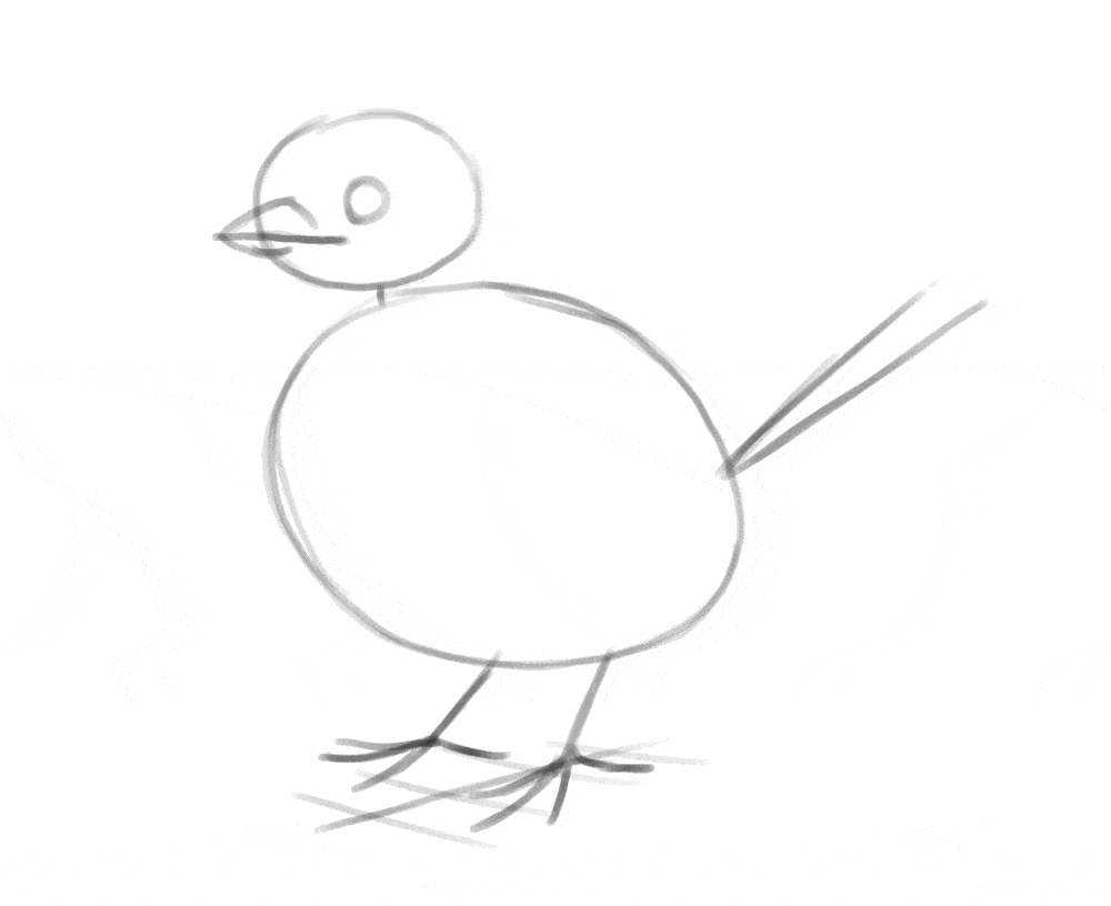
Step 1
Take a drawing brush, make it quite thick, and sketch the basic shapes of the bird—the big, round torso, a small elliptical head, a circular eye, and a few lines for the legs, beak, and tail.
Step 2
Connect the head with the torso to create the shape of the neck. Create the outline of the wings with two simple shapes. Add two simple feathers to the tail, and mark the claws.
Step 3
Divide the body into these separate areas, and add a “joint” to each toe.
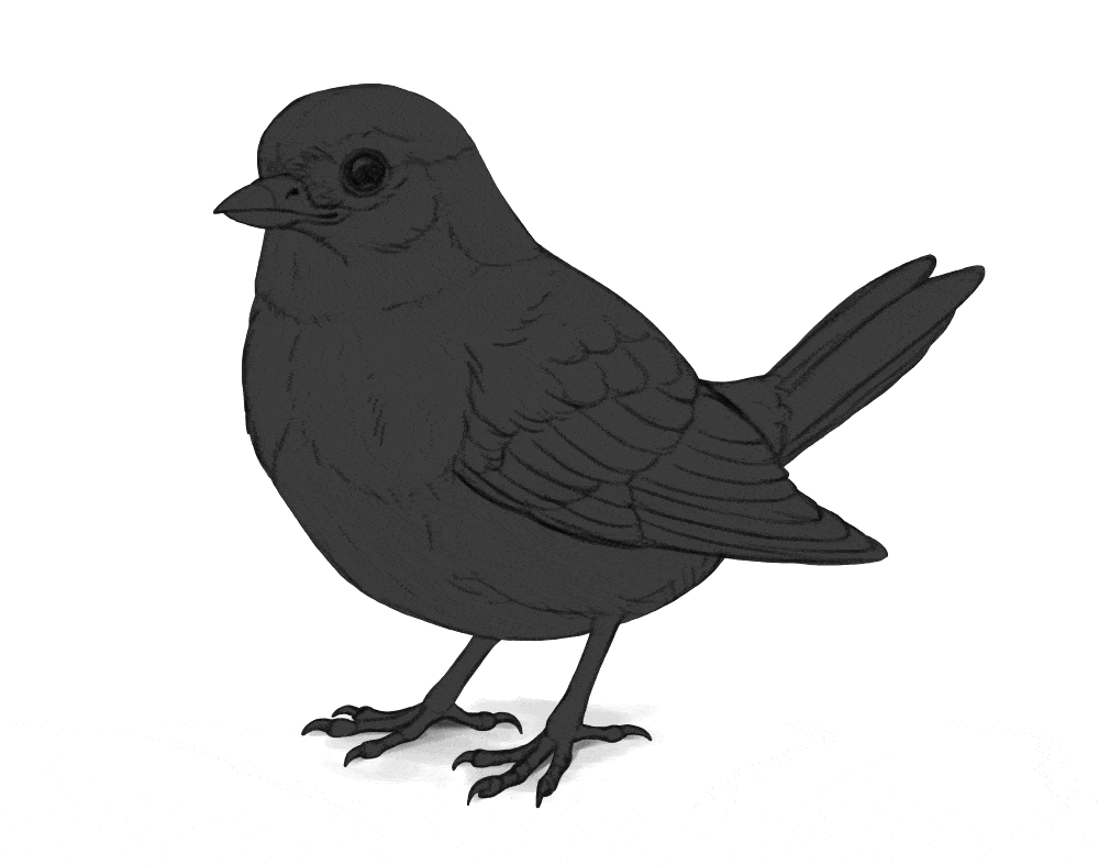
Step 4
Lower the Opacity of this sketch and create a New Layer on top. Make your drawing brush smaller and draw the line art based on the guide lines below. It’s good to use a reference at this point—there are many details that are hard to memorize, and a photo will remind you of their existence.
2. How to Draw the Basic Colors

Step 1
Create a New Layer over the line art and use the Lasso Tool to select the whole silhouette of your subject. Then use the Paint Bucket Tool to fill it with any color. Name this layer Mask.
Step 2
Turn this layer into an Alpha Mask and clip the line art to it. All the other layers from now on should be clipped to Mask, and remain under the line art.
Step 3
Create a New Layer under the line art and fill it with a random shade of grey. This will the background color of the subject.
Step 4
Create a New Layer. Your subject will probably have multiple color areas on its surface—for example, I want the beak to be colored differently than the feathers. We need to mark these color areas now.
Try to imagine the separate color areas, and outline them with the Lasso Tool. Try to be as precise as possible and follow the lines established by the line art. You can select multiple areas with different colors, as long as they’re at a distance from each other. Then fill them with another random shade of grey.
Step 5
After you mark all these separate areas, create a New Layer and mark other ones, using a different shade of grey this time. Feel free to put that new layer under the previous one, to avoid redrawing the same edges. Repeat this step until you cover all the color areas.
Step 6
Now, lock the transparency of each of the color areas. Then paint over them with a painting brush, assigning each area its actual color. You can create color gradients, but avoid adding too much detail.
3. How to Add Shading

Step 1
Now that we have the basic colors in place, we can sculpt the form of the subject with the magic of light and shadow! Don’t worry about its brightness and color for now—first we need to take care of the sculpting qualities of the shadow. To do this, create a New Group between the line art and the color layers. Call this group Shadow. Inside, create a New Layer and fill it with medium grey. Name it Ambient Light—which is the light coming from around the object, from the sky or the walls.
Step 2
Create a New Layer and use the Lasso Tool to select the areas that seem to be pointing towards the light source—possibly somewhere above. Then fill this selection with a lighter shade of grey. Name this layer Direct Light 2.
Step 3
The illuminated area has different levels of brightness—mostly due to the light falloff effect. In short, the wider the angle between the light ray and the surface, the less light that surface gets. To simulate this effect, create a New Layer and select the areas that seem to be pointed directly at the light source. Fill these areas with white. Name this layer Direct Light 1.
Step 4
Another aspect of light is called the reflected light (or the bounce light). The light hitting the ground (or the subject!) gets reflected, and if it reaches the shadow area, it illuminates it with its own power. Select these areas on a New Layer, and fill them with grey that’s brighter than the ambient light, and darker than the main light. Name this layer Reflected Light.
Step 5
So far, we’ve been adding mostly light—just weaker and stronger types. Time to add some real shadow, in the areas that the light doesn’t reach. Mark them on a New Layer, and fill them with black. Keep these areas small. Name this layer Occlusion Shadow.
Step 6
Finally, let’s add the cast shadow—the shadow visible on the ground. Do to this, create a New Layer on the bottom, outside of the masked layers. Paint a small grey patch under the subject—the closer this shadow is to the subject, the darker you can make it. Name this layer Cast Shadow.
Step 7
Now, time to mix all this shading to the colors. It’s very easy: just change the Blend Mode of the Shadow group to Multiply.
4. How to Add Shine
Step 1
Shadow is not the only thing that sculpts the form of the subject. There’s also shine—the direct reflection of the light source appearing only at a special angle between the light source and the viewer. To add this effect, create a New Group above the Shadow group. Name it Shine. Inside, create a New Layer and fill it with dark grey. Name it Background.
Step 2
Create a New Layer and use the Lasso Tool to mark the areas that should be slightly shiny. These areas can be pretty big, but still smaller than the illuminated area. You can use it to reveal the uneven surface of the illuminated area—for example, the separate feathers. Fill them with grey only slightly brighter than the background. Name this layer Dark Shine.
Step 3
Create a New Layer, and mark the most shiny areas. Keep them small—the brighter the shine, the smaller and sharper it must be. This strong shine usually belongs to smooth, hard surfaces—so here I’m adding it to the beak, legs, and claws, but not the feathers. Fill these areas with white. Name this layer Highlights.
Step 4
Now, create a New Layer between the two previous ones. You can use is to add the areas of a medium strength, and medium size, to reveal even more details of the surface. The grey here should be slightly brighter than the first, big shine. Name this layer Mid Shine.
Step 5
In real world, once a surface turns away from the viewer, it seems more shiny. It’s called the Fresnel effect, and you can include it by marking a thin outline right next to the edge of the subject—on a New Layer, of course. You can make it white, and then regulate its strength with the Opacity until it doesn’t look fake. Name this layer Fresnel Effect.
Step 6
Now, remove the dark grey Background and change the Blend Mode of the group to Screen. This will automatically mix the shine with the shadows and colors!
5. How to Adjust the Colors
Step 1
As you can see, my bird looks 3D now, but its materials look all wrong—it seems hard and shiny, like a painted sculpture. It’s because the soft feathers, in reality, would capture some of the light inside them, making them warmer in color and breaking the strength of the shine. This effect is called the subsurface scattering.
To include this effect, we need to adjust the colors and Opacities of the shadow and shine layers. First, hide the Shine group to see the shadows only. Then, lock the transparency of each shadow layer, and paint over it with the painting brush. The relative darkness of each shadow should remain the same—so, the occlusion shadow should stay darker than the ambient light, which should stay darker than the reflected light, which should stay darker than the direct light, and so on.
But other than that, you can change anything you want—make these layers brown instead of grey, brighten them all, make one shadow only slightly darker than the other, or even give each of them different colors. Don’t worry about the theory behind it—your goal is simply to make it look good! Just remember that the fluffier/softer the material is, the more light it captures inside, brightening the shadows.
Step 2
Do the same with the Shine group now. Shine looks the strongest on dark, smooth, and/or hard materials, so in my case, I can leave it pretty visible on the beak, in the eye, and the legs. The shine on the feathers, though, will be broken by their softness and their subsurface scattering, making it weaker and warmer. Keep in mind that this isn’t true for all feather—big black birds, like ravens, have smoother feathers with lots of shine!
Step 3
Now if you hide the line art, the artwork should look pretty good. And still, there may be some details missing—they are there when the line art is on, and disappear when you hide it. This is because we’ve recreated most of these lines with shading and shine, but some of them should com from variation in colors.
So look at your subject now and see where such variation can be added. For example, the feathers are often outlines with a thin, brighter edge, so adding it would help us separate the feathers without adding any extra shading. To do this, you can show the line art and use the Lasso Tool to select the areas right next to the lines. Then you can hide the line art again and paint these new colors on a New Layer, above the other colors and under the Shadow group.
Step 4
Continue doing this to all big feathers, or any separate elements that you have in your drawing.
Step 5
The basic color areas that we’ve established earlier can also be modified to include more details. You can use a drawing brush to draw a subtle texture on them, accentuating the 3D curvature of the area.
Step 6
If you mark all the colors and there are still some details left, you can add an extra shadow layer in the Shadow group, and add them there. Just keep them subtle!
6. How to render the artwork
Your drawing, in some sense, is already finished—just in a stylized way. If you want to make it look more realistic, though, there’s some extra work to be done.
Create a New Layer on top, over the masked layers. Look at all the sharp borders between shadows and colors—paint over these borders to cover them, picking the colors from the area with the Eyedropper Tool. This is also a great opportunity to suggest the texture of the surface by drawing subtle shapes in these transitional areas—for example, small individual feathers, or shadows between scales.
The artwork looks pretty good now, doesn’t it? It’s very much finished, but if you want to push it even further, here’s what you can do. Create one more New Layer on top and paint small details using a smaller painting brush (or even a drawing brush). If you’re not sure what details you’re missing, you can use a reference photo to see what else can be added. You can also move the line art to the top and show it for a moment, to see if there are any details that you’ve missed.
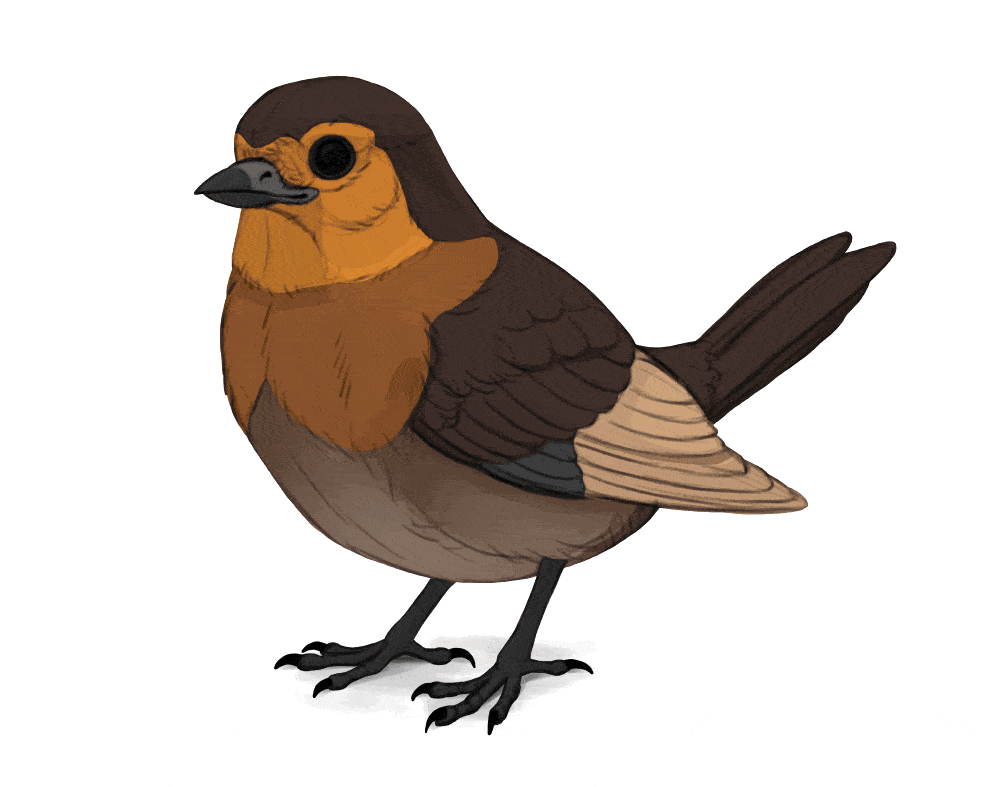
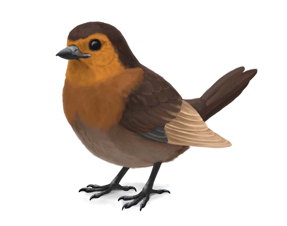
The final product:

Monika Zagrobelna is a Polish artist with a great passion for creating new things — whether by drawing, digital painting, or photo manipulation. She specializes in creating realistic art, especially of animals, and is a big fan of dragons and feline creatures!
She loves sharing her skills with others, including on her blog and social media accounts. Check her out on X (Twitter), Facebook, LinkedIn, Instagram, or on her website.
In this extremely detailed tutorial, she walks step-by-step through her process for drawing a “realistic” dragon.
Dragons are amazing, there’s no doubt about it! And in this tutorial I’ll show you how to draw such a magnificent beast from start to finish—complete with wings and scales. You’ll learn basic dragon anatomy and proportions, so after this lesson, you’ll be able to design your own dragons from scratch, too!
Keep in mind that we’re going to be drawing a classic, DnD-type dragon, with six limbs—four legs and two wings. If you want to draw a wyvern-type dragon (two legs, two wings), this instruction will still be helpful, but you’ll need to modify a couple of steps to create a desired effect.

1. How to Create the Body Plan of a Dragon
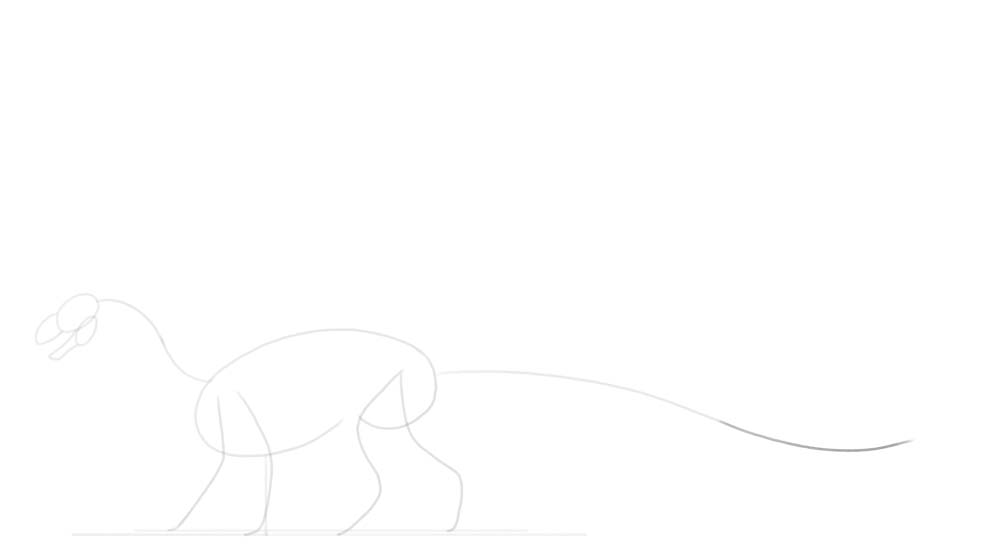
It’s important to capture the basic proportions as early as possible, before adding any details. First, draw the torso. It looks a bit like a bean, with a bigger front part (the chest) and a smaller back part (the hips). Tilting the chest down will give us some space for the big wing muscles over the shoulders.
Keep these first lines fairly thick—the smaller the brush, the more precise it feels, but in this early stage precision isn’t welcome. You’re drawing a very general idea of the subject at this point, and broad strokes will help you see the big picture. Leave a lot of space on the canvas for the wings and the long tail.
Add a line under the body to define the level of the ground. Keep the distance between the body and the ground fairly short—this will give your dragon lion- or tiger-like proportions. Add another line slightly higher. This will help us create an illusion of perspective, despite drawing a simple side-view pose.
Add the curves of the legs. Imagine them like your own limbs—the front ones should bend at the elbow and the wrist, and the hind ones should bend at the knees and ankles (with the feet in the tip-toeing position). If you’re drawing a wyvern-type dragon, make sure to keep the knees close to the middle of the body—unless you decide to use the wings as the front pair of limbs! Keep the closer part of limbs on the first ground line, and the second pair on the second one.
Let’s sketch the neck now! It should be long and curved, but it must curve in a specific way to look realistic. First, draw this concave-upward curve starting at the front of the chest. Then, attach a similar, but concave-downward curve to its tip. Add a simple oval for the head, slightly tilted. This will allow the dragon to look forward without the muzzle standing in the way.
Add simple jaws. Keeping the mouth slightly open will give the dragon an alert expression. Let’s draw the curved tail the same way we drew the neck. First a concave-downward curve … then a shorter concave-upward curve … and finally, a short concave-downward curve. Keep the tail at least as long as the rest of the body.
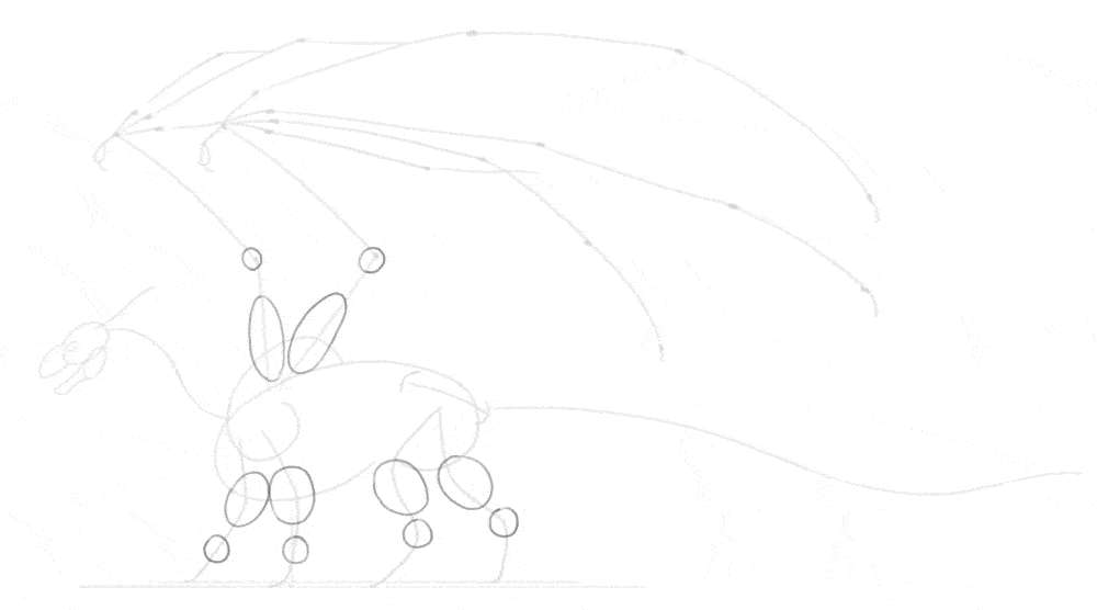
Now, add the shoulders and the hips. The shoulders should be huge, because they must be heavily muscled to carry the weight of the wings.
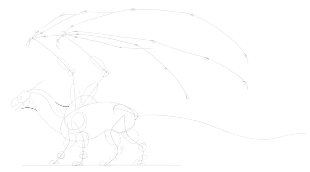
Time for the wings! If you’re drawing a wyvern-type dragon, you may want to draw the wings in the opposite direction—pointing towards the ground, to be used as front legs. Otherwise, draw these two lines pointing upward, creating a sort of a “V” shape. Add the second segment of the wing—a forearm with the big thumb at the tip.
Add the three, long “fingers.” Just like your fingers, they should bend in three places: first, right at the palm, and then twice along their whole length. You can also add a curved claw at the tip.
It may be hard to imagine the perspective at this point, but imagine they middle one is the closest to us, then the top one is slightly farther, and the bottom one is the farthest.
You can draw the fingers of the second wing entirely, but you can also visually copy the previous shape and save yourself some time. Also, add the last, little finger to the previous wing. Now the wing has all five fingers, the same way bats do. But keep in mind that this is a fantastical creature, so if you think it would look better with more fingers, go for it!
Finally, add an eye socket to the front of the head, right before the muzzle. Add a long, curved horn as well.
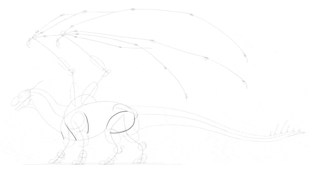
2. How to Add Basic Volume to The Body
Now we’re going to cover this bare “skeleton” with a bit of body, but without going into any anatomical details yet. First, add circles to the wrists, ankles, and the elbows of the wings. Drawing simple ovals over them will quickly add volume to the limbs.
Add smaller joints now—the tip of the elbow, the knee, the heel, and the finger knuckles. Adding a horizontal oval right over the (intended) toes will help you create the characteristic skin fold in this area. Also, mark the shoulder and the top of the hips. Add two little domes at the feet, creating a basic outline of the toes. Most dinosaurs had three main toes (with a smaller one on the inner side, like a thumb), so in the perspective you can just draw two—because the third one will be covered.
Let’s draw the neck volume now. The dragon neck must be thick and strong, to give an impression of a T-Rex. First, draw a long curve connecting the front of the chest to the back of the head. Add another curve on top, from the top of the head to the beginning of the neck. Finish the shape of the neck by creating a curve at the throat, and one more right before the wing shoulder.
Dinosaurs have very characteristic hips, with two long bones under the upper part: one pointing forward, and one pointing backward. The former will be covered by the leg in our case, but we need to draw the latter. It will serve as an attachment point for the long tail! Speaking of the tail, draw its outline now, following the curve we’ve established earlier. If you want to keep your dragon more realistic, you can slightly flatten/widen the tip of the tail, to make it more useful for steering.
Plan the spikes and teeth now—no details yet, just their direction and volume. A set of spikes along the tip of the tail will easily make this area look more detailed. Sketch the outline of the toes now, keeping them quite thick. Add the paw pads under the toes, as well as the thumb claw. Adding an angle to the ankle ovals will help you draw them correctly later.
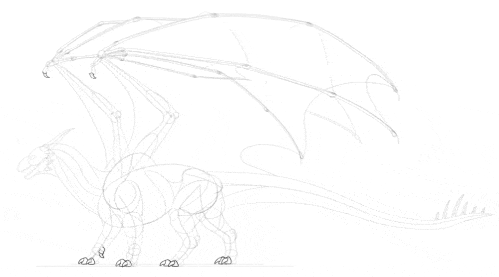
3. How to Draw the Anatomy of the Dragon
Our sketch definitely looks like a dragon now, but there are still certain areas that need to be filled to make it less skeletal. First, add the “muscles” of the arm and thigh, connecting the previously drawn volumes.
Mark the outline of shoulder muscles, the neck muscles, and the torso muscles. They don’t have to look exactly like this, because there isn’t really one correct dragon anatomy diagram that everyone must follow. However, these lines are designed to make these parts look similar to dinosaur and bird anatomy. Finish the outline of the thighs by adding these extra muscles.
Outline the rest of the legs, “shrink-wrapping” the previously established volumes. Outline the wings in a similar way. Outline the horns and spikes with gentle curves. Don’t make their tips too sharp—it wouldn’t look natural.
Spread the membrane of the wings between the wing fingers. Imagine how it connects the respective knuckles of each finger, and it should help you get the perspective right. Add a hint of the other wing behind the first wing. You don’t have to sketch it as a whole, just try to imagine where it should be. Add some extra muscle lines along the shoulder, thigh, and tail.
4. How to Add the Details to The Dragon Body
The body is almost complete now, but it will look more realistic if we add a couple of details. First, draw the claws inside the toe-tips volumes we drew earlier. Make them slightly curved, and not too sharp. Add a few extra volumes to the head, to create a foundation for further details. Add long claws to the wing fingers, too.
If you want the muscles too look realistic, you need to add some more detail to them. This isn’t necessary, especially if you plan to cover the whole body with big scales—but if you add a detailed anatomy, using lots of scales will not be necessary. Because the wings are folded, and they’re quite big, it’s likely that skin folds will appear here and there. Here’s how you can plan them:
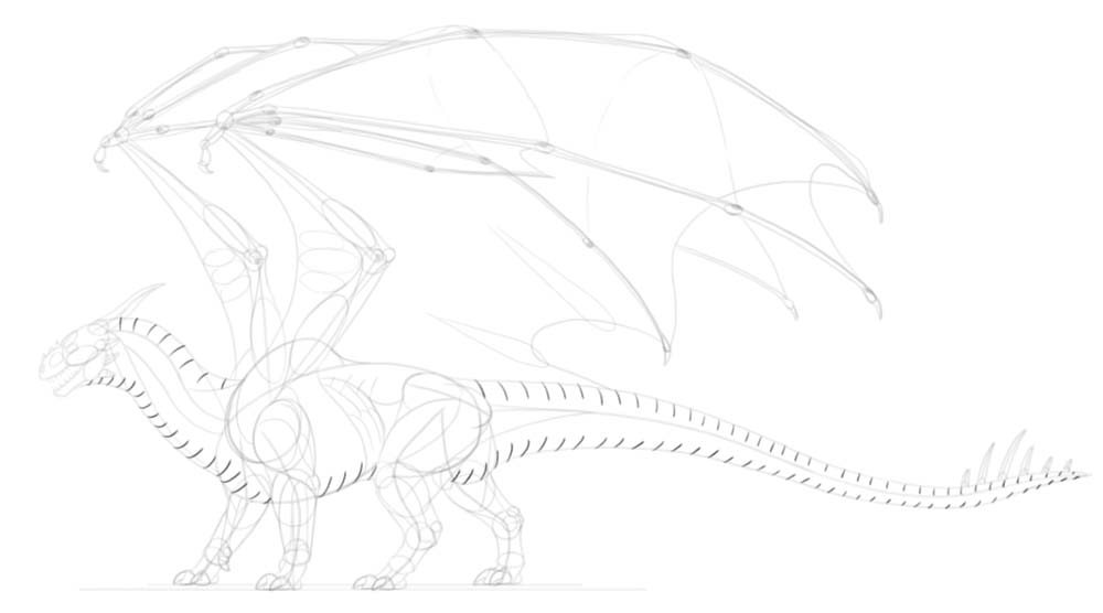
Time to plan the scales! First, sketch their “rhythm” along the upper and lower part of the body. Then, attach a big scale between each pair of lines in the series. You can make them flat, or very prominent—that’s your choice! If you want to add more scales to the body, you can plan them with various methods. Here are a couple of propositions that you can experiment with. On the head, the small scales can suddenly turn into small horns/spikes.
5. How to Draw the Final Lines
Ok, the sketch is done, time to add the final lines! Before you do this, make sure to lower the Opacity of the sketch, and create a New Layer over it. You can now make your brush smaller and more precise.
Start with the head. Be careful not too zoom in too much—you don’t want the head to look much detailed than the rest of the body, otherwise the latter will look unfinished. Keep your lines light and even a little shaky, to simulate the rough surface of the scales. Outline the top and bottom scales. Make sure that each one is slightly different that the previous one. Outline the rest of the body with minimal detail.
At the secondary scales now, if you’d like. They don’t have to lock into each other—in fact, if you avoid it, then the whole style will look looser, and leaving other parts scaleless will not look as distracting. Use short, gentle lines to accentuate the volume of the muscles. Use similar lines to show how the membrane of the wings is stretched between the fingers. To make the scaleless areas of the body look less empty, you can add some hatching here and there, to suggest a texture of the skin. Add some shadow under the feet with simple hatching.
The drawing is basically done, and finishing it further is just a matter of style. You can keep following my steps, or just finish it the way you prefer—it’s your choice!
If you decide to follow my instructions, accentuate the main outline of the body by thickening these lines. Just don’t do it continuously—leaving the tapered lines lighter will make the horns, spikes, and long scales look less “blocky”. You can accentuate some lines within the outline of the body as well, but do it even less continuously—focus on the places where two lines come in contact with each other, or the places where you’d expect a shadow to appear. After tips part, you can come back to the main outline and darken specific parts of it even more, to bring more attention to them.
Now, if you want, you can add some basic shading to the body. To do this, create a New Layer under the line art. Hide the sketch layer. Use a hard brush and light grey to accentuate these areas of the body:
Since the body of our dragon is not perfectly smooth, you shouldn’t leave shading this simple. Instead, add smaller shadows at the border of the main shadow, between the scales and smaller parts of anatomy. This will create an illusion of texture. Take a blending/smudge brush and soften the bigger shadows. This will create the effect of light falloff.
There’s an extra trick that you can use at the end, although it’s quite subtle. Duplicate the line art layer, and put it on top. Move it slightly to the side, just a few pixels away from the original. Then change its Blend Mode to Multiply, and it’s Opacity to 10%. This should add a subtle blur near the outline, making it look slightly more detailed.
You can keep adding more detailed shading (and coloring!) after this point, but keep in mind that the more similar to a painting you make it, the more lacking it will look—because it will stop looking like a finished drawing, and will start looking like an unfinished painting instead. So adding colors and shading is not really a “finishing touch”—it’s more like a separate stage that you may decide or not to enter.
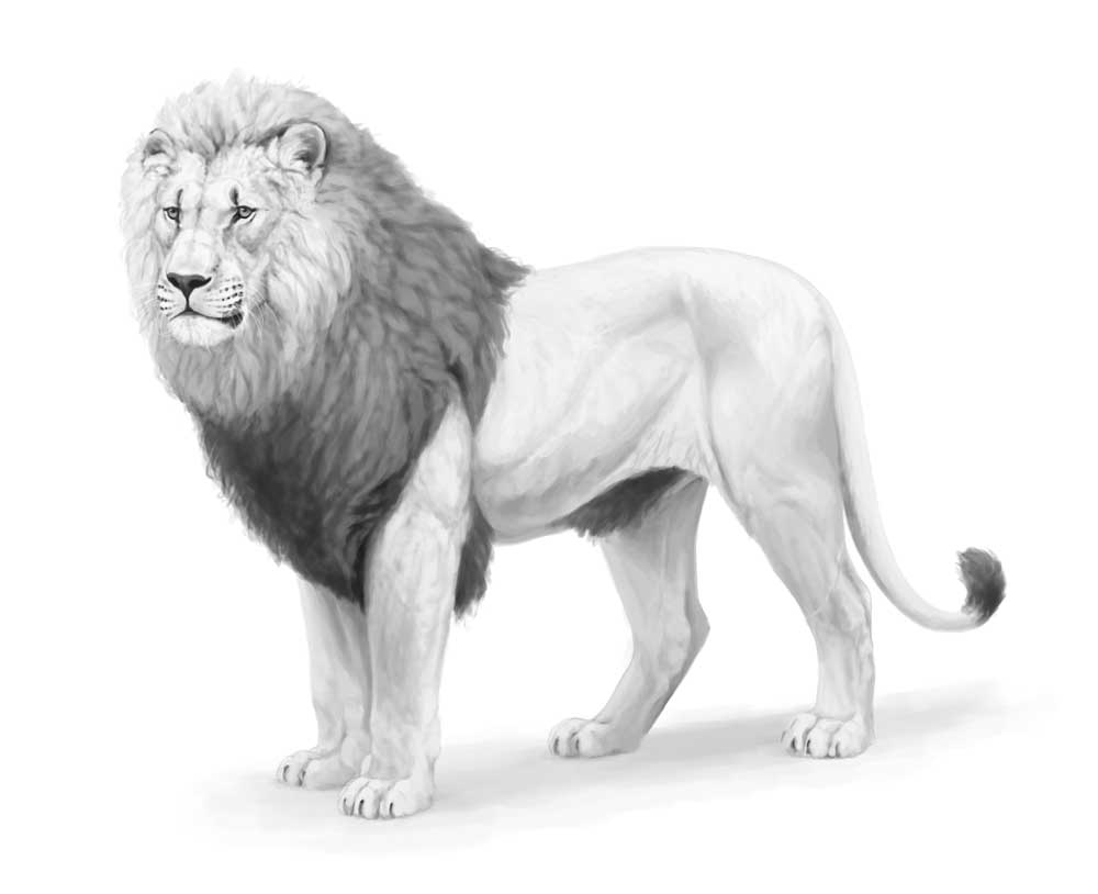
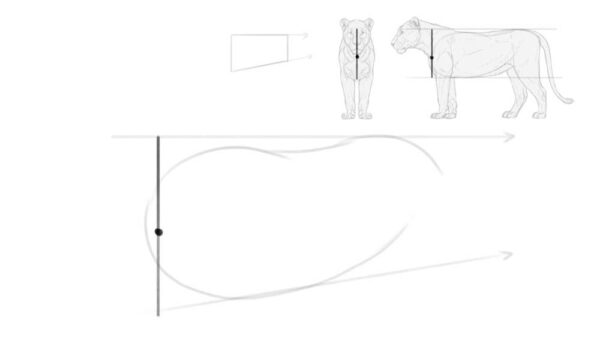
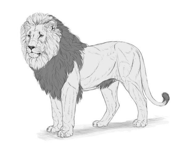
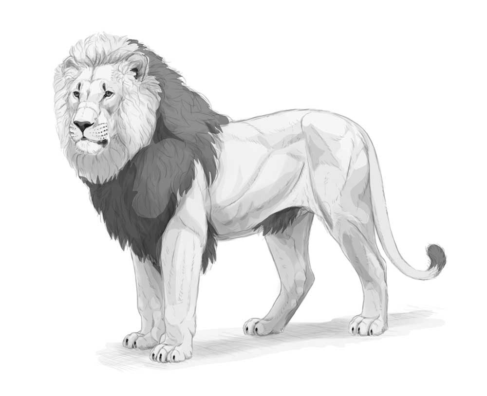
]]>In this tutorial I’ll show you how to draw a lion, but it won’t be your usual step-by-step guide — instead, I’ll show you how to use the basics of perspective to draw an animal body in 3D space. This method will allow you to draw a lion from various angles, expanding beyond the specific view and pose presented in this tutorial.
I’ll also provide a quick overview of the shading method I used for this drawing. Feel free to use any drawing app you like. I will mark the names of the tools in bold, so if you want to find them in your app, just Google “[Tool name ] [Name of the app]” — for example, “clipping mask Sketchbook Pro” — to learn how to use it in your preferred software.
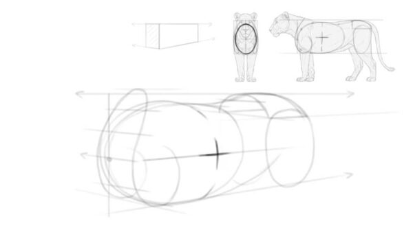
1. How to plan the perspective of the lion’s body
First, we need to define the position of the body in 3D space. We’re going to use 2-point perspective for this. This may sound scary, but without perspective you’ll never be able to draw dynamic, 3D-looking poses — so it’s good to bite the bullet and learn it as soon as possible! To make it simpler, here are the terms I’ll be using when referring to perspective:
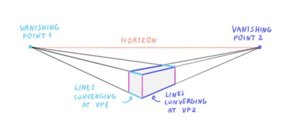
Step 1
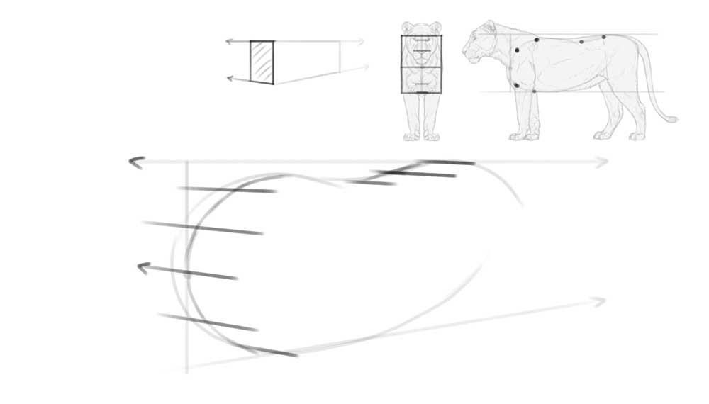
Imagine the torso of a lion as a big, long box. The upper and lower edge of its side rectangle are parallel to each other in the side view, but in perspective, they must converge. Draw the upper one as a simple straight line (the horizon line), and imagine it’s pointing towards something far behind the right edge of the page (a hidden vanishing point, VP2). Then draw a lower line pointing towards that same hidden point.
You can use any sketching brush you want for this part, but it’s best to keep it fairly thick. This way, you won’t have to be too precise, and you’ll have more room for errors. The exact size doesn’t matter — it should just feel like a thick marker when you use it.
Step 2
Now sketch a basic shape of the torso between these two lines. Keep in mind that it must be slightly shortened — similar to how a side of a box appears visually shorter when the box is rotated.
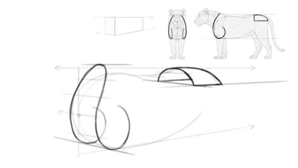
Step 3
The outline of the torso may appear quite flat at this stage, so let’s enhance its 3D form by adding special perspective marks. Start by defining its front—draw a dot next to the left edge of the torso and cross it with a vertical line.
Notice that this line is positioned at the left edge of the torso outline in the side view and at the center of it in the front view. In perspective, it must be somewhere between these two points—the more you shorten the side, the farther you can move this line. Since we’ve only slightly shortened the side, this line must stay very close to the edge.
Step 4
Draw a line crossing our front point. Imagine it’s pointing towards something behind the left edge of the page (this will be our other vanishing point, VP1). Then sketch a few more lines along the surface of the torso, imagining that all of them meet at the same point. This should make the torso look roughly like a bean!
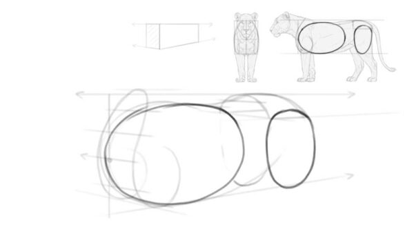
Step 5
Now that we have both points of the 2-point perspective defined, we can start adding more body parts. Draw the shoulders and hips in the following way, ensuring their sides are aligned to the lines converging at VP1.
Step 6
Add the oval for the chest. It should start between the shoulders and end a little before the hips. Make sure to shorten this oval the same way you shortened the whole torso to maintain consistent perspective. Also, include the thighs—a separate oval positioned under the hips.
Step 7
To turn the flat oval of the chest into a real, round rib cage, mark its side with a cross. The horizontal arm of the cross should point at VP2, and the vertical arm should become a part of an imaginary ellipse wrapping around the chest. Just keep in mind that the lion’s torso is not really cylindrical in shape—it’s rather flattened on the sides. That’s why the vertical arm should be pretty straight.
Step 8
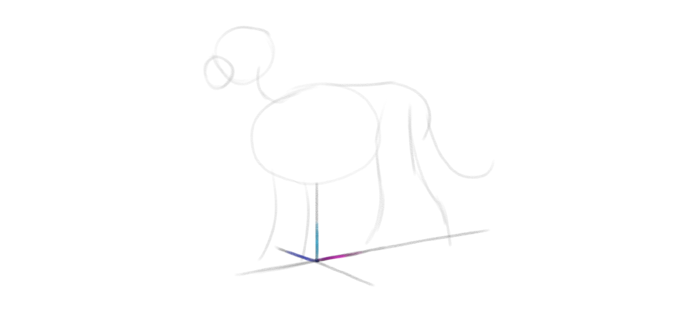
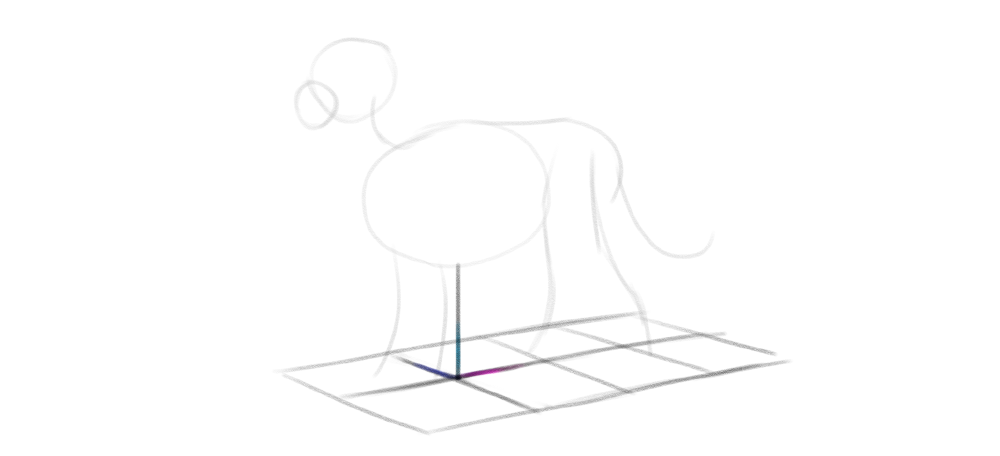
For now our torso is floating in space, so let’s add the ground underneath. This is a very important step, because it will define the length of the legs—and getting it right is crucial for keeping the correct proportions.
The distance to the ground is best measured right under the chest. You can compare it to the width of the chest—in big cats the former is slightly smaller than the latter. Keep in mind that the lower edge of the chest outline is not the bottom of the chest—the bottom is actually slightly above that outline, just like in a box.
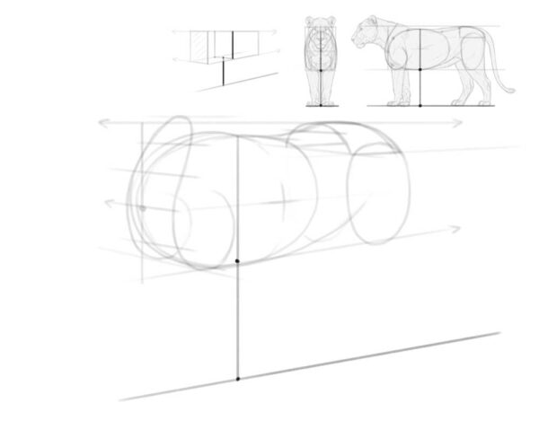
Step 9
To add a plane of the ground, sketch a few lines along the previous line—all converging at VP1. Now the whole scene should look 3D!
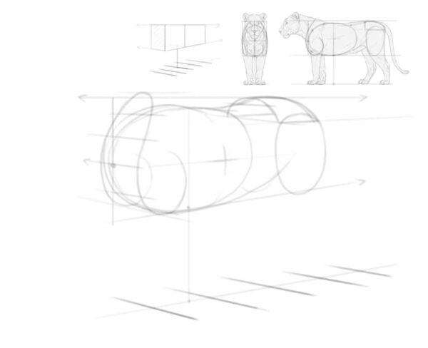
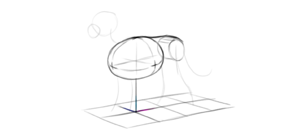
2. How to Add the Body Parts
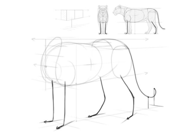
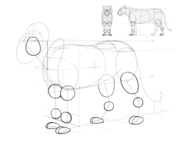
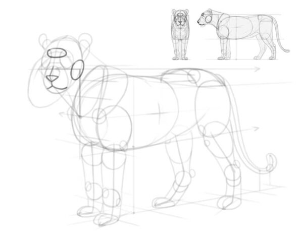
With the perspective in place, we can now begin constructing the rest of the body. Start with the legs and tail. Here’s another useful rule of perspective — if two lines are not converging, it means they would not be parallel in the side/front view. And that’s exactly what we need to do here, because the front paws of the lion (and the hind ones, to an extent) are rotated slightly outward.
Step 1
So instead of drawing the paws along the lines converging towards VP2, rotate them a little. You can also move one of the hind legs forward by not linking its position to the other hind leg on purpose. If you look at the tail, you’ll notice how you can easily convey movement in 3D space by deviating from the previously established lines.
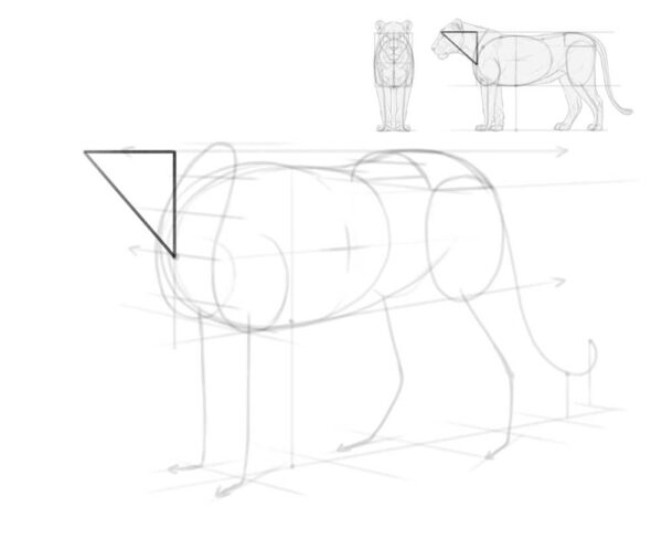
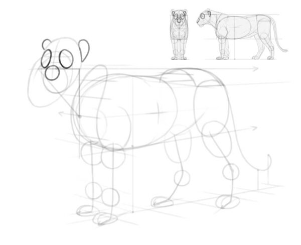
Step 2
Now, let’s add the head. This can be a challenging part, and even with all my experience, I often get it wrong. Fortunately, in digital art, you can easily move and resize the head afterwards—so don’t feel too stressed about it! If you want to experiment with the head without worrying about ruining the body, feel free to create a new layer for it.
In the side view, you can imagine a triangle between the front of the chest and the forehead. Add the same triangle to your drawing, following the perspective and shortening it slightly.
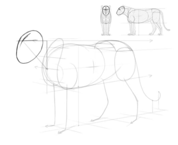
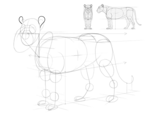
Step 3
Add an oval attached to the tip of that triangle. Mark its front with a cross, to see it as an ellipsoid rather than a flat oval.
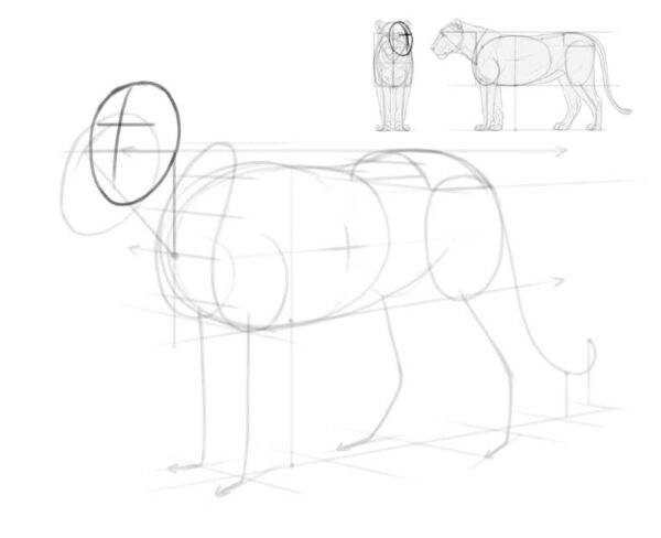
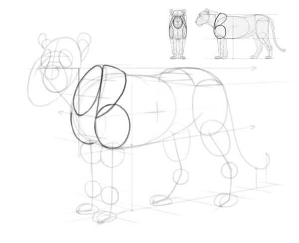
Step 4
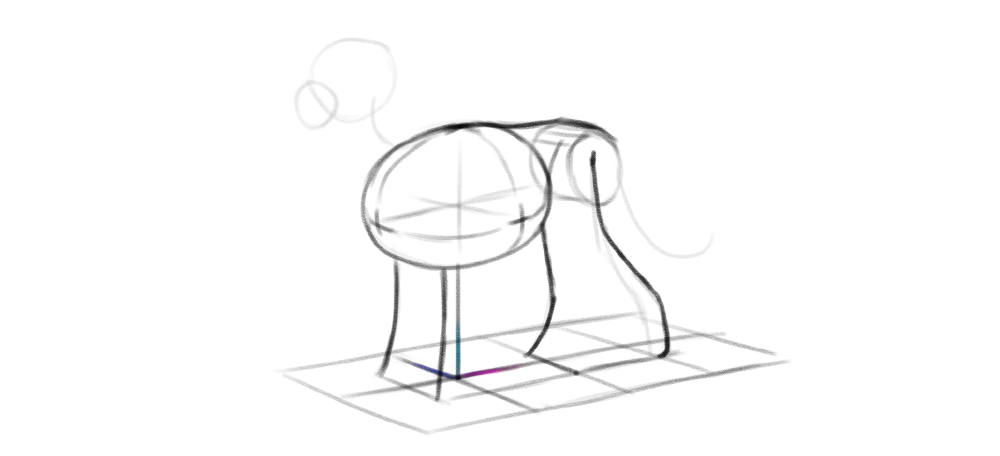
You can keep the head in this place, but the thing is, animals rarely stand in a perfect, “linear” pose, with all the parts of the body parallel to each other. Because of this, drawing it this way will make your lion look more like a statue than a real animal. So instead let’s move the head slightly up and rotate it towards the viewer.
To get it right, move the long curve on top of the head closer to the center of the oval.
Step 5
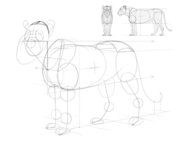
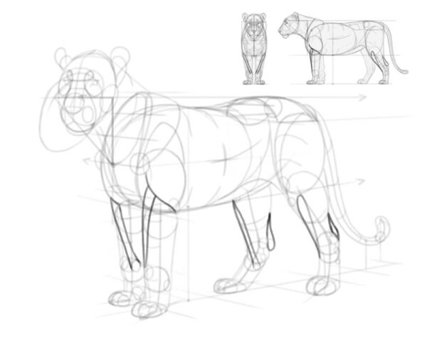
Ok, things should be more straightforward from now on! To create the volume of the legs, add ovals for the joints and paws. Draw a curve along the surface of each paw, keeping it parallel to the direction of the paw. Add a muzzle, too.
Step 6
When it comes to the details of the head, it’s best to start with big surfaces that are easier to get right. So add two ovals for the “eye sockets,” one oval for the nose, and two petal shapes for the base of the ears. Keep in mind that the other ear is partially hidden behind the head, like a ship disappearing behind the curve of the horizon.
Step 7
Attach two rounder petals to the base of the ears.
Step 8
Add a mass of the arm, the shoulder blade, and an “opening” for the neck. Keep in mind that the shoulder blades are tilted towards the top line of the body, so you need to curve them properly.
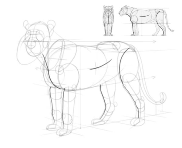
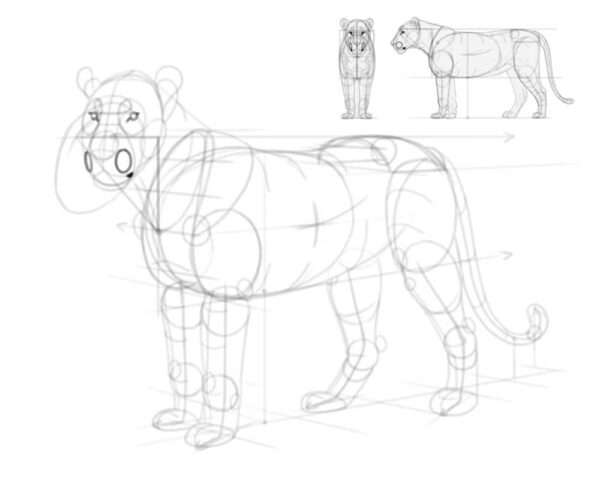
3. How to Add the Details of the Body
Our drawing already resembles a lion, now we only need to make it more detailed.
Step 1
First, curve the back of the head slightly downwards—this is the part of the skull that’s usually hidden between the ears, but we must know where it is to draw the neck properly.
Step 2
Add the outline of the neck. Keep in mind it’s not actually attached to the shoulder blades, but to the spine between them.
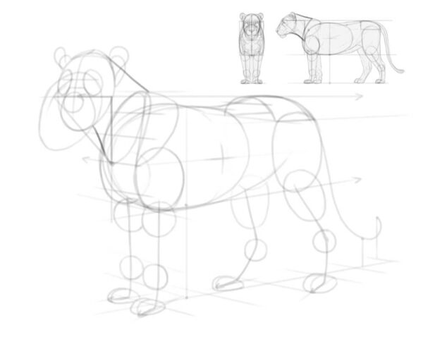
Step 3
There are lots of places where the bones are sticking out a little, affecting the surface look of the body. Add these places now. This is also a good time to add the volume of the tail tuft!
Step 4
You can now connect the joints with gentle, flowing lines to create an outline of the legs and tail.
Step 5
Let’s add a few details to the head: the forehead, the cheek, the nose, and the mouth. Notice that the nose is slightly raised above the oval outline of the head.
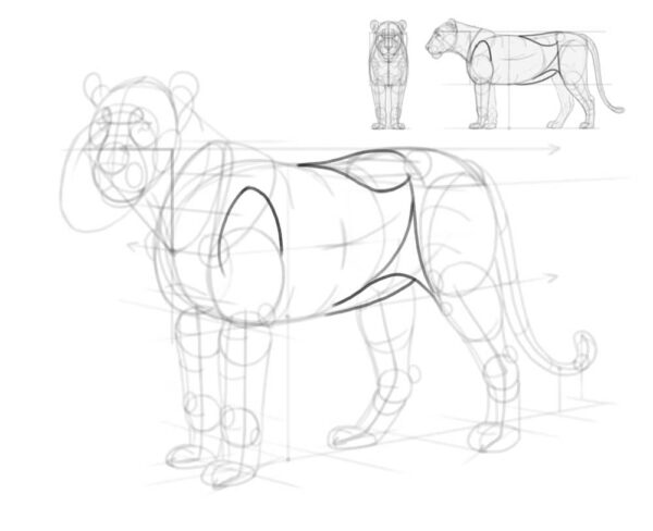
4. How to Finish the Shape of the Body
Our lion looks pretty good, but there’s still something missing. Before we add these parts, we need to make sure we can see the volume of the whole body.
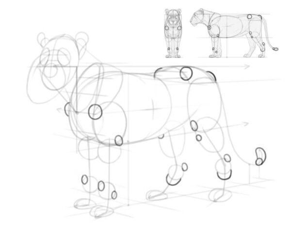
Step 1
First, “cut” through the body parts, marking the front of the legs and chest, the bottom of the neck, and the side of the torso.
Step 2
Then, cross each of these lines with curves wrapping around these body parts.
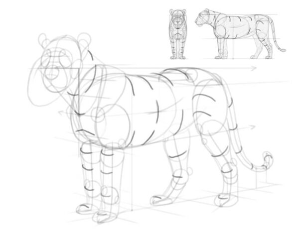
Step 3
Add the bridge of the nose connected to the eyebrows. Finish the outline of the bottom of the head by adding a protruding chin.
Step 4
Add small circular eyes—make sure not to place them symmetrically on both sides of the nose bridge, because the nose bridge is on a different plane than the eye line. Add the whisker pads and the corner of the mouth, too.
Step 5
There are other, less obvious parts of anatomy missing, too. Add a volume between the arm and the shoulder blade, a volume between the hips and the chest, a curve under the belly, and a triangle of skin connecting the thigh to the torso.
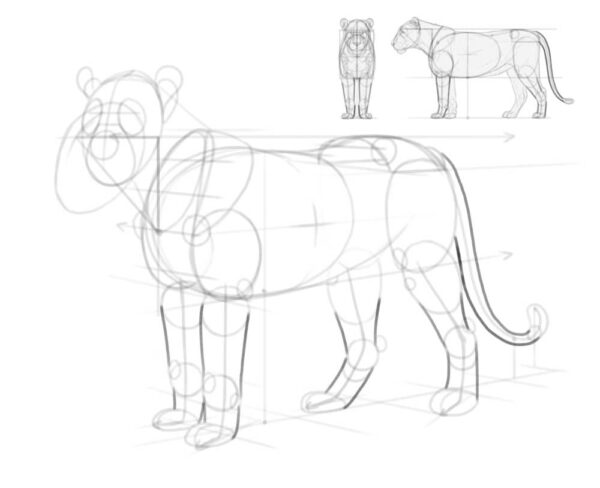
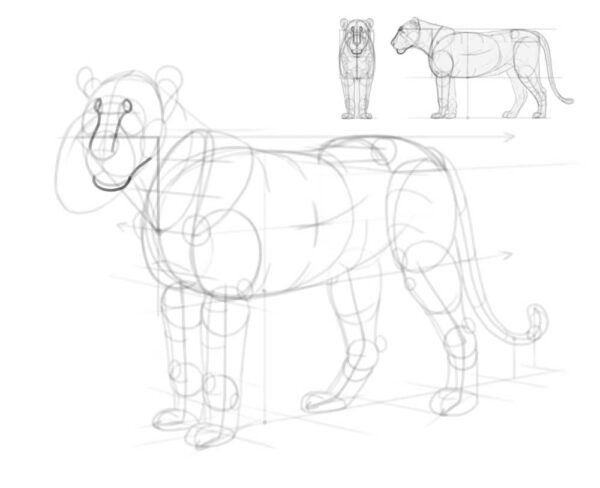
Step 6
Time to make the paws more detailed, too! Cats have four toes, with two middle ones sticking out farther than the outer ones. In the front paws, there’s also an extra toe called the dew claw, and it hangs on the inner side of the paw, under the wrist—just like a thumb!
Keep in mind that not all toes will be visible in every view. Follow the perspective of each paw to decide if the toes should be pointing towards the viewer (more toes visible), or away from them (fewer toes visible).
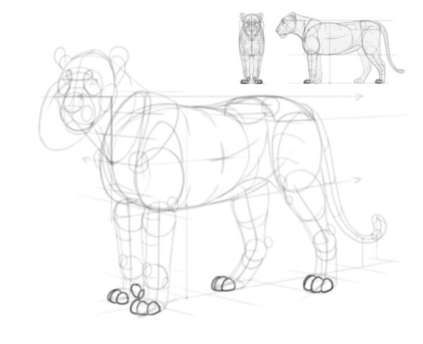
Step 7
The wrists and ankles are made of complicated bones, and some of these bones stick out a lot. They can be drawn in a simplified way, like this:
Step 8
To get the shape of the legs right, add a few extra structures: a long muscle connecting the inside of the wrist to the outer side of the arm bone, a similar muscle on the hind leg, and the Achilles tendon connecting the heel to the calf muscles.
Step 9
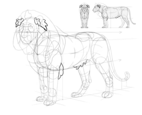
If you’re drawing a lioness, you can skip right to the next section. If not, you need to add the mane now! Start by surrounding the head with small tufts: on the forehead, under the ear, on the cheek, and under the throat.
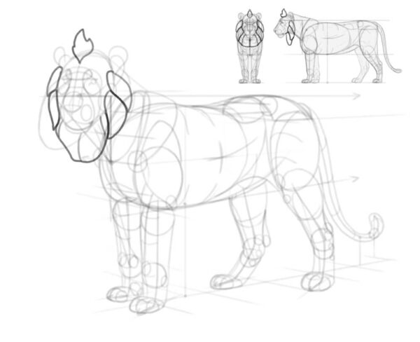
Step 10
Now add the big volume of the mane, high above the neck and in front of the chest.
Step 11
Connect the mane with the body with a few flowing shapes, following the gravity.
Step 12
Add extra tufts in front and behind the ears, as well as behind the elbow and on the side of the belly.
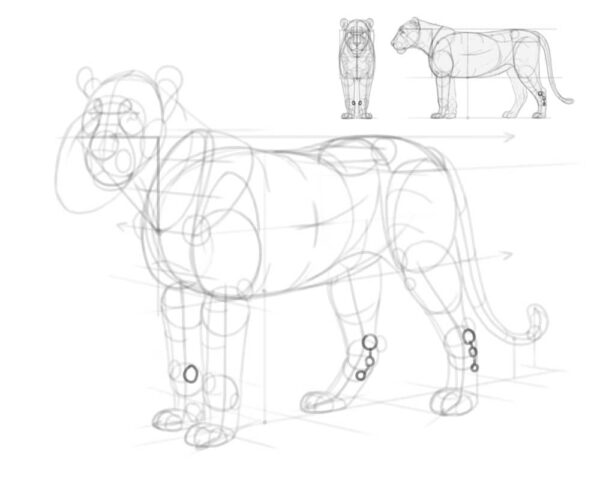
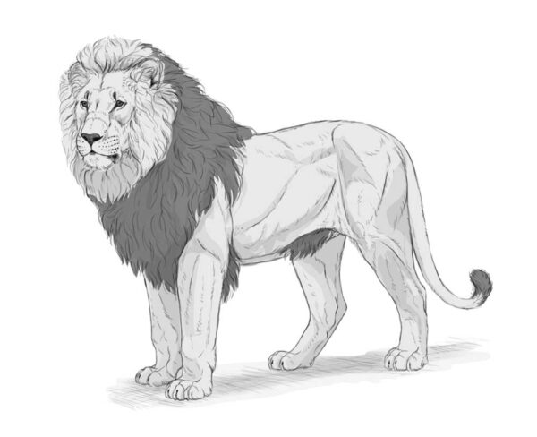
5. How to Finish Your Lion Drawing
Now that you have all the body parts established, you can lower the layer opacity of the sketch layer and create a new layer on top, to draw the final lines with a smaller brush (that feels more like a pencil or a fineliner).
Step 1
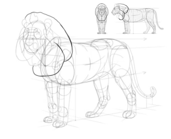
Start with the details of the head, accentuating the curves of the skull with short, non-continuous lines. Make the nose, eyes, and lips darker to capture the proper contrast.
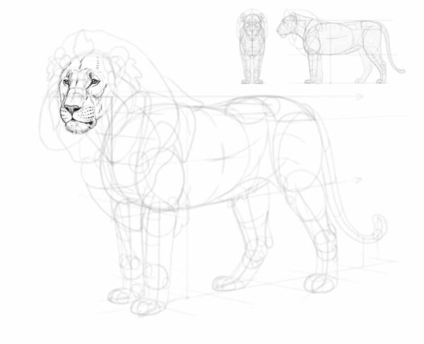
Step 2
Outline the whole mane, trying to keep the distinct areas we’ve sketches earlier. Keep the edges of the mane light and feathery, and avoid dark, thick lines.
Step 3
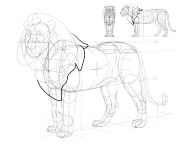
Add the details to the paws. Each toe should have a double hump—one for the main joint, and one for the claw hidden under fur. Mark the presence of the claws with a simple darkened crevice on front of each toe.
Step 4
Outline the rest of the body. Avoid keeping your lines continuous for too long—breaking a line and turning it into a series of short lines will create an impression of a slightly fluffy surface.
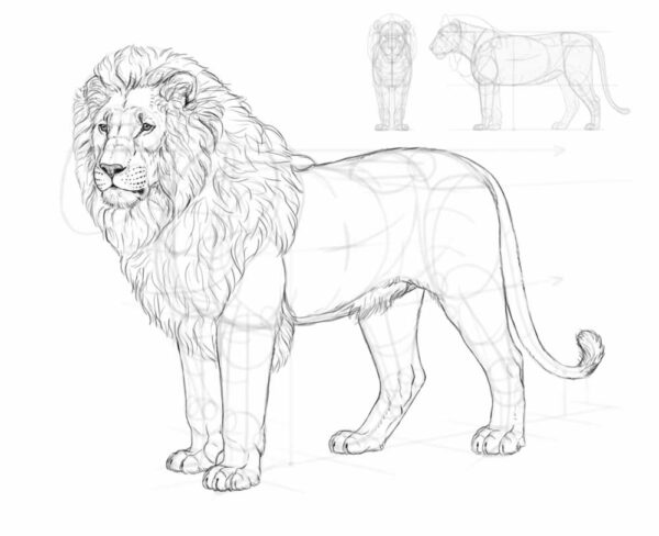
Step 5
Now, time to fill the area inside the outline with details. You don’t have to include all these lines—in fact, it’s not realistic for a lion to have all its muscles outlines this way. However, they will be helpful if you decide to shade the body later.
Step 6
After you finish the lineart, you can hide the sketch to make only the final lines visible.
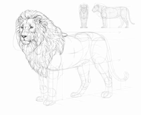
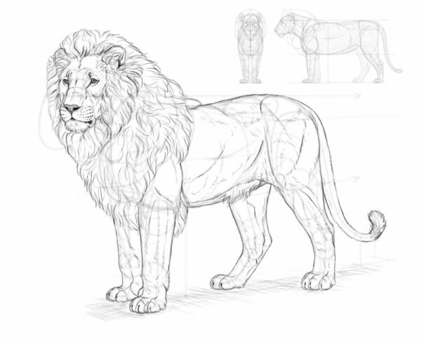
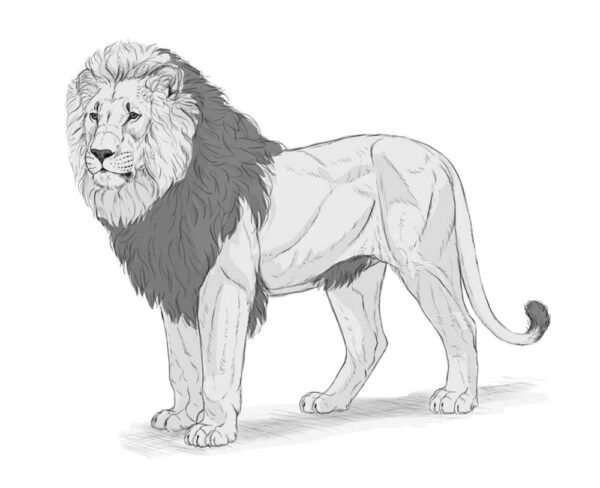
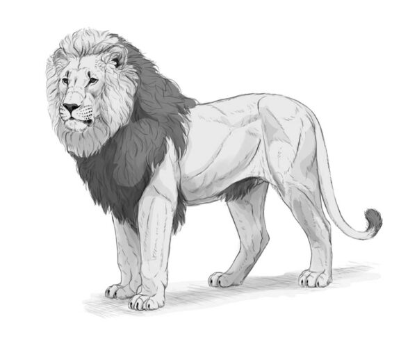
6. How to shade your lion
If you want to shade the drawing, I’ll quickly show you one method of doing this. The exact process will depend on your software, but this method should work in every decent drawing program.
Step 1
First, create a new layer under the lineart. Draw on it with a hard brush, creating a light gray silhouette within the bounds of the lineart. You can also add a simple shadow under the body, on a separate layer.
Step 2
There are certain parts of the body that are darker than the rest, regardless of the lighting. Lock transparent pixels and mark these darker areas using the same brush (or the Lasso Tool + Paint Bucket tool).
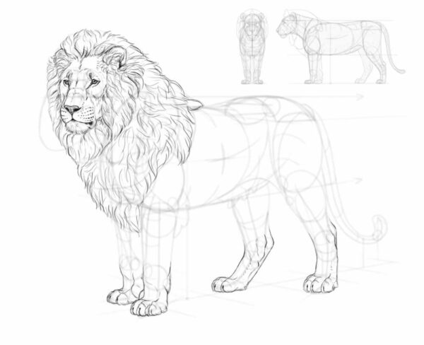
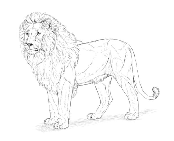
Step 3
With the basic values established, we can now add some shading. Create a new layer and clip it to the color layer, creating a Clipping Mask. Set the Blend Mode of this layer to Multiply, and paint with black to mark the shadowed areas. Then lower the layer opacity to modify the darkness of the shadows.
If you find it easer, you can also paint these shadows by choosing the colors manually, without changing the Blend Mode. However, with the Multiply mode you don’t have to adjust the color of the shadow to the colors below, because it’s adjusted automatically.
Step 4
Add another clipped layer the same way, and draw smaller shadows inside the previous shadows. Lower the opacity too, but make it slightly higher than in the previous layer.
Step 5
Continue doing it this way, until you reach the preferred level of details. Each new area of shadow should be smaller and darker than the previous one. Try to avoid pure black, or leave it for the smallest, tightest areas of shadow.
To quickly darken a whole area even further, you can use a softer brush and make it big enough to cover a big area of the body without having to repeat the strokes. You can easily limit this new shadow, e.g. to the inner side of the leg, by using the Lasso Tool.
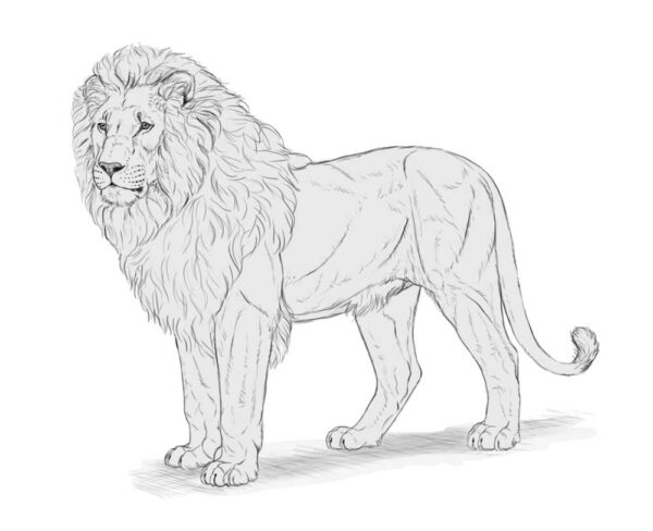
Step 6
Finally, add a new layer on top, clip it too, but this time paint with white to mark the areas that face the imaginary light source on top. Set the Blend Mode to Screen, and use very low opacity to avoid an effect of shine. If you want certain areas to be less bright than others, you can use any other shade of gray—in the Screen mode, any shade will have a brightening effect, and you can control the opacity of that effect by changing the shades of gray.
Step 7
You can leave the drawing as it is, or lower the opacity of the lineart, create a new layer at the very top, and start rendering. Rendering is a whole different skill, so I won’t explain it here, but the basic premise is simple: you need to replace every line with a border between shades.
You don’t need any special brush for it—here I used the same pencil brush that I’d used for creating the whole sketch. You just need to keep it relatively small (it should feel like a pastel stick or a crayon), and use the eyedropper tool to pick the colors from the area you’re painting over. Feel free to use a photo reference every time you’re confused about something—the more realistic you want your drawing to be, the more attention you should pay to your references.
Also, you don’t need to cover the whole lineart. You can simply hide it—by hiding it, you’ll quickly see which areas need to be worked on. Once you don’t see any negative change after hiding the lineart, you’ll know your rendering is finished!
Monika Zagrobelna is a Polish artist with a great passion for creating new things — whether by drawing, digital painting, or photo manipulation. She specializes in creating realistic art, especially of animals, and is a big fan of dragons and feline creatures!
She loves sharing her skills with others, including on her blog and social media accounts. Check her out on X (Twitter), Facebook, LinkedIn, Instagram, or on her website.
In this extremely detailed tutorial, she walks step-by-step through her process for drawing a realistic lion.