About Chromebooks
Just in case anyone needs an introduction, a Chromebook is a simplified laptop that runs Google’s Chrome OS. They’re intended primarily as vehicles for browsing the internet and using web services, and are staples in classrooms around the United States for their simplicity and ease of use.
While they primarily use web-based services accessible via the Chrome browser, they can also run Android apps via the Play Store. And despite what you might have heard about them in past years, Chromebooks have come a long way lately, with manufacturers increasingly rolling out mid-range and even high-end Chromebooks, with specs comparable to Windows laptops – and sometimes they even have faster actual performance, since the OS consumes next-to-no system resources.
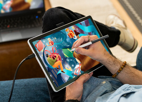
If you have a Chromebook, simply add a Chromebook-compatible drawing tablet – the Wacom Intuos pen tablet and Wacom One 14 pen display are excellent, affordable, entry-level options – and the right creative software. Then your Chromebook can become a drawing tool that allows you to express your creativity and your unique style.

What Chromebook specs will I need?
There are a wide range of art programs you can run on Chromebooks. Some of them will run on virtually any Chromebook, and some might require a slightly higher-end device. Generally speaking, you don’t need to worry too much about specs with Chromebook – but if you have a lower-end device, then it may lag a bit if you try to create a large canvas with multiple layers, for example. If you’re shopping for a Chromebook, you might want to go for at least a mid-range one so you don’t suffer from cursor lag when drawing. Generally, anything with a decent processor and at least 4 GB of RAM should be enough to run any of the programs listed below.
What drawing tablets can I use with Chromebook?

Wacom Intuos
This has been the gold standard for pen tablets since the 90s. The Small version comes in a wired or a Bluetooth Wireless version, and there’s a Medium size one for extra space as well! Wacom Intuos is Works with Chromebook certified, so it should work seamlessly with most Chromebooks! Note: Wacom Intuos connects via USB-A. You may need a USB converter on some Chromebooks. Learn more.
Wacom One 14
Wacom’s most affordable drawing display, Wacom One offering the same peerless pen-on-screen drawing experience as a Wacom Cintiq in a smaller, more budget-friendly package. Both the monitor and its pen are lightweight, so it’s easy to travel with. Note: Wacom One 14 connects via USB-C. You may need a USB converter on some Chromebooks. Learn more.
What art software will run on Chromebook?
The ability to run Android apps gives you far more choices than you’d have in-browser alone: too many to fit a real guide to them into this article. But here are a bunch of suggestions!
Your best options
Here are what I consider the top options, followed by a bunch more that might be just as good, but that I just haven’t tried.
- Clip Studio Paint: The mobile version is nearly as full-featured as the desktop version. In my personal opinion, it’s the GOAT art program. Even better, any purchase of Wacom Intuos or Wacom One 14 comes with a free three month trial of Clip Studio Paint Pro!
- Magma: This browser-based collaborative art program allows multiple people to work together on the same canvas online!
- Sketchbook: This is a simple, lightweight, app famous for its drawing tools.
- IbisPaint: A very popular and versatile drawing app with tons of brushes available.
- Krita: This one differentiates itself from the others in that it’s not a phone app, but a whole “desktop-class” art program that’s merely installed through Play Store.

Other options to consider
Browser-based Apps: Sketchpad, Photopea, Kleki, Pixilart Draw, Sketch.io, Sumo
Android Apps: Medibang Paint, Tayasui Sketches, Infinite Painter, ArtFlow, Pixel Studio, PaperColor
That’s more than 15 apps in total! So if there’s anything stopping you from drawing on your Chromebook, it won’t be a lack of options.
- Their subjects had to go beyond mere scary faces and staple creatures — e.g. vampires and werewolves — into the realm of the unsettling and even upsetting.
- On the other hand, I avoided artists who specialized in gore. Some blood and guts is to be expected from any artists of this genre, but I didn’t include any whose whole body of work would be at home on Cannibal Corpse album covers.
Within these parameters, it turned out there are still plenty of artists doing fantastically frightening work. Here are six horror artists to follow if you’re looking to creep yourself out.
Content Warning: There’s plenty of scary and/or upsetting imagery, including body horror, throughout this blog post.
This post’s feature image is by Igor Krstic.

David Romero
He goes by the username CinemaMind on his social media accounts, and has the same surname as legendary Night of the Living Dead director George Romero, so it’s not a huge leap to guess David Romero is inspired by horror movies. If you did so, you’d be right! Romero initially went to Philadelphia’s University of the Arts to study film, but realized the visions he had in mind could be more easily realized in animation. He started out with illustration on a freelance basis, seeing it as a means to an end to practice for his personal projects. But he became incredibly prolific, racking up over 700 pieces on Deviantart alone and making a name for himself illustrating “creepypastas.” And the practice paid off, as he ended up finding success in animation too, starting a Youtube channel that’s scored a number of hits.
For example, the short horror animation below, entitled “Pleasant Inn.” Content Warning: blood and violence.
Follow David Romero on Deviantart, Tumblr, and YouTube.

Alexandr Kumpan
It says something when an artist can make well-lit compositions and fully visible creatures chilling. Kumpan’s paintings are colorful, with few typical genre tropes and sometimes even a sense of humor. But his work is counterbalanced by his masterful rendering of the grotesque and body horror. His creatures have a moist, fleshy, drippy quality that’s discomforting to look at, their rainbow psychedelia only adding to the unearthliness if anything.
Follow Alexandr Kumpan on Instagram, Artstation, and Deviantart.

Igor Krstic
There’s something I really appreciate about Eastern European artists. Whether it’s the cold climate or the history of hardship that inspires them, they do surreal horror like no one else. Kristic hails from Serbia and describes himself as a lover of “dark folklore,” which the region has in spades, and its influence on his art is clear. His drawings look like they could be torn from an occult bestiary, documentations of the creatures that slither from swamps, crawl from fog-shrouded forests, and pass through the veil. He also takes inspiration from classical paintings, excelling at ominous medieval-style portraits and scenes.
Follow Igor Krstic on Artstation, Instagram, and Twitter.

Leslé Kieu
Kieu is a shadowy illustrator who was raised in New Jersey, attended Ringling College of Art and Design, and… that’s about all the biographical information about them on the web. Their art should make their passion for the genre obvious, though; it bristles with excess limbs and orifices on body parts where they shouldn’t be. Manga icon Junji Ito has reacted to their work on Youtube twice, calling their monsters “very novel” and “quite scary.” Those are about the highest accolades a horror artist can receive! Kieu does stream their art as a skeletal vTuber on Twitch, though. Maybe you can glean more about them there.
Follow Leslé Kieu on Twitch, Instagram, Twitter, and their website.

Martín Santos
Martín “Dr. Korpus” Santos is a brilliant creature designer from Argentina with a unique aesthetic: he draws the kind of things you’d see shambling towards you down a hallway in a zombie video game like Silent Hill or Resident Evil. Although he does his fair share of original designs, his trademark is mutating people, animals, other horror creatures — and more recently, a series of pop culture figures — into gash-faced, toothy, tendrilled abominations with gaping maws and wiggling loose tendons.
Follow Martin Santos on Instagram, Twitter, and Deviantart.
Parker Boisvert
Parker Boisvert’s work doesn’t quite fit in with the rest of the artists featured in this blog post, as rather than illustrations, they create a unique form of mixed-media animation that blends low-res line drawings, photo elements, and filtered real footage.
Their videos are cryptic, often religious-themed, and clearly, deeply personal. Visually, their palette is almost exclusively high-contrast black and white; the only other hue to be found is an occasional blood red. Sonically, they create a sense of dread through drones and electronic screeches, and give their characters an inhuman quality by voicing them with text-to-speech programs. And as for meaning, their body of work is supposedly telling an abstruse story about a depressed, antlered humanoid called Ouriel and a host of eldritch angels and demons — in English, French, sign language, Morse Code, QR codes, and hidden messages. There are plenty of videos and a wiki analyzing it, but the plot isn’t as important as the poetry of the language and the feelings it conveys.
What sets Boisvert’s work apart from your average analog horror creator is that their intention is not just to scare, but to express… an emotion. What emotion? It’s hard to put your finger on it, but I get the feeling that’s the point.
Follow Parker Boisvert on YouTube, Instagram, and Twitter.
About the Author
Cameron “C.S.” Jones is a West-Philly-based writer and illustrator who’s been contributing to Wacom’s blog for four years now. You can see more of his work, including most of his contributions to this blog, at thecsjones.com, or follow him on Instagram or Twitter.
And since cartooning and animation are all about lines and fills, the optimal tools for you will correspondingly be a little different than the best one for a painter. That being said, one of the biggest determinants in a cartoonist or animator’s choice is budget. There are cartoonists at every level, and I’d like to emphasize that you can get started for any price, so that’s how I’ve sorted these products — ranging from our simplest pen tablet to our most specialized machine.
These are the best creative pen tablets and displays for comic artists, cartoonists, and animators.
The best pen tablets for cartoonists and animators
When I bought my first tablet, I was worried about size: would medium be big enough? In hindsight, a larger tablet wouldn’t have fit into the laptop messenger bag I ended up using daily. A smaller tablet might be hard to control if you draw on a big monitor — so for me, medium is just enough space. Each of these tablets comes in multiple sizes, so you need to determine what’s best for you.

One by Wacom
The One by Wacom is our entry-level device, a perfect first tablet for someone brand-new to cartooning. It has minimal features, but is extremely capable.
It has a respectable 2,048 pressure levels, and a little tip: you don’t need any more than that to draw well, especially if you’re a beginner. The pen doesn’t have an included eraser, but I almost never use them anyway. Keyboard commands are faster and just as convenient.
So if you’re new to your cartooning journey, give the One by Wacom a try.
Wacom Intuos
Wacom Intuos is the first tablet in our lineup with included ExpressKeys, which means customizing your experience and workflow is convenient and intuitive here. Some models are Bluetooth-compatible, for even more portability when working with a laptop or just for removing cable clutter from your desk. The Wacom Pen 4K has 4,096 levels of pressure sensitivity, making extremely precise lines possible.
Even better: Wacom tablets last forever. There are a lot of Intuos 3s still kicking around, and many professionals still swear by them. Newer tablets do come with better pens and much grabbier textured surfaces, however, which helps with accuracy — especially important when it comes to getting that perfect line.
Wacom Intuos Pro
The main selling point of the Wacom Intuos Pro is that it comes with a Pro Pen 2, for a full 8,192 levels of pressure sensitivity. That makes it our most precise drawing tablet, and the only one you can try out the large variety of special Wacom pens, such as the Pro Pen Slim or our Ballpoint Pen — with the Paper Clip, you can lay a sheet of paper over your tablet and draw on it with this (refillable) hybrid ink and tablet pen that digitizes your strokes.
It also has Bluetooth, twice as many ExpressKeys, and a programmable touch ring for ultimate customization.
The best pen displays for cartoonists and animators
It’s said that the tool doesn’t really matter in the end, that a skilled artist can make professional work on whatever they have. That’s largely true … but on the whole, graduating from a drawing tablet to a pen display was the one exception I’ve found.
After years of hesitation, I took the jump due to multiple artists on blogs, forums, and subreddits saying the ability to draw on a screen as you do on paper will take your digital work to the next level, and it did. And this isn’t due to some magical property of pen displays, but simply due to the fact that it’s much easier to draw more elaborate pieces with less headache when you’re drawing directly onto it as you would on paper.
Although this isn’t true for everyone’s art style, it’s so much easier for me to do small, precise details when you don’t have to worry about the disconnect between your muscle memory and the screen. Some professional artists — far better ones than me — prefer pen tablets so their hand isn’t in the way, though. See which one fits you.

Wacom One
Best for the cartoonist who want a pen display but also likes to draw on the go, Wacom One is great for sketching at places like coffee shops and stopovers on road trips. Since this is a point of confusion for some, however, it is not a standalone device like an iPad — you do need a laptop.
So it’s not the most portable device ever, but with comics and cartooning you don’t want to be sending files back and forth between devices anyway — better to have them all live on your computer. And I can still fit everything I need into the same messenger bag, anyway.
As an aside, though: the main drawback to Wacom One is that it’s only 13 in, giving you less screen space — so it’s a tradeoff.
Wacom Cintiq
The Cintiq line is designed for the ultimate drawing experience. It’s the best-feeling art implement I’ve ever used, rivaled only by the 0.5 Bic Atlantis mechanical pencil, which they don’t make anymore.
This was basically my first creative pen display; technically I had another brand for about a month, but this was the first I did serious work on. It’s still the best all-purpose drawing monitor I’ve tried, for an absolute middle-of-the-road price.
It comes in two sizes: 16 and 22 inches. I’m an evangelist for the 16. I believe all but the most zoom-hating artists can go their whole career on a 16-inch screen and not feel limited by it — going larger is a comfort choice.
Wacom Cintiq Pro
The Cintiq Pro is, as the name suggests, intended for professionals. There are a three sizes, from 16 to 27 inches — and the largest is Wacom’s latest innovation in the field, released only a couple months ago: the Cintiq Pro 27. In addition to its impressive size, the Cintiq Pro 27 uses the new Pro Pen 3, our lightest and slimmest pen by far, although it comes with a kit of interchangeable parts that let you customize the weight and thickness. I’m excited about trying it, since the only problem I’ve had with the Pro Pen 2 is its bulkiness. The 27 has also brought back the eight shortcut keys from previous generations.
The exact demographic I’d recommend this for are professional animators working with programs like Toon Boom Harmony, though professional comic artists who like to fine-tune their pen feel for drawing consistency and work on a large 4K screen for maximum speed might also want to upgrade.
Bonus: software
Software can make as much of a difference in the line-drawing process as the right device. Everyone has their own preference, but when it comes to comics, cartooning, and animation, these are your best options.
Clip Studio Paint
While Photoshop excels at what it’s made for and is the granddaddy of all digital painting programs, I can not overemphasize how much better Clip Studio Paint is for line drawing. No hard round brush variant I’ve seen in any program compares to the Darker Pencil, G Pen, and Architectural Pen tools, designed to imitate the stroke dynamics of the manga tools they’re named after. Clip Studio Paint’s native fill tools are much better than Adobe’s, and the popular fan-made Close and Fill tool on the Asset Store is even better. Although there’s a learning curve, it makes the tedious flatting stage a breeze.
And did you know? Every purchase of a Wacom Intuos, Wacom One, or Wacom Cintiq comes with a free trial of Clip Studio Paint!
Lazy Nezumi
One of the best tools for drawing those crisp, precise lines isn’t hardware at all, but this stabilizer. Think of it as a turbocharger for whatever tablet you have.
Lazy Nezumi is pinned to my toolbar and is an integral part of my drawing process, used even with art programs that have built-in smoothing. Compared to most programs’ one to three settings, it has 12 presets, with dozens of settings each — so you can micro-tweak it for precisely the drawing feel you want.
But just as important, and even more numerous, are Its line and shape rulers. They’re simply the best way to draw those things in most programs, especially if you need them in the same brush as the rest for consistency. And while you’ll likely only use a handful of its total options, your top five or so will be among your favorite drawing hacks. It’s almost worth it for the Parallel Lines, Perspective, Perspective Ellipse, and bezier curve rulers alone.
Toon Boom Harmony
Like Clip Studio Paint, ToonBoom Harmony is engineered to be the best at what it is: professional-grade animation. It has both traditional and rigged-puppet animation tools, and for the former, both raster and vector editing.
Just a few examples of why it’s awesome: Vector editing has the customization of Photoshop’s pen tool, making it incredible for the precision this article’s focused on — if you see your character drifting off-model between frames, you can grab the bezier curve handle and rein their lines back in. Various versions also have auto-inbetweening, an auto-fill tool that tracks a shape across frames, and auto lip-syncing.
This is why it’s the animation industry standard, used to make everything from Rick & Morty to, and this one surprised me, Jojo’s Bizarre Adventure.
Toon Boom Storyboard Pro
As the title implies, this companion program is made for in-depth storyboards and animatics. It provides drawing tools, a timeline to drop your panels into, and a sound mixer so you can sync them to your vocal tracks and music. But it also has a pretty cool, under-sung feature: support for 3d assets, letting you open your models, rotate them around to decide the best camera angle, then draw your characters on top of them. And it has built in multi-planing, letting you move foreground and background elements at different speeds to simulate parallax.
If you’re working on a major animated project, especially if you’re going to be doing it in Harmony, this might be ideal for sketching it out before you jump in.
About the Author
Cameron “C.S.” Jones is a West-Philly-based writer and illustrator who’s been contributing to Wacom for four years now. You can see more of his work, including most of his contributions to this blog, at thecsjones.com, or follow him on Instagram or Twitter.
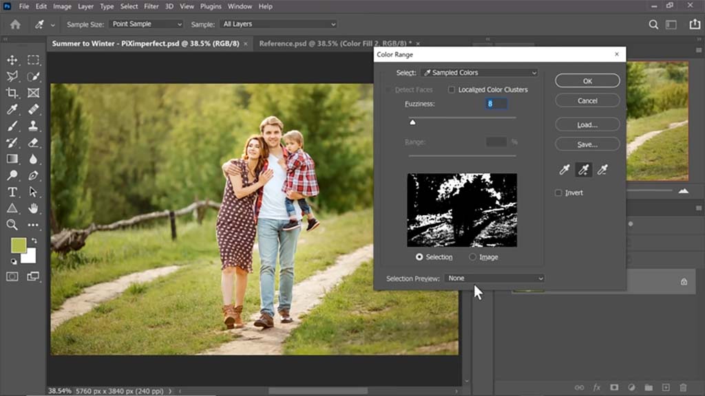
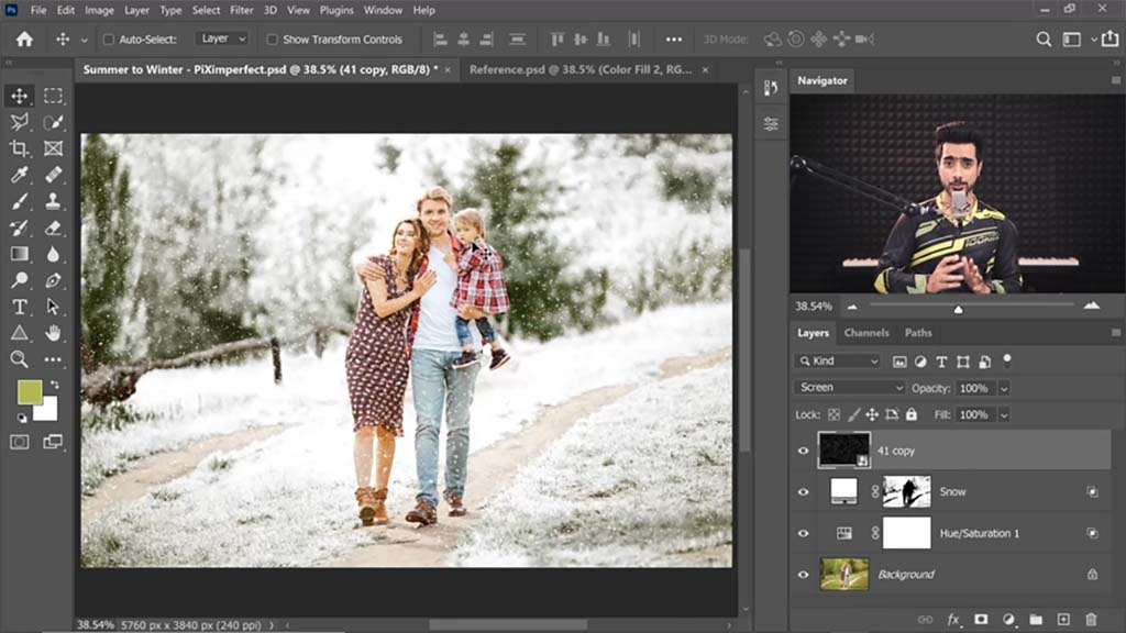
Unmesh Dinda, the creator behind PiXimperfect, is known for tutorials featuring some of the most dramatic and striking transformations possible with Adobe Photoshop — such as previous tutorials we’ve featured on this blog including Turning Day into Night and Cutting Out Hair From A Busy Background. In the below video and tutorial, Dinda pulls out another one of his stunning tricks: Turning summer into winter. Watch the video or read on to see how he does it.
This tutorial is short but dense, as he uses relatively few steps to completely overhaul the entire image. Similar to the turning day into night tutorial, he reverses the colors of the scene, transforming a summer scene full of greens and yellows into a white winter scene with a dusting of snowfall.
Color selection
The first thing Dinda does is select everything green in the image using the Select > Color Range tool, encapsulating all of the grass and foliage. He adds area to the selection multiple times with the Eyedropper, incorporating multiple shades of green. Then he drags up the Fuzziness slider, so almost everything surrounding the immediate areas will be included, giving him a more complete selection with edges that won’t be as sharp.
Changing the foliage
With the selection active, he creates a white Solid Color Adjustment Layer. This will turn the trees in the background white so they look like they’re coated with snow. “We only want it in the bright areas,” he says, though. “We don’t want to absolutely blow it out with snow.” So to achieve a nice balance, he uses “Blend If,” a slider in the Layer Styles panel that he often uses for various effects in his tutorials, to make some of the underlying layer — the greens of the trees — show through.
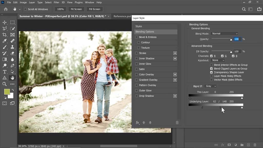
Key tip: Alt-clicking a slider will break it into two parts so that you can set a range of values instead of just one.
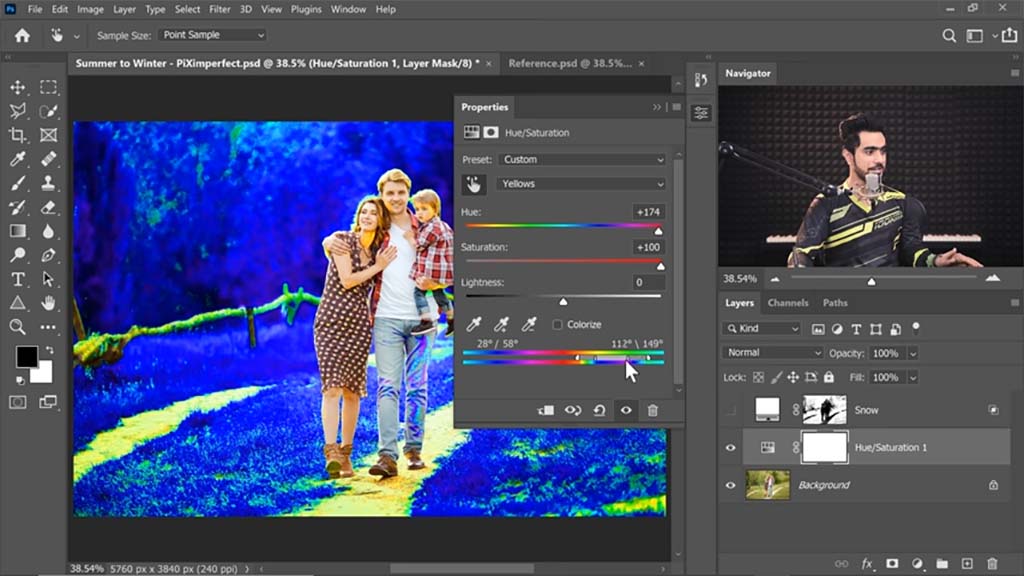
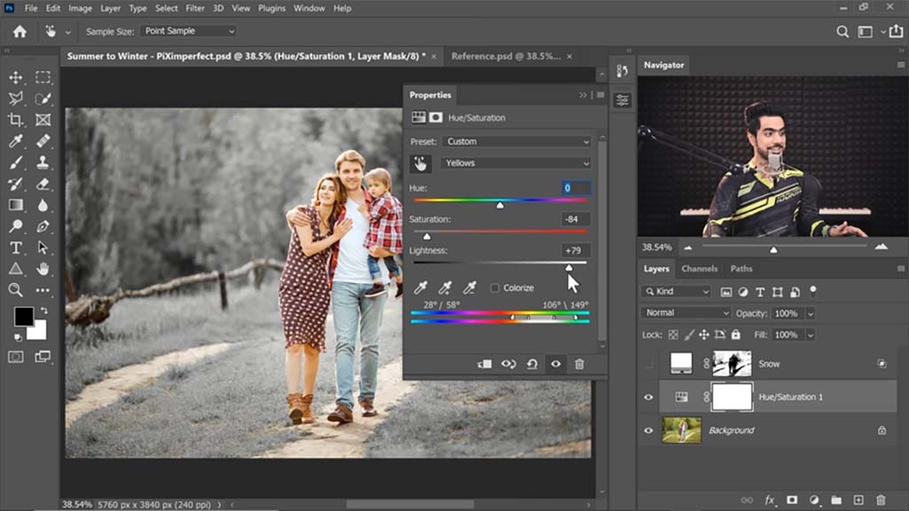
He then turns off the Solid Color Adjustment Layer and creates a Hue/Saturation Adjustment Layer on top. In order to decrease the saturation of the green areas, he has to increase it first. After using the Eyedropper on the grass to select the color range of the foliage, he cranks the Hue and Saturation sliders up to max, turning it bright blue, then turns the Saturation down and the Lightness up so it becomes more of a snowy light gray.
And when he turns the white Solid Color Adjustment Layer back on, it looks as if the trees are entirely coated in snow, except for a few darker areas at the bottom he intentionally leaves green.
Corrections
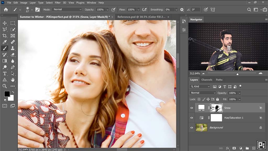
A small detail: Some of the lighting and color changes encroach onto the subjects, making them appear more exposed and paler than they should be. This is where your Wacom pen tablet or pen display comes in — Dinda uses a Wacom Intuos Pro — for these locations in the faces and hair, he subtly paints them out using a Mask. For where they encroach onto the woman’s leg, he uses the Quick Selection tool to select her calf, then paints black over the mask to erase it.
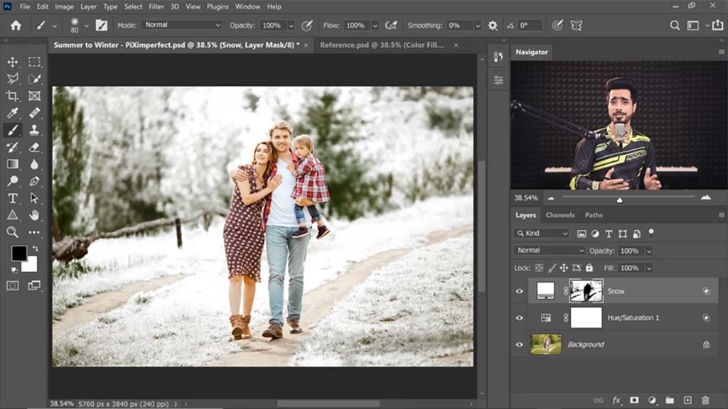
Adding Snow
This is when Dinda adds the actual snowfall we’ll see drifting in front of and behind the subjects. He divides the process into two sections: background snow and foreground snow. For the background snow, he uses two snow assets — pictures of white snow on black backgrounds — that he downloaded from Envato Elements.
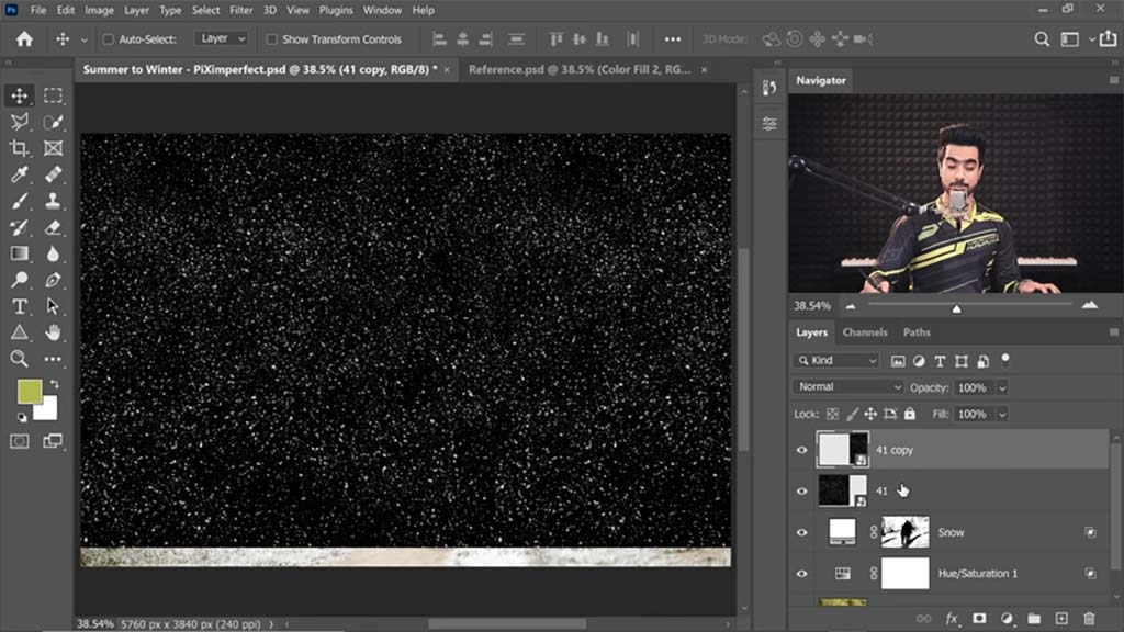
To cover the background, he converts the merged two images to a Smart Object, and sets the Blend Mode to Screen, which makes it so only the white shows through. This being for the snow behind the subject, he paints black on the Layer Mask to remove all the snow that crosses over the foreground of the subject. He also uses Gaussian Blur slightly so the snow will appear out of focus.
For the foreground snow, he does basically the same thing, except with an image of much larger falling snowflakes. And since the asset he uses doesn’t quite cover the entire image, he gradients the mask up from below to erase some of the bottom, creating a smooth transition into the snowflakes at the top. He also judiciously erases some of the more distracting snowflakes from overtop the subjects.
The final image:

About the Author
Cameron “C.S.” Jones is a West-Philly-based writer and illustrator who’s been contributing to Wacom for four years now. You can see more of his work, including most of his contributions to this blog, at thecsjones.com, or follow him on Instagram or Twitter.
This article is Part Four of our four-part, complete guide to Adobe Photoshop’s brush engine. If you haven’t already, be sure to check out Parts One, Two, and Three before continuing. This post will take everything you’ve learned in the past three parts to finally explore creating your own brushes.
Introduction
For our final article, it’s time to wrap up everything we’ve learned. Part III actually covered the bulk of what you need to know about making brush presets — most of the tools that make them unique are in the Brush Settings panel, and making the tip itself is the easiest thing in the world: you just select the part of the image you want and go to Edit > Define Brush Preset.
Remember: Brush tips are in grayscale. Black stays opaque, grays become translucent, and white becomes transparent. So make sure your tip image is isolated on white first. Also, to avoid straining your processor, it’s good to make them no larger than 1500 px (there aren’t many uses for tip stamps bigger than that anyway). But don’t make them too small either, or they’ll be blurry at larger sizes.
But the hard part of making a brush isn’t knowing how to draw a tip image or memorizing every slider of the Brush Settings panel, it’s knowing how to apply them and how they interact. So these four tutorials will show you just some examples.
Tip: Group your early brushes
You don’t want to mix your early experiments in brush creation with the finished brushes you’ll want to use for projects. Plus, saving different brush types into folders is a habit you want to build early, so you don’t end up having to search through a menu of hundreds of random brushes every time you forget the name of the one you need. Here’s how:
- Open the Brush Preset Picker.
- Click the Gear icon to open the settings menu.
- Go to New Brush Group.
- Name it something descriptive, for example:

Five ways to create your own Photoshop brushes
There are several different ways to define a new brush preset, so these tutorials are sorted by their point of origin.
1. Creating a brush based on another brush
Brush presets can not be saved over, only duplicated, then the old one deleted if you wish. So if you want to modify one, you simply select it from the preset menu, go to Brush Settings, tweak it how you will, open the hamburger menu at the top right, and select New Brush Preset.

This will give you two options. The first, Capture Brush Size, is pretty self-explanatory, but you usually don’t want it since tip images tend to be way bigger than needed.
The second, Include Tool Settings, will bind it to the tool you’re using at the moment. This is just for convenience, so that if you make a brush for one tool only, you won’t have to go through the rigamarole of switching to that tool every time you use it. If you check it, it’ll give you a third option for whether you want to Include Color, which, of course, will make it default to that color — but it won’t stop you from changing it.
Note: Liberating a brush
In your travels through the presets menu, you’ll find that in the last few versions of Photoshop, every default one has been assigned to a certain tool, indicated by the little symbol in the top right corner. Let’s say you’re browsing the Dry Media Brushes folder and see “Kyle’s Eraser – Natural Edge.” You’d love to paint with it, but whenever you click it, the tool changes to the Eraser.

To use it with whatever you want, you’ll have to make a duplicate with Include Tool Settings unchecked. For a little shortcut, right-click the brush, select New Brush Preset from the popup menu, and uncheck it there.
2. Creating a brush from a basic shape: Square painter
Now let’s make some actual brushes, starting with a simple stroke one. There are so many of these online that you could go your whole art career without making your own, but it’s still a good skill to have.
Most painting brushes are either circular, or some irregular shape that imitates a traditional medium’s tip but would fit into a circle. Some veteran painters, though, swear by square and triangular ones.
First, you’ll make a Tip Stamp. Create a new document, 1000x1000px. Tip: For general painting, keep your stamp height and width roughly equal. Brushes that are longer than wide or vice versa are harder to control, adding an unnecessary level of complexity.
Next, add texture. You could fill it with black and be on your way, but that would be boring. Set your foreground color to black, and your background color to white. In the Menu, go to Filter > Render > Clouds. Let it do its thing.
This needs to be stylized, however, or the result won’t look very good. Go back to the Filters menu, then select Filter Gallery. Pick Spatter. Max out the Spray Radius and set the Smoothness to 6.

Now go to Edit > Define Brush Preset. Name it whatever you like, as this is just a placeholder. “There’s not much black there for a brush preset,” you might ask. “Will it even paint the right shade?” But this won’t make a difference. You’ll see why soon.
Edit the Brush Settings like so: Edit Brush Tip Shape by changing Spacing to 5%. Edit Shape Dynamics by changing Size Jitter: Control to Off. Edit Angle Jitter: Control to Direction. Edit Transfer: Flow Jitter to Control Pen Pressure. Edit Noise to On.
Two things to note when you paint with this brush: One, your fears about the values being too light were unfounded. The density of tip stamps being laid across each other at 5% spacing more than makes up for it. In fact, in addition to Flow Jitter being set to Pen Pressure, you’ll need to paint with flow under 40 in order for the texture to show through. If you want even more texture, paint with Flow Jitter turned up (change this in the Transfer panel) in addition to the control method. It’ll give you an almost acid-washed look.
Two, when applied to a directional stroke, the clouds become nice paintbrush-like streaks. The grain of the texture is lost, however, which is why we turned on Noise.

Go on and save your new preset through the hamburger menu. Don’t check either box. And here you go:

3. Creating a brush from a photograph: Chameleon brush
Warning: This one’s complicated. But if you follow it, you’ll learn virtually everything about how to make a brush from a photo.
This will be purely a texture brush, meaning it’s not meant to be painted with; it’s only used once, to give your creature a coating of scales. You usually do this near the end of the painting, once the flesh is already done, then the only further stage is overpainting, rendering how light and shadows play off them. Our source image will be this photo by Girish Gowda from Wikimedia Commons.

First, download the image above and open it in Photoshop. Then, use the Rectangular Marquee tool. Pick somewhere on the body there’s a patch of flat scales uninterrupted by a shadow or an edge. Start dragging, then hold Shift to turn your selection into a square.

Copy your selection, create a new image, and paste the selection into it.

The next part will require some playing around with features you’ve possibly never heard of before, but if you follow the instructions below, it should work OK.
In the menu bar, go to Layer > New Adjustment Layer > Black & White. Adjustment Layers are one of the most useful tools for experimentation, letting you modify colors in the same way as “Image > Adjustments,” except non-destructively, meaning you can turn them off and on and change them whenever you want. This box will pop into the sidebar — set it to roughly the following:

- Selecting the “Green Filter” preset as a base will even out the values for you.
- After that, Greens are cranked up to max, making it even flatter.
- Turning Yellows up brightens it. This is as far as you can go without losing the texture.
If you picked another part of the lizard, modify them accordingly. Either way, you’re looking for a result like this:

That dark spot won’t go totally away, but we can minimize it. Make another adjustment layer, this time for Brightness/Contrast. Set Brightness to about 25 and Contrast to about 20. Then make another adjustment layer, this time for Levels. Set it to something like this:

And the result should look like the below (but if you’re incredibly particular, you can go in with Clone Stamp and paint out the remaining splotch):

Go to View > New Guide Layout. Set the Rows and Columns to 2 and the Gutters to 0:

Save that as a preset, and name it something like “Quarters.” It’s useful to have, both for making other photo brushes and for things like text layouts.
On a new layer, select the Gradient tool and click the gradient preview image in the toolbar (If you don’t see it, tap the Paint Bucket tool and drag it to the right). Under the Basics folder, select “Foreground to Transparent.”
Back on the toolbar, select the circle icon to change it to Radial Gradient mode, and to the right, check Reverse. For the last prep step, set your Foreground Color to white, hold Shift, and draw a gradient line from the middle of the image horizontally to one of the edges. You should have this:

I recommend stamping out the dark spot for smoother scales. I took a quick stab at it:

Finally, go to Edit > Define Brush Preset. Don’t worry about merging your layers, it’ll automatically sample the whole image. If you want, start a new document, paint randomly with it, and tweak your Brush Settings accordingly. Or you can dial in these ones:
- Brush Tip Shape
- Spacing: 60%
- Shape Dynamics
- Angle Jitter: Control: Direction or Tilt
- Flip X and Y Jitter: on
- Scattering (Optional)
- Scatter: 10-30%
- Both Axes: on
- Transfer (Optional)
- Flow Jitter: Control: Pen Pressure
Resave it, and you have your brush:

If you paint strokes that overlap at the edges just right, the scales should appear to blend seamlessly together:

This brush will already be transparent, so you won’t need to use blending modes or anything like that. One interesting trick is to paint the scales on one body part at a time, then use the Warp tool (Edit > Transform > Warp) to curve them to fit that part, making it look way more 3D. This tutorial by frequent Wacom collaborator Aaron Blaise will show you how:
Alternatively, there’s this amazing tutorial by Robert Marzullo on how to overpaint shadow and shine onto reptile skin so it looks virtually real.
4. Creating a brush from a drawing: Hatching brush
I’m a “tradigital” artist, and occasionally still do lineart in pen. Hatching is both my favorite and least favorite part of this process; I love how it makes a drawing come together, but for seven years, I’ve been looking for a way to digitally automate the boring task of drawing hundreds of straight lines. The problem was that I just couldn’t find any way to do this that could actually blend in with ink-on-paper lineart. I still haven’t, but the process I’ll outline below is the closest I’ve gotten. It’ll still need some blurring and tweaking to make it actually look real, but it’s a good start and works pretty well for hatching backgrounds.
We’ll make the brush tip first by drawing with another brush. Create a new image and turn on the grid with View > Show > Grid. Open the brush picker, and in the Wet Media Brushes default folder, select “Kyle’s Inkbox – Classic Cartoonist.” If you’re using an older version of Photoshop without the Kyle brushes, you can download them from Adobe here, or substitute it with any ink brush of your choice.
Before turning it into a hatching brush, we’ll have to turn off a few settings so the line will stay the same width. Open Brush Settings and visit Shape Dynamics. By default, the control methods for Size Jitter and Angle Jitter will be set to Tilt, and Roundness Jitter to Pressure. Set all of them to Off, but leave the sliders where they are. Save this as a preset so you can use it for lines of different thicknesses. Leave Include Tool Settings unchecked.

Hold Shift and draw two vertical lines following the grid. The lengths, thicknesses, and spacings are up to you — and if you end up liking this method, you can make different variations. I’m doing a thin one.

Highlight them, then go to Edit > Define Brush Preset. Name it whatever you want, then return to Brush Settings. For Brush Tip Shape, set a Spacing that makes the gaps on the sides of your lines roughly equal to the gap in the middle. Some trial and error will be necessary.
For Shape Dynamics, set Angle Jitter: Control to none. This brush relies on precise angles, so you’ll get the best results by changing the angle yourself with the arrow keys between strokes. But if you have an older version of Photoshop without that shortcut, set the control method to Initial Direction.

Turn on Flip X and Y Jitter so the bumps and crags in the ink won’t be identical for every line. If you want it to have rougher edges, select a craggy inner tip and drag the Size slider up until it comes right to the edges of the outer brush.
Unfortunately, this brush can only paint in straight lines because curving it messes up the spacing. To make it perfect, you can use either pulled-string smoothing, a Lazy Nezumi ruler, or draw a straight path with the Line tool, then stroke it (see Part III’s final tip).
You can carve precise shapes out of it using the eraser tool, and if you need curved or angled lines that match the hatch, you can fill them in with the brush you made by modifying Kyle’s pen.
5. Creating a brush from a painting: Foliage brush
Our source image for this one can be downloaded from Stockvault:

Download the image and open it in Photoshop. Pick a leaf of your choice and, using your Wacom, trace it on a new layer. Select the trace and define a Brush Preset from it. Then, it’s time to adjust the dynamics; open Brush Settings and make these adjustments:
Brush Tip Shape:
- Spacing: 75%. This might seem annoyingly scant when you first start painting, but the last thing you want with a foliage brush is to paint it so thick it becomes one color.
Shape Dynamics:
- Size Jitter: 30%, no control method.
- Max out Angle Jitter. Really mess it up.
Color Dynamics:
- Apply Per Tip: on
- Saturation Jitter: 10%; Brightness Jitter: 10%. For some subtler color variation, or:
- Hue Jitter: 20%, Brightness Jitter: 10%. Looks awesome, but a bit cartoonier.
Paint with 100% Flow if you want a more stylized look, or if you want subtler blending, you can turn it down as far as 70. Go any further and you’ll lose the distinction between the leaves — which is only good for distant foliage.
I always paint from dark to light, first drawing the silhouette of the bush in almost black, then moving up to midtones, then highlights. One caveat for drawing plants is that since the leaves that get the most light are on the outside, they have to be painted last.

A fun hack for trees is to find a silhouette of a dead one, like this one:

Ctrl-click the layer icon to select it, then fill it with brown. Then, use your new foliage brush to paint the leaves on a new layer over it, and add detail to the trunk with a rough, woody brush:

A final tip: Make brushes per-project
For extended illustrations that have lots of repetitive elements, try drawing one element, sampling it, and making a brush out of it, with no obligation to use it again for anything else. Keep these types of brushes in a folder named for your project, then when you’re done with the drawing, save it to your hard drive as an ABR and delete it from your brush list. If you find something you can use for other illustrations, that’s a nice bonus — pop it into another folder.
Conclusion
I learned a lot by working through this series. I still will not be using Photoshop as my primary software for painting — I love Clip Studio Paint and I’m more fluid in it from years of practice, plus it still has some drawing-tailored features Photoshop doesn’t — but I will be putting more effort into learning more about the things Photoshop excels at, like photobashing.
Even if Photoshop isn’t your program of choice, it’s the original. Every other image editing program I’ve used has ripped off this brush engine with varying amounts of changes. Some have improved on it, others are lower-quality knockoffs, but in most painting programs, you’ll find the same brush tools just under different names, so understanding how they work in Photoshop is still useful.
All I hope is that you learned anywhere near as much about them as I did.
About the Author
Cameron “C.S.” Jones is a West-Philly-based writer and illustrator who’s been contributing to Wacom for four years now. You can see more of his work, including most of his contributions to this blog, at thecsjones.com, or follow him on Instagram or Twitter.
This article is Part Three of our four-part, complete guide to Adobe Photoshop’s brush engine. If you haven’t already, be sure to check out Parts One and Two before continuing. This post will explore the Brush Settings panel. This will be important to understand before Part Four, which goes into how to create your own brushes.
The Brush Settings Panel
The biggest thing to remember when working with this panel is not to let yourself be intimidated. Nothing here will permanently alter your brush, and if you want to reset it, go to that hamburger menu in the top right corner and hit Clear Brush Controls. Or if you want to keep your changes, you can save it as a new preset.
First, a note on workspaces and the brush settings panel
Photoshop has several different premade Workspaces — window arrangements designed for certain tasks. Try them! And don’t just stick to the same one all the time; try using each one when you’re doing the task it’s intended for, and once you get into the flow of using the program, try making your own with the windows you use most.
There’s one specifically for digital painters, so let’s start there. This article will be easier to follow if you have a Photoshop window open while you follow along. By default, Photoshop gives you the Essentials Workspace. Go to Window > Workspace in the main menu, and set it to Painting. This will give you easy access to the features we’ll be talking about. Note: if you don’t want to change your whole workspace, going to Windows > Brush Settings will pull up the panel we’ll be dealing with most, and you can pin it to your sidebar.
Select the Brush tool, and then click this icon in the sidebar that’s popped up: the Brush Settings panel.
Note: Since a lot of these settings control how brush tips are distributed on the canvas, the theoretical brush tip — the one you see in the picker — will be called the tip image, and a single tip image placed on the canvas will be called a tip stamp.
1. Brush Tip Shape

This is just an expanded version of the Brush Preset Picker, so if there’s anything here you’re confused by, just revisit that section in Part One. But there is a major difference: this panel only changes the tip image. All other brush settings will be carried over, which isn’t the case when you select a whole new brush from the Preset Picker. When you do that, it’ll come with its own settings — unless you padlock the panel in question.
Also, there are two extra options here:
- Flip X and Y mirrors the brush tip horizontally or vertically, respectively. This is unnecessary for most brushes, but crucial for object brushes or others where the specific shape matters.
- Spacing adjusts the amount of space between each tip stamp. The lower the spacing, the smoother the brush gets, whereas higher spacings will drop one image at a time. It goes by percentages, so at 1% spacing, the tip stamps will be laid on each other so thick they form an unbroken line. At 100%, they’ll be placed perfectly side-by-side. Anything over 100 will put a proportionate amount of space between them. Unchecking the box makes it totally random.
Another important note: Jitter, Control, and compatibility
For the rest of the panels, there are two sub-adjustments you can make, that you’ll need to know: Jitter and Control.
Jitter is just randomness, simple as that. A higher percentage = more random. That being said, most Jitter sliders will have a drop-down list of various ways to Control the effect, making it not entirely random, but instead tying it to how you draw. Control methods don’t fully override the sliders, so if a slider is turned up, it will still add some jitter to the effect.
- Off: Default to the slider.
- Fade: Causes the effect to drop to zero on every stroke. This is another one of those Photoshop features that’s named the opposite of what it does: it applies the effect at the beginning of your stroke, not, as it sounds, at the end. When you select this option, the number box next to the drop-down menu will activate. This is where you specify how many tip stamps the effect will take to fade out once you start drawing.
It’s best demonstrated: set the spacing to 100%, go to the Size Jitter option in the Shape Dynamics panel, select Fade as the control method, and enter “10.”

See? Over the course of ten stamps, the brush size is reduced to nothing. This is the only control method that doesn’t need a pen tablet or display, like a Wacom Intuos or Cintiq.
- Dial: This is for the Microsoft Surface Dial, if that’s something you’re using.
- Pen pressure: this is usually set to brush size and/or opacity by default, but this option lets you assign it to other functions.
- Pen tilt: Most Wacom products come with Pen Tilt support, which tracks the angle you hold the pen relative to the tablet surface. This adjusts that.
- Stylus wheel: The Wacom Airbrush Pen comes with a little wheel at thumb level where the two keys usually are. This option lets you assign it to a brush setting.
- Rotation: This one is for the Wacom Art Pen, which has a bonus feature called Barrel Rotation that detects when you turn the pen in circles. This lets you control settings by doing that.
If you select a control option and see a little warning triangle pop up next to the box, that input method isn’t working. Either because you don’t have the device needed, or because one of your pen features isn’t working and the Wacom driver needs to be restarted. Here’s the best tutorial for doing that.
It’s less likely, but it can also mean that the option you’re trying to use is already set to control another incompatible feature. It can also trigger if you’re using a mouse to navigate the menu, then go away when you pick up the tablet pen again.
Yet another important note: can I tweak my pen pressure?
One option Clip Studio Paint and several other programs have that’s conspicuously missing from Photoshop is a Pen Pressure Curve: an adjustable line graph that lets you fine-tune your pen’s sensitivity. With some devices, you’re out of luck, but most Wacom products let you adjust this in Wacom Center.

On to the rest of the Brush Panels:
2. Shape Dynamics

This panel can radically change your brush’s functions in all kinds of ways, some of which will only be useful for experiments, others which will be exactly what you need.
- Size Jitter grows and shrinks the brush as you draw. Great for adding more variety to scatter brushes, or creating a blobby effect like a leaking pen on stroke brushes.
- Minimum Diameter: If you don’t want the tip stamps to go below a certain size, enter it here.
- Angle Jitter spins the brush. This is also very useful for some scatter brushes. Subtle angle jitter is also the key to making an ink brush look real, as it creates a craggy stroke that’s similar to the way ink bleeds into paper.
Important Angle Jitter feature: Direction
Angle Jitter has two control functions the others don’t: Initial Direction and Direction. And the latter is one of the most useful brush features in the program, with whole classes of brushes based on it.
- Initial Direction angles the brush towards the first direction you move the pen in, but doesn’t change it if you turn the stroke. This is perfect for placing tip stamps in straight lines.
- Direction angles the brush so that the top of the stamp always points the way the pen is moving. This works really well with Pulled-string Mode Smoothing to ensure that the line of tip stamps is even.

- Roundness Jitter makes the brush go from circular to ovular and back.
- Flip X and Y Jitter flips your brush tip at random. This is also good for adding variety to scatter brushes.
- Brush Projection automatically sets Tilt and Rotation to control Brush Angle and Roundness. If you don’t have Rotation, Tilt will cover both. If you have a tablet that supports tilt, pick a basic Round Brush, then try checking this. You’ll notice that when the pen’s upright, the brush cursor is a circle, but when you tilt it, the brush stretches into an oval:

The brushes whose previews are an icon of a drawing tool instead of a tip image are called Natural Media brushes, and they have extra settings to make them mimic the real properties of that medium. Clicking them will replace the above settings with one of three sets unique to that tool.
3. Scattering

This setting scatters your tip stamps to the four winds. Often used for effect brushes like stars and snow, or for small object brushes like falling leaves. The percentage slider spreads the stamps out across a wider area. This creates a more truly random-looking effect, but also makes them harder to control.
Normally it only scatters them vertically, unless you use:
- Both Axes, which spreads them out in all directions, forming a loose cloud of brush tips around your cursor.
- Count, which increases the number of brush tips, making the scatter pattern thicker, but more like a solid line. This causes massive lag at the highest settings. Turn up Spacing to decrease the count below the minimum.
- Count Jitter, which randomizes the number of Tip Stamps placed as you draw. The effect of using the slider alone is very subtle; this is mostly useful in conjunction with the Control menu options, letting you set how many stamps are laid down with pen pressure or the like.

Scattering hints
- Scattering works alongside a few settings from the last two panels: Turning up Spacing decreases the number of tip stamps, and most of the time, you’ll want to turn on Size, Flip, and/or Angle Jitter to make them look less identical.
- If you want a wide scatter while keeping tip stamps out of areas where they shouldn’t be, use selections or layer masks to mark those areas off.
- Enable Airbrush Style Build-Up Effects also works on scatter brushes, causing them to keep dropping tip stamps for as long as the pen’s held down.
4. Texture

This feature uses the same patterns as the Pattern Stamp, it just applies them differently — in one of several ways depending on the blending mode you pick. Since this panel works differently from the others, I’m going to cover the options in order of importance, instead of from top to bottom.
Image
The Image picker choose a pattern.
Some modern versions of Photoshop have a very small set of default patterns. Like the brushes, however, you can get the old ones back — but the process for doing this is different. Go to Windows > Patterns, then to the hamburger menu on the top right. Click Legacy Patterns and More. Note: you won’t find this option in the menus of the Pattern Stamp or Brush Textures toolbars, only here.
More importantly, you can download packs from the internet in the form of .PAT files, and import your own. This you can do from any settings menu. Don’t save them into Photoshop’s “Patterns” folder on the hard drive, though; that’s where it places them after importing. If you try to put them there before, you won’t be able to import them and they won’t work.
Mode
The whole Texture panel revolves around Mode. In fact, the combination of the specific Image and mode is what determines whether a Texture will work for you at all.
Texture Modes work differently from normal blending modes, and there’s very little info on them online, I tested them out myself with a pattern from Screentones’ 600 DPI Print Pack, since the two-tone dots will make it clear how each mode handles lights and darks:

With a black Hard Round brush and the brightness and contrast sliders on zero:
- Multiply paints the pattern inverted:

- Subtract paints it the right way. For some reason, this is the opposite of how Multiply and Subtract work on Layer and Brush Modes.

- Darken also inverts it.
- Overlay:
At first, it seemed like Overlay did nothing but produce a black mark. However, when I tried it on some softer brushes, it sticks the texture in the partially transparent bits:

- Color Dodge seems the exact same as Overlay, even when I tried it with different colors and mixing them.
- Color Burn, at high flow, is also identical to Overlay and Color Dodge. At low flow, however, it paints the pattern on as if it were a normal brush, darkening it as you add more color:

- Linear Burn works the same as Color Burn, but blends smoother, without the clear separation between transparent and non-transparent bits. Works with hard brushes too.

- Hard Mix: Same as Overlay et al, but with a harder separation between the transparent and non-transparent parts.
- Linear Height: At 2 to 15% Depth, makes the pattern show through with varying clarity.

- Height seems to work the same as Linear Height, no matter what settings I change.
Depth
Increases or decreases how much the pattern shows through the brushstroke. Whether it does one or the other depends on the blending mode.
Depth Jitter
Randomizes the above, of course, creating a blobby effect kind of like Size Jitter.
Minimum Depth
Activates if you select a control mode for Depth Jitter.
Texture Each Tip
Changes how the tool works, causing each tip to be textured separately instead of applying it consistently like the pattern stamp, causing a more random effect that’s better for blending.
Size
Zoom in or out on the pattern.
Brightness
Remember: On all the modes except Subtract and the two Height ones, dark colors are rendered as light and vice versa, so this changes the ratio between them. It won’t have any effect on a two-tone pattern like we’ve been using, but check out the effect it has on a pattern with some nuance, like the default Autumn Grass.

Also, if you can’t see your texture at all, check this slider first.
Contrast
Makes the texture go from subtle to hard, stark shapes lines.
5. Dual Brush

Dual Brush uses your primary brush tip as a container for a second one — and when combined with the other panels, it opens up a world of new options.
If you like the Hard Round Brush’s simplicity, but want to give it the texture of a splatter brush, you can do that. If you want a charcoal brush with the fuzzy edges of a Soft Round, you can do that too. You can create a brush that scatters tiny tip stamps strictly within the boundaries of a normal-sized one, or place a large media-brush tip within a smaller object-brush tip to stamp flowers with the texture of watercolor paint.
This function also has blending modes and for some reason they work totally different from the Texture panel’s. I won’t be doing a full rundown this time, I’ll just say Multiply, Darken, and Linear Burn are the most straightforward and the most useful in the majority of cases, just popping the second brush tip into the first one.
There are only a few other settings to control the inner tips, and we’ve already covered them in other panels: Size, Spacing, Scatter, and Count.
Some notes about Dual Brush functionality:
- On Overlay, Color Dodge, and Color Burn modes, inner tips are affected by Opacity, but not Flow. At low flows, they’ll show more through the main brush, remaining fully opaque—until you go below 5%, then they begin to fade.
- If your inner tip is smaller than the outer one, the whole brush will be smaller. Unless you set it to scatter.
- If you select a textured inner tip but the brush doesn’t change, turn up your Spacing a bit, and if that’s not enough, your Scatter. The tips are probably clustered so closely they’ve fused into a solid.
6. Color Dynamics

Apply per tip
With this off, each stroke will be assigned one color. With it on, each tip stamp will be a different color, causing scatter brushes to look nicely varied and stroke brushes to look like a stack of crushed Skittles.

Foreground/Background Jitter
This makes the paint various mixtures of the foreground and background colors. The rest of the jitters are a little notable for not having control settings, intended to add some genuine randomness into your life.
Hue Jitter
This changes the hue. Layering low-flow, hue-jittered strokes over each other is good for a psychedelic effect, adding all kinds of crazy color tones to your painting. Illustrator Apterus uses this a lot for his fantasy work, sometimes painting with it all the way at 100%:

Due to the crushed-Skittle effect, though, applying this per-tip is useless for stroke brushes. If you want a real rainbow brush with smooth transitions, you’ll have to use the Mixer Brush, a complicated tool that’s outside the scope of this article.
Saturation Jitter
This makes the colors more or less vivid.
Brightness Jitter
This makes them darker or lighter.
Purity
This is just saturation, going from -100% (grayscale brush) to +100% (Lisa Frank brush), with zero in the middle meaning the brush will paint exactly the color you picked. The purpose of this slider is to put a hard limit on Saturation Jitter if you don’t want your colors to get too bright or too dull.
Tip: How to prevent colors from clashing when using Jitters
For a little color theory, check out this older article. It details how hue, saturation, and value are the three ingredients of every color, the only things that separate any one from any other. And to preserve unity, one of those settings has to stay consistent no matter how much the other two change. So, if you want to randomize your colors without your painting looking like rainbow puke, use at most two of these sliders at a time.
7. Transfer
This might have a lot of cryptic settings, but if you’re using the normal brush tool, it’s actually the simplest window. Only two sliders will be available to you:
- Opacity Jitter, which jitters Opacity, and
- Flow Jitter, which jitters Flow.
The rest are only for the Mixer Brush, which is outside the scope of this series. In fact, if you have a pre-CS5 version of Photoshop, this panel will be called “Other Dynamics” and consist only of those two options.
Also, you won’t have this next panel:
8. Brush Pose

This tab makes the least sense without explanation. Aren’t these just things tablets themselves do? But it’s actually simple: this panel is for people who want to lock these settings at one value, or whose devices don’t have them.
Part of why it seems confusing is that dragging the sliders won’t have any effect on your tip preview. That’s because in order for them to affect your brush at all, you have to set the slider’s effect as a control method for another tool.
Clicking any of the Override buttons activates the slider, causing Photoshop to ignore your tablet’s input and always draw with that setting at the value you enter. By now, you’ve learned what Tilt X and Y, Rotation, and Pressure do, so you can guess what setting exact levels for them will do.
But since having to manually adjust the sliders defeats the purpose of setting a control method, there’s not much you can do with this panel that isn’t more efficiently done some other way. Instead of setting a specific Pen Pressure, it makes more sense to use a fixed-size brush. Instead of entering precise Rotation and Tilt values to make your brush hold its angle and roundness, you can just set it to that angle and roundness. The only unique benefit I see here for tablet users is if you want to enable tilt in one direction, but not the other.
9. Noise
This fuzzes up the partially-transparent parts of a brush. You can see here that it makes the default Soft Round look like spraypaint. It has little effect on hard brushes.

10. Wet Edges
Darkens the edges to make your brush look like watercolors. But also lowers the rest of the brush’s opacity, which can make it harder to blend with due to the overlapping-stripes effect.

11. Build-up
This is a duplicate of Enable Airbrush-Style Buildup in the Brush Options Toolbar.
12. Smoothing
This toggles whether Smoothing can be used on this brush.
13. Protect Texture
This ensures that your texture will be carried over when you pick a whole new brush from the Preset Picker, not just change the tip in Brush Tip Shape. Some brushes, like the Natural Media ones, don’t allow textures, but it’ll work on any other.
Note: Padlocks

You’ll have seen these alongside every setting. They do the same thing as Protect Texture, making sure that panel’s settings are applied when picking any other compatible brush, not just when applying a new tip to the current brush.
One Last Tip: Try stroking paths with brushes
Being able to use brushes on paths and shapes is a great way to draw manmade objects. It’s also the simplest way to use the Hatching and Dual Line brushes we’ll be making in the next article.
- On a new layer, draw anything with the Pen or Shapes tool. If you go with shapes, make sure the Tool Mode (in the toolbar next to the Preset Picker) is set to “Path.”
- Select the brush tool. Pick the brush and settings you want to stroke your path with.
- Hit enter.
- If you want to do another path, pick it with the Path Selection tool, return to Brush, and repeat. Anytime you have a path selected while using a brush-based tool, hitting enter will stroke it.

Part 4, available here, will take everything you’ve learned throughout the series and walk you through creating your very own, customized Photoshop brushes!
About the Author
Cameron “C.S.” Jones is a West-Philly-based writer and illustrator who’s been contributing to Wacom for three years now. You can see more of his work, including most of his contributions to this blog, at thecsjones.com, or follow him on Instagram or Twitter.
This article is Part Two of our four-part, complete guide to Adobe Photoshop’s brush engine. If you haven’t already, be sure to check out Part One before continuing. This post will walk through all the different types of brushes that Photoshop has to offer. This will be important to understand before Parts Three and Four go into the settings of these brushes, and then finally how to create your own.

Let’s take a moment away from Photoshop’s interface to cover the different types of brushes and why you’d use them. For this and the following sections, I asked several questions about brush use to artist Axel Patterson, who goes by Omtay Dover around the internet and previously wrote “How to Draw Your Dragon” for us.
Look throughout this article for boxes with gray backgrounds, like this one, for Photoshop brush insight from a pro.
The basic types of Photoshop Brushes
There are countless subtypes, but I think these are the broad categories most of them fall into:

Round Brushes
Hard and Soft Round: this is as simple as digital painting gets. A circle, with hard or soft edges, that makes pixels change color.
There are two extremes on the spectrum of digital painters: “brush hoarders” and “Round-Brush purists.” Most of us will fall somewhere in between, but an exercise many pros recommend is to practice using only the Hard Round brush for a piece. It’ll force you to focus on values, colors, and blending, not taking shortcuts to achieve an aesthetic result, and help overcome the idea that you just need the right brushes to take your art to the next level.

Media and Grunge brushes
Media brushes imitate, with varying degrees of success, traditional media. They’re often made from scans of that medium’s marks on paper.
Grunge brushes are one of the most common types you’ll find in packs online. In function, they’re like media brushes, just with the grit turned up to 11 — think of them as drawing with charcoal compared to pencil.

Drip and Splatter brushes
If you turn the chaos of a grunge brush up even higher, you get brushes that are just random splotches. These are often intended for abstract art (or blood), but some people like the wild quality that painting with them gives you. By trying them with different blending modes and opacities, they can also be used to apply texture.

Is there any particular thing you always use a certain brush for?
Axel: Fur. Self-explanatory as to why, but still at the end of the day, you can use the right kind of fur brushes for so many different things. Fur, hair, grass, moss.
Just tweaking the settings to make the brush denser or less, changing the scatter and amount of rotation. Getting creative and troubleshooting ideas.

Shape and texture brushes
Shape brushes are for basic shapes, as well as abstract ones, as well as icons, wingdings, silhouettes, dialogue balloons, clipart-style ornaments, and more.
Texture brushes are made to imitate a textured surface, usually made from a photo or another painting of it. Can be used either to paint that surface from scratch, or with a transparent Blending Mode to create an overlay of that surface’s texture on your picture. Very different from using either the Texture panel in Brush Settings or the Pattern Stamp tool because the texture won’t be fixed in place or tiled. Common texture brushes include hair, fur, concrete, canvas, and pores.

Object brushes
Object brushes place objects into your image, usually to save time drawing dozens of repeating objects. Most are stamps, meaning they place one brush tip at a time, or directional, meaning they place stamps in an angled line. We’ll cover both types in the Brush Settings section.
Object brushes made from photos are a staple of photomanipulation, but care should be taken when using drawn object brushes you’ve gotten from other artists. An object brush in someone else’s style won’t match your own, meaning you’ll have to trace the brush tip’s image to recreate it yourself (a valid option as long as you don’t redistribute it as your own brush) or live with a noticeably out-of-place element. Learning to make object brushes from your own art is an incredibly useful skill, though.

Do you have a go-to brush for skin textures?
Axel: My style is particularly more stylized, so I stick with a mixture of a spotty, slightly jittery brush, and airbrushes.
What are some specific tasks you have designated brushes for?
Axel: Chains, sparkles, lace fringe. For any sort of consistent repeating pattern that I don’t normally use, I’d make a new brush for it. Cut down on work time.

Special effect brushes
Special effect brushes create effects like lights, rain, flames, lightning, or abstract swirly things. These are hard to define and can get wildly creative.
As with many other categories, there are so many subtypes and edge cases that I could split hairs about the different types for days, but this should help you make sense of them.
One last tip: beware brush “hoarding”
When browsing Etsy, Tumblr, Deviantart, or wherever Photoshop brushes are offered, it’ll be tempting to hoard as many hyper-specific brushes as you can just in case you ever need them. But don’t fall for the trap of thinking all you need is a shiny new brush pack, and you’ll be set. And by no means should you be bouncing between fifty downloaded brushes in one piece.
Concept art Youtuber BoroCG recommends that, for consistency, you should only use one brush per painting: “Whenever you use some kind of different brush for certain objects, like a cloud brush for clouds, it will stand out as just something that you Photoshopped into the painting,” he warns. “It just won’t work with the rest of the painting; it will have a different quality.”
Conclusion
Knowing the various types of brushes is still valuable so you know the terms to Google when brush-hunting, and to give you some ideas for what kinds of brushes you can make yourself. But to make it more worth your while, here are some brush collections to check out:
- Devin Kurtz’s City Brush set is brilliant. There’s a Youtube tutorial on how to use it here.
- Her Bookshelf Brushset is great too. The best thing about her object brushes is how often she makes them out of simple colored shapes, removing the problem of them clashing with your other art.
- Mohamed Saber’s photorealistic Light Beam, Clouds, and Water Splash brushes are recommended.
- Syntetyc’s Environment Brushes: Brushes for painting plants, rocks, clouds, and things, are cool.
- Sketchyfun’s Photoshop Pencil Set. This isn’t free ($3), but they make up for it with how much they look like the real thing.
- Sakimichan’s Brushes. No matter what you think of her subject matter, there’s no doubt she’s a master renderer. And these are what she does it with.
- Deharme Brushes. Bastien Deharme is a prolific fantasy illustrator who’s made brush packs for Adobe themselves; here’s an eclectic pack of some of his faves that he gave away for free. Check out his 2019 set too, which is also $3 but contains more, and more advanced, brushes.
- nikafargos2iris’s Traditional Artistic Set. 158 media brushes.
- Mels Mneyan’s 8,000-Image Custom Shapes Ultra Bundle. Silhouettes of vehicles, tech, people, and virtually everything else under the sun, as both brushes and shapes. Meant for concept generation: combining silhouettes to create ideas for spaceships, fancy weapons, and more.
Just make sure to avoid brush hoarding — check a few of these out, but don’t download them all!
If you appreciated this post, check out Part Three and Part Four in the series to extend your learning about Adobe Photoshop brushes!
About the Author
Cameron “C.S.” Jones is a West-Philly-based writer and illustrator who’s been contributing to Wacom for four years now. You can see more of his work, including most of his contributions to this blog, at thecsjones.com, or follow him on Instagram or Twitter.
In this two-part series, he gives advice to aspiring artists on their own monochrome studies and overpaints their work. He covers four students’ work in total across the series’ two parts. This is Part Two; click here to see Part One.
To begin Part Two, Neimeister critiques the students’ layer organization as well as their use of light and shadow. It starts with a study by “Chris:”
Chris, he says, has done a great job not just separating the dark clothes from the light skin and background, but his layer structure is on point too, with him keeping the body, hair, clothing, and hat all on their own layers.
One issue, however, is that he’s only painted the hair up to where the arm covers it. That works in this piece, but if he wanted to adjust the arm’s position later, this would leave a big gap in the painting. Instead, Neimeister suggests, one way he could solve this is by painting the entirety of the hair, including what’s not visible, on a separate layer, then using a layer mask to block out the areas of hair that are covered by the arm.
The other way Chris could handle it is to create a separate layer for every part of the image, meaning not just a separate one for the main swath of hair, but one for the face, and another for the bit of hair that falls behind the face. He’d paint the hat and the clothing on layers above that, then finally the arm and sword on a layer above all of them since they overlap everything.
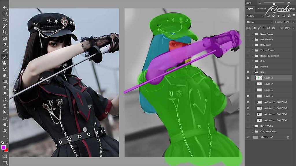
This might seem like a lot of work across too many layers, but for more complicated characters and poses, “you’ll often have to start adjusting your posing and your proportions to get things to look right, especially if you’re working from imagination.” So having the parts on separate layers will save you a lot of time having to repaint things compared to if multiple elements are painted onto the same layer.
Next up are three assignments from “Nicole:”
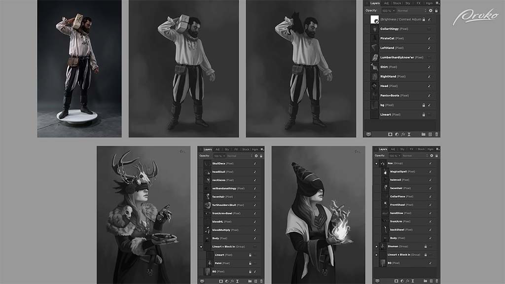
Overall, he says, her paintings are really good, which they are: “You’ve got a great grasp on your value control and are very clearly separating your light and your dark shapes, which makes these super easy to read.” He also compliments her layer structures and how she’s separated every element of the characters onto their own layers. He dedicates the rest of the video to her first study:
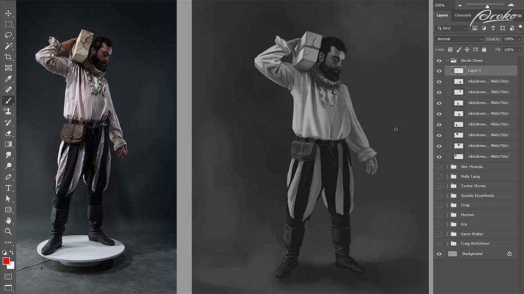
Unlike previous studies, instead of advising her to follow the reference more closely, he suggests she deviate a little more from it for the sake of a stronger composition.
He starts with the arm. The folds on the sleeve are too contrasty, he says, creating a distraction. And although that’s how it is on the reference, she can paint more shadow over them to make them stand out less. The upper arm also appears too flat, so she should “put a little less emphasis on the folds of the fabric and a little more on the cylinders of the arm.”
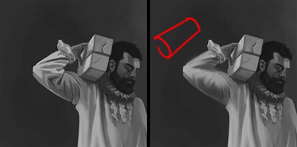
His next lesson is one in subtle shape design, as demonstrated by the clothing folds, which he then critiques. This one, he says, is “too parallel and even.”
Although it’s accurate to the reference, it’s too boxy for his liking. So he tapers the bottom, turning it into a triangular shape. She also hasn’t fully captured the cast shadow falling over the arm, so he paints a darker value over the armpit to complete it.
In addition, he suggests deviating from the reference on the side of the shirt that’s cast into shadow. Although she’s captured it correctly, she could achieve a more atmospheric effect by darkening it so that it fades more into the background. Same with the bottom of the pant legs, to emphasize their cylindrical shape as they tuck into the boots.

Want to learn more?
To see more of Jon Neimeister’s work, check out his website or Twitter. If you’re interested in expanding your digital painting skills even further, consider taking a full course from Proko.
This lesson is part of the Digital Painting Fundamentals course taught by Neimeister, but Proko has tons of courses by instructors such as Stan Prokopenko, Marco Bucci, and Trent Kaniuga.
His YouTube channel is a gift to aspiring artists. He does a mixture of tutorials on everything from the fundamentals to advanced rendering techniques, critiques of his fans’ work, challenges, art games, and more – all with an ever-present sense of humor that keeps his content from getting boring even when it’s technical.
The following two tutorials aren’t technical; they instead go almost as far back to the basics as possible: expressing faces in lines. Simplicity is the name of the game here; as the titles promise, he breaks it down straightforwardly enough for a total beginner to grasp. He might disclaim up front that he’s “not a certified art teacher,” but as quite a few commenters attest to, his lessons are more helpful than many that cost money.
Tutorial 1: How to draw faces
This first video focuses on the structure of a face itself. Yang uses a simplified version of the Loomis Method, a face construction process invented in the 1940s that’s been the gold standard in art training for decades. He divides the process into eight steps.
For Step One, he draws a circle for the cranium, then a vertical centerline that extends below it, and a shield shape around the line to form a simplified base. The rest of the video will be devoted to mapping out the proportions of the “average” face over it.
For Step Two, he finds the horizontal center of the cranium, then draws what will become the brow line across it.
For Steps Three and Four, he sets up the rest of the horizontal guidelines, dividing the face into even thirds: chin to nose, nose to brow, and brow to hairline, a staple of classical proportions. Although in real life, these ratios vary from person to person, and changing the ratios is a fundamental part of stylization, this basic ratio is considered a standard model to work off of.
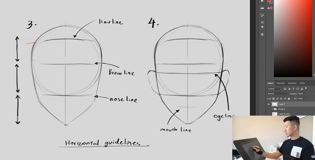
Steps Five and Six are the vertical guides: the eyes are spaced one eye width apart, with the nose spanning the same distance in the middle of the face. And for a bonus horizontal, the ears extend from the bottom of the nose to the middle of the eyes. These, too, are classic proportions, but it’s rare that you’ll find them all so neatly summarized at once.
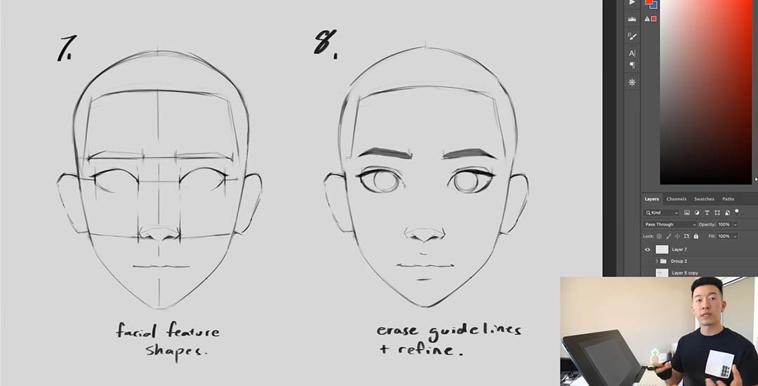
Finally, for Steps Seven and Eight, Sam draws the actual features in over the guidelines. This might seem like way too much to condense into one step – but this is where the artist’s individual style and creativity come in, which is the starting point for the rest of your journey.
Once you’ve gone through the basics, it’s time to practice. And that’s where Sam’s next video comes in.
Tutorial 2: How to practice drawing faces
If the last video was on how to start drawing the face, this one is on how to keep drawing it. And where the last demonstration was done on a Cintiq, here Sam Yang breaks out the sketchbook to return to his traditional roots. As he told 3dtotal in an interview last year, “Even though all [my] work that people see nowadays is digital, there’s so much value in just holding a pencil and drawing on a sheet of paper, and not being able to just undo every brushstroke.”
He warms up with a page of skulls. From experience, these can be one of the most complex and detail-intensive body parts to draw – but only if you let them. To set the precedent for the rest of the session, he keeps them breezy. “Very nice and rough,” as he puts it. “Not very detailed at all. There are a lot of lines that are more gestural.”
Sam’s known for his fast pace, finishing most of his paintings in under two hours, and this practice technique is how he builds up to that speed. Instead of meticulously thinking about how you’re going to capture every feature of the face, he stresses that you just need to fill the book. Set a timer, he advises, and don’t be too precious with any single sketch.
For his second warmup, he does a page of contour drawings, another standard exercise where you draw the entire picture in one long, winding line without lifting your pencil from the page.
Once he’s nice and limbered up, he moves on to the meat of the lesson, finished faces. Where he’s most known on social media for his portraits of cute girls, in this video he flexes his range with subjects of all ages, races, and sizes, using various amounts of exaggeration to style each one in a unique way. And he also makes sure to pick references shot from as many angles as possible, as artists might have to use unusual or extreme ones in their finished pieces, and you don’t want to risk being caught unprepared.
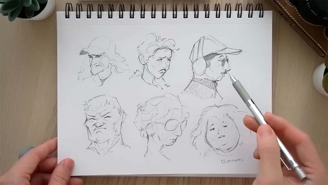
You have to make yourself uncomfortable to grow, he says, pushing yourself to accomplish more than you might have thought possible per sitting. It’s “kind of like getting your reps in at the gym. Each one of these pages is one of your sets, and every single drawing is a rep – and through these repetitions in these sets, this is how you grow your artistic muscles. That’s how you get huge!”
You can follow Sam Yang on X (Twitter), Instagram, Youtube, TikTok – or visit his Linktree, which connects to those and all his other social presences. And why not check out our last article on one of his sketching tutorials here?
About the Author
Cameron “C.S.” Jones is a West-Philly-based writer and illustrator who’s been contributing to Wacom for four years now. You can see more of his work, including most of his contributions to this blog, at thecsjones.com, or follow him on Instagram or Twitter.
These are the best anime and manga series about art, perfect whether you’re looking for inspiration for your own artistic practice or just want a great new series to check out.
Blue Period
Yatora Yaguchi is by all appearances a well-adjusted high school student. He has an active social life and great grades… but no ambitions. Like many anime “everyboys,” he assumes he’ll go on to a regular college, get a regular job, and spend the rest of his life in a suit and tie — at least until he stumbles into the after-school arts club, where he’s blown away by a senior student’s oil painting, motivating him to take his own art class more seriously. He quickly finds the purpose he’s been lacking, and resolves to get into the elite Tokyo University of the Arts.
The driving themes of Blue Period are some of the big ideas behind art as a whole. The first is originality. Yaguchi has to find himself before he can express himself, which his teacher insists is the key to developing a unique voice. The second is hard work. When he joins the club, then later a prep school for art college, he develops an inferiority complex as he’s outshined by far more experienced students. To move forward, he has to overcome his misconception that great art is the product of natural talent and focus on honing his craft instead. And the third is the leap of faith it takes to pursue art as a career. He’ll have to abandon the middle-class life he’d planned for himself and risk his long-term financial prospects for a dream that might never pay the bills.
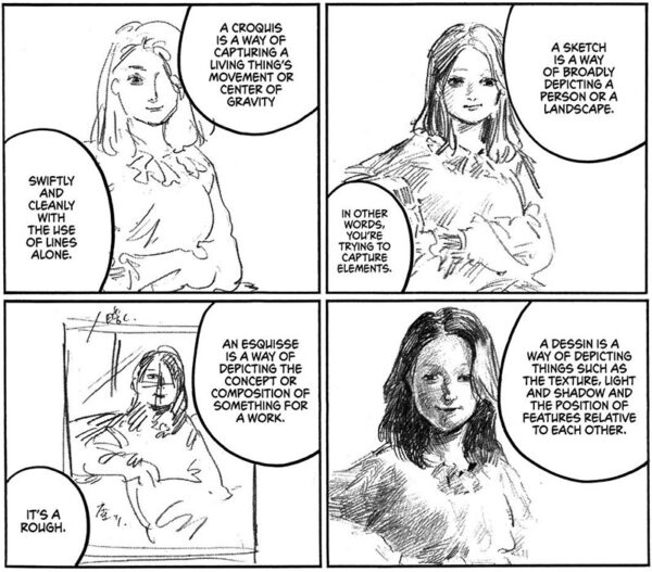
Blue Period sets itself apart from the crowd of high school club manga by eschewing cliches and never dumbing down its subject matter. If anything, its encyclopedic detail on techniques, styles, movements, the art business, and Japan’s universities can be a bit much. But it’s not superfluous to the plot, and if anything, shows the amount of knowledge and passion that goes into the series.
Plus — minor spoiler — it continues past high school. Collegiate art students will find Yaguchi’s struggles with heavy workloads and hypercritical teachers painfully relatable. After all, it’s based on creator Tsubasa Yamaguchi’s own education at Tokyo University of the Arts.
I’m going to take a stance here and recommend the manga over Netflix’s adaptation – for artists, at least. The anime cuts a lot of the informational material to focus on character interaction, a decision that’s drawn a lot of fan complaints. Plus, the manga has a unique watercolor texture to the toning, and all the works of art created by the students are real pieces by guest artists. Even the covers and splash panels contain some delightful painting references. See this X thread for a list.
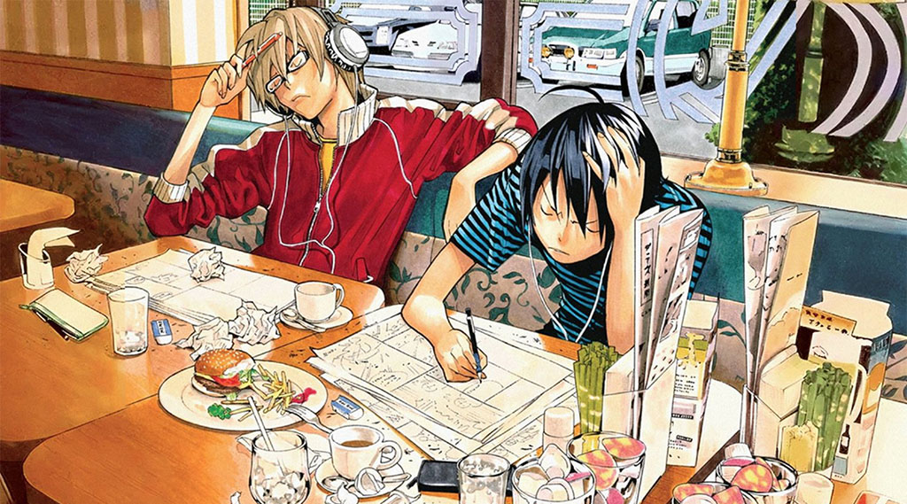
Bakuman
Bakuman is the quintessential manga about manga. Created by Tsugumi Ohba & Takeshi Obata, co-creators of the legendary Death Note, it follows a team like themselves: writer Akito Takagi and artist Moritaka Mashiro.
We begin in middle school, with Akito as an untested but determined aspiring storyteller and Moritaka as a talented but aimless notebook doodler. Although the latter is loath to take on the workload of drawing a whole manga, he finds an incentive in his crush Miho Azuki, who aspires to be a voice actress. When he spontaneously proposes to her, she makes a deal that she’ll marry him if their manga is adapted into an anime with her in the lead role – but they can’t see each other until then, instead only communicating by text. This is a pretty big ask for middle school, but it works to motivate him. Our protagonists take up the joint pen name Ashirogi Muto, and from there, the story follows them over the course of ten years through every stage of a manga career.
The level of detail that Blue Period goes into about painting, Bakuman applies to manga techniques. If you’ve ever wondered what the differences are between dip pen nibs or how to cut screentone by hand, this series has your answers. It also covers the pressures of working in the industry, dealing with strict editors, deadlines, audience expectations, and competition for the top spots in reader polls.
It received an anime adaptation in 2010 – a more faithful one than Blue Period’s, to better fan reviews. Many prefer it to the manga. It’s much slower-paced, though, and there’s something special about seeing the medium being made in the medium itself, so it comes down to preference.
It’s admittedly quite “tropey,” which leads to two criticisms. My personal one is that you should watch out not to let it reinforce unrealistic notions about the age you should expect success by, the same kind fueled by comparing yourself to prodigies on Instagram. No, it’s not normal to get published in early high school while still juggling homework, and neither should the sleep deprivation and illness our protagonists put themselves through to attain it be glorified. But since most anime focus on teenagers, it’s all in keeping with conventions. Just don’t take it too seriously.
The other, a more common complaint, is its dodgy portrayal of women. Female characters tend to fall into the camps of either obedient or nags, and we have Takagi dropping lines like, “A girl should be graceful and polite … she should be earnest about things and get average grades … a girl won’t look cute if she’s overly smart.” And Moritaka’s father says, “Men have dreams that women wouldn’t understand,” with no irony or pushback.
But if you can get past those, you’ll find an entertaining, extremely passionate story that’s been hailed as one of the most accurate depictions of mangakas’ creative processes out there. Oh, and Eiji Nizuma is a treasure.
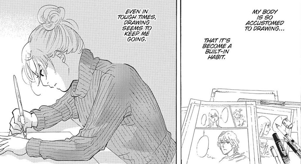
Kakukaku Shikajika
Kakukaku Shikajika is the autobiography of artist Akiko Higashimura, most famous for Princess Jellyfish. This one only exists in manga form, running from 2011 to 2015 as a side project that overlapped with five of her other works, but it’s emerged as a standout.
It shares some common ground with both previous entries. It opens with an arc about traditional painting and art school, then progresses to the protagonist’s manga career – although it should appeal to those who want a change of pace from the larger-than-life drama of Bakuman, depicting a slow artistic growth marked by setbacks. Higashimura starts off expecting her rise to be meteoric, but within the first chapter she has her delusions of genius shattered by a brutal art tutor.
This pattern continues; failure is a large part of her journey. She does not burn with the determination of a shonen manga protagonist. She slacks off, she gets artist’s block, and she wastes her college years by prioritizing shopping, hanging out, and her boyfriend. Then she has to move back in with her parents, dealing first with unemployment, then trying to eke out time to draw while working unrelated jobs. Looking back twenty years later, she calls her younger self a “terrible girl,” for which she’s now “filled with regrets.” But in spite of her relentlessly self-deprecating narration, most of her failings are those of a normal aspiring artist. And seeing as she’s now a renowned mangaka, that’s more reassuring than the story of someone who’s spent their life working like an automaton.
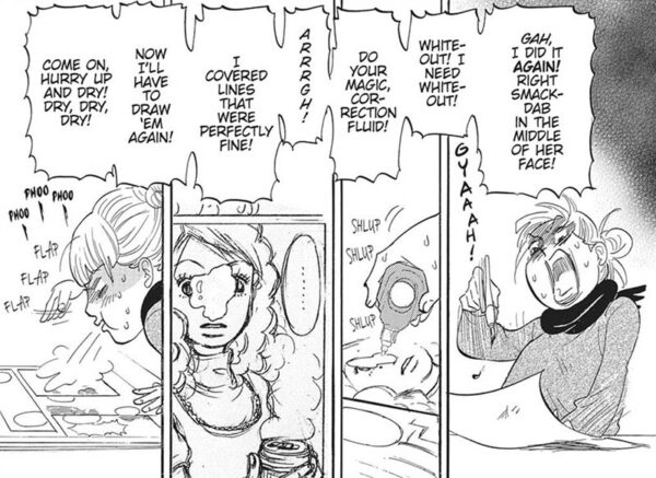
But motivating her through it all is her sensei, who, despite his borderline abusive teaching style, cares deeply for her. Their relationship is the heart of the manga. Whenever she’s in danger of losing her way, he drives her to get back to work and push past her limitations, ultimately leaving her with the mantra “Just draw.”
One way it diverges from the other entries, though, is that little of it focuses on technique; it’s about the mental and emotional sides of the artist life. There also aren’t high stakes or even a linear plot, as it’s told in a stream-of-consciousness format with frequent digressions. This is indeed the source of its title — the Japanese equivalent of “blah blah blah” — although the English release is called Blank Canvas. But as rambling as it may seem, it all goes to demonstrate the many, many life experiences that go into an art career, and ties up into a breathtakingly poignant ending… With the moral being that even the best of us make mistakes along the way.
Keep Your Hands off Eizouken
I’m going to gush a little here, because this is my favorite anime of all time. Originating as a manga by Sumito Ōwara, Keep Your Hands off Eizouken is another one about high school extracurriculars, but couldn’t be more different in style or execution from your typical cutesy slice-of-life.
It starts with the eccentric Asakusa, who’s obsessed with animation, dragging her odd-couple friend Kanamori, a natural-born businesswoman who couldn’t care less about it, to a screening where they run into wealthy teen celebrity Mizusaki. She’s a fellow student who also wants to be an animator – but her parents forbid it, wanting her to pursue an acting career instead. That rules out them joining the school’s anime club, but it’s not a problem: the trio will start their own, the Film Studies Club (Eizō-ken)… with the little catch that the films will be animated, and their studies will be on how to make them.
The three girls emulate the departments of a studio: Asakusa pulls double duty as the writer-director and background artist, Mizusaki does characters, and Kanamori uses her managerial smarts to become the producer. The plot mirrors the difficulties of animation as a business too, with the club having to contend with tight deadlines for presentations, threats of having their funding cut, and authorities who don’t understand what they’re doing at all. The way studios run on a razor’s edge to survive, it’s a constant struggle to get external forces to… keep their hands off Eizouken. But above all, the story is an ode to the power of art to realize dreams.
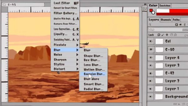
It splits its focus between the roles of both imagination and technique, giving equal attention to the girls’ fantasies and the actual work it takes to execute them. It makes the tools and tricks of animation, even common cost-cutting hacks, fascinating. And it’s the only of these series that delves into digital art, since no modern anime’s made without it, and even touches on industry-standard software. It’s the perfect balance of inspiration and education, and will make you want to go out and work on your own projects as soon as the credits roll.
This is one where I’d wholeheartedly recommend the anime. It’s helmed by genius director Masaaki Yuasa, alum of The Tatami Galaxy – another of my personal favorites – the funky Ping Pong Club, the psychedelic Mind Game, and Netflix hit Devilman: Crybaby. Eizouken’s anime adaptation takes the material to the next level in a true showcase of the medium’s transformative potential.
Ōwara’s art style is singular, and impressively detailed, but it’s also quite rough. The anime refines it to perfection, and puts the extra dimensions of movement and sound to full use. The motions and expressions are as energetic as the girls’ personalities. We get to see their actual short films, and the daydream scenes — with their watercolor art and vocal sound effects — are landmarks in animation. The opening credits are also iconic:
Finally, the series is also commendable for its inclusivity. Although it’s never explicitly stated, it’s well-known among fans that Asakusa displays many traits of autism and ADHD. And as Ōwara has come out about having both himself, and has claimed her character is based off of him as a kid, it’s not a stretch to put two and two together. I also appreciate its frequent and seamless inclusion of Black and brown characters, a relative rarity in anime. It’s similarly not called attention to; they’re just part of the student body. This is a breath of fresh air and a brilliant hint at the show’s near-future setting.
Hopefully this list inspired you to apply to your country’s most exclusive art school, aim for the top spot in Shonen Jump at fifteen, recount your bittersweet emotional journey with your mentor, or start a club where you make short films about giant robots fighting crab-turtles.
If you’re looking for more inspiration, check out some of the other anime/manga content on Wacom’s blog, like Nine great YouTube channels for aspiring anime artists or The best Skillshare classes for learning how to draw anime and manga.
About the Author
Cameron “C.S.” Jones is a West-Philly-based writer and illustrator who’s been contributing to Wacom for four years now. You can see more of his work, including most of his contributions to this blog, at thecsjones.com, or follow him on Instagram or Twitter.
In the last video of his I covered, he showed us how to work from a sketch to grayscale painting in Photoshop, and in this two-part series, he gives advice to aspiring artists on their own monochrome studies and overpaints their work. He covers four students’ work in total across the series’ two parts.
The first painting he critiques is by a student named “Patricia.”
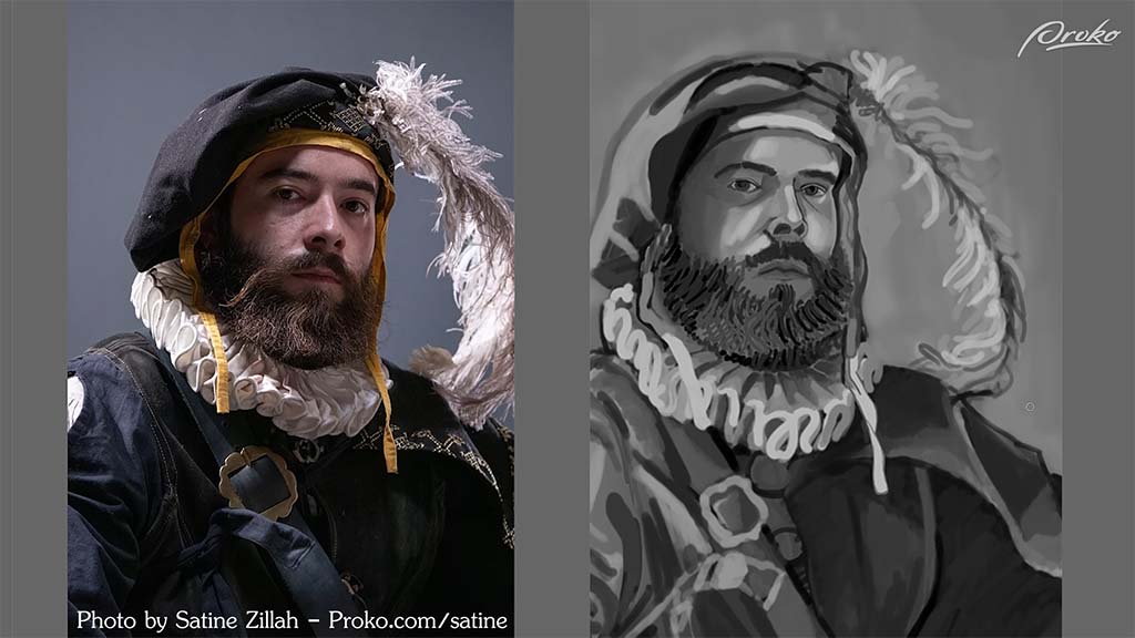
He compliments her “gestural, flowy mark-making style,” with its “Van Gogh sort of rhythm,” but suggests that she can improve her value control. She needs more separation between her lights and her shadows, as well as between her different local values, or the underlying “colors,” he recommends. Of course, the skin, the collar, and the feather are all generally lighter, where the clothing is generally darker. She did a good job separating them overall, he says, but once she got to the clothes themselves, she “started to lose control of the values a little bit.”
Looking at the reference, he continues, you can see that the hat and clothing are much darker than Patricia has painted them. By bringing their brightness down, she can not just match the photo more closely, but draw more attention to the face.
With this solved, he proceeds to the issues with the lighting. Starting with the ruff:
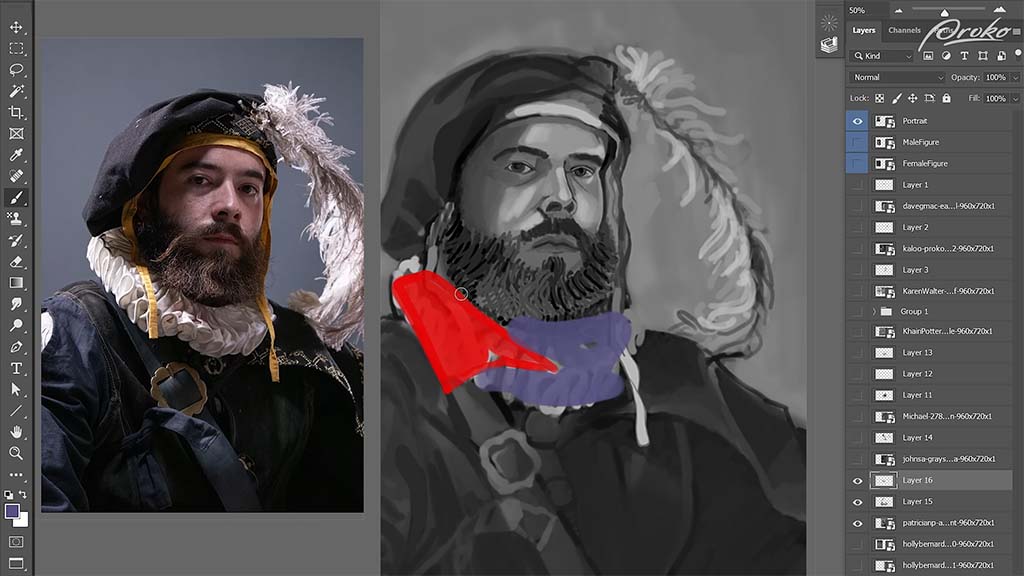
One aspect she missed, he explains, is that while she’s painted the entire thing as if it were lit equally, in reality, the red area is in light and the purple area is in shadow. Darkening the purple area will “reduce contrast and limit information to be sure that our focus stays where it needs to be,” meaning the face. This can also be a way to save time when painting, since it limits the amount of detail she’d need to paint into the dark areas. She could include just enough information to show it without having to render every fold of fabric. This will also have the side effect of making it appear more atmospheric.
He moves on to the face, where “a similar thing is happening.” After darkening the shadow over the left eye, he points out that she’s put too much emphasis on the rimlight coming from the right side of his face, causing it to break up the overall shape of the shadow too much. He demonstrates how she can paint a darker swath of shadow across the right side of the face before going back and erasing some of it to re-add the rimlight.
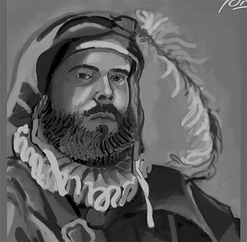
The second artist he critiques is “Karen,” who in my opinion already nailed it:
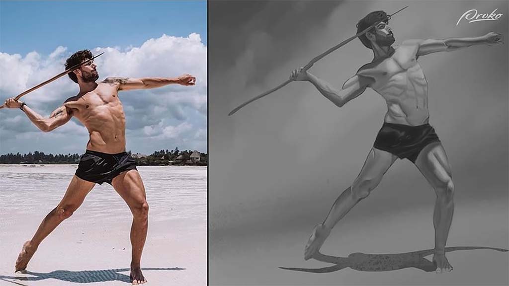
But he still finds ways to improve on it. The first problem he points out is that the shadows aren’t dark enough, being constrained entirely to midtones and mostly being used to outline the smaller muscles, where there should be larger ones describing the forms as a whole. What she needs to do, he advises, is “separate the shadows a little bit more from the midtones,” and on a new layer, he takes a dark gray brush and demonstrates where the extra shadows need to go.
The torso needs “form shadows,” or the natural shadows that occur when something is pointing away from the light source. In this case, the chest is pointed upwards towards the light, where the stomach is pointed downwards away from it, creating a distinct shadow shape across the torso, which he paints in over it.
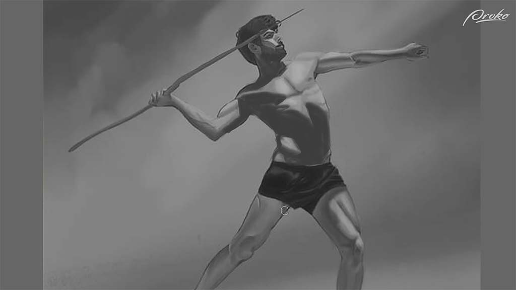
Karen also underemphasized how the left leg is shrouded completely in shadow, so he paints it in. Once done, he turns the opacity down to 40%, turning his opaque paint into perfect shading.
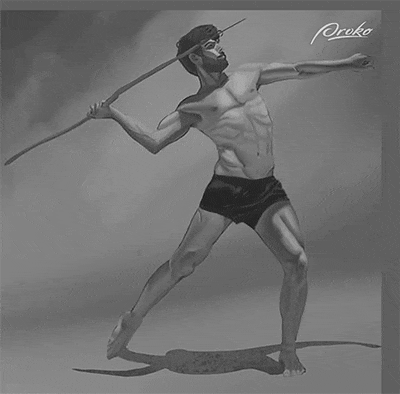
Once you have the large areas of shadow painted, he says, then you can go into the subtle rendering of the individual muscles, but “starting with that clear separation of shadow is ultimately one of the most important things for achieving a realistic effect of light.”
Neimeister continues this lesson with two more critiques — coming soon on this blog! Stay tuned for Part Two.
Want to learn more?
To see more of Jon Neimeister’s work, check out his website or Twitter. If you’re interested in expanding your digital painting skills even further, consider taking a full course from Proko.
This lesson is part of the Digital Painting Fundamentals course by Neimeister, but Proko has tons of courses by instructors such as Stan Prokopenko, Marco Bucci, and Trent Kaniuga.
Over this four-part series, you’ll learn everything you need to know about Adobe Photoshop Brushes. From the basics, including the Photoshop toolbar and how brushes work, to the different kinds of brushes available, to how to manipulate them and change their settings for different results, and finally to creating your own custom brushes.
- The Toolbar (You are here)
- Types of Brushes
- Brush Settings Panel
- Making Your Own Brushes
This article is Part 1, which will walk you through the most basic knowledge of brushes and create a strong foundation. The table of contents above will be updated as each part publishes. Let’s start with the most basic topic of all:
What is a brush?
Photoshop imitates the fundamentals of traditional media by taking a single image — called a Brush Tip — and replicating it, usually by layering it over itself to create the illusion of a single stroke.

Clicking the brush icon, or pressing B (if you still have the default hotkeys), will open up the Brush Options Toolbar. From there, can assign the tip a color with the Color Picker — and so much more. The Brush Options toolbar lets you change all of your brush tip settings.
Brush options toolbar
Here’s what the Brush Options Toolbar looks like in Photoshop 2022.

Yours may look slightly different if you have an different version of Photoshop, but everything should be almost exactly the same.
1. Tool presets
This is the multi-tool shortcut menu. If there are certain tools you use often with the same settings, you can save them here. Click here to watch a video from Adobe that explains in depth how this works.
2. Brush preset picker

This is where you’ll do most of your brush selection and adjustment on-the-fly while you’re drawing or painting.
A: Angle and roundness
This adjusts the tilt direction and height-to-width ratio of the brush tip. You change the angle by rotating the arrow, and the roundness by dragging the anchor points in or out.
B: Size
Adjusts the size of the brush tip. There are also hotkeys for doing this — by default it’s the bracket keys or by holding Alt/Option and dragging. Most users of Wacom devices use pressure sensitivity to adjust brush tip size, however — more on that later.
C: Hardness
For round brushes only: This increases or decreases the sharpness of the tip’s edges. Hard brushes, especially at high flow, create a drawing effect, whereas soft ones, especially at low flow, are best for smooth blending. You can also control it with shift + brackets if you have default hotkeys.
D: Settings
The menu behind this gear has changed a lot in recent versions of Photoshop. Here are the current ones for 2022:

Some of these are just toggles for the preset picker. Here’s a breakdown of the rest:
- New Brush Preset: See above.
- New Brush Group: Creates a new folder for sorting brushes.
- Rename Brush: Use this to name brushes so you can search by name and find them easily.
- Delete Brush/Delete Group: If you want to be safe, make sure you back your folder up as an ABR first.
- Append Default Brushes: This adds the default brushes onto the end of your brush panel.
- Import Brushes: This loads up a brush set you’ve downloaded to your hard drive. Brushes are saved as ABR files, each of which is a group containing one or more brushes Imported brushes will be appended to your brush panel as well.
- Export Selected Brushes: If you select a handful of brushes or a folder, this will pack them into an ABR so you can back them up.
- Get More Brushes: This takes you to Adobe’s brush packs page. They have a huge variety of free options, but it’s recommended that you learn more about the basics first.
- Converted Legacy Tool Presets: This one’s not helpfully named, but it’s the same thing as the legacy brushes option below, except it imports the default tool presets into the Presets window.
- Legacy Brushes: This appends all the default brushes from previous versions of Photoshop, giving you about a hundred times more than 2022’s defaults. Once again, it’s recommended that you hold off until you have a little more experience.
E: New Brush Preset
We’ll be covering custom brushes in Part 2.
F: Brush Picker
This is where you choose a brush. Photoshop 2022 comes with just four folders of default brushes, most made by Kyle T. Webster: General brushes, which are your Round Brushes; Dry Media Brushes, your pencils and charcoals; Wet Media Brushes, your paints and inks; and Special Effect Brushes, which are actually a mix of splatter and texture brushes. But you can add more with the Legacy Brushes option in the settings menu.
G: Slider
This controls the size of the preview in the brush picker. Older versions of Photoshop will have a Reset Brushes option that returns the panel to its default appearance. They took that away, so if you want the panel back to default for a fresh start, you’ll have to highlight all the folders you want to remove with Shift, then Right Click > Delete Group.
3. Painting Mode
Just like layers, brushes have blending modes. “The blending mode … controls how pixels in the image are affected by a painting or editing tool,” according to Adobe in this article, which goes into depth on how this works.
The main difference between layer and brush modes is that the latter are destructive, meaning once they’re applied, you can’t change them. They can be more convenient to change dynamically, however.
Brushes have two secret modes layers don’t, however:
- Behind lets you paint only on the transparent, unpainted, parts of the layer. If you paint over another line, it’ll pass under it.
- Clear turns any brush into an eraser. All of Photoshop’s default brushes are locked to one tool, usually, either the Brush or the Mixer Brush, and the process of getting them to work with the Eraser tool is complicated (more on this in Part 4), so this is the easiest way.
4. Opacity and flow
Opacity and Flow are the two ways to control stroke transparency for blending. They’re what make digital painting possible.
A lower opacity number means your brush strokes will be more transparent, and a higher number means they will be more opaque. You can set this by typing in any number from 1 to 100 with the brush tool open, or set it in 10% increments with just 1 to 9. 0 resets it to 100%.
Flow is more complex. It’s intended to better mimic traditional paint: think of it as a smoother version of opacity made just for painting. With opacity, each stroke lays down one “coat” of paint at that exact opacity until you lift your Wacom pen. No matter whether you cross your previous lines or not, that coat won’t get any more opaque until you end that stroke and draw a new one, and there will be an obvious separation between the two, like stacking pieces of colored glass on top of each other.
Flow is different. A low-flow stroke will still be partially transparent, but the “coats” of paint you apply will build up into a solid color more smoothly, and whether or not you lift your stylus, crossing your stroke will darken or lighten it.

Working with flow feels more “painterly” than opacity: Layering low-opacity strokes on top of each other creates a distinctive pattern of overlapping streaks that’s a hallmark of digital artist. Enough passes and it’ll be less visible, but you’ll almost always get a smoother result with low flow.
While Opacity always works the same way, some media brushes have different Flow functions programmed in to more accurately mimic, for example, how pencils work when you’re only lightly touching the paper, or paintbrushes when they’re nearly dry. With these brushes, as Kyle T. Webster explains in his Photoshop Masterclass, Flow turns into “the rate at which pigment is flowing out of the stylus. If [there’s] a low flow … you’re not depositing very much of it as you’re using it.”
In short, If you’re trying to lay down one translucent coat of paint, turn down the opacity. But if you’re going for a natural painting feel, turn down the flow.

Note: The main exception is when brush spacing is set higher (see above, and more on this in Part 2), in which case lowering the flow will cause the individual layered images to show through each other, but lowering the opacity will look fine.
Always use pressure for opacity
Selecting this causes pen pressure to control opacity. It can be used in conjunction with Always use pressure for size (number 7, later), so that pressure controls both, meaning that low pressure will produce a stroke that’s both small and light-colored, like drawing with a pencil compared to a pen.
If you’re painting, we recommend leaving this off and using pressure to control flow and size instead. The Pressure-Flow control setting is located in the Transfer section of the Brush Settings panel, covered in Pt. 3.
Enable airbrush-style build-up effects
This determines whether the brush will continue painting when it’s not moving. Without it on, turning the flow down and holding your tablet pen in place will produce a single pale dot. With it on, holding the pen will cause it to keep spraying on color until it’s 100% opaque — like an airbrush. If you have this on, the number keys will automatically switch to controlling flow, and shift-typing to opacity.
5. Smoothing
Default smoothing works basically the same way as Clip Studio Paint’s, with a higher percentage producing smoother strokes, but Photoshop’s engine is a little different. It also has a few modifiers. Click the gear to adjust these:
- Pulled String Mode is a little deceptively named; all smoothing in Photoshop uses a pulled string, the length of which increases with the percentage — it’s just invisible by default. Going to Edit > Preferences > Cursors… > Show Brush Leash will make it visible so you can see for yourself how it works. In addition to adding an always-visible leash, Pulled-String mode draws a circle around your cursor; your brush won’t start drawing until it reaches the edge. Increasing the percentage simply widens the circle.
As you pull the circle along, it’ll “average out” your pen’s movements, making your lines butter-smooth no matter how slow you go: at 30%, it gives you smoother strokes than default mode at 100%. This makes it better for people who draw very slowly and deliberately, stopping after each line, and for drawing sharp corners without two separate lines.
- Stroke Catch-up: Photoshop’s smoothing has a quirk Clip Studio Paint’s doesn’t: with this setting off, the brushstroke will always stop short of the cursor’s current position. If you’ve made the Brush Leash visible, you’ll see why, but with this on, the brush will catch up with the pen whenever you hold it still.
- Catch-up on Stroke End: When you lift your pen from the tablet, the brush will draw a straight line from the end of the brush leash to where your cursor was. With Pressure-Size on, this results in every line tapering to a point, so it’s good if you want that effect.
- Adjust for Zoom: This increases smoothing when you zoom out and decreases it when you zoom in, so you’re always drawing at the same level of precision relative to the image size.
You can also set the smoothing percentage with the number keys. This works the same way as setting Flow, except you hold Alt instead of Shift.
6. Brush angle
With this you can san exact brush angle by entering a number in degrees, or clicking the icon and dragging L or R. This is much more precise than the arrow in the Brush Preset Window. Why would you want to change the brush angle? First, it’s invaluable for object or special effect brushes that have to be pointed in a precise direction. But also, if you turn down your brush’s Roundness and turn on Pressure-Size, angled brushes mimic the feel of a calligraphy pen or a chisel-tip marker, where line thickness depends on the direction you pull it in.
7. Always use pressure for size
The Hard Round brush and most others patterned after it always use pressure for size by default, but many others don’t. So if one doesn’t and you want it to, click this. Whatever other settings you also assign to Pen Pressure will still work, but this will force it to also control brush size.
8. Symmetry rulers
This creates a ruler that mirrors your strokes along a horizontal, vertical, other axis. After selecting one, you can place and transform it, then turn it on and off via the Symmetry Off and Last Used Symmetry menu options.
Most of them are pretty straightforward: Vertical, Horizontal, Diagonal, and Curve replicate the drawing once. Dual Axis replicates it in quadrants, and Parallel Lines in columns. Radial and Mandala let you pick a number of axes and replicate it several times around a center point. Circle and Spiral seem to distort your image, but surely must have some kind of use.
That’s it for the Brush Toolbar, but it’s enough to get started painting! Stay tuned for parts 2, 3, and 4 — coming soon.
Bonus information
A few other interesting things that didn’t make it into the basic information about the toolbar itself.
Lazy Nezumi Pro Review

If you have an older version of Photoshop before Adobe integrated brush smoothing into the software, there’s a third-party stabilizer called Lazy Nezumi Pro. It’s $30, so is it worth it when Photoshop includes smoothing? Actually, yes.
The stabilization engine in LNP is much more elaborate than Photoshop’s and nearly any other art program’s. Instead of just a slider and a pulled-string mode, Nezumi offers a choice of twelve smoothing algorithms, each with many fine-tuning options.
There are also also many parallel rulers, perspective rulers, isometric rulers, fisheye rulers, wave rulers, sawtooth rulers, rulers for ellipses and speed lines and spirals and gears … lots of rulers.
A great feature is that it works with any program, not just Photoshop. So if you switch software down the line, it’ll still help. You can use it on Illustrator, Adobe Animate, Toonboom, Krita, Autodesk Sketchbook, and more.
Brush Precision Tip: Turning on the crosshairs
It can be helpful to turn the crosshairs on inside the brush cursor so you can always find the exact center of a weird-shaped tip. To do this, go to Edit > Preferences > Cursors, and check “Show Crosshair in Brush Tip.”

Conclusion
The next installment in this series will be simpler, and will cover the types of brushes you can expect to find, or might need to make, for Photoshop. In Part 3, we’ll tackle the Brush Settings Panel, is where things will get pretty involved.
Some of Part I will seem basic, but other sections might not. The point of going into so much depth is that there are important intricacies to even the simplest brush functions in Photoshop, and knowing them will make digital painting involve way less trial and error. Be sure to stay tuned for the rest of the series, coming soon!
This is Part One in a four-part series. Part Two covers Brush Types, and is available here. Part Three covers the Brush Settings Panel, and is available here. Part Four covers making your own brushes, and is available here.
About the Author
Cameron “C.S.” Jones is a West-Philly-based writer and illustrator who’s been contributing to Wacom for four years now. You can see more of his work, including most of his contributions to this blog, at thecsjones.com, or follow him on Instagram or Twitter.

While interning at Warner Brothers, the then-teenage illustrator and animator noticed they were the only Black person on their crew. The situation was similar in their classes at the Maryland Institute College of Art.
“I was like, ‘I wish I could find a way to connect with other Black artists beyond [the] local,’” Hayford explained during a Wacom panel at Lightbox Expo 2020. For inspiration, they looked to the hashtag #VisibleWomen, which had become a viral sensation just the previous month. “There was a woman who was able to connect all these women artists,” they explained. “Maybe I could start something that connects and promotes Black artists.”
They sent out the above tweet, and #DrawingWhileBlack was born.
Since then, the hashtag event has recurred annually on X (formerly Twitter). The dates change, but this year’s was from September 1 to 3. A few accounts have carried the responsibility for reposting the artists’ work over the years, but the current one is @DWBlk_Official.
As a Black artist myself, I couldn’t pass up the chance to highlight some of the ample talent on display during this year’s showcase. Although the official account only shares posts from those three days, artists can and should use the hashtag year-round – so I’ve included some who used it later in the month as well.
#DrawingWhileBlack on Twitter

Mikhail Sebastian
Known as Mythallica online, Sebastian specializes in superheroic characters and dramatic scenes, masterfully shaded and brought to life with a flair for capturing motion in both still images and animations. Sitting at the intersection of Marvel comics and shonen battle manga, his art is all about action.
Check out Mikhail Sebastian’s portfolio, or follow him on Twitter or Instagram.

Deanne Go
Deanne “Deegoo” Go has won over thousands of fans with a cute, memorable body of work marked by vivid colors and streamlined shapes reminiscent of Pernille Ørum’s. If you’ve always wanted to see more Black and brown princesses, mermaids, and other fantastic figures, her art will be right up your alley.
Follow Deanne Go on Twitter, Instagram, or Tumblr.

KouSIN
“Kouya” is an African law student who somehow manages to squeeze making elaborately detailed art into their presumably minimal free time. A specialist in character design, their portfolio and social profiles are a museum of gorgeous, ornate outfits – and buff men – expressed with meticulous lineart.
Check out KouSIN’s portfolio, or follow them on Twitter or Instagram.

Seth Redd
With wild linework, bold and even surprising colors, dynamic perspectives, and innovative use of photo textures, this Brooklyn-based comic and concept artist’s style borders on the psychedelic. But there’s also a sense of familiarity to it; if you dig the aesthetic of the Dreamcast classic Jet Set Radio or Monogatari’s backgrounds, give him a follow. He also has a webtoon called Love Sickubus.
Follow Seth Redd on Twitter or Instagram.

Vanessa Tweneboah
Vanessa Tweneboah is a Ghanaian-American visual development artist and background painter who’s worked for Disney, Nickelodeon, and Netflix among other big names. A Rhode Island School of Design alum, she describes herself as “very passionate about capturing the world through her eye with color, mood, and atmosphere.” I think her immersive environments speak for themselves more than anything else I could add.
Check out Vanessa Tweneboah’s portfolio, or follow her on Twitter or Instagram.

Art by Atlas
Elijah Johnson is another one with impressive credentials. He’s been in media all his life, starting out as a child actor, then discovering a passion for art as a tween that he turned into a career in comics by his early twenties. He illustrated bestselling titles by other authors before getting two original series crowdfunded, then published his passion project, a collaboration with his dad and brother called The Formula. Today, he also runs an animation company called AnimeHipHop.
Check out Elijah Johnson’s portfolio or follow him on Twitter.

Michelle Oléns
If I had to sum up Michelle Oléns’ aesthetic in one word, it’d probably be “calm.” Although characters are where she shines – they’re drawn with light, airy lines and colored in masterful pastels – she also has an understated but impressive talent for composition and even backgrounds on occasion. Plus, she deserves all the props just for this image, intended to help artists avoid unintentionally racist character designs:

Check out Michelle Oléns’ Carrd page or her ArtStation, or follow her on Twitter.

Buttercup
Buttercup, creator of the webcomic Um, has one of the most unique art styles I’ve come across in a long time. While its flat colors and minimal shading are common in indie comics, their way of simplifying faces and exaggerating proportions is all their own, accentuated by a frequent use of extreme perspectives. And their animations are stunning.
Follow Buttercup on Twitter, Instagram, or Twitch.

Onsta
Onsta, an artist and vTuber living in Japan, describes herself as a lover of “vibrant colors and magical moments,” and her work has both in spades. Her portfolio is an explosion of rainbows and shimmering stars, often cast in a hazy light that adds a touch of the ethereal. She’s active in the Sega fanart communities, especially for the Yakuza and Mega Man games, but is just as capable when it comes to original art. She streams both drawing and games on Twitch.
Check out Onsta’s portfolio here, or follow her on Twitter or Twitch.

B.J. Golez
B.J. Golez – or “Pina” online, short for “Blackapina,” itself short for “Black and Filipina” – is a Toronto-based illustrator who’s done freelance work for Legoland, NASA, Turkey Hill, and more. But her passion is depicting Black glamor, which she does in a style equal parts urban art and anime. Her work has won her recognition from big names like Doja Cat and Megan Thee Stallion, among a litany of other hip-hop and R&B artists. She does a mixture of fanart and original pieces; my personal favorite is her modernized tribute to the classic Ernie Barnes painting Sugar Shack.
Follow B.J. Golez on Twitter or Instagram.
#DrawingWhileBlack on Instagram
The #DrawingWhileBlack hashtag can also be found year-round on Instagram. It’s used on DeviantArt and Artstation, too, although not as often. Here are a few more incredible artists I found on Instagram outside of the dates of the Twitter event.

Nia Coppedge
Illustrator and visual development artist Nia Coppedge hails from Washington, D.C., and both its cityscape and history of Black excellence seem to inspire her paintings. Her gallery is truly eclectic, ranging from cartooning to anime to near-realism, all pulled off with equal aptitude but tied together by her distinct, “posterized” style. Particularly impressive are her skills at drawing environments and creating atmosphere.
Check out Nia Coppedge’s portfolio, and follow them on Instagram and Twitter.

Thea
Thea, also known as Peixel, has an eclectic gallery of traditional and digital art at all stages of refinement, but it’s her painting that stands out. In addition to her formidable rendering skill, her work is distinguished by her evocative use of color, often depicting elegant Black women in moody blues and enchanting twilight purples.
Check out Thea’s Artstation or follow her on Instagram.

Kamrin Webby
Cameron Webb’s art is incredibly developed for a 20 year old. Their work strikes an adept balance between control and chaos: they’re already proficient at the concept art technique of laying down fast strokes that look rough and messy from close up but form a perfectly clear whole when viewed at the intended size. They also have a hell of a knack for dramatic lighting. An Instagram post mentions they’re in art school; I hope they end up making it a career, because they have a bright future ahead.
Follow Kamrin Webby on Instagram or Twitter.

Louidela Nutakor
This Afro-French manga artist is so talented, he broke through my desire to not feature too many artists in the shōnen manga style. In addition to nailing the aesthetic, his work is set apart by a focus on tribal characters and motifs, as well as a body and age diversity rarely seen in anime and manga art. His current series, from where the majority of his Instagram posts come, is a reimagining of African myth called Redflower. None of his graphic novels have been translated to English, but who knows what the future will bring?
Check out Louidela Nutakor on Facebook or follow him on Instagram.

Beyond a hashtag
During Hayford’s Lightbox 2020 panel, they expressed hope for the future of the event and the movement: “One day, Drawing While Black might be beyond just a hashtag,” they said. “I’m very optimistic with how it’s growing each year.”
Whether or not the event ever breaks free from social media to become a website, a physical event, or even a gallery show, as Hayford imagined, there’s no doubt the Black art scene is continuing to grow, and both the hashtag and the concept have become a fixture of the community.
Finally, many of the artists listed here are open for jobs or commissions, and many sell prints, classes, and/or digital assets. Check out their bios and websites, and if you can, buy from or hire one of them! Direct, monetary support will do more for Black artists than an article, retweet, or social media follow ever could.
About the Author
Cameron “C.S.” Jones is a West-Philly-based writer and illustrator who’s been contributing to Wacom for four years now. You can see more of his work, including most of his contributions to this blog, at thecsjones.com, or follow him on Instagram or Twitter.
That’s why we’ve pulled together these five great online learning resources for aspiring artists. Each of these resources offers tons of free material to get started, and once you found your go-to resource, you can usually get even more for a small fee.
Just a little editorial tip: learning within your comfort zone feels a lot easier, but stretching yourself is the best way to gain creative strength. So check out these top five go-to learning resources for digital artists: one or two might do the trick for you.
1. YouTube

There are literally thousands of YouTube channels you could follow to find support for improving your art. YouTube’s ubiquity in the art world is exactly why it helps to have recommendations. Standing out among the endless tutorials, speedpaints, video essays, and drawing hacks, are these channels: some of our favorite teachers.
Sinix Design
Sinix is an art professor whose channel is almost as old as the platform. If you want to learn to paint nearly anything, from any part of the body, to materials, to different styles, he has a video for you — as well as plenty on the more intangible aspects of art, like design theory and motivation.
Marc Brunet
Marc Brunet, the world’s most explosive concept artist, does a brilliant job conveying the fundamentals, tempered with a breezy pacing and sense of humor that keeps his lessons from getting dry. And no one does simplified anatomy like him.
Ethan Becker
If you need the basics drilled into your brain, Ethan Becker will give it to you straight without sparing your feelings. But behind his gruff persona is a great teacher who truly cares about giving useful advice, with a specialty in stylization and creating appealing characters.
Bobby Chiu
Bobby Chiu is a seminal educator with his own online art school and real-life convention. His Youtube content mostly focuses on mindset and interviews with other artists, but he’s just as good at those, too. He recently retired this channel, but with over a thousand videos, there’s enough backlog to keep you watching and learning indefinitely. And he’s already started uploading to two new channels, Schoolism and Chiu on This, so keep an eye on them.
Aaron Blaise
Aaron Blaise is a former Disney animator turned illustrator and prolific YouTuber, not to mention a frequent Wacom collaborator. His specialties are motion and creatures, so if you want to learn to animate dynamic characters and/or draw a dope lion, this is the channel for you.
2. ArtStation Learning

ArtStation is known as the portfolio site for world-class digital artists, so it makes sense that their learning platform, ArtStation Learning, would be just as exceptional. There used to be a monthly fee, but a couple years ago, Epic Games bought it and made it free, opening this invaluable resource up to anyone. Some cool courses:
From School to Studio
Becca Halstedt has been a professional game artist since before they graduated college. In this course, they’ll teach you how to get your first job in the industry. As you can tell, it’s particularly recommended for students.
Grady Frederick’s Environment Design Series
In this three-hour, three-part course, the freelance concept artist will walk you through every step of creating backgrounds that aren’t just pretty, but cohesive, well-composed, and full of visual storytelling.
Sketching Characters with Energy
Joel Dos Reis Viegas is a former Ubisoft art director and creator of the viral animated pilot Urbance. In this course, he teaches about a fundamental but undervalued part of character design, the sketch. He’ll show you how to bring a drawing to life with bold linework.
3. Skillshare

Skillshare will normally set you back $168 a year, but a free three-month trial of Skillshare comes with every purchase of a Wacom One or Wacom Intuos! I’ve done another article with a complete list of Skillshare recommendations, but here are a few highlights.
Digital Concept Art: Designing Creatures | Learn with Wacom
Concept artist Justin Goby Fields uses ZBrush to make the monsters that movie and game studios seek him out for. In this course, he’ll first teach you the ins and outs of the program, then how to do what he does best. And, 3D sculpting being very hard with a mouse, his tool of choice is a MobileStudio Pro.
Character Illustration: Drawing Faces, Figures & Clothing
Gabriel Picolo, a DC Comics artist with 3.6 million Instagram followers, shares in this course how he comes up with the vibrant characters that have earned him his fanbase. After going through poses and expressions, he creates a zodiac-themed archer, starting with pencil on paper, then pivots to Photoshop to ink, color, and texture the drawing.
Intro to Surface Pattern Design
Surface Pattern Design is the art of making motifs for products like fabric, notebooks, and wallpapers. It’s done with vectors to be infinitely scalable, and the gold standard program is Adobe Illustrator. In this 3.5-hour course, designer Bonnie Christine will take you through its functions from the ground up, making it an excellent way to learn it with real applications.
4. Udemy

Udemy lurks in the background of the art tutorial world: always there, but rarely used to its full potential by students. Their daunting base prices might be a factor, but they run constant sales where courses go as low as $10. Their tutorials are in-depth and thorough, and some are by concept artists of the same caliber as ArtStation Learning.
Art Fundamentals — Building Blocks of Digital Painting
This course is free, so there’s no reason not to check it out. It’s a compact introduction to the common tools of digital painting and the principles of value and color you’ll need to get started, plus some design theory and a dose of attitude advice.
Cartoon Drawing: For The Absolute Beginner!
Another freebie: This one’s a traditional art class, but it covers the foundations of cartooning that apply to any medium. Like the last one, it’s designed for complete newbies: so much so, in fact, that instructor Mitchell Bouchard starts with how to draw stick figures on notebook paper. But from there, he progresses to the 3d forms that make up the building blocks of art, and finally, how to shape them into a cartoon character.
The Logo Design Process From Start To Finish
This course is paid, although at time of writing, it’s on sale for $15. That might be a bargain for seven hours of thorough instruction on how to use Adobe Illustrator to create a logo — one of the staples of graphic design — build a brand around it, and even find clients for your new business.
5. Ctrl + Paint

There was a time when Ctrl+Paint was one of the only games in town for learning digital art from scratch: They had a full walkthrough of Photoshop’s toolset back when most of the big name YouTube channels were barely getting started. They’re not as prevalent anymore, but they’ve updated their old tutorials and kept adding new ones up until 2020. Since none of their courses have direct links, click here to see their video library for the tracks.
Digital Painting 101
If you’re reading Wacom’s blog you probably have some experience with digital art. But for those totally new to it, this is where to start: a rough but overarching guide to Photoshop’s functions that serves as the basis for the rest of the courses.
Basic Painting Techniques
In this series, teacher Matt Kohr begins to actually paint, with several still-life demos. He then moves on to a litany of rendering techniques, some that come from traditional, but others that make use of the program’s special properties. Speaking of which…
Uniquely Digital Techniques
Don’t get me wrong, all the courses in between are just as valuable. But since we’re a digital art blog, our last selection will be one about things you can only do in this medium. Things like tweaking your lighting with adjustment layers, confining your brush strokes with clipping masks, correcting your colors in post, and more.
Conclusion

There’s more content on these resources than anyone could ever get through in a lifetime — but this list just scratches the surface! There are also educators like Proko, schools like CG Spectrum … and of course, there’s this blog. However you choose to learn, we support you!
About the Author
Cameron “C.S.” Jones is a West-Philly-based writer and illustrator who’s been contributing to Wacom for three years now. You can see more of his work, including most of his contributions to this blog, at thecsjones.com, or follow him on Instagram or Twitter.
A mysterious phenomenon has drained all the color from the world, and only Pizza, a dog with a borrowed magic paintbrush, can restore it. In this charming video game’s one simple but wildly versatile mechanic, you use your cursor to splash hues across Pizza’s world, causing different magical effects.
In other words, it’s literally a game about digital painting! Chicory was released for PC, Mac, and consoles in 2021 — and you can indeed play it on your computer with a Wacom tablet.

Not many people could pull off a game about flatting lineart, but if anyone could, it’s the team behind Chicory.
The entire gaming experience — design, programming, and writing — was done by Wandersong creator Greg Lobanov. Night in the Woods’ Em Halberstadt worked on sound effects, and Celeste composer Lena Raine did the music — there are multiple official soundtracks on Spotify. Backgrounds and level design were by comic artist and illustrator Madeline Berger.
And the character artist was Alexis Dean-Jones.
From Brisbane, Australia, she moved to Vancouver to work in animation, working on the Tom and Jerry reboot and Netflix’s The Hollow before starting on Chicory, her first game.
She has a simple, cute, but striking visual style, with impeccable simplification, stylization, and taste, not to mention composition and color palettes.

At the time, she did all her work on a 13-inch Wacom MobileStudio, using Clip Studio Paint for still illustrations and Adobe Animate for character movements in-game.
But the reason I sought her out for this interview was her recent drawings for the Chicory team’s Australian wildfire relief fundraiser. The designs exemplify her simple, effective, and completely adorable work, and they were done on the fly to buyer requests. So I wanted to talk to her about how she did that.
Do you have a #1 rule of character design for cute characters?
Not exactly, no number one rule … But I guess the main thing that I keep in mind is to try to convey a feeling. With these fundraiser drawings, if I wasn’t given a prompt by the person, I would try to think of something like “cozy” or “chilly” or something like that, and just try to convey that with the expression or the pose. I find that’s usually a really good place to start with a character design.

Was that also what you did for Chicory, or did they give you more defined prompts?
It’s often just like that, yeah. It depends on the character. Sometimes there will be characters we need for the story that have well-defined personalities that I need to say something specific [about], other times it’ll just be, “We need a certain number of people for the setting,” and I’ll try and come up with a couple of unique people.
What advice would you give to people who struggle to stylize things in appealing way?
If you’re trying to stylize animals, for instance, I would really recommend sketching from life or from videos as a starting point, just going through videos and pausing. Videos in particular, I find a lot more helpful than photos, because you can really quickly get to grips with how the animal moves in 3d space, how its face looks from different angles, and what its proportions are. A photograph can really skew things a lot.

Do a few sketches, and then look at those sketches and see what you can emphasize. Like, if its eyes have a particular diamond-y shape, you might emphasize that; or if it’s got kind of a little pointy nose, give it a really little, pointy nose; find out what its head shape is and try to push that.
So it’s like animal caricature.
Basically, yeah!

How much reference are you using during the actual drawing? Or do you have a large enough visual library of animals at this point that you can just go for it off the top of your head?
It kind of depends on the animal. A lot of animals, I’ve drawn a lot already, and I’ll have an idea about how I want to go about drawing it. But if I don’t have a really clear one, or if I’m doing sketches and they’re all looking kinda samey, or like a design that I’ve seen before, that’s when I go back to reference the original animal and try to pull something different from it.
Did you use them for clothes and poses too?
Yeah. I like to draw people in cafes and I’ll often reference those drawings for outfits and stuff. If I need something a little bit different, I’ll go and look for photos online. But usually it’s from life.

What Clip Studio Paint tools do you draw with?
The Real Pencil for the lines … I like how scratchy it is. And then their standard Oil Paint brush for the colors.
Is the sketchiness an aesthetic choice or a timesaving method?
It’s a bit of both. [Laughs]
For these sketches, I wanted them to look unified and I wanted to restrict myself: I have a bit of a tendency to get too stuck in the details, and I wanted to make sure I could keep going at a reasonable pace. I made sure to stay zoomed out — I didn’t allow myself to zoom in or out — and I gave myself two layers. On the first layer I’d do a white sketch, and then I’d do a black sketch on a layer above that to clean up, and then over the white sketch, I’d do one to three colors.
And that was starting from a midtone background color?
Yep! I just made a little gradient: Kinda orangey in the middle and kinda green on the edge.
How long did they take?
Most of them were 15-20 minutes. Some of them were a little bit quicker, some were a little bit longer if it was an animal that I’d never drawn before. [Laughs]
Like the crab?

Yeah, the crab and the turtle eating pasta. [Laughs] I had to redraw that one!
Does Chicory have a style guide, or do they just let you do your thing?
Kind of, yeah. I came onto the team really early, when it didn’t have a look yet; I started designing the main character, and went back and forth with Greg on [his] design, and once we had it nailed down, we formed the next couple characters, what their proportions would be, and what scale they would be at…

From there, I designed a couple more characters, and once I had a few — anytime I design a new character, I’ll open up the enormous file that has all the existing characters in it and make sure they’re fitting in with the world.
How many characters are we talking about?
A lot! [Laughs] They’re not all done yet, but I think the last time I counted, we’re up to about sixty now, and that’s definitely not all of them.
And finally, why did you use the Wacom MobileStudio?
Not having a home office, I work in all sorts of places. The MobileStudio fits easily in my regular backpack, so I can just have it with me all the time. It’s small enough that it doesn’t take up much table space, but still big enough to draw comfortably on. It’s really easy and convenient to take travelling; I’ve used it to draw at the booth when we’re demoing Chicory, and also as a screen to display a reel of the game when I tabled at an art show.

Chicory was released for PC, Mac, and consoles in 2021 to rave reviews. Check out its website here, and consider giving the game a try!
About the Author
Cameron “C.S.” Jones is a West-Philly-based writer and illustrator who’s been contributing to Wacom for three years now. You can see more of his work, including most of his contributions to this blog, at thecsjones.com, or follow him on Instagram or Twitter.
So, as a follow-up, these are the best places to host your art portfolio, how much you can expect them to charge, and what use cases they’re best for.
Free portfolio options
There are advantages to using a free platform or social media site, and the biggest is stability. You don’t have to worry about paying the bill, keeping it debugged and live, or fiddling with HTML or coding — and the bigger the platform, the less likely it is to fold and erase all of your content with it.
The biggest drawback, however, is the stigma of amateurishness associated with using a free platform. There are ways to overcome this, however, which we’ll cover.

Artstation
If you’re looking for the kind of job that relies on hard skills, Artstation is the place to be. Even if you have your own website, you want a second presence here anyway, as many art directors, as well as other artists you might want to network with, often trawl it to look for new talent.
I used to think that a non-customizable public site like Artstation should not be any professional artist’s main portfolio. But it turns out an actual art director disagreed with me!
“When people apply to the studio that I’m working at and I have to review it, I love just getting an Artstation link … I don’t have to navigate through different types of websites and portal pages that they have, so it makes it easy.”
The only issue is that certain types of art don’t always fit in on Artstation, like simpler and lighter styles. Someone who draws cute animals for commission probably won’t find their audience here. It’s also synonymous with the best of the best artists for hire, so unless your portfolio is exceptional, it might not stand out.

Bonus: Artstation Plus, which costs $7 a month, also gives you a builder to set up your own full-featured portfolio website from a selection of templates. This is a cheap way to be a part of the Artstation community, have a customized, fancier-looking portfolio, and also not spend too much.

Behance
Artstation for graphic designers: Owned by Adobe, Behance is intended primarily to showcase graphics, UX, and branding projects — with some illustration — as opposed to concept art. But besides that, all the same rules apply, and recruiters similarly tend to scan it for potential hires.
This is one of the few sites on the list I haven’t gotten to try myself, as that’s not my field. I do browse it regularly, however, so I can at least attest to the quality of the site’s interface and the work on it. And it’s one of the highest-rated platforms I looked at. But unlike Arstation, many graphic designers suggest against Behance being your only portfolio, since in that field, you want to prove you can design your own site.

Tumblr
Believe it or not, Tumblr blogs can be reworked into very effective portfolios and even business sites; it just takes some serious customization work. Some of this will cost money, but it still goes in the “technically free” category, as at the end of the day, you don’t have to pay a cent for the hosting itself; there are good templates out there for no cost, they’ll just require more work on the backend; and there are other ways to hide a Tumblr URL like QR codes or a URL shortener like bit.ly.
Three rules for using a free hosting site
- Get a custom domain name. Whether or not it’s right, seeing a social network’s name in a portfolio URL says “hobbyist,” not “professional.” A potential client probably won’t turn you down based on that if your work is excellent, but it could make them less likely to visit the site in the first place. It doesn’t have to be a .com, but get something that’s your own. This will run you $10-$15 a year.
- Get a good theme. This part is as expensive as you want it to be. There are some seriously impressive gallery themes out there, many built for professional use. And while some can be found for free, and many for under $20, the best ones can run over $50. It all depends on the level of polish you want to put into it and how much work you’re willing to do on the back end to make it look good. And a one-time payment of that much is still cheaper than most website builders.
- It has to be a dedicated page. Just in case it needs to be said, do not post anything there except your art. Tumblr is a major culprit here — there should be no reblogs, no text posts unless they’re directly relevant to your gallery contents, etc. And curate it like you would any other portfolio by removing outdated images. It’s not a social presence — use social media for that.
Paid portfolio options
If you want to get serious about your portfolio, you’re going to have to spend a little money. These options usually offer a bit more customization, are more reliable than the free options, and can offer more robust features.

Carrd
Carrd is the best option for people who do one thing. It might be the simplest option — you get one page and a set of drag-and-droppable modules for your gallery, bio, contact information, etc. It’s very simple to set up, and their starter paid plan costs only $9 per year, making it an appealing choice for those who just want a simple, clean place to display their work. In the first article, I mentioned that you’ll want a separate portfolio for every type of work you’re willing to be hired for. If you want total disconnection between them, multiple Carrd sites might be an easy way to do that.

Portfoliobox
Portfoliobox is like Carrd, but taken to the next level. It’s made specifically for portfolios, and adds in side pages instead of being strictly a single page. It doesn’t stand out much in terms of quality, but its starting price of $3.50 a month definitely caught my attention. Reviews are mixed, but overall, they describe it as a solid option and the best in its price range. It has everything you need for a good portfolio, with solid templates, but it can feel somewhat restrictive as it only lets you modify them so much.

Adobe Portfolio
It’s hard to know for sure which category this belongs in, as it’s included if you have a subscription to an Adobe CC product. The cheapest Adobe subscriptions, like the Photoshop and Lightroom package, start at $20 per month, so if you include the benefit of the portfolio that isn’t a terrible deal.
Similarly to the last two, though, you’re trading customization and complexity for cost. Adobe Portfolio is pretty robust, including multiple pages and tons of great themes, but if you want something very fancy and completely customized, these three won’t be the best for you.

Squarespace
This is the first full-featured builder on this list; it’s made for creation of websites of any size, not just portfolios. This is where my own website is hosted, and I have no problems with it — besides the $16 per month price tag being higher than most other options. The site was straightforward to set up — although because my site is fairly elaborate, so setting it up was pretty time-consuming). They’re essentially zero-maintenance once they’re up.
Squarespace’s templates are second to none. They’re stunning; many have huge, full-page hero images to blow the viewer away the moment they click into them, and they have the best typography of these kinds of no-coding website builders. Some of the advanced features can take time to figure out for a beginner, but it’s still pretty intuitive. It’s nothing compared to say, hosting your own WordPress site.
Speaking of …

WordPress
This is for those who want to build a more complex, multifaceted site from the ground up.
A word of caution: WordPress.com is the company’s own hosting platform, which offers a simpler version of their builder with customization behind a paywall. My recommendation: avoid it! The one everyone’s talking about is WordPress.org, where you download the content management system, then find your own host and install the files to their servers.
This generally runs less than $10 per month for starter packages, although it takes quite a bit of basic web hosting experience. There are a few ways to mess it up and end up with a blank site, and too much traffic can crash it — problems you generally don’t have to worry about on any of the other listed platforms.
If you just want a place to throw up a collection of your work, WordPress likely isn’t the option for you. But the reason it’s a staple of web design is its unparalleled customization. Letting you craft your site from the ground up with a bigger collection of themes than any other builder, and countless plugins for features you won’t find anywhere else, the sky’s the limit. This is for people who want a more elaborate website, with lots of pages for their various projects — especially if they don’t want to pay as much for it as Squarespace.

Final thoughts
Remember: if you’re open to work in multiple fields, each of your themed portfolios should be a clearly labeled separate page of your portfolio — or a completely separate site. You should still only be sending out links to one at a time
No matter what host you choose, having a custom domain name is a good idea, and they aren’t terribly expensive. There are some social platforms with more gravitas than others, like Artstation, but it still looks more professional to have your own URL. This will also make your URL more memorable and easier to share, print on business cards, etc. — and if you decide to change hosts down the line, or a particular host goes out of business, you can easily keep your custom URL and just apply it to a new host or platform — and you won’t have to update links or re-print business cards.
Whether or not you have a domain name, try to claim the bit.ly and Tinyurl links for your name, so you always have an easy way to direct people to your site on hand. If you attend conventions or in-person networking events, I also recommend getting a QR code you can print on the back of your business cards or flyers that goes to your site. It’s much easier for someone to whip out their phone while they’re holding it than to remember to look your site up on their computer when they get home.
Note: the feature image for this blog post was taken by Domenico Loia and found on Unsplash.
About the Author
Cameron “C.S.” Jones is a West-Philly-based writer and illustrator who’s been contributing to Wacom for three years now. You can see more of his work, including most of his contributions to this blog, at thecsjones.com, or follow him on Instagram or Twitter.
Don’t think about it just from your point of view, though — think from your client or admissions officer’s as well. On your end, the purpose is to achieve a goal: usually, getting accepted to an art school or finding work. On theirs, it’s an indication of whether you’ll be a fit for their specific needs.
So you need to go about it differently than you would, say, picking pieces to post to social media; the audience and purpose are different. Let’s start with a hack most artists don’t take advantage of, so if you follow it it’ll immediately put you miles ahead.
Tip: You should have multiple portfolios
If you already have a portfolio, chances are it’s a general-purpose one — a broad overview of everything you do and are as an artist. These do impress people, but they’re not as likely to get you into school or hired. That’s because the biggest problem portfolio reviewers complain about is too much irrelevant material. If your portfolio shows everything you can do … it’s more likely some of it will be irrelevant to a particular audience.
So let’s walk through how to make themed and targeted portfolios. A themed portfolio is set up for a general type of program or client, and collects a variety of pieces within a particular art style or type of piece. A targeted one is customized for the specific one you’re applying for.

The basics of a good portfolio
If you’re going to be applying to a lot of schools or jobs, first you’ll want to make one themed portfolio for each broad type of program you’re applying for. For work, one for each position you’re open to working in.
According to every source I consulted, a portfolio should be from 10 to 20 pieces, with several citing 12 as the ideal number. If you don’t have 12 good images for your intended program or position … you’re probably not ready to major or get a job in it. Sorry.
Next, copy all your best pieces into one folder on your hard drive. This is the image pool you’ll draw from for your targeted portfolios.
Then, when it’s time to send them out, you can pick one of your themed portfolios ones to apply to most schools or companies. But for “highest-value” applications — the schools or jobs you’re dying to get accepted by — make a targeted portfolio featuring the work that you think would best fit exactly what they’re looking for.

What pieces should you put in your portfolio when applying to art school?
What type of pieces are appropriate will vary wildly between schools and programs. Fine Art portfolios should focus on pieces that show your unique personality and make a statement, for example, whereas ones for technical or industry-oriented programs should focus on images that are as close to professional work in that field as possible. But overall, here’s what you should be trying to demonstrate:
Focused versatility
Schools encourage branching out much more than workplaces; their reasoning being that this is the experimental phase of your life and you should be throwing art at the wall to see what sticks. They want to know that you’re willing to try a wide variety of media and subjects, not just become a production machine for one type.
For digital arts programs, toss in a few traditional pieces to show you can draw without Ctrl-Z. And for traditional ones, you have even more leeway. Fine Arts departments, especially, encourage you to work in and on different media. Art School Prof recommends trying painting on unusual materials and found objects, for example. Vary your compositions, too. Multiple sources in my research mentioned they get tired of always seeing subjects centered in frame.
The “focus” part comes in because you still want it all to remain relevant to the program.
Your voice
Schools are generally looking to see whether you have the kind of potential and artistic intentions they’re trying to bring out. Even the hardest technical ones won’t just drill process into your head: if they’re any good, they also want to see what’s unique about your art and help develop it. A large part of that lies in you as a person, your story and what makes you different from their thousands of other applicants.
Many like to see works dealing with identity, so if you have any pieces that address this, make sure to include them — not for cynically pandering reasons, but because they’re an important part of who you are and what you bring to the school’s table.
Technical skill, but not mastery
Most schools want to see some level of technical proficiency – but not necessarily expertise. Some value it more highly than others. “CalArts, for example, they really look at your technical ability, and MICA [Maryland Institute College of Art], they really look at expressing your artistic voice,” says Youtuber sakuraopal, who was accepted to multiple schools with her portfolio and ended up going to CalArts.
You don’t need to be a professional-level artist to get into great schools, though. If you’re already a master, why go to art school in the first place? What would they have to teach you?
On a similar note, it’s important to include drawings representing earlier stages of the creation process including studies and sketches, not just the shiny finished pieces. This shows a bit of your process — like “showing your work” in math classes.
What to avoid
Portraits of celebrities, anime, fanart that doesn’t put a new spin on the source material, closeups of eyes, zentangles and mandalas, anything copied from a photo reference with no changes, or bad photos of your traditional pieces are all things that should be avoided.

What pieces should you put in your portfolio when applying to a creative job?
“People think ‘my portfolio is about me,’ when it’s really about the client’s needs!”
– Marshall Vandruff, art teacher and co-host of the Draftsmen podcast
Although they look similar, job portfolios are very different from school ones. In some cases, what clients are looking for will be directly opposite.
Mastery
Where schools usually want to see enough competency to take you the rest of the way, in the working world, the more skill and polish you have, the better. But this doesn’t necessarily mean technical skill; skill comes in a variety of forms. It could be how creatively you communicate ideas or how simply you convey a complex concept.
Nobody excels at everything, and you want your particular strengths on full display in your portfolio. And it should focus on your best finished pieces, with just enough sketches to let a client know you can do that too if they require it.
Don’t think this means you need to be an art god to become a professional, though. There are jobs of some kind or another available to artists at every level above baseline competence. This also depends on the field: a magazine might accept rougher illustration styles than a video game company might accept for concept art, for example.
Versatile focus
This is where the expectations differ the most from art school. Where schools want to see versatility within the program’s subject, most jobs want to see as much proof as possible that you can nail the specific things they want you to create. So assemble a topical collection of work with just enough variation to reassure them you can branch out if they need it.
Don’t worry, though — this doesn’t mean you should switch from drawing what you enjoy to only what you think is marketable. There are countless stories of potential students and prospective employees submitting portfolios full of their most boring art because it’s in a genre that’s popular, but still getting rejected by everyone. Often, these end in the applicant deciding to draw what actually appeals to them — and getting hired.
Your voice … but also theirs
The apparent contradiction in what art directors are looking for is one of the hardest parts of the job search: they seem to want someone who brings a unique style to the table … but who can hide it and draw as close to the project’s pre-existing style as possible. But what this really means is they’re looking for someone who’s already good at doing the type of art they’re hiring for.
So the compromise is tailoring your targeted portfolio to even more specific niches. This means your work won’t be the right fit for most employers — but that’s a good thing, as it weeds out jobs you’re not suited for and draws in clients in your area of specialty.

A few final tips
Start and end with your best. Start with your very best, since it’s the reviewer’s first impression of you. Then end with your second best to leave a strong final impression on them.
One common recommendation is that nothing in your portfolio should be more than three years old. This is not a hard rule, especially for your work portfolio if your style hasn’t changed very much. But definitely favor recent work over older work.
Get critiques from established art students and professionals, in real life or online, as often as possible.
Finally, consider how you’re presenting your work — just on Instagram? On your own website? A free host like ArtStation? Printed out in a nice folio you can bring to job interviews? Once you’ve got the work selected, it’s time to actually put the dang thing together and display it.
Here’s how to do that – check out the sequel to this post, The best places to host your art portfolio.
Note: this post’s feature image features portfolio pieces from textile designer and Wacom user Julia Hill.
About the Author
Cameron “C.S.” Jones is a West-Philly-based writer and illustrator who’s been contributing to Wacom for three years now. You can see more of his work, including most of his contributions to this blog, at thecsjones.com, or follow him on Instagram or Twitter.
Many of my articles are rooted in my own experience with tablets and digital art. But I didn’t go to art school. So I asked a few people who did about how their expectations for art school compared to what it was really like — and to weigh in on whether it was ultimately worth it.
Eric Z. Goodnight, 41 is a Tampa-based t-shirt printer, digital art tutorial writer, and pinup artist who attended East Carolina University for a BFA in Communication Art from 1999 to 2004.
Bodie Chewning, 49, went to New York’s prestigious School of Visual Arts (SVA) from 1991 to 1993. He dropped out, but is still making a living as a concept artist in Brooklyn.
They both attended art school a while ago, and the landscape has changed a lot. I wanted to talk to a more recent art school attendee, as well. And I found one!
Rachael Forbes, 23, obtained a Fine Arts degree from Indiana University of Pennsylvania from 2017 to 2021. She’s not currently employed in the arts, but instead is working an unrelated job on-campus as she saves to return to school for her Master’s.
Their experiences are diverse, and yet it should be noted that they aren’t exhaustive. Your experience could be totally different! Take their first-person perspectives for what they are, and make your own decision after doing plenty of research.

Did you have plans for what you wanted to do with your degree, or did you just see it as a means to get any industry job?
Rachael: Yes. I want to be an art historian, and I have a Fine Art degree with a minor in Art History … so now I need to go back to school. But for a lot of people who just want to be an established artist, a Fine Art degree is all they need.
Eric: I was shockingly cavalier about what I was going to do with my degree, because I had no idea what I was doing. Part of it was my background, coming from a very rural place where an art career was a foreign concept. When I left a long-tenured art job in 2018, my father suggested I “get a job working outside.” They still have no idea what I do for a living.
Bodie: Probably the latter … I was thinking of doing comics at the time of application, and SVA’s big line was that their professors were all “working professionals.”
How much of a burden is or was your student loan debt?
Rachael: A pretty good-sized one. I was lucky enough to be able to split it with my family, so I have 50% of the debt and my parents have 50% of the debt — but considering my 50% is $30,000 without any student loan forgiveness, it’s still pretty sizable to have to carry.
Eric: One of the few fortunes of being an elder millennial is that I got in before the dramatic rise in tuition. My parents were able to afford to put me through a state school, and I never had any loans after getting my undergraduate degree. Even in the 2000s, I was aware how lucky I was to not have that debt.
Bodie: None, as I was lucky enough to have scholarships and family help. Also, ‘91 to ’93 tuition was like a fraction — well under $20k if I remember correctly — of what it is now.
Part of the appeal for some aspiring students is that the challenge of having to meet deadlines will force them to produce art. How valuable did that discipline turn out to be?
Rachael: Very. Nowadays I don’t practice as much anymore because I work full-time, but it’s ingrained in me from how much I did it. I don’t find myself coming back to a painting after a few months and being like, “Oh no, I lost all ability to paint!” I will never forget how to do it.
Eric: As a neurodivergent person who discovered their ADHD in their mid 30’s, I don’t think I really learned any discipline, nor will I ever. It’s nearly impossible for me. I did, however, learn a great work ethic, and that has served me well in everything I have ever done … work ethic and discipline might look the same from the outside, but internally it’s very different.
Bodie: Oof! I didn’t really understand the utility of basic art skills and discipline at that age, so I’ve gotta say I really just staggered through it all. Had a tough time making deadlines and keeping my ambitions realistic in any way.
How much of the art skill you came away with ended up being from instruction vs. self-taught for projects?
Rachael: Both. It really forces a large amount of practice. At my school, every single studio art class required eight hours outside of class a week in-studio. So I was practicing 40 hours a week outside of classes on top of the classes themselves … so 60 hours a week at least. It’s a lot, but it was worth it. It forced me to get really good at what I was doing because I had no choice but to show up and put [in the time].
Eric: This is a difficult question, because I think after maybe a few semesters it all felt self-taught. We had a very rigid and academic school, but I feel like the inspiration and good critique [made me the person I am]. It’s difficult to say where any direction from a professor ends and mine begins, at least in terms of illustration. In terms of design, I had little-to-no idea what I was doing, so it was almost entirely them. I felt like I was struggling for quite some time. But it was an environment that I needed in order to grow as an artist, and I think all young artists should look for this, no matter where they find it.
Bodie: I’d say it was a mix. As a first-year illustration major, I found the basic instruction was all solid, with drawing and anatomy shining above the rest. When I switched to animation in year two, it was a very different story. It became more about access to basic tools like 16mm film and Oxberry [animation stands] and exposure to larger sound design and motion-control systems. And the teachers’ industry stories.
I found my time in Voltaire’s class — a continuing-education stop-motion film class I took for about three months after dropping out — to be a more useful experience than my three years as a “matriculating” art school student combined.
Wait, I just realized… Do you mean Aurelio Voltaire?
Yes, Aurelio. Funny, he used to go by just the one name. He was kind of an East Village goth personality and fixture during my time at SVA. I had a real bonding experience during my time in his class.

It’s said that the most valuable thing about art school is the contacts, another common draw for prospective students. Did you make any there who helped you in your career later?
Eric: Is that what they really say? I’ve gotten zero job placements or gigs out of art school chums, even though I am still in contact with a good many of them. I worked on a Ludum Dare game project with my friend Will Jardine, and I have tried to hire my friends that went into web development or design. It’s not really gone very far even though some of my friends from that time have gone on to be quite successful. All my useful networking seemed to happen in my 30s. In my experience, networking at cons or in your local art scene is more fun and useful.
Bodie: Probably Voltaire. Everyone I met and the entire experience counted … but he became a locus for my eventual understanding of how one might carve a path through that particular niche industry.
What’s been even more useful — and interesting — to me is coming into contact with the people who went to the very same program ten years after me. That whole class is a group of comics and illustration powerhouses: James Jean, Mu Pan, Farel Dalrymple, and Chris MacDonald and his Meathaus zine crew are some of the most influential and inspiring artists to me presently.

And finally, the question this has all been leading up to: Was it worth it?
Rachael: It really helped. It really, really helped. I don’t think you have to go to art school in order to be a successful artist, but if you need the resources and don’t have somebody to actively teach you or help you, or you don’t find the internet as helpful as other people, I think art school can really … propel you. You get a lot of resources, you get contacts, and most of your professors are pretty renowned or established, so usually you can go back to them later and ask for some push.
The debt’s a lot. College in general is unattainable sometimes for people, and it’s really hard as a regular working-class person to pay off that kind of debt. Especially for artists, because a lot go into that career without a lot of money promised to them.
But It’s all about what you make it. It’s not always for everybody, but in general, college is good if you want to do it, and it can be super helpful in the long run.
Eric: I’ve had a pretty decent career and have been able to do fairly well for myself because of my degree, and been able to do very impressive things as a result of the brutally hard work I put in during those years.
Going through college with no idea I had ADHD was incredibly hard on my mental and physical health. I look at that as the main price I paid since I had the good fortune to get out without debt. I think without a college education, I would be miserable, living in my small rural hometown, making bad folk art and working at a furniture store. If you live in NYC or San Jose, CA, maybe you can get away without an education. But for nearly everyone else on Earth, I feel pretty strongly that higher education is a net positive.
Bodie: This is something I still struggle with at 49. On one hand, most of my professors suggested dropping out to get a job in the industry. And I do believe experiences and execution count most, so that is a valid path. But on the other hand, I’ve been wishing I could go back to school and finish ever since I dropped out, although I’m still trying to train myself and keep growing on my own.
I think, if you’re the kind of person who can flourish under self-imposed regimens and find your own way to what you need, that it’s probably not necessary. But if you need [designated] time [to practice], and can use that time [wisely], school can be a real great opportunity depending on what you get up to.
Feature image photo by Matthew Henry on Burst
]]>Still, as someone with lots of freelance experience, I’d like to share my thoughts. This was written with graphic designers in mind, but it’s relevant to almost any creative. I wanted to dig deeper, be more honest – harsher even – than most.
So here’s what you need to consider when deciding whether you want to strike it out on your own — or just apply for a job.

Should I go the freelance route?
Upside: It’s where most of us will start
Except for the lucky few artists who land a creative job right out of college, gigs are usually the first work available and are the primary means most people use to build their portfolios. So whether or not your ultimate goal is a salaried job, there’s a good chance you’ll pass through the freelance world.
Here’s the route most freelancers follow: First, they pick up a project or two in their off hours after their full-time job. Then, as their business naturally grows big enough to support them, they transition to a part-time job, then eventually to full-time freelancing.
Downside: Getting started is hard
Jumping into freelancing first is harder. Especially if you don’t have savings built up, it’s a recipe for months of panic. I know because this is how I first did it eight years ago!
The beginning is when you’ll be the most optimistic, but also struggle the most. Finding clients is hardest when you’re unproven and unsure how much your skills are worth, making it the easiest time to get taken advantage of. Most freelancers have stories of the early years, when they were consistently taken advantage of and underpaid.
But this is a warning, not an inevitability. It takes time to find the good clients, so pace yourself and don’t rush into a contract with anyone who seems suspicious.
Upside: You make your own work
While accepting gigs you’re offered is typical, learning to pitch can take your freelancing to the next level. It’s nerve-wracking at first, but it’s what opens up the majority of the real work out there. By reaching out to potential employers with proposals to fill their creative needs, you can find jobs without worrying about competition.
And gig-hunting can be fun! If it’s your thing, you can make a living off a diverse patchwork of income sources. There are some weird niches out there, and no one’s making you stick to one. You can even hire yourself out for your other skills at the same time: if you also code or write, that’s added value in the market.
Downside: You make your own work
Freelancing is a gamble. You’re betting on your own art skills, self-promotion, and hustle to consistently find and keep gigs. You’re a one-employee startup assuming the same risk as any other … and the same amount of unpaid paperwork. For starters, you have to handle all client communications, write and negotiate your own contracts, keep track of every business expense, and do your own taxes which, if you’re not finance-minded, can be tricky.

Upside: You’re never unemployed, just “between gigs”
Just something nice to keep in mind. Freelancers can suffer huge client losses, but if you have transferable skills you’ll find new work far faster than someone being fired from an equivalent job.
Downside: Feast or famine
Finding enough freelance work to sustain you can be tough. Many art fields are oversaturated, others run on in-house work. And when you do land clients, never bet on them paying on time: you could have to bug some about an invoice for months.
But for some reason, when gigs rain, they pour. You’d be surprised how quickly your schedule can go from empty to swamped. If you resist the temptation to overspend when money’s good, you can build up enough savings to carry you through the dry periods.
Upside: Learn and practice your work style
We all know 9-to-5s aren’t for everyone. Some people’s work styles conflict with, or even run opposite to, mainstream norms. Freelancing lets you discover how you work when left to your own devices. You might find you work best in marathon sessions, or in intense sprints, or in a more traditional 9ish-to-5ish schedule. It’s up to you.
That being said, many of us need external schedules to keep us accountable and on task. If you don’t trust yourself, you might be exactly who the 40-hour workweek is designed for. Factor this into your decision.
Downside: Poor work-life balance
Freelancing can become a 24/7 job, one you never mentally clock out of. During those “feast” periods when you’re booked and busy, you might have no social life.
Freelancing guides tell you to set on and off hours, but the minute you need to pull an all-nighter to make a deadline, they go out the window. Overwork can also lead to conveniences becoming necessities, costing you a lot in the long term. Ordering food delivery, for example, will save you time when you’ve got a deadline coming up, but if you do it too much, you’ll seriously eat into your earnings.

Should I work for an agency or studio?
Note: Studio vs. agency
What’s the difference between a studio and an agency? Not much – agencies usually hire out a variety of creatives to other clients for projects, while studios usually focus on providing a particular kind of service. Both will hire you full- or part-time to work on creative projects for their clients, agencies are just usually bigger and do a wider variety of projects. Either way, you’ll have a job doing creative work.
Upside: Security
This is the big one. It’s much easier to focus on making your art as good as it can be when you’re not distracted worrying about rent and bills. This usually includes benefits, too: especially if you’re in the United States, health insurance, a retirement plan, and/or sick leave are nothing to sneeze at.
Although freelancing “gurus” hype up the potential for freelancers to make more money from fewer hours, that’s not how things pan out for most of us. The creative world is unpredictable; if you need security and stability, a steady source of work might be your best shot at it.
Downside: Pressure & Flexibility
This is one place where there can be the most variety. While freelancers are typically paid by the project, and can spend as much time as they feel is necessary before the deadline to perfect it, working for an agency or studio can mean meticulous management of your hours. Some agencies are infamous for their tight deadlines; you might have a set number of hours to turn around a project. And, as at any job, there’s the risk of ending up with a micromanaging boss.
Also, at agencies in particular, you might have no choice in projects you work on. You can’t turn down a “client from Hell” if their contract is with the company, not with you. Given all of this, there can be high turnover rates at some agency and studio jobs because of the pressure – meaning that sense of security and stability could turn out to be false.

Upside: Coworkers
Your coworkers and managers are often what makes or breaks any work experience. Supportive ones will help keep you on-task and make the job go by easier, and the value of having other creatives to collaborate with and learn from is underestimated. Working as part of a collective will give you access to a pool of resources much bigger than you’d find on your own.
And if your coworkers aren’t beneficial to you, some agencies let you work from home.
Downside: Finding one
The biggest problem with a nice, reliable creative job … is getting it.
They tend to be clustered in high-cost areas like Southern California, the Pacific Northwest, and the urban Northeast. Even when applying for jobs with remote potential, a local address opens up a lot more opportunities. And if you’re less experienced or specialize in a particular creative endeavor, you’re much more likely to get hired for a single gig than to be brought on full-time at a studio or agency.
Competition is tight and requirements are strict. You’ll likely see “BA/BS/BFA or equivalent” in many job postings. Although it’s less important in creative fields than most, some algorithms use whether you have a degree for screening, so your resume might not even be seen by a human without it. And if you’re thinking about starting your job search without knowing your field’s Adobe Suite programs and other relevant software, stop what you’re doing and study up. If you’re not familiar with the tools professionals use – like Wacom tablets and displays, for example – training you will be a burden they might not want to undertake.
And the last hurdle might be the biggest: the interview. These can be especially difficult for neurodivergent and otherwise marginalized people. In freelancing, meanwhile, it’s possible to go your whole career without ever meeting anyone face to face.

Afterword
No matter which path you pick, it usually won’t be perfect. If you pick an agency job, you’ll long for the freelancer’s flexibility. If you freelance, you’ll gaze wistfully through your home office’s windows at the employees with their regular paychecks enjoying their free weekends. But one will likely fit your needs better than the other.
And there are middle grounds, too: You can narrow your search to work-from-home jobs, which can offer some of the best of both worlds — or you might be able to find an agency that offers part-time work or a studio that gives you a freelancer’s flexibility.
Good luck!
]]>But if you use it right, it can help you both take in information and relay it to others — maybe even gaining you a reputation as the office talent in the process. But don’t worry; you don’t need to be the office talent for the improved communication part to still work.
And digital tools, like a Wacom tablet, can help you take that undervalued skill from breakroom napkins to boardroom meetings. So whether or not you work in a creative field, read on to learn how to use drawing to convey information in a way that sticks, even to yourself!
1. Whiteboard without the whiteboard

“Whiteboards are the tool to use to prevent bad meetings,” says Christine Liu, of Harvard Business Review, in the below video.
They ensure everyone’s ideas are documented so the loudest team members don’t monopolize the brainstorming session, she explains, and that everyone’s on the same page: “Everyone’s looking at a shared space, so there’s less room for miscommunication or error.”
And although the video is about physical whiteboards, a digital whiteboard lets you accomplish all of the same, but in a much smaller format that doesn’t require a power drill to install. With a laptop and a tablet like the Wacom Intuos, you have a whiteboard anywhere there’s a projector! And that’s not the only benefit of going digital:
- You can zoom in on small text for the people in the back.
- Most whiteboarding apps are infinite canvas, so you’ll never run out of room.
- They always erase cleanly.
- Digital markers don’t dry out.
- And, of special interest to left-handed folks: they don’t smear.
Whiteboarding digitally can even improve your delivery. In teacher Dianne Tyers’ guide to whiteboarding in the classroom, one pitfall she warns of is “having a conversation with the whiteboard.” That’s the tendency for presenters to lecture with their back to the audience while writing long passages. But if you’re working on a computer at the head of a boardroom table or on a Zoom call, all you have to do to address your coworkers is look up.
For more on using visual communication to increase engagement, see our webinar with Linzie Reynolds and Tim May.
2. Bring presentations to life

Tablets aren’t only useful on a blank canvas — they can also be used to add crucial highlights and annotations to PowerPoint or Google Slides decks, comment on project materials, or mark up someone else’s work. And digital art skills are just as useful when preparing a presentation: making your own graphics for slides in an image editor will give you precise control over their designs and colors, and hand-drawing charts can add a quirky element if that’s what the presentation calls for.
Tip: Less is more when it comes to adding graphics to slideshows. It’s best to save images for when they’re needed, and pick a limited range of colors to write, draw, and highlight in, assigning each a meaning to help your coworkers categorize the information.
3. Study smarter by sketchnoting

You’ve probably heard the old saying: we remember only 10% of what we read, 20% of what we hear, and some far higher percentage of what we see and do.
While the exact numbers tend to change depending on the teller, actual scientific studies agree there’s at least a 50% difference in retention between text-only and images — and retention goes up even more when you draw the images yourself.
When taking notes for a project, doodling representative symbols by key concepts will accentuate them both on the page and in your mind. Sketching and labeling the icons of a program’s tools will help memorize them faster than simply learning their names. Even just the slower, more deliberate process of hand-writing words causes you to retain more of them than typing.
This is the principle behind sketchnoting, a fascinating (and very cool-looking) discipline that blends writing and drawing to create a hybrid form of notetaking. And there are a host of apps like Explain Everything and Wacom’s own Bamboo Paper designed for doing it on tablets.
Bonus: Stay in Practice
Not a communication hack per se, but there has to be something in this for you. Drawing productively isn’t just to impress your coworkers, it can also help you get your daily line in when you’d otherwise be too busy with the job itself.
About the Author
Cameron “C.S.” Jones is a West-Philly-based writer and illustrator who’s been contributing to Wacom for three years now. You can see more of his work, including most of his contributions to this blog, at thecsjones.com, or follow him on Instagram or Twitter.
Boris is best known for a suite of video effects programs that helped make films like Infinity War, Avatar, Interstellar, and similar blockbusters. Boris FX Optics adapts their tools to still photography, letting you make fire, fog, lightning, explosions, and a host of other effects you’d normally need stock images for, in either a standalone program or as a Photoshop plugin.
From the time I first heard about it, I was struck by how particularly useful it sounded for cosplay photography: if making fire with a click of a button sounds like magic, that’s because spell-crafting is one of Boris’ specialties – along with the rest of the lighting, background replacement, and color grading it takes to give a cosplay shoot next-level production values.

Imagine a program made entirely of Photoshop’s adjustment layers: Create one, click an effect to add it, tweak its settings, repeat until you have a composite effect, then save and export. That’s all there is to using Optics, really. It’s as user-friendly as effects programs get, perfect for those new to photo manipulation.
But that simple framework unfolds to reveal massive complexity: its 160 tools come with a combined 1,700 presets, and most have long menus that let you tune every property.
Unfortunately, it’s been years since I’ve shot photos at a con, but I had to pull out some of my old cosplay photos to try it myself. Here are just a few examples, grouped by what cosplay photographers can use them for:
1. Change backgrounds in a flash
Although Boris FX Optics is known for visual effects, the Photoshop plugin also comes with a smart masking tool that can cut subjects out of backgrounds in a sliver of the time it takes manually.
If you can get shots with decent color separation between your subject and background, you can take them straight from the con to wherever you want — without having to worry about masking out each spike of hair.

2. Correct colors with a click
Color palettes are integral to a franchise’s look, and Boris FX Optics has done a great job emulating a lot of famous ones — some were created with Boris software, after all.
The Color, Film Lab, and Grads/Tints tabs come with more grading presets than you can imagine, including a series based on actual movies: “Back to the Future” and “Stranger Things” will wash your image out in blue, “The Matrix” will tinge it green, and “The Walking Dead,” will apply a yellow tint. A personal favorite is “Children of Men,” which will desaturate it to an apocalyptic gray.

3. Work magic
Optics 2022’s new killer feature is the Particle Illusion Library, a collection of over 70 effects ported over from Boris’s video programs. Entire animations are replicated, so you can advance through them frame-by-frame and select which stage of them you think fits best.
The glow effects automatically light the rest of your photo, or you can use smart masking to constrain them to the parts you want lit. And of special note to cosplayers: it has a whole subsection of anime effects!

4. Match the show’s style
Finally, after you’ve placed the character in their setting, matched them to the show’s color profile, and given them canonically-accurate powers, time to apply the final production tricks to push it over the top.
The Lighting tab contains smart lighting effects as well as sun ray generators, glints, sparkles, and dozens of lens flares in more sizes and colors than you’d think possible. These are lowkey some of the program’s most impressive tools: they genuinely map the light to the contours of your image, not just add a light-colored overlay to it like other programs’ filters, with very professional results.
Scattered across the panels, you’ll find miscellaneous other effects for various post-prod duties, like PI HUD-GUI, a selection of sci-fi interface graphics, and S_TVDamage and DigitalDamage, the rare genuinely good glitch effects. And Beauty Studio in the Diffusion tab has your quick skin-healing needs covered.
Conclusion
With Optics, Boris FX has done a lot to make their toolset available to laypeople without studio budgets.
The one-year trial that comes with every Wacom Intuos tablet is enough to build a substantial cosplay photography portfolio on its own, but at just $10 a month (or $150 for a perpetual license) afterward, it won’t be too expensive to keep enhancing your photos for good.
And for all it can do, it’s surprisingly lightweight. The download was huge, but once installed, it ran comfortably with other programs open on a relatively low-spec laptop, lagging only on complex particle effects. So if you have one of those, you can easily take it to the next con you attend and edit the day’s photos from your hotel room that night — which I can attest is the best way to get the jump on uploading them to social media before the event’s over.
For a more dynamic demonstration of these tools, you can watch Boris’s official tutorial on enhancing cosplay photos at the video below.
Header by me. Instagram.
—
Tablets are made primarily for art, so most discussion of them overlooks their use as general-purpose input devices. No more: A flat tablet is capable of being a full-time mouse replacement—or at least, if you already have one, you might find a lot more uses for it at the day job than you’d think. So let’s go over a few of them:
1. Whiteboarding
We’ve written a lot about how useful they are with remote whiteboarding tools like Limnu and Collaboard. And if you work remotely, I suggest you check them out. But did you know that, combined with a projector or HDMI input, they’re just as useful for in-person meetings too?
With a laptop (even a Chromebook) and a simple, portable tablet like the Intuos Small, you can whiteboard in the office, the boardroom, the class, anywhere you’d use a marker—and more, since you don’t need a special surface to write on and you can save your creations permanently.
A tablet is perfect for visual idea-generation exercises like mind-mapping and starbursting: much better than tediously dragging dozens of ugly text boxes into a place with a mouse, at least. You can even make things more interactive by inviting all your coworkers up to write their ideas themselves.

With mind mapping, you start with your goal at the center of the board and assemble a tree of related ideas around it. Example from Mindtools.org
And most importantly, you’ll never have to fight to write with a dried-out Expo marker again.
2. Client presentations
Ever been in the middle of a PowerPoint you spent ages preparing only to see your coworkers nodding off and furtively checking their phones? Maybe some visuals will add more interest.
Whether you just use it to help you pre-prepare illustrations and charts to drop in beforehand, or to navigate, write on, draw on, and highlight content during the slideshow itself, there are a lot of ways a Wacom tablet can make a dry presentation faster and more fun. And as a bonus, using the laser pointer tool in Presentation Mode with a pen is a lot more intuitive than a mouse.
3. Notetaking
…But should you be the one on the receiving end of the presentation, a tablet can still help. Studies show the process of translating your thoughts into letter shapes helps you retain notes taken by hand more than ones taken with a series of identical keystrokes—but on the other hand, the latter are easier to store and accessible from multiple devices. Taking notes with a tablet and uploading them to a cloud solves both problems at once. For a full guide to the finer points of it, check out “How to Take Notes in a Meeting with a Writing Tablet” on Wacom Discover.
4. Photo editing
With a mouse, spot-healing, clone-stamping, color-brushing, and isolating photo subjects is a tedious chore. I used to do it full-time ten years ago and still think about how much I wish I’d had a tablet. Now, when I need an image cut out, I’ll just pop it open in Photoshop (or even Clip Studio Paint) and erase the background in minutes, using hard brushes to cut along edges and soft brushes to gradient smooth areas to transparent.
5. Graphic design
If your job involves even the slightest bit of graphic work—say, cropping header images for blog posts—a tablet will speed it up, and the more advanced you go, the more uses for it you’ll find. Drawing up website mockups, typography layouts, user flow diagrams for UX, storyboards for video content—you really don’t realize how many there are until you try it.
6. Saving your wrist
Navigating with a pen feels more natural than spending the day with your wrists pressed flat against a table as you switch between mouse and keyboard. You might even find it more comfortable.
7. Passive drawing practice
If you’re a digital artist on the side, maining a tablet is a good way to get used to using a pen as an input device, learning the driver and shortcuts. Not to mention just getting your hand physically acclimated to the feel of the pen you’ll be drawing with.
8. Cool factor
As mentioned in the last article, using a pen tablet is just fun. And anything that makes the work day more fun can’t be bad, right?
…Now, which device?
Generally, this is where I run down the list of our current-gen products, and give a quick summary of their whole deal, before concluding that the best choice depends on your budget and how much you plan to use it. But for this specific task, there are three clear winners.

Intuos Small
The best all-around choice, for its four shortcut keys. Program them to the simplest functions you use most, or save one to open the Vertical or Radial Menus, onscreen toolbars of extra shortcuts. You could go for the Intuos Medium for its larger drawing surface, but for a mouse replacement, a small will do.
Bamboo Ink
If you already have an iPad, Android, or Windows tablet and don’t think you need a whole new drawing device, our Bamboo line of active stylii is made for exactly these same use cases—especially notetaking, via the Bamboo Paper app. The Ink comes with 4,096 pressure levels, beating a passive stylus any day—and the Ink Plus adds USB recharging and a choice of nibs for finer control.
ExpressKey Remote
This, you might notice, isn’t a tablet… but a shortcut dynamo, with seventeen programmable buttons that you can assign every function you regularly use to, in every program. I personally use it for autocomplete and formatting shortcuts on everything I write, including this.
Interested in trying one of the above?
Check out the Wacom Estore.
—
About the Author
![]()
CS Jones is Philly-based writer and illustrator. You can see more of his work, including most of his contributions to this blog, at thecsjones.com, or follow him at @thecsjones on Instagram or Twitter.
If you’re a veteran Chromebook user, or at least taught remotely on them through the pandemic, you might have these things already—but if your school’s distributing them for the first time, or you’re looking to buy your own, here are some peripherals that’ll make your life way easier:
1. A powered USB hub
…To plug all of the following into, since most Chromebooks come with just 1-3 USB ports and running peripherals off them will guzzle the battery. So make sure you get one with its own power source is also a necessity. Really, any of them will do, but make sure all of the ports are powered instead of just one or two special ones. (Manufacturers will try to pull a fast one on you.) The Sabrent 4-Port USB Hub fits that bill for under $20.

Or if you’re feeling extra, there’s the 16-port version. Look at this absolute unit.
2. A ChromeOS Keyboard
Several of the Chromebook’s problems are endemic to laptops in general—like the plain old annoyance of using truncated keyboards that force your hands into an improper typing position, especially on a 13-inch like the Chromebook. Getting a standalone one will make writing anything way faster and more comfortable.
You can use any old USB or Bluetooth keeb you have lying around, but if it’s a Windows one, the Function keys, Caps Lock, and Fn shortcuts won’t work, leaving you with a lot of dead space. So if you’re going to buy a new one for the purpose, a full-featured ChromeOS keyboard will give you the hotkeys meant for your system.

The Brydge C-Type Wireless. Not the most affordable, but it looks cool, so it’s the image.
Also, I can’t recommend a wrist rest enough. They look unnecessary right until the hand pain sets in.
3. A USB Microphone
Bad audio is just harder to listen to. As you’ll see if you look up an old 240p on YouTube, it causes ear fatigue, making it an endurance test to sit through for the length of a lecture. No laptop has a good built-in mic, and your standard gaming headset won’t cut it either—but the upside is that there are so many cheap options, especially used ones, that there’s little financial barrier to great sound anymore. The $40 Blue Snowball iCE is the most popular option in its range, but going off name-brand can get you even better value for less: I can personally attest that the $30 Tonor has great sound quality for the price.

And the $33 Pardunll comes with enough accessories to make you feel like you’re teaching from a radio station.
4. An HD Webcam
Looking good on camera might be less important to the learning process, but like audio, there’s no reason to settle for crappy video when you can look professional for a steal. Any 1080p Logitech webcam is more than enough for all video calling and general recording needs: I use the venerable C920. Expect to pay about $70 for most types of them new, but used ones go for $30-ish on Ebay.

The Pro Stream Webcam, a newer C920 variant (they all have the same design, just in different colors) that retails for $53.
5. A pen tablet
But of course.
Many Chromebooks come with touchscreens and passive styluses—but not pressure-sensitivity or stabilization, leaving them useless for drawing. So if you plan to do anything more than note-writing, it’s more practical to get a Wacom tablet that’ll let you draw for real—not to mention they can be reused with any future machine, and chances are they’ll last you through several. It wasn’t that long ago that using a tablet with ChromeOS was a tall order, but the latest generation of Wacom devices have native plug-and-play support for versions released after 2021, including pen pressure and even tilt.
There are three lines:
The One By Wacom

The simplest and cheapest option, for those who want to get going without much initial investment—but don’t worry, it draws just as well as one at any price point.
The Intuos

The Intuos has been the standard for beginner and intermediate artists for twenty years for a reason: striking the perfect balance between simplicity and precision, it’s versatile enough to use for art at any level. Support for its programmable shortcut buttons is coming later in 2022.
The Wacom One

Our entry-level drawing monitor, counterpart to the One by Wacom. If you’re a heavy user of digital whiteboards and marking programs, or moonlight as an artist, this might be the companion for you. Also serves as a second monitor, which by itself is invaluable for Chromebooks.
Finally…
Speaking of digital whiteboards and annoting programs, Wacom tablets come with three-month free trials of Collaboard, Limnu, Explain Everything, and Kami, versatile apps for noting and grading that integrate with most LMS’es.
Visit our eStore
—
]]>—
Looking to liven up a Zoom, MS Teams, or Slack meeting? Why not try adding a digital whiteboard? If you’re not familiar with it, remote whiteboarding can:
- Add another dimension to a dry presentation!
- Help the audience retain information!
- Let multiple people to draw at once, giving the whole team a say in brainstorming and decision-making!
…And with Limnu, you can get started for free.
Limnu is a browser-based whiteboard app that might be the easiest collaborative drawing tool out there. It works on both desktop and mobile browsers, and it’s so simple, you can jump in without any instruction and figure out its features in seconds. And as a fun touch, its marker tool looks just like the real thing, complete with white streaks. But there’s a catch: to write or draw with it effectively, you’ll need a Wacom tablet or display, not a mouse. (But more on that later.)
EdTech’s Sam Kary walks you through the basics.
On starting a new Limnu board, you’ll find an infinite canvas that takes up the whole window save for a small toolbar, giving you plenty of room to work without the interface getting in the way.
In that toolbar are a handful of drawing tools, a palette of thirteen colors, an eraser, navigation, and options to add text boxes, files, and pins. Pins are the only feature whose function might not be immediately obvious, but they just serve to make organization more convenient: As in a maps app, when a whiteboard gets too big to scan by eye, you can drop them in important spots and label them to search later. And it’s not just a blank canvas: You can make audio and video calls in-app, making it a capable standalone tool for collaboration among teams.
The basic version of it is free to use. to unlock unlimited whiteboards and stop them from being automatically archived after two weeks, you’ll need a Pro subscription, but at $5 a month, it won’t exactly break the bank. For $8/mo per person, you can purchase a team license, which in addition to giving each individual all the Pro features, allows you to create group boards with advanced security options. And if you happen to be a public school teacher, you can get it for free.
What tablet should you use with it?
Wacom tablets and displays work across operating systems and with any app a mouse does. How much you should invest in one depends on your needs: whether you only want to whiteboard, or you have other uses in mind. We have three recommendations at different price points, for users at different levels:

1. The One By Wacom
The flat tablet distilled down to its essence: a pressure-sensitive slab with a pen and a USB cord. But it handles just as well as the more expensive tablets, just without shortcut keys or as many levels of pressure sensitivity. If you’re buying one just for whiteboarding this might be all you need.
Compatible with: Windows, Mac, Chrome OS
2. The Intuos
Our mid-level tablet line, halfway between the OBW and the Intuos Pro, this is the gold standard for beginner to intermediate digital art, so if you’re interested in getting into graphics or considering a tablet as a permanent accessory for other kinds of work, consider this as a mid-level option that will hold you for a long time.
Compatible with: Windows, Mac, Chrome OS, over 70 Android devices

3. The Wacom One
Not to be confused with the One by Wacom, the Wacom One is our entry-level drawing monitor: You can write, annotate, navigate or whiteboard right on it. And it operates as a second screen, so you can ditch that single-purpose monitor taking up space on your desk. And unlike the slick surface of an iPad or Android tablet, the Wacom One is designed to be drawn on: with low parallax and a paper-textured screen, it’s built to feel like your favorite pen on your best notebook.
Compatible with: Windows, Mac, Chrome OS, select Samsung and Huawei phones. See our Compatibility page for each device’s full list.
—
Ready to Try Limnu?
Ready to Try a Tablet?
About the Author
![]()
C.S. Jones is a Philly-based writer and illustrator. You can see more of his work, including most of his contributions to this blog, at thecsjones.com, or follow him at @thecsjones on Instagram or Twitter.
]]>“We got so many unique character designs this year, despite having over 100 submissions, no two animations looked alike.”
For those who haven’t heard, Animation Dance Party is an annual Lightbox Expo event that challenges contestants of all skill levels to do a 24 to 48-frame dance cycle—a looping animation to a beat—to be compiled onto a dance floor with everyone else’s contributions at the end.
Following the success of its 2019 debut, the theme for 2021’s return was “Neon Space Disco,” which was exactly what it sounds like, with contestants animating to a 120-BPM retro-futuristic track from composer Jon Castellanos that backed it all up perfectly.
The YouTube stream of the entire panel. 22:04 for the finished short film
What happened to 2020’s, you might ask? Like everything that year, it was shaken up, replaced by Cartoon Crunch—a reality miniseries that challenged contestants to make an animated short in a week—also headed up by Mike Morris, our main interview subject today. (You can watch it in its entirety on Youtube.) But Animation Dance Party came roaring back for 2021 more successfully than ever anticipated, blowing 2019’s participation out of the water with over a hundred submissions.
Entries were judged by a panel of experts including illustrator and production designer John T. Quinn, character designer Elsa Chang, and the 2019 winner of Animation Dance Party, animator Dane Romley. Dance cycles were evaluated on not just technical skill, but entertainment value and the appeal of the character design, which were weighted equally, with the top three taking home a shocking amount of MSI and Wacom gear.
Finally, everyone’s animations were composited together on the background of an orbital nightclub: The impressive short film combined the dance cycles with an animated intro, outro, and unique credits list. These were provided by Mike and his team of amazing animators who will be listed in one of the answers below. It was debuted and the winners were announced during an hourlong panel at Lightbox:
How did you decide on the theme?
Mike: If you were to speak with my wife, she’d tell you I’ve been on a space kick lately! She’s not wrong. Neon is a perfect fit for space, and disco is a perfect fit for neon, thus we arrive at Neon Space Disco!
How were the team’s roles and responsibilities defined?
Mike: The crew were all friends of mine that were very generous with their time. On the alumni side of Animation Dance Party was:
- Ben Halstead, our Technical Supervisor and Toon Boom Harmony Wizard, who was key in making this whole thing happen. As he was last time!
- Vinod Krishnan, an awesome background painter.
- Laura Franke was our producer and utility player, who had her hand in several different tasks, both artistic and administrative.
- A good section of the crew were people that I’d worked on the Cartoon Crunch miniseries with—I say “worked with” but I was more of a reality show host slash mentor. I was really impressed with their prodigious talents, so I hired as many of them as I could afford to. I wish I could have hired all eight!
- Brittney Consuegra was our de facto art director, and was a powerhouse of productivity!
- Annie Bearden, LeAnn Schmitt, and Daniel Whelan were our main squad of animators, and they did everything from characters to special effects.
- Ben and Christina Halstead also chipped in with animation duties. Incidentally, Christina was one of the judges for ADP in 2019.
- Jon Castellanos was our phenomenal music composer.
- Vanessa Flores-Castellanos and Kat Jackson were our promo artists, with Laura Franke also stepping in to oversee and add to promotional images.
- I myself did a good deal of artwork, from storyboards to building the dance floor set.

Promotional Art by Vanessa Flores-Castellanos and Laura Franke
What were the challenges of working remotely, and how did you overcome them?
Mike: Y’know, we were all used to working remotely from doing it on Cartoon Crunch. I think as time marches forward, we’re all getting more and more used to it. It wasn’t really an issue.
Brittney: Communication is the biggest challenge of working remotely, as many have different schedules due to having other jobs outside of this project or being in different time zones. What made it easier was being clear when one of us did not understand something, and communicating that or any other problems we ran into.
Daniel: Almost all of our communication was done via notes written in the animation files and Slack messages. I didn’t really have any communication in voice calls until the last day where we were frantically trying to finish shots. It was sometimes a bit hard to tell how a shot needed to be animated just by looking at a few lines of text in Slack, so I would often message Mike back-and-forth about the specifics.
Jonathan: Working remote wasn’t too hard. Most of my correspondence was in the team Slack and through private messages with Mike. I did have a call once. But I’m used to doing a lot of projects via online messaging.
How did the Wacom gear, the Toon Boom software, and the MSI computers help?
Mike: Couldn’t have done it without the proper tech, right!? Our Cintiqs were working overtime doing drawings in [Toon Boom] Harmony 20 and 21: a very efficient pairing for getting animation done! The show was rendered out on an MSI z16 Creator Series laptop: Had it not been for that system, we wouldn’t have been able to render it all in time! I named it the “Beast Jr.” after “The Beast,” the other MSI laptop that rendered the 2019 Animation Dance Party.
Daniel: My Wacom tablet is a rock-solid piece of hardware that I can always rely on to make artwork. Toon Boom is also a great software for animation. It’s a vector program, so it’s easy to select and transform bits of artwork from frame to frame to save time on animation. Otherwise I would have to do a lot more redrawing. Toon Boom also has a lot of in depth compositing tools you can use to add the finishing touches to the animation. Mike seemed to have a great time with the MSI computer because of how fast it could render big files.
Brittney: I have been using a Wacom Cintiq for years. It makes it easy to draw, especially when I have multiple windows open: I can keep working on my Cintiq while keeping the needed windows up and in my view [on another screen].
Annie: I adore using Toon Boom’s software. I’ve gone through a couple other options for animation, but I’ve always turned back to Toon Boom. It’s got the best interface to work with. From the vector pen tool, to the node library, it’s jam packed with tools to get the best work. As for Wacom, I use the Wacom Cintiq 22 and it’s a great piece of tech. When I first started animating I used a Wacom Bamboo (now Intuos) tablet, and while I have only been using this Cintiq tablet for a short time, I can say that Wacom knows what it’s doing!
Ben: Wacom devices have been my trustworthy companions for everything from personal projects to studio work, ever since I was an art student. For this project, my Cintiq allowed me to satisfy my obsession with detail while still working quickly and efficiently enough to meet our deadlines. Regarding Toon Boom, I’ve been a huge fan of their software ever since I saw an episode of Toot & Puddle on Canadian TV. If you’re looking to draw 2D animation and display it on a 2D screen, then it makes sense to use animation software that tries to give you as many 2D tools as possible. Toon Boom has met this challenge and has been a big part of my and my wife’s careers for many years. It has tools for 3D art and compositing as well, which were crucial for building and compositing the dance floor scenes for this video.
The gear that powered it all
MSI Creator Z16
The MSI Creator Z16 is an incredible piece of hardware. With Intel Core i9 processor, an NVIDIA® GeForce RTX™ 3060 Laptop GPU graphics card, and video memory of 6G GDDR6, it lives up to Mike’s nickname, “the Beast, Jr”.
Wacom Cintiq Pro 24
4k resolution. 8192 levels of pen pressure. Laminated screen for near-zero parallax. One of the best digital drawing tools ever made, with the second-largest screen we offer.
Wacom Cintiq Pro 16
Same as above, but smaller. (And in 1080p.) Perfect for most artists at the intermediate and professional levels.
Wacom One
This isn’t one of the devices Mike and Daniel worked on, but the third-place winner took home one of our new Wacom Ones. If you’re a beginner looking to get into animation yourself, and want to get started on a screen tablet, the One might be just the device to do it on.
Toon Boom Harmony
The compiling and backend animation was done in Harmony, one of the foremost animation programs on the market. If you’ve watched a 2d cartoon in the past decade, there are about 50/50 odds it was done on a Toon Boom product. (See this incredible, yet still incomplete, list.)

Ben Halstead animating the DJ on the Cintiq Pro 24
How do you feel about the quality of submissions this year?
Daniel: We got so many unique character designs this year: Despite having over 100 submissions, no two animations looked alike. It was great to see so many artists express their creativity. Everyone on the team would get excited as new submissions came in, because Mike would post them in the Slack chat. I think that helped motivate us to do our best work on the project.
Brittney: The submissions were lovely. You can see every person’s personality in each one. It was incredible to see how different each one was from one another.
Annie: Gosh, the submissions were so incredible to see. So many talented animators from different backgrounds and styles. It was great to see that there are so many different ways people create movement in their own way.
What highlights can you share of your successes? What made you happiest when doing this?
Mike: At first, seeing the amazing response from people, and then as the project started coming together, as people finished their scenes, I was giddy with excitement!
Daniel: I was the most happy seeing my shots in the final animation. It was great to see everyone’s work combined into a finished piece.
Brittney: Seeing the scenes come together. From the rough animation with the uncolored background to the fully colored scenes, [they were all] so great to see. It’s always amazing when every piece starts to fit together.
Annie: I think the most remarkable thing about this project was how amazing the team was. A lot of the team members from last summer’s Cartoon Crunch also worked on Animation Dance Party. This team was made up of dedicated artists who knew how to get things done! I am so grateful to work alongside them.
Working with this team was great preparation. Everyone was so great at what they do and it was great to work together towards a common goal. I am almost worried I have too high of expectations for teams I work on in the future! Everyone on here is so dedicated and hard-working.
Ben: Most of my professional work these days involves doing animation touch-ups and compositing, troubleshooting software, and doing other finishing touches, which is satisfying work. But my roots are in traditional frame-by-frame animation. So I was excited to get a chance to do some animation on the DJ for this project.
What would you like to see next year?
Mike: I’d like to see people really take advantage of the constraints and use them to their advantage: Planning things out and avoiding having their character do too much. Don’t fight the frame count!
Daniel: This year we were approaching the limit of how many dancers we could fit on the dance floor. Ben [Halstead] managed to fit all the submissions in this time, but maybe next year we could go with a more flexible space to display the dance cycles. With an outdoor setting like a wide beach or something, we could work with as many dancers as we want.
About the contributors:
 Mike Morris has been working in animation for 15 years, starting on The Simpsons, and working on such titles as Disney’s FutureWorm!, DuckTales (2017), Fox’s Housebroken, and the upcoming Netflix Series, Mulligan. Mike is also actively engaged in streaming and online events, as well as creating his own content IPs and shows for Wacom and Toon Boom. You can find Mike’s self-admittedly poorly kept Art page at Facebook.com/AnimikeArt.
 The bio Daniel Nguyen Whelan identified him only as an “animator/storyboard artist.” But his drawings can be found at Instagram.com/meepmeepguy, and they’re good enough to speak for themselves.
 Annie Bearden is a character/FX animator working as a freelance artist. Currently she is enrolled in university studying animation to further her career. StarAni (@Starr_Ani) / Twitter
Jonathan Cast ellanos is a composer from LA county who likes to dabble in other arts too. You can find him on Twitter @MonotronFox.
![]()
Brittney Consuegra is an illustrator from LA who wanted to make one of her hobbies into a career. Follow her at Brittney (@_britt_brittney_) • Instagram photos and videos.
 Ben Halstead is is a Technical Director at Disney Television Animation for The Ghost & Molly McGee. He has previously worked on other Disney shows including The Owl House, DuckTales, Milo Murphy’s Law, The Lion Guard, and Phineas & Ferb: Candace Against the Universe. His prior experience includes 2D animation, rigging, and compositing for various studios and ad houses. He graduated from the College for Creative Studies in Detroit, Michigan in 2011. Website and Instagram.
 Pamela Park is the email programs and influencer outreach manager at Wacom. She works behind the scenes to coordinate a lot of the videos and stories from the artists, YouTubers, and reviewers we work with and has been with Wacom for 15 years. She’ll will remind you to sign up for the monthly Wacom Newsletter. Her Instagram has mostly posts of her cats and corgi.
![]() CS Jones wordsmithed a lot of this content. If you want to see more of his work, it’s at thecsjones.com/writing.
CS Jones wordsmithed a lot of this content. If you want to see more of his work, it’s at thecsjones.com/writing.
(The pink guy in the yellow shirt was robbed.)
]]>