Did you know that every purchase of a Wacom One pen display or drawing tablet comes with a free trial of the Affinity Suite? If you want to know more about the differences between Affinity and Adobe software, you can also check out Viv’s previous guest posts and videos with Wacom: How to get the most out of Affinity Designer with your Wacom tablet, or Adobe Illustrator vs. Affinity Designer for graphic design: A software comparison.
Introduction
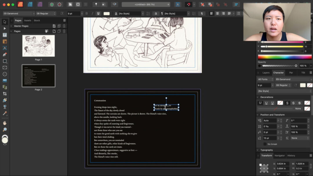
Today, I’ll be designing a bookmark with Adobe InDesign and Affinity Publisher to compare and contrast the key features of each program. I’ll first digitize a physical drawing I made using the Wacom One tablet, then walk you through my process of laying out text and preparing the files to be printed.
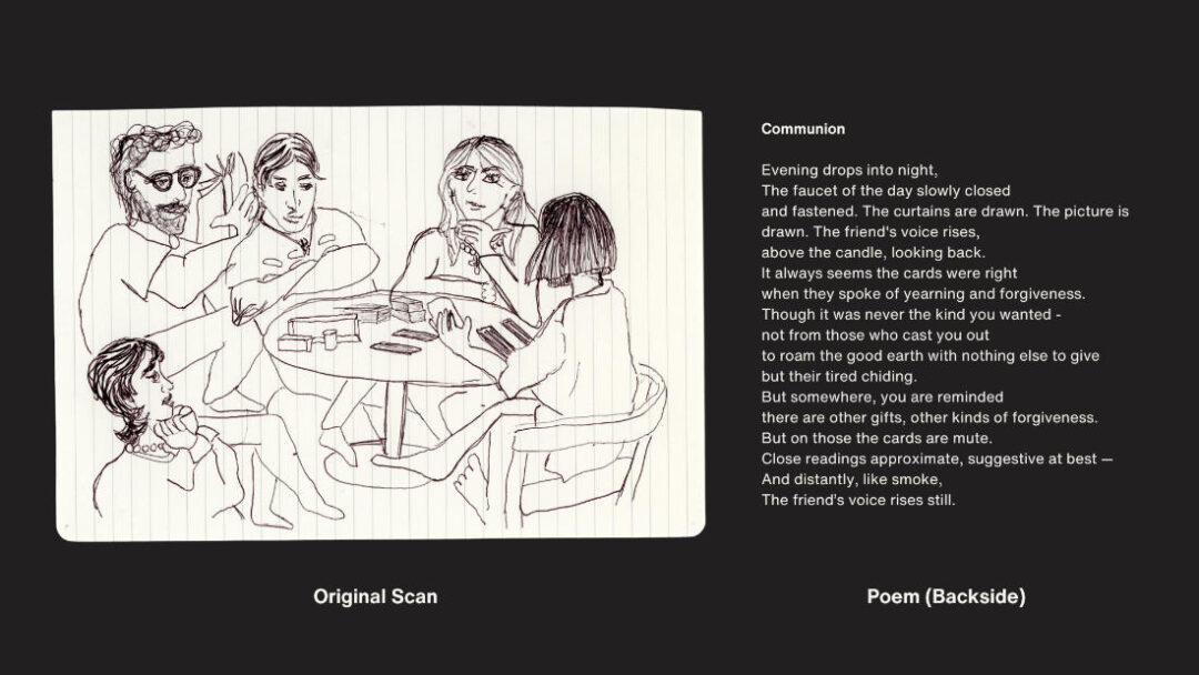
Just to give you some context, the bookmark combines a 2D illustration and a short poem written by my friend on the backside. As you can see from this original scan, I want to erase the paper lines. I’ll do that first by importing the file into Adobe Lightroom, which is the program I think has the best generative eraser tool for the job.
Digitizing the Physical Drawing
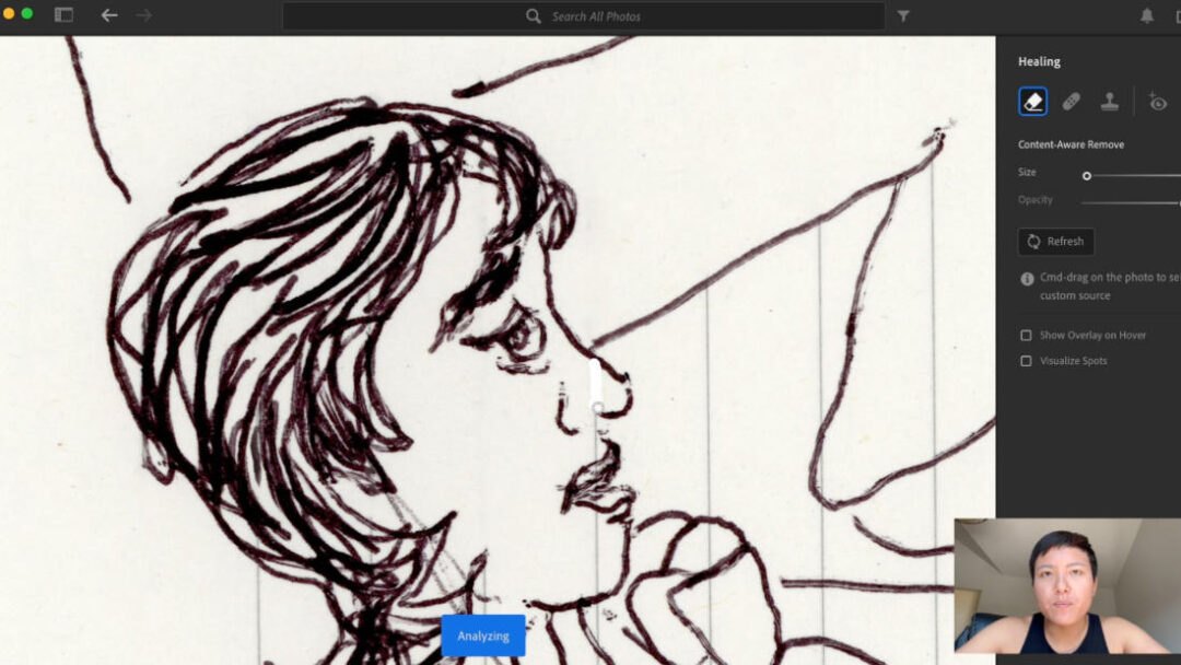
In Lightroom, I am using a tool called Generative Remove. This is a new tool released by Adobe as of 2024 and I think it’s the best for clean up jobs like this. I pair it with my Wacom One tablet to make straight selections that easily remove the lines. I’ll go ahead and finish cleaning this up. There is some artistry to this process, as I am making decisions on what elements to keep and which to erase.
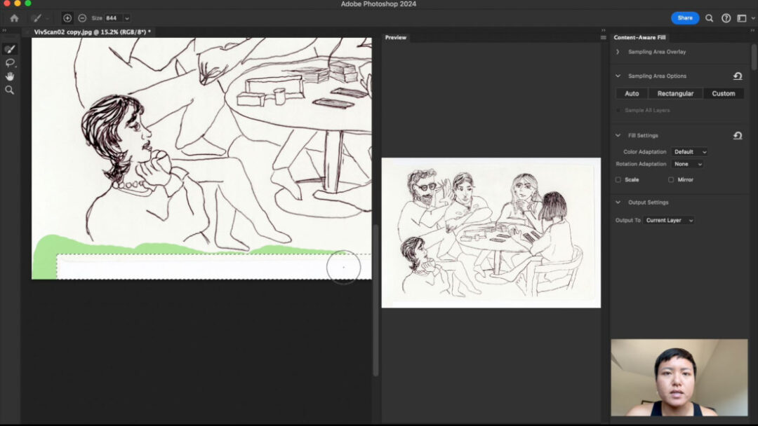
Then, I extended the paper background of the scan using Adobe Photoshop. First I select the space I want to fill, then I right click and select “Content Aware Fill.” Then I select the areas I want the tool to sample and fill in with more paper.
Laying Out the Bookmark in Adobe InDesign
Now let’s put the drawing into Adobe InDesign. Although I am calling this a bookmark, I am actually sizing my design to be the size of a standard postcard, 4 by 6 inches. As an avid reader, I prefer this size for my bookmarks instead of the traditional long and narrow bookmark format.
I begin by setting up my document to the bookmark dimensions. It’s important to add bleed and margins. The standard for both is 0.15 inches. Bleed means you have to extend the background by 0.15 inches to make sure the printers cut the print correctly. If you don’t include bleed, there’s a chance your prints could be cut with white borders around it. Margins are important to make sure that all text you layout stays inside them, because it’s possible the printers can cut each page slightly off-center and cut off your text.
InDesign makes it easy to customize layouts with its robust tools. Everything feels very professional and precise, which is great for larger and more complex documents.
Then, I bring in the 2D illustration. InDesign handles imported files well – whether they’re vectors or raster images. It’s easy to adjust the size and position without losing quality. Next, I add the poem. InDesign’s typography tools are highly detailed. From character styles to advanced kerning, I have complete control over the text appearance.
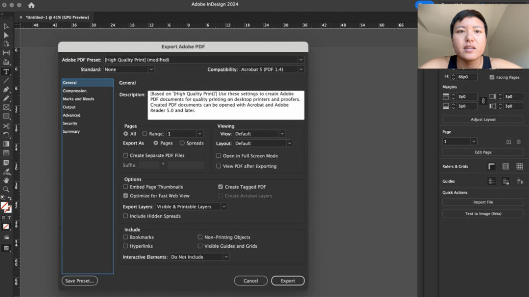
When it comes to preparing for print, InDesign gives a lot of options for setting color profiles, like CMYK for print. The export options for PDFs are extensive, and you can check for any preflight issues to make sure your design is ready for professional printing.
Laying Out the Bookmark in Affinity Publisher
Now, let’s move over to Affinity Publisher. Setting up the document in Publisher is similar – you can adjust dimensions, margins, and guides easily. One thing I love about Affinity is the interface – it feels slightly more user-friendly for beginners, with many tools clearly labeled.
Bringing in the illustration is simple here too. One advantage Publisher has is its ‘StudioLink’ feature. If I need to make adjustments to the illustration, I can jump directly into Affinity Designer or Affinity Photo without leaving Publisher.
Adding text is straightforward, and Publisher has a good range of typography tools, although not as many advanced options as InDesign. For simpler projects like this bookmark, it’s perfectly adequate.
Affinity Publisher also offers print preparation tools, letting you set up your design in CMYK and export directly to print-ready PDFs. It doesn’t have all the preflight options that InDesign does, but for smaller-scale print projects, the workflow is pretty smooth.
Direct Comparison
So, how do these two programs compare when it comes to designing a bookmark? Let’s break it down:
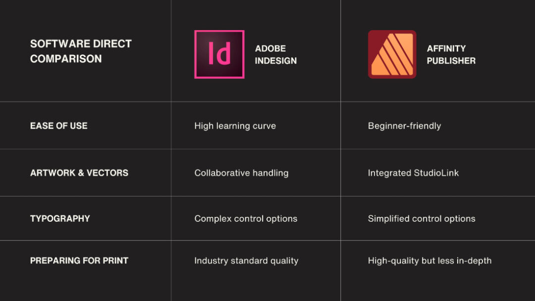
Ease of Use:
InDesign has a steeper learning curve but is incredibly powerful once you master it. Affinity Publisher, on the other hand, feels more approachable and streamlined – perfect for someone looking to quickly create professional designs without a steep learning curve.
Artwork & Vectors:
InDesign’s vector handling is top-notch but often requires jumping into Illustrator for detailed edits. Affinity Publisher’s integrated approach with StudioLink lets you tweak vectors directly within the program, which can be a big time-saver.
Typography:
If you need high-level text control for complex layouts, InDesign is the way to go. But for simpler, smaller-scale designs like a bookmark, Affinity Publisher’s tools are more than capable.
Preparing for Print:
InDesign excels with detailed checks and advanced export settings, making it ideal for professional print work. Publisher simplifies this process without sacrificing quality, so for most print projects, it’ll get the job done without the extra steps.
Conclusion
So, which software is right for you? If you’re a professional designer working on large, complex projects, Adobe InDesign’s powerful tools and extensive options are unbeatable. However, if you’re looking for an affordable, versatile, and easy-to-learn program for simpler designs, Affinity Publisher is a fantastic option, especially since you pay once instead of subscribing.
For this specific bookmark design, both tools worked well. Affinity Publisher felt a little quicker to navigate for a simple layout, while InDesign gave me a few extra features to finesse the final look. As you can see below, the results were pretty much identical, which goes to show the strength of both programs for designers at any level.
Thanks for watching! If you’ve used either of these programs, I’d love to hear your thoughts and experiences in the comments — I’m on Instagram at @studio_viv. Don’t forget to subscribe to Wacom’s Youtube and sign up for the Creative eNewsletter for more design tips and comparisons. See you in the next video!
]]>The first is the Persona System, which lets you switch between vector and raster elements in the same document. The second is the Symbols Tool, which allows you to create reusable elements that sync in real-time for efficient style updating.
Setup
When I’m traveling and have to do my design projects, the Wacom One connected to my laptop is a great setup. I have the size M (for Medium) so it’s really portable, while still feeling like a substantial surface to draw on. The tablet fits in my laptop sleeve with my 13-inch MacBook Pro. The Bluetooth connection is super easy, but I prefer using the USB-C cable for an instant link.
Why Should Designers Use a Drawing Tablet?
For my particular use case, I am 70% of the time designing for print — some kind of poster, publication, or product. This usually means a design combining 2D illustration with text. I also already remember all of my keyboard shortcuts on my Mac, so it is a lot faster and easier for me than touching through a bunch of menus. Affinity Designer is unique because it’s the only program where I can switch between vector elements and raster art on the same document. This streamlined workflow is possible with Affinity’s Persona System.
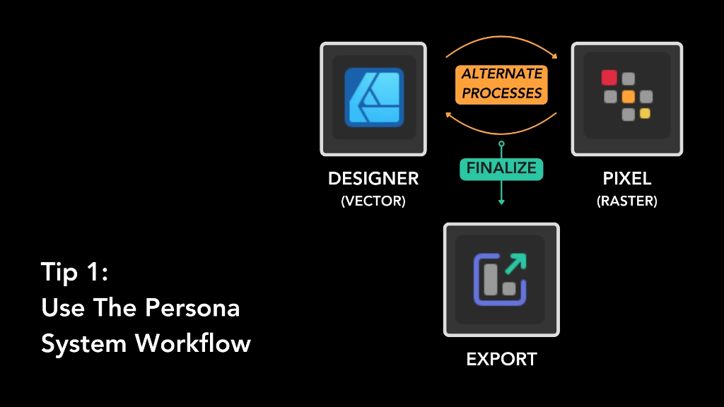
Tip 1: The Persona System – Designer, Pixel, and Export
As you can see here, there are three Personas. The Designer Persona is where you’ll spend most of your time if you’re focused on vector design, similar to how you would work in Adobe Illustrator. The tasks best suited for this persona are:
- Creating anything with vector graphics
- Vector-based text (This is crucial for printing sharp and clear text)
- Using symbols and reusable elements
The Pixel Persona allows you to work with raster images directly within Affinity Designer, something that Illustrator typically requires Photoshop for. The tasks best suited for this persona are:
- Pixel brushes; this is ideal for adding fine details or textures, or retouching
- Working with raster images
- Non-Destructive raster effects (blur, noise, grain, etc.)
The Export Persona helps you export in whatever file types you require for your project.
Switching Between Personas in a Design Workflow
The real power of Affinity Designer lies in the seamless integration between these two personas, allowing you to switch back and forth as needed:
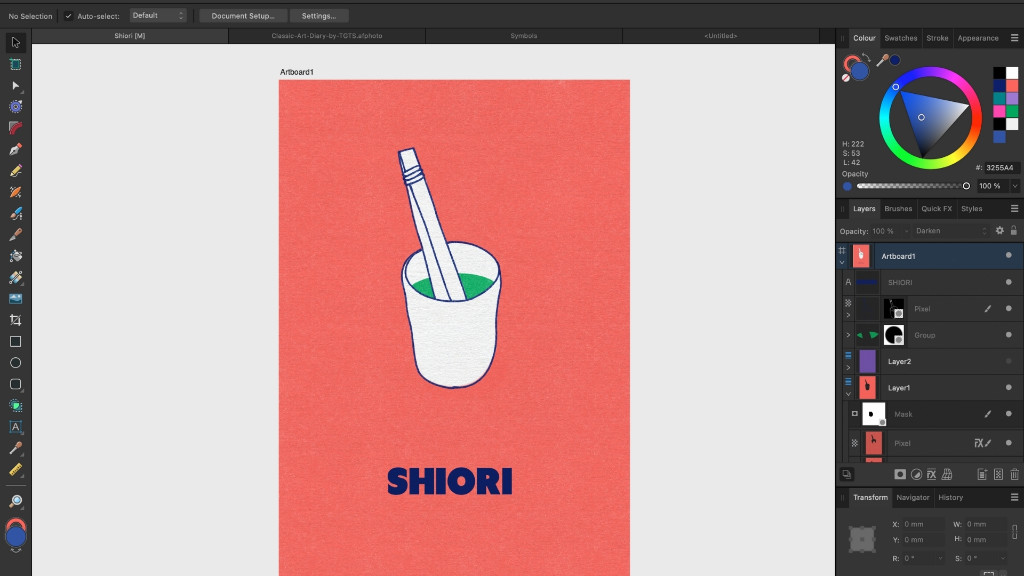
First, I start in Designer Persona. For this example, I used a personal photo of a meal I had in Berlin. I use the Vector Brush Tool to draw the spoon and teacup using the Wacom One tablet, which makes it super easy to create vector graphics from my sketches or photos.
Then, I switch to the Pixel Persona. I use a brush that mimics a risograph print, because I like the warmth that analog textures can add to digital designs. A useful shortcut to know is the keyboard brackets “ [ ”and “ ] ” change the brush size in both personas. I can also use the masking tool to erase vector curves in the Pixel persona without actually deleting them.
This is one of the ways Affinity Designer facilitates Non-Destructive Editing, which is crucial if you ever change your mind. Now I switch back to the Designer Persona to add type for the name of the restaurant. This file is essentially print ready and can go to the Export Persona.
In short, you can use Designer Persona to use vector tools and text, then switch to Pixel Persona to add texture and fine detail. Alternate between the two before going to Export Persona to prepare it for the file type you need.
This approach allows you to combine the precision of vector graphics with the richness of raster effects, all within a single document. The ability to switch processes without exporting to another program streamlines your workflow, saving time and effort while maintaining creative control.
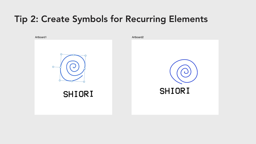
Tip 2: Creating Symbols for Recurring Elements
Symbols can be used for any kind of recurring element that is used in a lot of different materials. The most common is probably a logo and wordmark. Here I drew a super simple logo for the restaurant and added the wordmark below. Now you can access the Symbols panel through the top menu “Windows.”
Then select each item and click Create. Now you can drag them out of the Symbols panel to duplicate that element. You can change fill color, transform the text, rotate it, etc., and every instance of the symbol will sync with your changes across artboards.
Conclusion
So whether you’re an experienced artist exploring alternatives to Adobe, or a beginner learning the ropes, I hope these tips will help you use the Affinity software more efficiently so you spend more time being creative. I can highly recommend the Wacom One tablet if you’re an artist with an illustration background looking to take your artwork to the next level using graphic design tools.
Affinity Designer and the Wacom One tablet are less expensive, more streamlined, and will make a lot of people satisfied for 80% of their use cases, without overwhelming you with expert features. I hope you learned something new!
]]>A great alternative to the Adobe suite is the Affinity suite: Affinity Photo for photo editing, Affinity Designer for graphic design, and Affinity Publisher for print design and document layouts. Want to give them a try? Every purchase of a Wacom One pen display or tablet comes with a free three-month trial of the Affinity suite so that you can give it a try.
You may have seen the recent news that Canva purchased Affinity. While exactly what this will mean in the long term is unclear, there’s definitely the possibility that the combined forces of Canva and Affinity will result in even more resources and innovation going into the software. One important promise they’ve made, however: they say that Affinity will always offer perpetual, one-time licenses to purchase the software, as an alternative to the subscription model Adobe and some other software companies use.
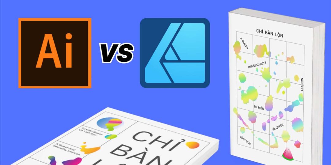
If you’re a graphic designer curious about how Affinity Designer compares to Adobe Illustrator, Vivienne Le has you covered. She’s a graphic designer currently based in Germany, and tried designing a book cover using her Wacom One tablet in both software applications to compare and contrast them. Check out the video she created below, or read on for a transcript.
Introduction
It almost feels tired to say Adobe Illustrator has long been the industry standard for vector graphic design, but with recent news of the online design platform Canva acquiring Affinity, I think Adobe has got some serious competition. Nearly 30 years old now, it’s worth reviewing how Adobe Illustrator holds up to its best competitor, Affinity Designer, in 2024.
Hi, my name is Viv and I’m a graphic designer based in Berlin. I’ll be exploring the design process of making a book cover with both Adobe Illustrator and Affinity Designer to compare the strengths and capabilities of each when paired with the Wacom One tablet. I made two abstract book cover designs to test the same tools on both programs, and I’ll be walking you through the process of turning my paper designs into vector graphics.
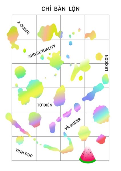
The book cover I’m designing is inspired by my friends in Vietnam who published the first collection of Vietnamese queer and sexuality slang with English definitions and many wonderful illustrations. For my sketches, I was inspired by children’s dictionary picture books and included some cute objects, shapes and some abstract paint blobs on top of a grid to convey the idea of breaking out of the mold.
My setup has my MacBook Pro connected to a monitor and the drawing tablet in front. Right now, I use the Wacom One M tablet as compared to an iPad or one of Wacom’s other tablets with a display, because I already do all my other work on my laptop, and this way it’s so much easier to keep all my files in one place. I’ll be using a combination of mouse work and the tablet to draw the vector graphics.
Designing with Adobe Illustrator
I began with Adobe Illustrator first. It’s just the one that everyone uses, so the UI is familiar to me. At the brainstorming stage, I am honestly a paper-and-pencil kind of girl, so I’m just gonna drop my sketch into here and work on top of it.
The basics
My Wacom One tablet works right out of the box without messing with any of the settings, and it’s so easy to pair to my laptop with Bluetooth and select the basic Brush Tool to draw simple vector paths tracing over my sketch. I mainly do minimalistic, abstract designs and don’t use all of Illustrator’s tools very often, but you can create way more complex shapes and illustrations with tools like Shape Builder and Blob Brush.
Working with stroke and fill gradients is as easy as clicking and dragging over the object to create the direction of the gradient how I want. I’m just using the preset swatches here and going for maximal color pop.
Image tracing
One tool that’s crucial to my workflow is called Image Tracing, and that’s exclusive to Adobe Illustrator. I’m not using it now, but I would say 80% of the time when I open Illustrator for work it’s because I’m using Image Tracing to turn bitmap or pixel-based images into vector paths, especially when I receive designs like stickers or illustrations from other people that weren’t made with vector graphic software, and I have to get them ready for print.
Typography
Illustrator also has way more features that are text-based, so if you work heavily with typography and need to edit not just the font but also mess with kerning and distortions, than this would be the match point. Here I just decided to use the Google Font “Be Vietnam,” since it’s pretty cute and one of the few typefaces with dedicated Vietnamese letterforms and adaptive diacritics (which are the accent marks above or below the letters), and is engineered for their readability. Illustrator is also integrated with Adobe Fonts, which is a massive library of some of the best fonts out there, and you can test them out in your project first before you decide to buy it.
Performance
I’m on a 2020 MacBook Pro, and Illustrator’s performance speed is pretty solid, though I usually have to mess around with settings each software update because it can get laggy dealing with complex files.
Layout
The new 2020-era updates attempt to make the entire program more beginner and user friendly. There’s a new AI popup bar that suggests contextual tools that adapt based on the selected object or tool, but it just always just kind of gets in my way. I would move it all the time and I’m due to reorganize my workspace, but also I just want Illustrator to work out of the box.
Compatibility
However, the synergy between InDesign, Photoshop, and Illustrator is crucial for me, and working in the Adobe ecosystem and being able to export in .AI files is crucial, as that’s the industry standard.
Here’s the finished design made with Adobe Illustrator:

Affinity Designer
Now to Affinity Designer.
Layout, performance, and Wacom compatibility
Right off the bat, I already appreciate the streamlined UI and the fact that it’s buttery smooth. It’s got all the main tools I use like Pen and Brush, and because it just feels lighter, I can actually see myself using the Pencil Tool to sketch if I wanted to do something quick while staying on my computer. It’s so easy to move objects around and I like that all the menus stick to the edges, so I can focus on the work and not on the settings.
My Wacom tablet also works out of the box without having to mess with any settings, but drawing just feels so much smoother. My entire workflow feels a lot easier, and I’m not constantly arranging so many open menus. Zooming in and out is seamless as I cleanup my vector paths, as you can see a lot of them didn’t close completely.
Colors, gradients, and menus
The gradient tool is pretty much the same as Illustrator’s, although I think Illustrator had nicer default color swatches. All the options are up here and are easy to understand if you hover over them, and you can even add noise to the gradient colors. Of course you can pretty much do anything in Illustrator that you can do in Affinity, but here the workflow and navigation feels more modern and intuitive. For example, Affinity uses sliders to control sizing and zooms, whereas Illustrator relies on its mainstay of drop-down numerical boxes, Affinity Designer’s sliders are a more intuitive way to determine sizing, whether you’re determining the appropriate stroke width or layer transparency.
If you haven’t used a vector graphics program before, or if you’re migrating from Illustrator like me, then tools are more or less in the same place. Except Affinity feels like a product designer removed every tool I don’t use, and kept everything I do use, then displayed it all more clearly and made everything faster. One drawback: Affinity doesn’t have a dedicated Image Tracing tool.
Compatibility
The file extension Affinity Designer uses is .afdesign, so to collaborate you would either share it with someone who uses Affinity, export it to another format like PNG, JPG, SVG, PDF, and I think the .PSD photoshop file too. But the risk in exporting to other formats is always that elements may be lost in translation, so that exported .AI files from Affinity Designer may arrive at the printer with missing or altered layers, making proofs even more important than normal. But it does import any Adobe extension file, so while it may not have the same level of integration and industry ubiquity as Illustrator within the Adobe ecosystem, there are easy workarounds.
Here’s the finished design I made with Affinity Designer:
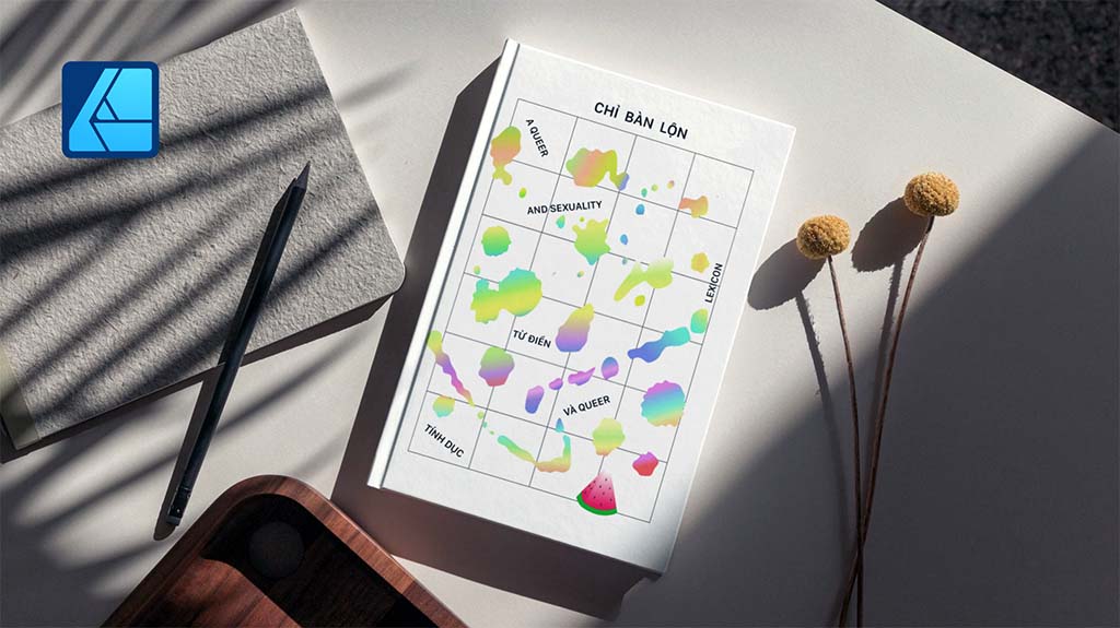
And here are the final versions, put into book mockups:
Conclusion
As you can see, the design process for both were … pretty much the same. Although Illustrator may have an edge in certain features, I just enjoy using Affinity Designer so much more when it boils down to the basics of actually drawing with it. Compared with how streamlined Affinity is, Illustrator is really hardcore and only a small percentage of people actually use all of the features.
On the other hand, Affinity Designer is faster, cleaner, easier to use, and cheaper. I actually got a free, three-month trial of Affinity with my Wacom One tablet, but you can buy it once for only 50 dollars, and own it forever. With how quality the product is, I’m pretty confident they’ll continue to update the program with quality features.
Now, will Affinity Designer actually replace Adobe Illustrator? Probably not. But there’s really nothing you can do in Illustrator that you can’t also work around in Affinity. And with Canva’s recent acquisition of Affinity, I think they could really challenge Adobe’s dominance over graphic design software in the coming years, especially in the AI space and for the 99 percent of people without design training.
The choice between the two ultimately depends on individual preferences, workflow requirements, and budget considerations. But if you’re looking for an excellent, cheaper alternative to just simply draw vector graphics, then I would highly recommend Affinity Designer.
]]>Unmesh Dinda, the creator behind PiXimperfect, is known for tutorials featuring some of the most dramatic and striking transformations possible with Adobe Photoshop — such as previous tutorials we’ve featured on this blog including Turning Day into Night, Cutting Out Hair From A Busy Background, and Making it Snow in Summer.
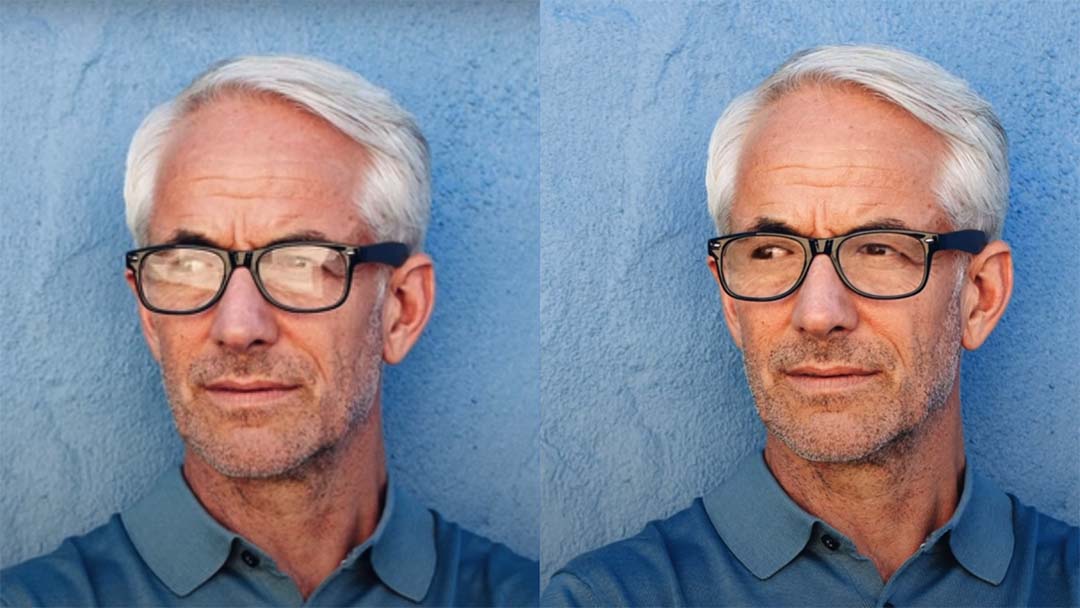
While eyeglasses help people see the world better, they also make it harder for the world to see one of the most important features of a subject — their eyes. In the below video and tutorial, Dinda shows you how to “magically” remove the glare from glasses in photos in Adobe Photoshop. Watch the video or read on to see how he does it.
The absolute best way to fix glare is through using two photographs of the subject in the same position, with and without glasses, and overlaying them in Adobe Photoshop. But if the only image you have has some detail around the eyes, we can make it work. Otherwise, removing glare from glasses in Photoshop is impossible when the eyes are entirely obscured.
For the past three years, I’ve relied on the Wacom Intuos Pro medium, which has accompanied me on numerous journeys worldwide. We’re gonna be doing a lot of dodging and burning, and the kind of precision and speed that we need for this is gonna be very hard to achieve with a mouse. Using Wacom’s drawing tablet for employing techniques used in this tutorial makes it an invaluable tool.
First we should desaturate the image, so its color doesn’t distract us from matching the brightness. Create a Solid Color adjustment layer, select a color with zero saturation, and set the blend mode to Color.
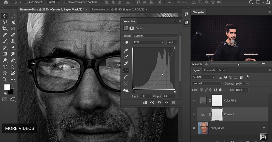
Next, let’s correct the brightness using curves. Create a curves adjustment layer, adjust the middle node downwards until bright areas appear natural, then invert (Ctrl/Cmd+I) the mask selection. Before the mask was white, and now all of it is black – this means changes will only show up on areas we paint white. Use a soft round brush with low flow to paint white on areas requiring adjustment.
Start painting. If you have practice and a tablet, this process will be faster than you think. Don’t worry about the glare edges, our focus right now is to use a basic burn to match the brightness.
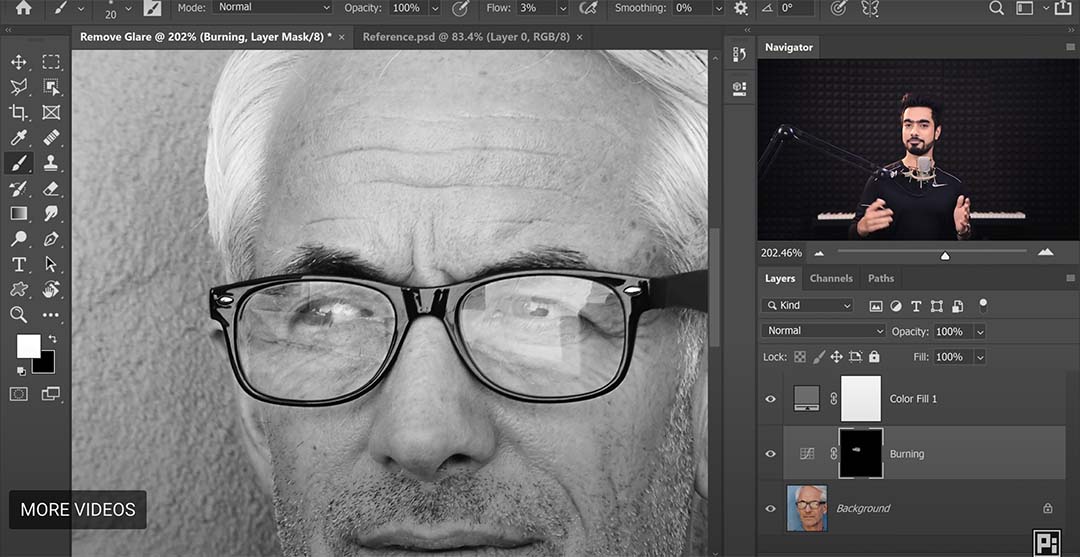
For further refinement, create additional dodging and burning layers to enhance results. Use an empty layer with Soft Light blend mode and adjust brush flow between 1-2 percent for precision.
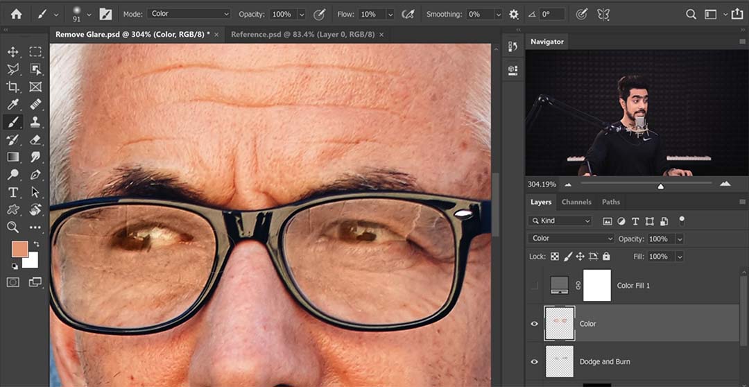
Next we must match the glare color to the surrounding image. If you disable the desaturation, you’ll see the colors don’t match at all. Easily fix this by creating a new layer, choosing a brush with 5-10 percent flow, and setting blend mode to Color. Use the eyedropper tool to sample nearby colors and paint over mismatched areas.
Darken the eyes using another curves adjustment layer, focusing on eye areas and painting with white on the inverted mask. Now, the last thing we need to fix are glare edges. Create a new layer and use tools like the Healing Brush or Spot Healing Brush to fix imperfections.
Keep in mind the Stamp tool doesn’t work on an empty layer, so we’ll have to create a visible layer for it. Ensure alignment of spectacle edges by sampling adjacent areas and painting carefully. For other areas, create another dodge and burn layer with a soft light blend mode.
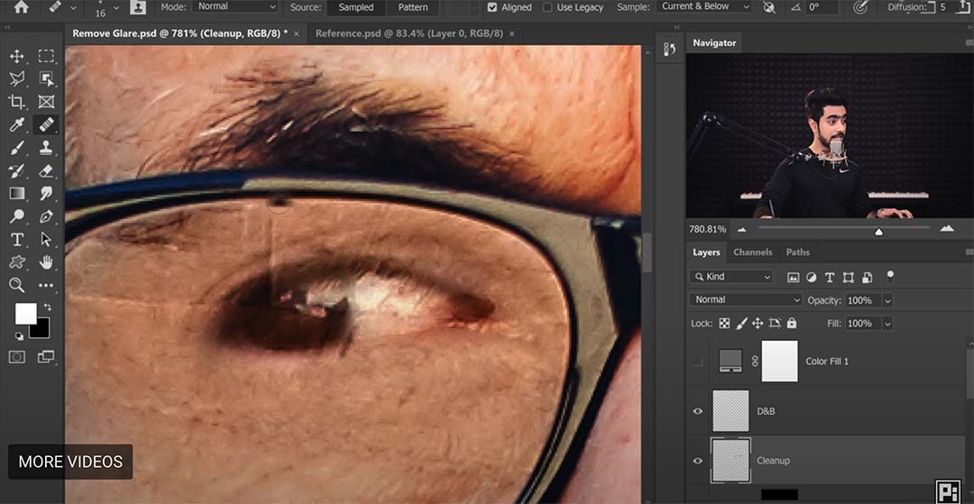
To avoid overcorrection, maintain natural features by adjusting layers as needed. If desired, retain a hint of glare by grouping adjustment layers and reducing opacity.
To recap: First, match brightness using curve and dodge/burn layers. Second, correct colors with a Color blend mode layer to sample from surrounding areas and paint to match. Third, clean the edges with tools like Clone Stamp, Healing Brush, and Spot Healing Brush. Continuously adjust layers to maintain natural appearance throughout the editing process.
And that’s it! Let’s take a look at the before and after:

About PiXimperfect
PiXimperfect is one of the premier free online resources for learning Adobe Photoshop and Lightroom. With over five million subscribers on YouTube, it’s clear that his high quality tutorials are some of the best.
In this tutorial Colin Smith, the creator of PhotoshopCAFE, shows you a powerful way to change the depth of field and blur the background of a photo in Adobe Photoshop. Check out the video below for the Adobe Photoshop and Lightroom tutorial, click here to visit PhotoshopCAFE and download the project files if you’d like to try the technique for yourself, and read on for all of the details.
Depth blur
Alright, let’s get started with this train. So the first thing we’re going to do is go to Filter in the menu bar, choose Neural Filters, then turn on Depth Blur. Maybe you’ve seen this filter before, but I’m going to show you how to manually overwrite things and get a much better result than just using than your filter on its own.

If you wanted to change the area of focus, you could simply just click on different parts of the photo and notice how this will recompose it. But you may see how there’s areas that get missed. Let’s look at how to fix all of that and actually use a better way of applying it than depth blur.
Depth map
So we’re going to go all the way to the bottom of the menu and choose output depth map only. On this depth map, lighter-colored things means they’re further away. Where they’re darker means they are closer to the camera.

Okay, let’s start with the first trick that you might not have seen before. Increase the effect of the depth map by using Levels (Ctrl/Cmd+L). And then what we’re going to do is take the shadow area and slide that closer to the middle. And it’s also going to the midtone. So what we’re doing and we’re intensifying those grays to give us more of an effect.
The next thing we need to do is to look at the area between the sticks to the right of the train. We want to make sure that this area is on the same depth plane as the background. Right now, they are different shades of gray so they will be on a different plane. So let’s make a selection around these areas.

Object selection
Select the Object Selection Tool (W) and select the area between the sticks. Then use the Polygonal Lasso Tool (W) and add to the selection. The way to do that is to hold down the Shift key and just click the points of the rest of the area.
Applying the blur
Turn back on the depth field top layer. Notice these are the shades that we want to be painting with. So grab a brush, hold down the Alt or the Option key and that will make a sample. Make the brush a little larger and let’s paint those out. Just pick up the same kind of tones.

All right, let’s go to the channels. And what we want to do now is duplicate one of those channels. Let’s just grab any of them red, green or blue, they’re all the same. Duplicate it with Cmd/Ctrl+J. And then this gives us another map. We’ll just call it “MAP.” It doesn’t really matter what you name it. Make sure you select RGB again. Let’s just duplicate the background so we can show it before and after.
Now let’s use a really powerful tool to apply the blur. We’re going to choose Filter > Blur > Lens Blur. This actually simulates the lens on a camera. So as you can see, you can choose different types of apertures. Now the important thing is we want to make sure under “Source” we’re choosing our depth map.

Let’s increase the blur so we can see the radius. Now watch what happens if we click the “Set Focal Point.” If we click on the front of the train, notice how now it comes in nice and sharp. Or we could click the back of the train. We could click on different parts of the photo to bring these areas into focus and notice we get the proper background blur in these areas there because of the way we selected them. Click Okay. Now we can look at it before and after.
Conclusion
So as you can see, these automatically generated depth maps are incredibly powerful. Let me know your thoughts if you learned anything new in this video, and if you’re new welcome to Photoshop, hit subscribe turn on notifications so you won’t miss any of my videos. And if you got any value out of this video, smash that Like button into dust and until next time.
]]>
Follow a Traditional Process
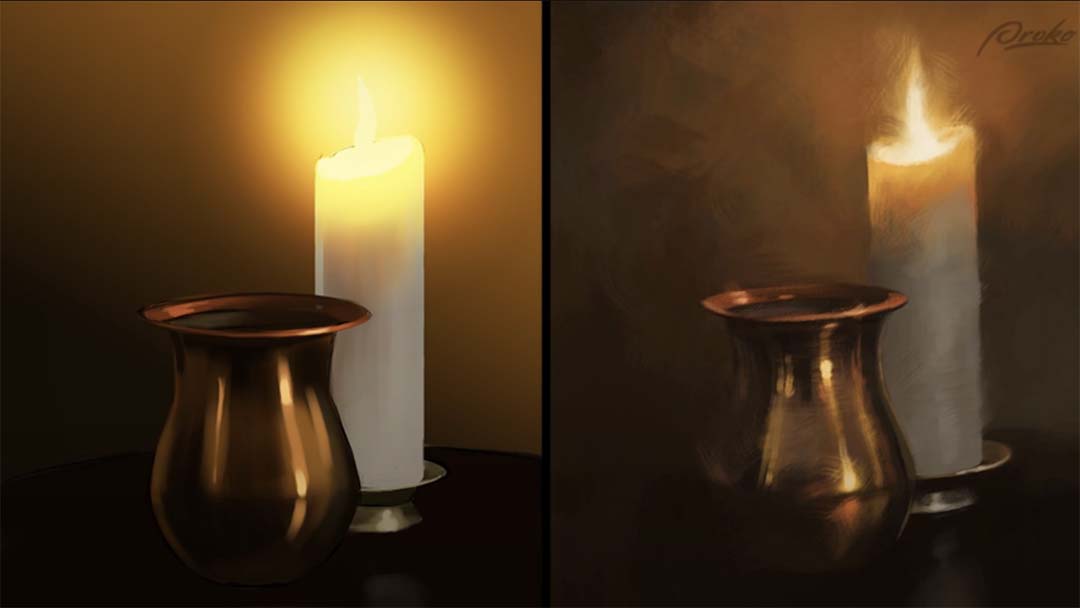
Do the same steps and procedures in digital as you do when working with real paints on a canvas. When working with oil paints, I stain the whole canvas a neutral or warm color. Then, I do a quick gesture line drawing before adding washes of local color to block in big forms or to act as contrast to the colors I’ll use later in the painting. Doing similar layers of undertone in a digital painting create an illusion of more texture or color vibration than would be there otherwise.
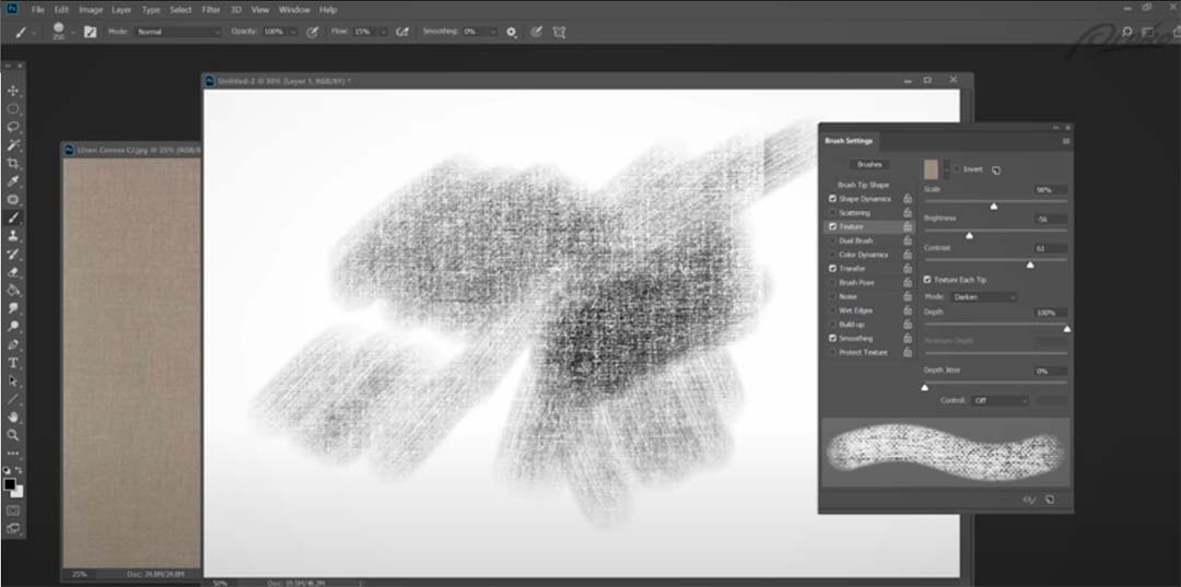
Textures!
One of the things that helps make a digital painting look like it was made with real materials is when there is visible canvas weave or paper grain. And that’s really easy to replicate in programs like Photoshop. But you can, and should, learn how to make and customize your own brushes so that you can have more control over the look of your paintings. For a quick tutorial on how I create a streaky textured brush, watch the video.
A word of caution: If you use the same texture on every brush stroke everywhere, it can become monotonous and repetitive. So experiment with different brushes and textures throughout the same painting.
Limit your layers
Ideally, paint on just one or as few layers as possible. On a real canvas, you only have one physical layer to paint on. Many layers in a digital painting are a safety net. It can hold some artists back from being more adventurous and expressive with their brush work. When you do all or the majority of your painting on one layer, you’ll be thinking and solving problems more like a traditional painter. And when you work more like a traditional painter your paintings tend to look more like traditional mediums.
Avoid special effects
Digital painting allows for special effects, but they can look really artificial. So I start this painting again on the right, using a variety of streaky and textured brushes. From start to finish, I avoid selections, fills, gradients, multiple layers or automated actions. When problems are solved with expressive brushwork and smart color choices, it has a much more traditional look. Also, when you make a mistake, try not to use the “Undo” command. Just paint over it.
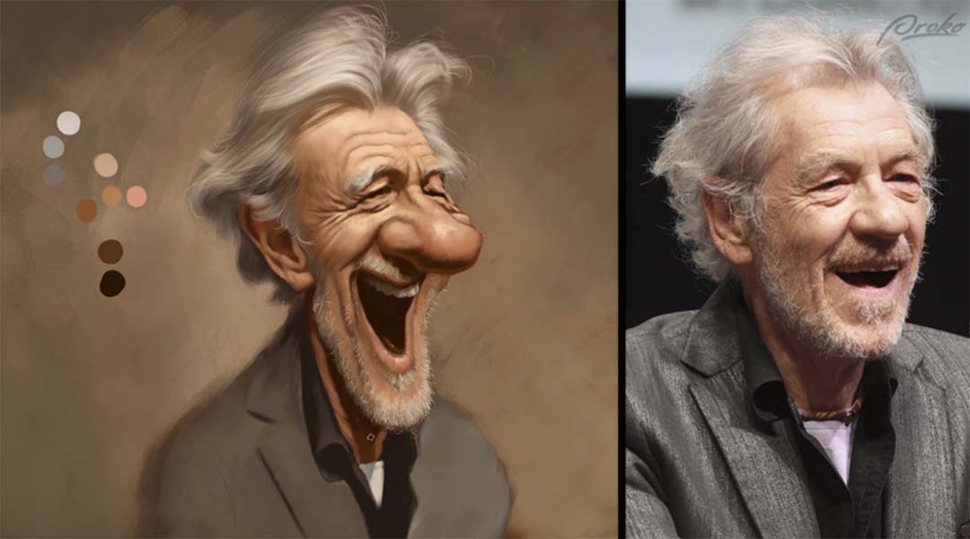
Use a controlled color palette
When looking at your subject or reference photo, decide first what the color temperature of light is. Then pre-select a limited range of colors and put them on your palette before starting. Set up all of the major halftone, transition and shadow colors.
When working digitally, you can put the dabs of palette colors right on the canvas you’re working on. Keep them off to the side and as you paint, using the eyedropper tool to pick a color from your palette when needed. You can lighten or darken the palette colors, but try not to add new colors as you go along. And most importantly, don’t sample colors directly from the photo. The more you engage your brain in this process, the better you’ll eventually get at choosing colors intuitively.
Stay back!
The farther away you are from the painting while working, the more impressionistic and painterly your work will be. When painting digitally, stay zoomed out on your work as much as possible. Try to keep the whole painting in view while working on it. If you zoom in on small areas too much, it will tempt you to overwork the details, increasing the chances that you’ll sacrifice the unity of the composition.

Forget the lines — it’s all about edges
Edge variation is one of the most overlooked and underused techniques in digital painting. And it’s probably the single most important trait of an artist’s style, other than color, which distinguishes you from other artists. You’ll get a variety of edges by painting back and forth over the line drawing, pushing, pulling and smudging the digital paint. Real oil and acrylic paints mix on the surface, colors overlap and cross contaminate with each other. The more variety you add to your edges in your digital work, the more painterly your work can look.
To soften and blend edges, look for brushes that have broken or streaky footprints and then use a light touch. Use smudging tools sparingly. And don’t forget, for visual contrast, there should be plenty of hard crisp edges in a painting as well if you want a realistic look. As a general rule, a good place to soften or even lose an edge entirely is when the values of two adjacent shapes are really similar.
Conclusion
So you may have noticed a pattern. The recurring theme here is to try to mimic the procedures of traditional artists, and to limit your digital tools so that they reflect more accurately the limitations of traditional materials. If you do that, your digital work will be more a reflection of you and your skills, rather than the software.

About Court Jones
Court Jones works as a freelance commercial illustrator and caricature entertainer in San Diego, California. He has done a lot of published illustration and concept work for film and TV projects, editorial and product illustration for clients such as Atlantic Records, Upper Deck, Rolling Stone Magazine, Wired Magazine, The Washington Post, The San Diego Union-Tribune, San Diego Uptown News and Blizzard Entertainment, among others.

About Proko
Proko is an online resource for artists where they’ll get fantastic art instruction videos that are both entertaining and educational. Proko’s core message is to make learning fun. If you’re having fun and enjoying the learning process, you’ll learn better because you’re paying attention, will retain more information, are more likely to continue learning and much more likely to go back and re-watch the tutorials. You’ll also leave more inspired and highly motivated to go practice. Check out their YouTube for free tutorials, or their website for all of their offerings.
In this tutorial Colin Smith, the creator of PhotoshopCAFE, demonstrates how to edit a photo to get the maximum detail out of the sky and the foreground. Check out the video below for the Adobe Photoshop and Lightroom tutorial, or read on for all of the details.
1. Make adjustments in Lightroom/Camera Raw
If you’re not doing it inside of Lightroom or you don’t have Lightroom, just go into Adobe Bridge, right click on the image and choose to Duplicate. Select both images and choose Open in Camera Raw. Do the same adjustments as below.
We first begin in Lightroom. Duplicate (Ctr/Cmd+’) the photo, and it will create a copy of the image.
Select the copy and go to the Develop module. What we want to do is bring out the detail here in the original sky. So bring Highlights to -100 and Exposure to -1.55. Yes, the foreground got dark, but it doesn’t matter.

Now select the original image. Notice the “blooming:” this means that we are losing edge detail because of the brightness. With the original photo selected, bring Highlights down to -64 so we can see our edges clearly. This also isn’t going to overly affect our foreground. Also lighten Shadows to +40 to bring out detail in the trees.
Now select both images by clicking on the X|Y button in the Library module to view them side-by-side. You can see below that the image on the left is exposed so the shadows are lightened. The image on the right is exposed so highlight areas will reveal the sky.

Now select both photos, Right Click > Edit In > Open as Layers in Photoshop. Now Photoshop will launch with these two images as individual layers.
2. Merge photos together in Photoshop
Now, we don’t want to replace the sky. We want to use the real sky. So with the top image selected, choose Select > Sky tool.
There will still be little bits that haven’t been selected. So what we want to do is we want to expand this selection a little bit. Go to Select > Similar. This will select the similar areas inside these little gaps that were missed on the first selection. Now deselect the areas that were incorrectly picked. Choose the Rectangular Marquee Tool. Select Subtract. Then drag a selection box over the areas we want removed.

Now hold down the Alt/Option Key and click Layer Mask. What this does is masks everything opposite your current selection. So maybe the background is just a little bit strong. What we’re going to do is we’re going to select the mask, go to Properties, see the Density — this slider controls the effect of the mask. So we can adjust the amount of the sky that we want and mix it with the layer underneath to make it look more believable. We set it to 73%. Notice the blue in the top right corner of the sky. If we zoom into the original image, that blue is actually from the original sky, but let’s fix it to be gray.

So to make a selection, let’s go back to our top layer, make sure we’re selecting the layer and not the mask. Now select the Magic Wand Tool (W). Set Tolerance to 30. Check Anti-alias. Change Sample to 5 by 5 Average. Uncheck Contiguous. Then click on the blue corner to select it. Now select the mask, choose the Brush Tool (B), and make black the foreground color. Then paint over the blue corner of the sky.
Don’t turn off the selection just yet! Create a New Layer in between the two layers, and use the Eyedropper Tool (I) to sample a gray color from the image. Notice how the foreground color will change to be this gray you sampled. Now use the Brush Tool (B) and paint the blue corner. Deselect by pressing Ctrl/Cmd+D.

3. Fine-tune color using curves
Let’s create a curve adjustment above the middle layer. The reason we’re putting it between our top layer and these layers underneath is because any adjustment we make is going to affect our sky area, and our little corrected patch of gray sky. Play around with the contrast by dragging different parts of the line up and down in the Curves panel. We darkened shadows by dragging the left side of the line down and brightened highlights by dragging a point on the right side up.

To give it more color, say blue, select the Blue channel from the RGB dropdown menu. Dragging the line will increase blue, dragging down will decrease blue (and make the image more yellow). We increased a bit of blue to the shadows like so.
If you feel it’s still a little fake, go back to our mask and lower the Density. That’s it! We hope you learned something new here, enjoy!
The final product:

In this tutorial, Colin Smith of Photoshop Café shows you his photo editing workflow to make a dramatic change to your landscape photos. This tutorial will help you quickly make landscape photos look better than ever using your Wacom pen display or pen tablet and Adobe Photoshop software.
Note that references to hotkeys and key commands are Colin’s or are Photoshop defaults; if you have changed your hotkeys or set up your ExpressKeys, some of the instructions might not match your exact workflow setup. Check out the video below, or read on for a step-by-step breakdown of the tutorial.
Getting started
This tutorial assumes that you’re starting with a Raw photo. If your photo is in JPEG or another format, you can skip to the next step.
Camera Raw Adjustments
First, change the profile of your raw photo. It may be set to the default Adobe Color. Click on Browse Presets go to Camera Matching. Select one that has a neutral contrast and colors you prefer.

Now let’s make adjustments. First, warm the color temperature. Then adjust highlights and shadows to reveal lost detail. Then do an overall Exposure adjustment, deepening Blacks and pumping up Whites. Notice there’s a little gap there on the histogram on the left hand side: that means that nothing is pure black. You can also use more contrast if you want, it’s essentially the same as using the whites and Blacks together.
Hit the Backslash ( / ) key to see before and after. There’s more detail in the shadows and highlights now.
Clarity makes the photo look sharper, but also more artificial. Texture brings out details in photo textures without giving halos around the edges. Increasing Dehaze can really make these clouds look good. So, let’s just give it just a little touch, and notice as I do that it really clears up the image, but it does darken it a little bit. So when you do that, sometimes you have to roll back off on the blacks. Then go down to Optics, and use profile corrections to remove distortion, vignette and fringing.
Finally, open the image as a Smart Object. Why do we use a smart object? Firstly it is non-destructive, so it protects the pixels. Second is the ability to go back to Camera Raw at any time.
Dodging and burning setup
Create a new layer, and call this “DB” for Dodge and Burn, and change the mode to Overlay. When I go into Overlay, it gives me the ability to fill this with a 50% Gray. This isn’t necessary if we’re going to use the brushes, but since we are going to use other tools, such as dodge and burn, then we’ll turn it on. In Overlay mode, you don’t see the gray fill. Some people like to work in a soft light or a hard light, and that’s fine as well.
Duplicate the layer by pressing Cmd/Ctrl+J. Name the copied layer “Lights.” We’re going to do the darker areas, and then we’re going to do the lighter areas by putting them onto separate layers. This gives us the ability to adjust the strength of that later on.
Now start doing basic dodging and burning. Hit the D key, and that resets the foreground and background colors inside of Photoshop. Then grab the brush tool, start with the Soft Round brush, and set hardness to zero.
Pen Pressure Settings
Using pen pressure is essential for getting the most out of your photo editing, which is why most professionals use Wacom pen displays or pen tablets for photo editing. So, make sure make sure Pen Pressure is selected to affect Opacity. Then adjust the Flow. Opacity is how much strength that you get from your brush, while Flow is how fast it comes out. Use a lower flow to build up your effect over time; I set flow to 10%.
Now, the other thing you might want to adjust is the size of your brush on the fly. If you hold down the Ctrl/Cmd (and the Option key on Mac) and drag up or down, you can change the hardness, while dragging left or right will affect brush size.
Dodging and Burning for Composition

Paint with black onto the DB layer, which is “burning.” I’m bringing out more of the detail in the clouds now — see how just the darks are coming out? Burn the horizon, and the corners, to give more of a vignette and draw the viewer’s eye into the image.
Now go to the Lights layer, and then we’re going to hit the X key. This is going to give me the lighter area. I want to emphasize certain areas of sunshine. Paint these lighter tones to give just a feel that there’s a little bit of sunlight kind of coming through. We’re creating the area that we want to focus on. Change the mode to Soft Light so it’s not blowing out the colors or causing us to lose some of that area in the photo.
Dodging and Burning for Dimension
Now I want to create a little bit of shape with dodging and burning. Create a new layer in overlay mode. Fill it 50% Gray. Set Brightness to 50. Hit the D key, reset foreground and background color, and keep working with 10% flow. And I’m just going to show you just a little bit of how I can create some shape and dimension using this Dodge inverter. Paint these shadows to add some dimension to the image.
Do the same thing for the highlights. And this is just going to kiss it with light and just really make the image come to life. So once again, create a new layer, put it into overlay blend mode, hit that 50% Gray. Paint with white as the foreground color. Notice how those lighter areas just tend to lift those parts of the image.
Group these layers together by holding the shift key while selecting all of them, then Cmd/Ctrl+G to create a group folder. Name the folder “DB” for Dodge and Burn. Adjust the opacity of this layer to adjust the strength of the edits you’ve done so far, to your preference.

Before we sharpen this, I’m going to select everything and then I’m going to hold down a keyboard shortcut, which is Option/Alt + Cmd/Ctrl + Shift + E to create a new layer on top that contains everything underneath. It’s just flattened into one layer while preserving everything underneath.
Final Camera Raw Adjustments
Now let’s go into the Camera Raw one more time. Choose Filter and use Camera Raw. The final adjustment will pull everything together to unify it. Warm the temperature and recover the highlights a little more. Deepen shadows and give it a little punch of contrast.
High Pass Sharpening
Now I’m going to do nondestructive sharpening. Press Cmd/Ctrl + J to duplicate that layer, and then we’re going to change it to overlay blend mode. It’s going to look overly contrasting at first, but this is just transitional.
Choose Filter>Other>High Pass. This is what’s known as High Pass Sharpening. Notice right now it looks a little sketched, kind of painterly, so lessen this effect. It’s giving us some more sharpening, which is looking quite nice.
If you didn’t want to sharpen the background, what you can do is create a layer mask, and then choose a gradient. Black will hide that layer and white will leave it untouched. Paint away the sharpening just at the top. Set black as the foreground color there, and then use a linear gradient. Notice the transition will happen just in that area that I’m dragging in, so everything outside of the top will be completely erased on that layer or hidden and then everything in between the transitional area will slowly transition.
If I hold down the Alt + Option keys and I click the areas that are black ahead and the areas of gray are fading so we don’t get an abrupt transition. But see how the sharpening is appearing in the foreground, but in the sky and the background it’s not sharpening. You don’t want to sharpen distance to add atmospheric perspective.
Conclusion
I use this process on every single landscape photo that I process. Sometimes I skip some steps, sometimes I might add some different steps, but this gives an overall feel of how I like to edit my landscape photos. One thing important to note is to keep everything non-destructive, so anything can be changed at any time.
One last tip: when you go away and then come back and look at the photo with fresh eyes, you’ll see things that you don’t necessarily see when you’re working on the image. So make sure to take a break and come back.
Before:

After:


About the presenter:
Colin Smith has been using Adobe Photoshop professionally for 20 years. He does training for Adobe and Apple and has written 20 books. At his YouTube channel, PhotoshopCAFE, he has hundreds of easy to follow Photoshop Tutorials and tips as well as Lightroom tutorials and occasional photography tech or drone videos.
For more information or to see more of Colin’s free Adobe Photoshop resources, check out the Photoshop Cafe website, or check out his premium training library.
In the below video, Corel Painter Master Elite Aaron Rutten walks you through the basics of how fluid paint works. The below article is a summary of his tutorial; for more information about Aaron and to sign up for a course, see the bottom of this article!
Fluid Paint Categories
Fluid paint brushes can be found in two new categories:
- Fluid – Build and Sculpt: digital styles.
- Fluid – Paint and Blend: traditional styles.
Given the name, you might get the impression that fluid paint is mostly for glazing and other wet techniques. However, by combining the properties in different ways, it’s possible to create blenders, oils, inks, impasto, and even dry media. You can even enable fluid paint from any of your favorite Legacy brushes to extend their opacity grain and blending capabilities.

How does fluid paint work?
Fluid paint combines enhanced cover, opacity, and glazing technologies. They might look a lot like Legacy glazing brushes, but there are several features that make them different.
First, fluid paint leverages the enhanced cover method so you get the added benefit of GPU acceleration, plus more control over the appearance and blending of brushes. For example, you get heightened control over grain visibility and, combined with the new highly detailed fluid paint papers, you can create strokes with bold texture that doesn’t get filled in at higher opacities.
Second, you can limit the maximum opacity level of your fluid paint strokes so that they do not build up beyond a certain opacity. Legacy glazing brushes on the other hand build up as you overlap consecutive strokes, eventually reaching 100 opacity.
Third, fluid paint can be used on default and thick paint layers. Legacy glazing only works on default layers.
Why is it called “fluid?”
There are different types of wetness in traditional art. A marker is wet, and when you overlap strokes the pigment builds up darker, with sharp overlaps. However, other types of wet media do not build up as strongly, and the wetness of the canvas or medium diffuses any harsh edges where strokes overlap.
The Legacy opacity stroke builds up more like a marker, and the fluid paint stroke looks more like a thin glaze on a wet canvas. It feels like painting with a fluid into a fluid. It gives you the ability to control the opacity by deciding where it does and does not build up using pen pressure.

Fluid opacity
While they can be used on the canvas layer, fluid paint brushes are meant to be used on a separate layer because transparency is what facilitates the fluid effect. If you paint directly onto the canvas, the white of the canvas will ruin the transparency effect and you’ll likely get unwanted shifts in color when you blend.
With the right settings, fluid paint can build up evenly at low opacities, which makes it easy to create an even glaze over underlying layers. You can also easily fade gradually to stronger opacities to glaze more thickly. This is closer to how a traditional pigment would behave as it runs out or becomes diluted.

The fluid paint panel
You can enable and disable fluid paint for brushes that can support it in the panel. Enhanced cover is required to enable fluid paint so aside from the general panel, a good indicator that a brush can support fluid paint is the paint opacity fly out in the properties bar. It also includes controls for paint layering, formerly known as stroke attributes.

Paint layering with fluid paint
Fluid paint brushes can feel like paint, dry media, or watercolor. To complete the feel, the right combinations of paint layering and composite method make the medium blend properly with itself and the underlying colors.
For example, oil paint and chalk are opaque and cover underlying layers, but both become semi-transparent when thinned out. On the other hand, watercolor is made of transparent pigments that tint rather than cover the underlying layers. You should be able to see through the underlying colors quite easily, and all that is obscured are the colors.
To make this look like a transparent medium, change the composite method of the layer to Multiply. Now it blends correctly with the background, but overlapping strokes don’t get more concentrated like a pigment should.
To achieve a watercolor effect, combine this composite method with paint layering. It is not compatible with thick paint layers so work on a default layer. Multiply will cause the strokes to build up darker giving you media that looks more transparent and concentrated rather than opaque like oil paint and you still get the benefits of being able to create smooth strokes with heightened opacity control. The downside is that now subsequent overlapping strokes will build up even with low pressure so you will no longer be able to fade harsh transitions like you could with paint layering disabled.
For a more vibrant shading, you could use the Color Burn modes or for pigment that looks diluted, use the Gel modes. Just be aware that gel is a proprietary mode that only works with Painter. For the most predictable results, be sure to match your composite method to the merge mode you have selected.
You can even add highlights without having to change your color by overlapping Strokes using the Screen or Color Dodge modes.
Conclusion
This is a brand new technology, so it’s up to you to figure out how to use it in your artwork. Experiment with it, and we’re certain you will find it to be very useful.
About the artist

Aaron Rutten is a Seattle-based Corel Painter Master, who specializes in combining traditional art techniques with modern digital art tools. While he works with both traditional and digital media, he prefers to be on the leading edge of a constantly-evolving profession by embracing the latest art tools and technology. He is currently putting most of his focus into his popular YouTube channel, where he teaches people how to make digital art. He also sells art courses on Gumroad.
If you’ve found this sample lessons to be helpful, consider attending Rutten’s Corel Painter 2023 Beginner’s Training Course — Wacom blog readers who sign up save 15% on purchase of the course by buying through the link above! Here’s a full syllabus of the course, so you can see exactly what Rutten teaches. And if you become a member of Rutten’s training platform, you can save even more on his courses.
]]>Proko is a hub for artists to improve their skills and connect with a community of like-minded peers and talented mentors. They provide a wide variety of online courses that can be beneficial for both digital and traditional artists. To see all of Proko’s offerings head to their website or check out their Youtube channel, where they post free short tutorials, including the one below.
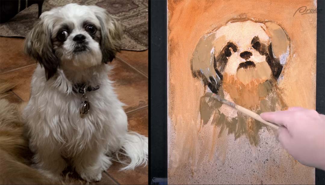
The blog post below is a summary of this video, “How to digitally paint in grayscale,” featuring artist Jon Neimeister.
In this lesson, we’ll be exploring a simplified digital workflow just to get used to using our tools in a digital environment. We’ll keep this process fairly simple for now, and dive into more advanced techniques later.
While our end goal is to be able to paint original images from imagination, we’ll start this course off by using references. Using a reference takes a lot of complicated decision-making off your plate, and allows you to focus on learning just the process. The important thing is that your reference has very clear and simple shadow shapes, that’ll make the whole thing a lot easier.
Let’s begin by making a clean and accurate drawing to work from. It’s important to take our time with the drawing step and build a solid foundation that we can paint on top of.
Lay-in
Let’s start with a simple figure painting. I’m going to start with a fairly simple drawing lay-in here focusing on the gesture of the figure’s largest forms first, such as the rib cage, hips, and head, and drawing the limbs as relatively simple cylinders with just a hint of anatomy applied to them.

I’m also working with more of a constructive method than an observational method, so I’m looking at my reference, observing the shapes, forms, and gestures, but then drawing them using perspective and simple shapes in 3D form rather than simply focusing on the two-dimensional shapes and silhouettes from my reference.
As I go through this process, some of my shapes and forms may end up being slightly different from the reference. As long as my figure looks accurate on the canvas, I’m not concerned if it matches the reference perfectly. As long as the overall proportions and perspectives feel correct.
I can still use some of the 2D shapes of the reference to double-check my proportions, such as the small negative space between his closer arm and his further leg, creating a little triangle of white next to the belly. I found that to be a helpful reference for my proportions but you’ll notice that the reference also has a small triangle of negative space between the two arms and next to the pec. In my drawing, that’s not there.

Although different from the reference, I’ll keep this pose because I trust my construction and proportions. My pose is slightly altered. Throughout the drawing process, I started with simple forms and progressed to more complex ones. I use the eraser tool with a soft brush to lightly erase and refine my line work. This helps me fix issues and add missing details. By repeating this process, I refine the figure from a basic gesture to a complete anatomical drawing.
If you zoom in too early and start working on things like arms, legs, and feet, you’ll lose the context of the whole figure or the whole painting. Whenever you’re painting, whether digitally or traditionally, it’s best to start with big general shapes and stay zoomed out, and then once your overall painting is in a good place you can zoom in a bit more and start working on the details.
I’m also going to sketch out the chair as any time you have a figure that’s sitting or leaning against something in the environment, it’s very important to draw the object in the environment to be sure that the weight of the figure is properly distributed on the object they’re interacting with.

Remember that the drawing doesn’t necessarily have to be super clean or pretty, it’s more of a road map for our painting. As long as it provides us with useful information that will help us make good painting decisions, then that’s enough for now.
We’ve invested a lot of time in preparation before we start painting, but it’s important to take our time with these early stages. The more accurate your drawing is and the stronger your value block in, the easier it will be to execute your final painting.
If you start your painting too early, you might get halfway through and then realize you messed something up and now instead of just having to fix the drawing, you also have to fix your values, colors, and maybe even your layer structure. Breaking our painting process into clear, distinct stages helps us to focus on solving one problem at a time and is much easier on our brains.
Painting

I’ll begin the painting process by toning the canvas with a simple dark gray. Once I’ve toned my canvas, I’m going to start applying some basic value patterns to the figure.
Once I’ve blocked in all my shadow shapes, I want to separate the figure from the background a little bit, so I’m going to grab a lighter value and simply paint around the figure. I’m not going to paint around the entire figure, as I want the focus to be more around the face and chest, and let the legs fall away into more subtle contrasts.
Blending, values, and shapes
The way I like to blend is to eyedrop one of the colors that I’m trying to blend and then lightly paint it over the color I’m trying to blend it into. I might eyedrop a shadow color and then lightly paint over a mid-tone with very subtle pen pressure.
Because my brush’s opacity is controlled by pen pressure, the brush stroke I lay down will then become an intermediate tone between the two values that I’m working with, and I can then use my eyedropper tool again to select that intermediate value and paint the transition between the two.
Speaking of blending and softening edges, remember that we have the smudge tool at our disposal. The smudge tool allows you to smear the pixels on your canvas as though they were soft charcoal or oil paint.
The value I toned my canvas with is pretty close to the mid-tones or shadows of the figure and the reference, so because the tone of the canvas is equivalent to my mid-tones of the figure, I can grab a lighter value and begin rendering the lights on top to create my forms and then simply blend them.
It’s worth noting that as I’m going through this painting process, I’m looking for areas where I can omit and simplify details to create a clearer sense of focus, and contrasting areas of complexity and simplicity.
I’m starting to work on the background a little bit now that I have more values on the figure established, it’s a bit easier for me to tell where the background needs to go.
I’m tweaking some edges, strengthening some contrasts, as well as adding a subtle indication of a floor plane by carrying the light from the right side of the image over to the left. So this figure isn’t just sitting in an ambiguous floating gray texture but rather there’s some sense of space to the painting.
Details

Once I’m happy with the figure as a whole, I can start going into more detailed areas like the face and hands. At this point, I’m going to zoom in a little bit closer. I recommend not zooming in too much.
I’m following the same process for the face that I did with the figure: placing down a tone, eyedropping that tone, lightly painting to create a transition color, and then repeating that process over and over to blend. I’m also looking for areas to lose detail in the face. For instance, I’m letting most of the eye bleed into the shadow of the eye socket, as well as the nose and the shadow side of the face.
I’ve chosen to make the beard the darkest value in this painting. That combined with the bright background reinforces that the face is the focal point and other areas are secondary. Now that I have the entire figure as well as the areas of detail painted in, I’m combing through and looking for other areas where I can erase further detail.
In this case, I’m going to simplify most of my shadows to just a single flat value. You can see that on the chest, the belly, and the legs. I’m ignoring a lot of the reflected light and just simplifying those areas to flat values. And as long as I get the edges of those flat values transitioning into the midtones correct, it will still feel like three-dimensional form.
]]>If you’re just getting started with digital painting, learning how to use layers is crucial. To learn how to use layers for digital painting in Adobe Photoshop, watch the video or read the article below.
Not only are layers useful for making your workflow faster and more efficient, but they also make your artwork more valuable to clients in many industries. Having different elements of your painting separated onto their own layer can be a requirement, so getting comfortable painting with layers is really important.
The layers palette
In the bottom right hand corner of Adobe Photoshop, you’ll see your layers palette. If you don’t see it, you can go up to the Window dropdown menu and click Layers to make it visible. This window shows all the layers that exist in your .psd file and you can scroll through the list with the scroll bar or your scroll wheel.
Pretty much every digital painting software has a similarly styled layers palette, so if you’re using Procreate or Clip Studio Paint, don’t worry. Most of this lesson is still relevant.
Layer basics
Every Adobe Photoshop file comes with a default background layer. This layer is slightly different from other layers as it does not support transparency and will always be the exact dimensions of your canvas. We personally like to use this layer as the base for backgrounds in paintings as it reduces chances of artifacting around the edges of the canvas if the image is later resized.
If you delete your background layer and want to get it back, you can create a new one by selecting any layer and going to Layer > New > Background from layer.
To create a new layer click on the New Layer button at the bottom of the palette or press Cmd/Ctrl+Shift+N. This will open a dialog box where you can name your layer and assign some basic parameters like blending mode and opacity.

It’s really important to get in the habit of naming your layers. If you always name your layers you’ll save yourself and your clients a lot of headache over the course of your career. Also not everyone knows this but every time you name a layer, a puppy gets a belly scratch.
Once your new layer is created you’ll be able to see it in the layers palette. Note that new layers will appear above whatever layer you previously had selected. You can delete a layer by selecting it and pressing Delete or by dragging it to the trash can at the bottom of the layers palette. If you want to duplicate a layer you can press Cmd/Ctrl+J or drag your existing layer to the new layer icon.
Layer functions and parameters
Now that we have a layer to work with, let’s explore its functions and parameters.
The name of the layer is displayed to the right of the thumbnail. You can double-click on it to rename your layer. To the left of the name is a thumbnail that displays the contents of that layer. You can Cmd/Ctrl+Click on a layer’s thumbnail to select all the pixels on that layer. On the far left of each layer is an eyeball icon. You can click this icon to toggle the visibility of that layer on and off.
Clicking and holding down while sliding left and right on the opacity will control the opacity of the layer as a whole, while maintaining the relative opacity of the pixels on the layer. So if you have a layer that has a 100 percent opacity brush stroke and a 50 opacity brush stroke, reducing the layer’s opacity to 50 will cause the 100 opacity brush stroke to become 50 opacity and the 50 opacity brush stroke to become 25.

Fill is similar to opacity but does not affect layer styles. For instance, if we paint on a layer then add a stroke style to the layer reducing the fill will reduce the opacity of the pixels, but not the stroke.
At the top of the layers palette is a dropdown box that allows you to set a blending mode for your currently selected layer. We’ll explore what all these modes do in the premium course at Proko.com so for now just know that they’re here.
Under the blending mode drop-down is a collection of locks that allow you to limit what actions can be performed on the layer. The transparency lock locks the existing opacity of all pixels on the layer allowing you to paint only on pixels that already exist, rather than adding new ones. The opacity of the pixels is preserved so painting over a 50 opacity brush stroke will change the color but not the opacity. This is the most useful lock for painting and we’ll explore some great ways to use it in future lessons.

The pixel lock locks all of the pixel content on the layer, meaning you can no longer paint on it but you can still move it with the move tool or transform it with the transform tool.
The position lock is the opposite of pixel lock. This will allow you to paint on the layer, but you are no longer able to move or transform the layer.
Finally, lock all will lock the layer entirely, meaning it cannot be edited in any way until the lock is disabled. Note that you can use forward slash (/) to toggle locks on and off. Whatever lock you used last will be the lock that toggles with this hotkey. We recommend binding this to your tablet buttons.
If you double-click on a layer’s thumbnail it will show you a full set of that layer’s options as well as layer style options. Most of this is beyond what we’ll need for digital painting, but we will go through some of the layer styles in a future lesson as they have some niche use cases.
Right-clicking on a layer displays a whole variety of options and at the bottom of these options you can set a color for the layer in the palette. This can be useful for visual organization as well as filtering. Note that if you apply a color to a group all the layers in that group will automatically adopt the same color.
At the very top of the layers palette is a set of filtering options. Clicking the dropdown will allow you to filter layers by a whole variety of parameters. You can hide layers in your palette that don’t have that parameter to quickly find a text layer in your document, or to display only layers with a certain color applied to them. For example, we often like to tag all special effects layers as purple, and if we ever need to see the image without the effects, we can simply filter by the purple color and disable all those layers.
To the right of the filter drop-down are a selection of quick filters allowing you to filter by layer type. At the far right is an on/off toggle so you can assign a filter that you like and turn it on and off as needed.
Merging layers
As you progress with digital painting, you’ll probably end up using more and more layers for various reasons. Some of these layers you’ll want to keep separated, but a lot of them might become unnecessary, and you can consolidate them together by merging. You can also merge multiple layers together to clean and consolidate your layers palette.
You can press Cmd/Ctrl+E to merge your currently selected layer with the layer below or you can select a group of layers and press Cmd/Ctrl+E to merge them all into one.
When merging layers together be mindful of any blending modes that you’ve used. A single layer can only have one blending mode at a time. So if you merge two layers together that have two different blending modes you might not get the result you expect. At this point you can probably see that layers are really useful for a digital workflow: they allow you to manage your painting and control your process in an efficient way.
Layer groups
Depending on the kind of project you’re working on, you might end up with dozens or even hundreds of layers in a single painting. Groups allow us to organize our layers in meaningful ways that can be really useful for both us and our clients.
You can create a new layer group by clicking the folder icon at the bottom of the layers palette, which will create a new empty group. You can also press Cmd/Ctrl+G which will create a group and add your currently selected layers to that group. You can move layers in and out of groups by dragging and dropping.
Note that groups have the same parameters as individual layers so you can change the opacity of a group or change its blending mode which will apply to all the layers within the group. Remember puppies need lots of belly scratches so name your groups as well as your layers.
Clipping masks
Clipping masks lock the transparency of one layer to the pixels of the layer below it. It’s similar to using the transparency lock but in this case anything you paint is preserved on its own layer. This is a fantastic way to perform non-destructive editing which has an infinite array of possibilities.

To create a clipping mask you can press Cmd/Ctrl+Alt+G which will clip your currently selected layer to the layer below. You can also create a clipping mask by holding Alt and clicking in between two layers.
Here’s a few common ways to use clipping masks:
If you’re working on cell-shaded artwork, you can do your flat colors on one layer then paint your shadows with a multiply layer clipped to the flat colors. This allows you to paint your shadows in isolation, and if you need to change the flat colors underneath, you don’t have to repaint your shadows.
You can also use clipping masks for safe experimentation. If you have an area of your painting that you like but want to maybe try something else, you can create a new layer and clip it to the original layer. Then try your edits on the new layer. If you decide you like the results of your experiment you can merge it with the original layer. If not you can just delete the clipped layer and go back to where you were before.
You can also use clipping masks to separate complicated elements like keeping a trim or pattern separate from the fabric underneath. You can also apply clipping masks to groups allowing you to make large scale adjustments to a whole stack of layers very easily.
There’s a lot you can do with clipping masks. The examples we’ve shown here are just some of the most common ones, and don’t worry if this seems a little confusing right now as we’ll show you some very practical ways that you can use these later on in the course.
Layer masks
The last key feature available to us is layer masks. They allow you to control the opacity of a layer’s pixels without editing or losing the pixels themselves.
To create a layer mask select the layer you want to mask then click on the layer mask icon. This will create a second thumbnail on your layer that shows the mask. You can click between these two thumbnails to change your painting mode between the layer and the mask. The way this works is that Adobe Photoshop interprets white pixels as fully opaque and black pixels as fully transparent, with the range of grays in between being various levels of opacity.
So if I want to make this weapon look like it’s being held in the hand I can create a layer mask on the weapon layer and simply paint with black where I want the weapon to be transparent.

If you want to see your layer without the mask, you can right-click the mask thumbnail and choose Disable Layer Mask.
If you want to remove the layer mask, right-click and choose Delete Layer Mask.
If you want to apply the layer mask’s transparency destructively to your layer’s pixels, right-click and choose Apply Layer Mask.
Finally, you can click on the chain icon in between the layer thumbnail and the mask to unlink the mask from the pixels. This allows you to move each part independently, which in this case allows us to change the position of the staff without having to repaint the mask for the hand.
As you can see, layers and groups are powerful and versatile tools that make digital art highly appealing to both artists and clients. You can use them to speed up your workflow, organize things in a useful way, edit things non-destructively, and deliver a highly professional and usable image to your client.
