Eunbi Kang is a concept artist, illustrator, and visual development artist who has worked with Netflix, Wacom, and Mercury Film Works. In her illustration work, she’s known for dreamy, fantasy-inspired digital paintings, like her Roman Holiday project.
We’ve worked with Eunbi on a number of collaborations over the years, including a process video for an illustration called “The Fish Market,” an illustration process for a wintry, mountainous scene, and her thoughts on why design sheets are so important. Typically she uses a Wacom Cintiq 16 pen display for her illustrations, but we wanted to know what she thought of the Wacom Movink 13 pen display, a more-portable, but still professional level drawing tablet.
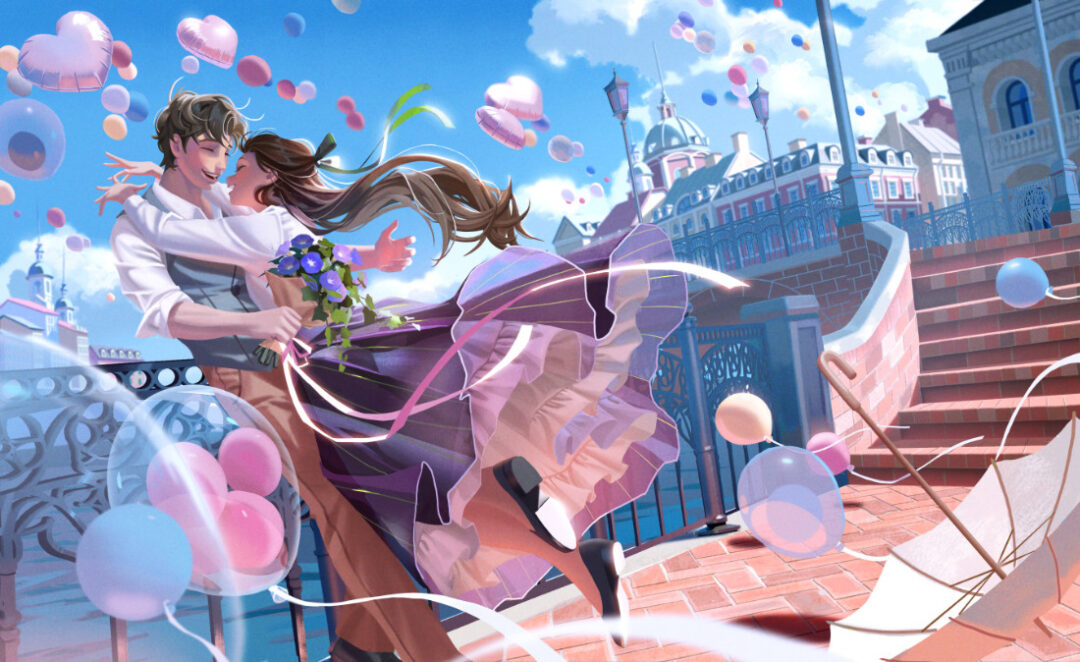
We also thought that her lovely, romantic style would be perfect for an illustration celebrating the holiday of love and romance: Valentine’s Day. The illustration she created is incredible, and she recorded her process on the Movink 13 to showcase how it went, from start to finish. Check out that video below and read on for some more insight into her inspiration and process in a short interview we conducted as well. Note: the interview below has been lightly edited for length and clarity.
What inspired your choices for this illustration?
Even when I’m not actively painting, I’m always kind of painting in my head. So when I got this Valentine’s Day-themed illustration commission, I didn’t jump into sketching right away. I let the idea kind of sit in my subconscious for a few days.
Since this was for the Wacom Movink 13, I wanted to include a sense of movement, not just romance. I kept thinking about how to connect the idea of movement with Valentine’s Day, and during that time I started collecting little visual memories from everyday life – like some morning glory flowers I once saw near a train station, balloons hanging outside a neighbor’s house, red bricks glowing in sunlight, a long ribbon I used while wrapping a friend’s birthday gift, and my favorite skirt I found again while folding laundry … all of these small things slowly turned into sketches in my head.
Have you ever seen morning glory flowers under sunlight? The colors and translucency of the petals are truly beautiful. That image stayed with me, and I think that’s how I ended up imagining a skirt that resembles a morning glory.
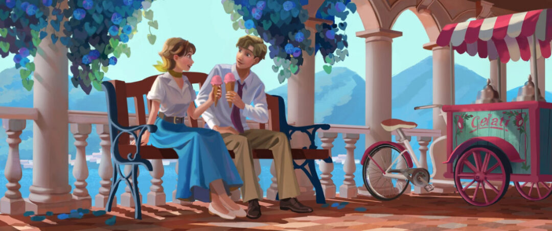
As for the characters, the moment I heard “Valentine’s Day,” I thought of Roman Holiday, which is my favorite movie and was also my college graduation project – a colored, remade, visual development version. I didn’t plan it intentionally, but I started wondering: what if Princess Ann and Joe, from the film, got to live a normal, everyday life together? That thought naturally influenced how I designed them.
In Roman Holiday, what Ann truly wanted was very simple – like dancing in the rain and eating gelato on a sunny day. So I imagined Joe learning what her favorite flower is, preparing it for her on a day when balloons filled a bright blue sky, as a sweet little surprise. When I think about it, drawing feels like connecting tiny dots of thoughts over time. In a way, that feels very similar to the Wacom Movink, too.
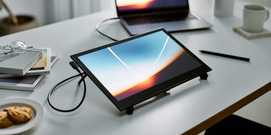
You normally use a larger Wacom Cintiq 16 for your illustration work, but used a Wacom Movink 13 for this illustration. What do you think about the differences between the two pen displays? Would you use the Movink 13 again in the future?
Yes, I usually use a Wacom Cintiq 16, and I still think it’s an amazing device. It has a great size and great performance. But when I first saw the Movink 13, I was honestly shocked. I didn’t expect something that thin to have such amazing display quality. The colors are incredibly accurate, and you only need a single cable.
That portability isn’t just great for artists. I think professionals in many different fields would find it useful – especially teachers who teach online, regardless of their subject. I also think it’s perfect for beginner artists or art students in college.
The OLED screen is super vivid, it’s super easy to carry, and I would assume it feels very natural for people transitioning from traditional art. You can zoom in and out with your fingers, the pen feels like the thickness of a real pencil, and there’s no lag or distance between the pen and the screen.
Most digital artists, depending on their field, use industry-standard tools like Photoshop, Blender, Unreal Engine, Lightroom, and so on. Movink feels like one of the very few pen displays that lets you use those full professional programs with a vivid screen while staying truly portable like a sketchbook. So I’d especially recommend it to beginners who are moving from paper to digital and want great display quality, and to art students who use professional software but have to move around a lot.
Personally, I use both devices for different purposes. As you saw in the video, when I lose focus, I need to change locations. I love lying in bed and going to cafés. It sounds funny, but I think every artist has dreamed of drawing in bed at least once. Being able to sit on my bed and use a pen display still feels like the future to me. And on nice weekends, I love bringing it to a café to draw. Lately, I’ve also been using Movink for final touch-ups. The color accuracy and sharp display make it really easy to catch small things I might have missed otherwise!
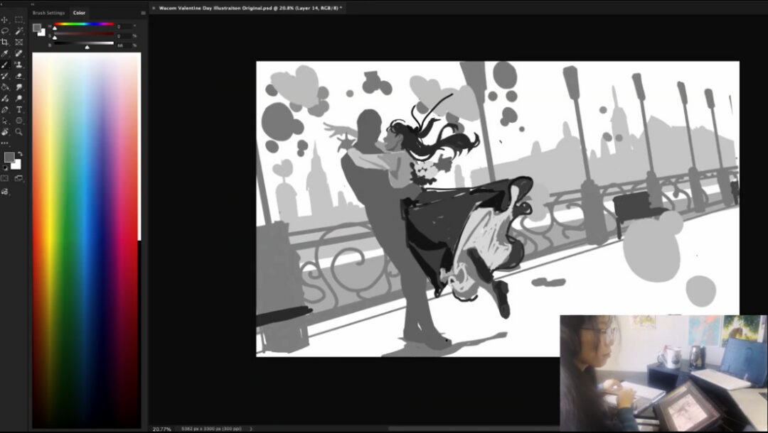
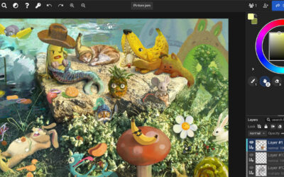
You created a unique sketch for this illustration, focusing on shapes and values rather than line art. Do you have a typical process for your illustrations, or does it depend on the piece? When do you choose to sketch in one particular way instead of another?
I think it really depends on the piece and, honestly, on my mood too! When I have a clear idea in my head, I tend to sketch using shapes and values. When I feel totally lost, I lean more toward very loose line art. But even that changes sometimes.
Overall, blocking in forms works best for me. I naturally see the human body more as masses than lines, and this method helps me see the silhouette and lighting at a glance. I also knew this illustration would be quite complex, so that influenced my decision.
There are a lot of elements even in the air in this piece, and the balloons were one of my main concerns. Working with shapes helped me quickly check the number and placement without making things feel messy. Since the two characters are about to hug each other, their poses are also a bit complex, so this sketching approach made it easier to read their pose relationship right away.
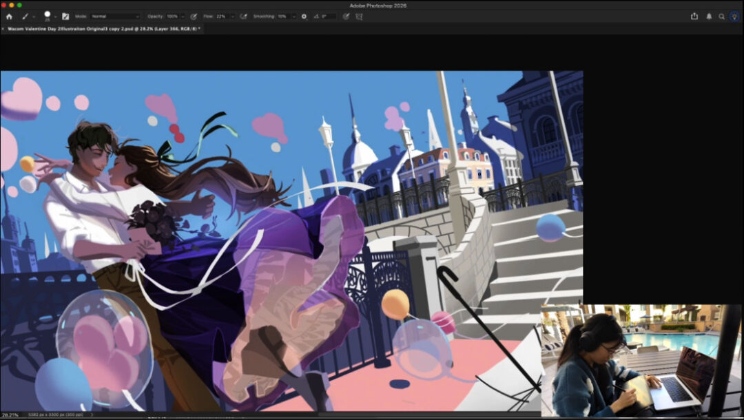
Something that often sticks out about your illustrations is your commitment to backgrounds, especially with respect to perspective and architecture – in this one, you redesigned the background partway through. What inspired the background architecture in this piece, and why are backgrounds important to you generally?
Thank you! That really means a lot. I’m actually very glad I decided to change the background midway. While filming the tutorial, I originally wanted to show a perfect, seamless process from start to finish. But I’ve learned so much from watching other artists restart their sketches or make big changes, and I realized that if my mistakes could become someone else’s lesson, that would make the tutorial even more meaningful. So, to anyone reading this: please, don’t be afraid to show your mistakes! Sharing that part ended up being one of my favorite things about this process.
I didn’t base the buildings on a specific country or city, but I think they were influenced by Prague. My mom once traveled there and brought me a book about Prague’s architecture, and I looked through it so many times that those building shapes must have stayed in my memory.
Background art is one of the things I love most in life, and also one of my biggest challenges. I love both characters and backgrounds, so many of my illustrations include both. Bringing them together in a natural way is one of the most fun and most difficult parts of illustration. Creating a background that tells a story, feels realistic, but is still beautifully designed without being overly complex, always pushes me. But when I see the finished piece, I always feel proud. I honestly can’t wait to see how much more I’ll grow in background art!
About the artist
Eunbi Kang is a South Korean-born visual development artist and illustrator for games, animation, and more. She is a graduate of the illustration department at the Art Center College of Design in Pasadena, California.
While pursuing her career, she won the independent Environment category at the 2022 Concept Art Awards and the Japanese illustration Award. She has a fascination for vibrant color palettes and fantasy themes. Follow her on Instagram.